
 Web Front-end
JS Tutorial
Comprehensive analysis of Bootstrap accordion effect_javascript skills
Web Front-end
JS Tutorial
Comprehensive analysis of Bootstrap accordion effect_javascript skills
Comprehensive analysis of Bootstrap accordion effect_javascript skills

Triggering the accordion can be triggered through the custom data-toggle attribute. The data-toggle value is set to collapse, data-target="#collapse area identifier".
The first step is to design a panel combination with three folding areas:
<div class="panel-group" id="myAccordion">
  <div class="panel panel-accordion panel-default"></div>
  <div class="panel panel-accordion panel-default"></div>
  <div class="panel panel-accordion panel-default"></div>
</div>
Step 2: Add content to the panel . Each panel includes two parts. The first is the panel title panel-heading, and add the title panel-title inside. The second part is the panel content, which is the folding area, using the panel-collapse style.
<div class="panel panel-accordion panel-default">
  <div class="panel-heading">
    <h4 class="panel-title">标题一</h4>
  </div>
  <div class="panel-collapse">
    <div class="panel-body">折叠区内容...</div>
  </div>
</div>
The third step, in order to bundle the title and content area , you can connect the title area and panel area together through anchor links:
<div class="panel-group" id="myAccordion">
  <div class="panel panel-accordion panel-default">
    <div class="panel-heading">
      <h4 class="panel-title"><a href="#panel1">标题一</a></h4>
    </div>
    <div class="panel-collapse" id="panel1">
      <div class="panel-body">折叠区内容...</div>
    </div>
  </div>
  <div class="panel panel-accordion panel-default">
    <div class="panel-heading">
      <h4 class="panel-title"><a href="#panel2">标题二</a></h4>
    </div>
    <div class="panel-collapse" id="panel2">
      <div class="panel-body">折叠区内容...</div>
    </div>
  </div>
  ......
</div>
The fourth step is to control whether the content area of the panel is visible. In the Bootstrap framework, if you want the content area to be invisible, just add collapse
The content area of each panel is hidden and becomes invisible, but sometimes I want the content of the first panel to be visible by default. What should I do? In fact, the author of Bootstrap has already considered this for everyone. You only need to add the in style on top of collapse.
<div class="panel panel-accordion panel-default">
  <div class="panel-heading">
    <h4 class="panel-title"><a href="#panel1">标题一</a></h4>
  </div>
  <div class="panel-collapse collapse" id="panel1">
    <div class="panel-body">折叠区内容...</div>
  </div>
</div>
The fifth step is to activate the accordion interactive behavior. To complete the interactive behavior, you need to customize two attributes in the title link. One is data-toggle, and its value is collapse; the other is data-target, and its value is the identifier of the content area of each panel, such as Speaking of IDs, in this example they are #panel1, #panel2 and #panel3
div class="panel panel-accordion panel-default">
  <div class="panel-heading">
    <h4 class="panel-title"><a href="#panel1" data-toggle="collapse" data-target="#panel1">标题一</a></h4>
  </div>
  <div class="panel-collapse collapse in" id="panel1">
    <div class="panel-body">折叠区内容...</div>
  </div>
</div> Note: It is okay not to add data-target="#panel1" in this case, because there is already href="#panel1" before, but if it is a button button As a trigger, you must use the data-target="#panel1" statement.
The sixth step is to define the data-parent attribute , so that when one of the elements is clicked, all folding areas will be closed, and then the clicked area will be opened (if the clicked area is displayed, it will be closed ). The data-parent value matches the identifier of the accordion panel container, which in this example is #myAccordion:
<div class="panel-group" id="myAccordion">
  <div class="panel panel-accordion panel-default">
    <div class="panel-heading">
      <h4 class="panel-title">
        <a href="#panel1" data-toggle="collapse" data-target="#panel1" data-parent="#myAccordion">标题一</a>
      </h4>
    </div>
...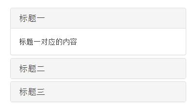
七 7. Complete code
<div class="panel-group" id="accordion">
  <div class="panel panel-default">
    <div class="panel-heading">
      <h4 class="panel-title"><a data-toggle="collapse" data-parent="#accordion" href="#collapseOne">标题一</a></h4>
    </div>
    <div id="collapseOne" class="panel-collapse collapse in">
      <div class="panel-body">标题一对应的内容</div>
    </div>
  </div>
  <div class="panel panel-default">
    <div class="panel-heading">
      <h4 class="panel-title"><a data-toggle="collapse" data-parent="#accordion" href="#collapseTwo">标题二</a></h4>
    </div>
    <div id="collapseTwo" class="panel-collapse collapse">
      <div class="panel-body">标题二对应的内容</div>
    </div>
  </div>
  <div class="panel panel-default">
    <div class="panel-heading">
      <h4 class="panel-title"><a data-toggle="collapse"data-parent="#accordion"href="#collapseThree">标题三</a></h4>
    </div>
    <div id="collapseThree" class="panel-collapse collapse">
      <div class="panel-body">标题三对应的内容</div>
    </div>
  </div>
</div>Rendering
The above is a comprehensive analysis of the Bootstrap accordion effect. I hope it will be helpful to everyone's learning.

Hot AI Tools

Undresser.AI Undress
AI-powered app for creating realistic nude photos

AI Clothes Remover
Online AI tool for removing clothes from photos.

Undress AI Tool
Undress images for free

Clothoff.io
AI clothes remover

AI Hentai Generator
Generate AI Hentai for free.

Hot Article
Hot Tools

Notepad++7.3.1
Easy-to-use and free code editor

SublimeText3 Chinese version
Chinese version, very easy to use

Zend Studio 13.0.1
Powerful PHP integrated development environment

Dreamweaver CS6
Visual web development tools

SublimeText3 Mac version
God-level code editing software (SublimeText3)
Hot Topics


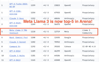 750,000 rounds of one-on-one battle between large models, GPT-4 won the championship, and Llama 3 ranked fifth
Apr 23, 2024 pm 03:28 PM
750,000 rounds of one-on-one battle between large models, GPT-4 won the championship, and Llama 3 ranked fifth
Apr 23, 2024 pm 03:28 PM
Regarding Llama3, new test results have been released - the large model evaluation community LMSYS released a large model ranking list. Llama3 ranked fifth, and tied for first place with GPT-4 in the English category. The picture is different from other benchmarks. This list is based on one-on-one battles between models, and the evaluators from all over the network make their own propositions and scores. In the end, Llama3 ranked fifth on the list, followed by three different versions of GPT-4 and Claude3 Super Cup Opus. In the English single list, Llama3 overtook Claude and tied with GPT-4. Regarding this result, Meta’s chief scientist LeCun was very happy and forwarded the tweet and
 How to use bootstrap to test mediation effects
Apr 05, 2024 am 03:57 AM
How to use bootstrap to test mediation effects
Apr 05, 2024 am 03:57 AM
The Bootstrap test uses resampling technology to evaluate the reliability of the statistical test and is used to prove the significance of the mediation effect: first, calculate the confidence interval of the direct effect, indirect effect and mediation effect; secondly, calculate the significance of the mediation type according to the Baron and Kenny or Sobel method. significance; and finally estimate the confidence interval for the natural indirect effect.
 What is the difference between bootstrap and springboot
Apr 05, 2024 am 04:00 AM
What is the difference between bootstrap and springboot
Apr 05, 2024 am 04:00 AM
The main difference between Bootstrap and Spring Boot is: Bootstrap is a lightweight CSS framework for website styling, while Spring Boot is a powerful, out-of-the-box backend framework for Java web application development. Bootstrap is based on CSS and HTML, while Spring Boot is based on Java and the Spring framework. Bootstrap focuses on creating the look and feel of a website, while Spring Boot focuses on back-end functionality. Spring Boot can be integrated with Bootstrap to create fully functional, beautiful
 What frameworks does vue have?
Apr 05, 2024 pm 11:54 PM
What frameworks does vue have?
Apr 05, 2024 pm 11:54 PM
Vue.js is a progressive framework for building user interfaces. When choosing a framework, you should consider project requirements, developer skills, community support, and maintenance costs. Commonly used Vue.js frameworks include Nuxt.js, Vuetify, Element UI, Quasar, BootstrapVue, VeeValidate, Axios, Vue Router, and Vuex.
 What is the z-value of the bootstrap mediation test?
Apr 05, 2024 am 04:12 AM
What is the z-value of the bootstrap mediation test?
Apr 05, 2024 am 04:12 AM
The Bootstrap mediation test z-value is used to evaluate the mediating effect of X on Y through M. The z-value is calculated as the mean value of the c' path divided by its standard deviation. The larger its absolute value, the higher the statistical significance of the mediation effect. The z value >1.96 indicates that the mediation effect is significant at the 0.05 level, the z value >2.58 indicates that it is significant at the 0.01 level, and the z value <-1.96 indicates that it is not significant at the 0.05 level.
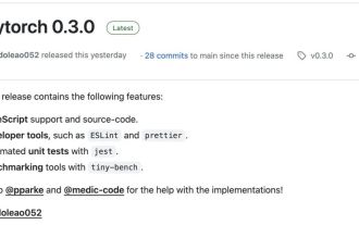 The AI era of JS is here!
Apr 08, 2024 am 09:10 AM
The AI era of JS is here!
Apr 08, 2024 am 09:10 AM
Introduction to JS-Torch JS-Torch is a deep learning JavaScript library whose syntax is very similar to PyTorch. It contains a fully functional tensor object (can be used with tracked gradients), deep learning layers and functions, and an automatic differentiation engine. JS-Torch is suitable for deep learning research in JavaScript and provides many convenient tools and functions to accelerate deep learning development. Image PyTorch is an open source deep learning framework developed and maintained by Meta's research team. It provides a rich set of tools and libraries for building and training neural network models. PyTorch is designed to be simple, flexible and easy to use, and its dynamic computation graph features make
 Which version of dreamweaver is better?
Apr 08, 2024 pm 09:39 PM
Which version of dreamweaver is better?
Apr 08, 2024 pm 09:39 PM
The version of Dreamweaver that's best for you depends on your skill level and project needs. Beginner: Dreamweaver CC General User: Dreamweaver 2022 Professional Developer: Dreamweaver 2022
 How to use layui and bootstrap together
Apr 26, 2024 am 03:51 AM
How to use layui and bootstrap together
Apr 26, 2024 am 03:51 AM
LayUI and Bootstrap can be integrated in the following ways: directly introduce styles and scripts, but you need to customize CSS override rules; use Sass to override Bootstrap variables, which requires Sass environment support; use Laystrap plug-ins to encapsulate the Bootstrap style version of LayUI components; use Layui Bootstrap plugin that automatically handles style overrides and responsive layout.
