Adaptive code sharing when browsers change
Sometimes, we open the browser page and display the current rendered model. However, if you don't set the scene model to adapt to the width and height changes of the browser, it will be a problem. This article mainly introduces to you the method of Three.js to adapt when the browser changes. The article introduces it in great detail through sample code. I hope it can help you.
If the scene adapts as the size of the browser changes, you need to monitor the window's resize event, which is the browser change event.
window.onresize = function(){}Or use the addEventListener event
window.addEventListener("resize",function(){})After the event monitoring is successful, you need to write the event that needs to be triggered after the change Expression:
//窗口变动触发的函数
function onWindowResize() {

 camera.aspect = window.innerWidth / window.innerHeight;
 camera.updateProjectionMatrix();
 renderer.setSize( window.innerWidth, window.innerHeight );

}The above mainly updates the proportion of the camera and the proportion of the renderer to achieve the current effect.
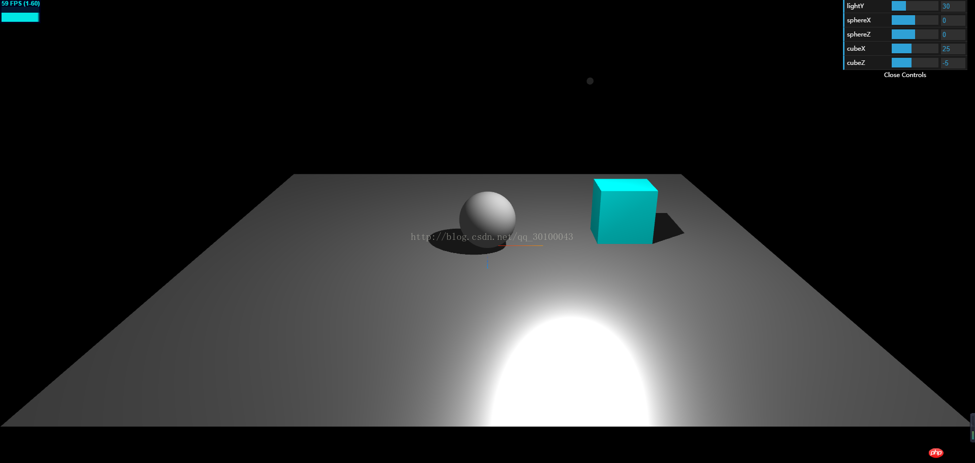
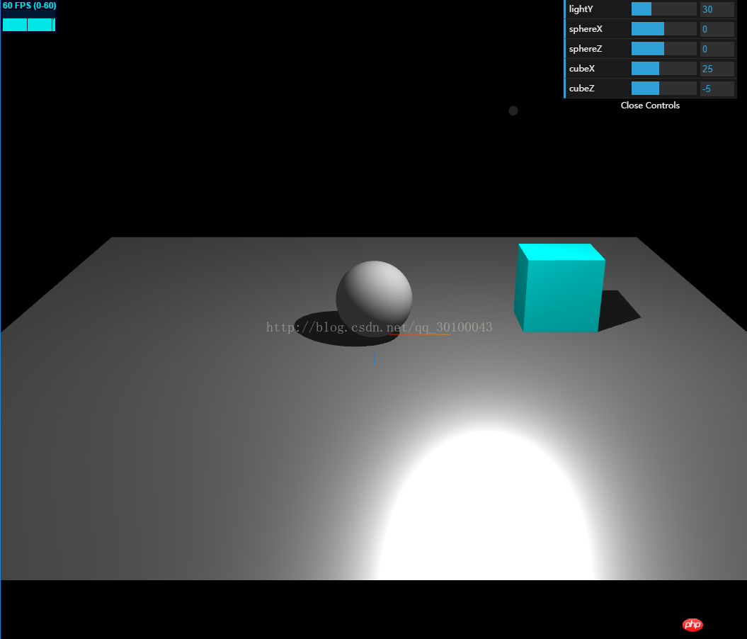
The code is used in the previous section, so I will not upload the code (if you need it, click here), but upload two sample effects.

The above is the effect of displaying in full screen state, and the following is the effect of directly changing the browser to half:

Related recommendations:
React adaptive height based on width example sharing
How to make mobile web page content self-adaptive Adapt
WeChat applet implements image component picture adaptive width ratio example sharing
The above is the detailed content of Adaptive code sharing when browsers change. For more information, please follow other related articles on the PHP Chinese website!

Hot AI Tools

Undresser.AI Undress
AI-powered app for creating realistic nude photos

AI Clothes Remover
Online AI tool for removing clothes from photos.

Undress AI Tool
Undress images for free

Clothoff.io
AI clothes remover

Video Face Swap
Swap faces in any video effortlessly with our completely free AI face swap tool!

Hot Article

Hot Tools

Notepad++7.3.1
Easy-to-use and free code editor

SublimeText3 Chinese version
Chinese version, very easy to use

Zend Studio 13.0.1
Powerful PHP integrated development environment

Dreamweaver CS6
Visual web development tools

SublimeText3 Mac version
God-level code editing software (SublimeText3)

Hot Topics
 1386
1386
 52
52
 How to customize the resize symbol through CSS and make it uniform with the background color?
Apr 05, 2025 pm 02:30 PM
The method of customizing resize symbols in CSS is unified with background colors. In daily development, we often encounter situations where we need to customize user interface details, such as adjusting...
 How to correctly display the locally installed 'Jingnan Mai Round Body' on the web page?
Apr 05, 2025 pm 10:33 PM
Using locally installed font files in web pages Recently, I downloaded a free font from the internet and successfully installed it into my system. Now...
 Why can custom style sheets take effect on local web pages in Safari but not on Baidu pages?
Apr 05, 2025 pm 05:15 PM
Discussion on using custom stylesheets in Safari Today we will discuss a custom stylesheet application problem for Safari browser. Front-end novice...
 How to control the top and end of pages in browser printing settings through JavaScript or CSS?
Apr 05, 2025 pm 10:39 PM
How to use JavaScript or CSS to control the top and end of the page in the browser's printing settings. In the browser's printing settings, there is an option to control whether the display is...
 How to use locally installed font files on web pages?
Apr 05, 2025 pm 10:57 PM
How to use locally installed font files on web pages Have you encountered this situation in web page development: you have installed a font on your computer...
 Why does negative margins not take effect in some cases? How to solve this problem?
Apr 05, 2025 pm 10:18 PM
Why do negative margins not take effect in some cases? During programming, negative margins in CSS (negative...
 The text under Flex layout is omitted but the container is opened? How to solve it?
Apr 05, 2025 pm 11:00 PM
The problem of container opening due to excessive omission of text under Flex layout and solutions are used...
 How to use CSS and Flexbox to implement responsive layout of images and text at different screen sizes?
Apr 05, 2025 pm 06:06 PM
Implementing responsive layouts using CSS When we want to implement layout changes under different screen sizes in web design, CSS...


