How to fix the width of table table-layout: fixed
This time I will show you how to fix the width of the tabletable-layout: fixed, fix the width of the table table-layout: fixedWhat are the precautionsWhat are the following? Let’s take a look at practical cases.
In order to allow the table to fill the screen (the remaining blank area), its width attribute is often defined as: 100%, and the cells are also defined as percentages.
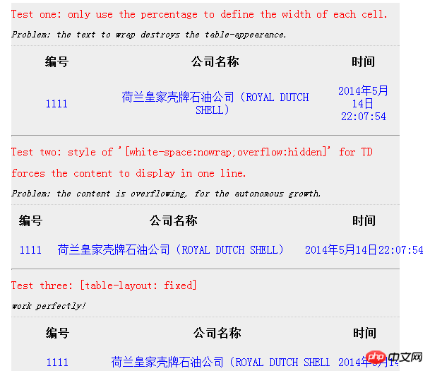
But this will cause problems: If the text in the cell exceeds the width limit, it will automatically wrap and the height will automatically increase, causing the style of the entire table to be uneven and ugly.
The easy solution is to disable text wrapping: white-space:nowrap; overflow:hidden;
So easy! But The effect is still unexpected: the text is all displayed in one line, the width is automatically widened, and even exceeds the parent container, and the overflow has no effect at all!
what happened? Is it because of the percentage? But if you use the fixed width of static, you lose the flexibility of the table.
Ever since, I found the ultimate solution effortlessly: fixed table width: table-layout: fixed;
I made a simple rendering by the way, for reference:

# I believe you have mastered the methods after reading these cases. For more exciting information, please pay attention to other related articles on the php Chinese website!
Related reading:
The dividing line hr is different What's the difference in browsers
The above is the detailed content of How to fix the width of table table-layout: fixed. For more information, please follow other related articles on the PHP Chinese website!

Hot AI Tools

Undresser.AI Undress
AI-powered app for creating realistic nude photos

AI Clothes Remover
Online AI tool for removing clothes from photos.

Undress AI Tool
Undress images for free

Clothoff.io
AI clothes remover

Video Face Swap
Swap faces in any video effortlessly with our completely free AI face swap tool!

Hot Article

Hot Tools

Notepad++7.3.1
Easy-to-use and free code editor

SublimeText3 Chinese version
Chinese version, very easy to use

Zend Studio 13.0.1
Powerful PHP integrated development environment

Dreamweaver CS6
Visual web development tools

SublimeText3 Mac version
God-level code editing software (SublimeText3)

Hot Topics
 1387
1387
 52
52
 Convert VirtualBox fixed disk to dynamic disk and vice versa
Mar 25, 2024 am 09:36 AM
When creating a virtual machine, you will be asked to select a disk type, you can select fixed disk or dynamic disk. What if you choose fixed disks and later realize you need dynamic disks, or vice versa? Good! You can convert one to the other. In this post, we will see how to convert VirtualBox fixed disk to dynamic disk and vice versa. A dynamic disk is a virtual hard disk that initially has a small size and grows in size as you store data in the virtual machine. Dynamic disks are very efficient at saving storage space because they only take up as much host storage space as needed. However, as disk capacity expands, your computer's performance may be slightly affected. Fixed disks and dynamic disks are commonly used in virtual machines
 How to set a computer lock screen wallpaper that will not change
Jan 17, 2024 pm 03:24 PM
Generally speaking, the desktop background pattern of a computer can be adjusted by the user. However, for some Windows 10 users, they want to be able to fix the desktop background image on their computer, but they don’t know how to set it. In fact, it is very simple and easy to operate. How to fix the computer lock screen wallpaper without changing it 1. Right-click the picture you want to set and select Set as background picture 2. Win+R to open and run, then enter "gpedit.msc" 3. Expand to: User Configuration - Management Templates - Control Panel - Personalization 4. Click Personalization, and then select "Prevent changes to desktop background" 5. Select Enabled 6. Then open settings and enter the background. When you see these small words, it means that it has been set up.
 How to keep the widgets panel always visible in Windows 11
Aug 13, 2023 pm 07:13 PM
How to always show widget board when opening in Windows 11? Well, you can start by downloading and installing the latest Windows updates. In the latest update patch for the Insider Program, Microsoft revealed that users in the Development and Canary channels will be able to pin the widget board open so it is always visible at a glance. How to Always Show Widgets Board Open in Windows 11 According to Microsoft, to pin a board to open, just click on the pushpin icon in the upper right corner of the board. Once your board is pinned open, the widget board will no longer ignore closing. While the board is pinned, you can still close it by opening the widget board via the Widgets button on the taskbar. when widget
 How to pin computer notes to the desktop
Feb 15, 2024 pm 04:00 PM
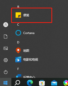
The Windows 10 operating system is pre-embedded with a convenient note function so that valued users can write temporary notes or messages as they wish. Suppose you want to use this as a tool to quickly and easily find and use sticky notes, or you want to pin this practical small program in the center of a large screen for easy reference. You can realize the above wishes in just a few simple steps: How to pin sticky notes on your computer On the desktop 1. Click Start and then click the sticky note here. 2. After opening the sticky note, you can directly enter the corresponding content here, and you can also click the plus sign above to add a brand new content. 3. If you want to use a third party If you have a note-taking software, you can enter the settings of the corresponding software to operate.
 How to use vue3 table component
May 12, 2023 pm 09:40 PM
Basic table Before developing the table component, first think about what style of API to use. Because the author uses element in production work, the styles of the previous components are similar to element, but this time I do not plan to use the element style. , I plan to change it and display it directly: We expect users to use it like this: constdataList=[{id:1,name:'"JavaEE Enterprise Application Practice"',author:'dev1ce',price:'10.22',desc:&# 3
 Why front-end fixed positioning can produce dynamic effects analysis
Feb 02, 2024 pm 12:09 PM
Front-end fixed positioning is a common CSS property that can fix an element at a specific position on the page and not change its position as the page scrolls. Unlike ordinary positioning, the position of fixed positioning on the page is relative to the viewport, not relative to the parent element. The effect of this fixed positioning is all the more attractive precisely because of its dynamic nature. The main reasons why fixed positioning produces dynamic effects are as follows: Scroll effect: When the page scrolls, fixedly positioned elements will not scroll with the page, but remain in a fixed position. this
 How to solve the problem that the win11 start menu cannot be fixed
Jan 06, 2024 pm 08:09 PM
Many friends like to open the software directly in the start menu, which requires directly pinning the application to it. However, they found that they cannot be pinned to the start menu in win11. This may be because we did it incorrectly. Let’s take a look at the correct method below. Method. What to do if the win11 start menu cannot be fixed 1. First, we click the search button in the taskbar below. 2. After opening it, search for the application you want to pin at the top, and when you find it, click "Pin to Start Screen" on the right. 3. Wait for the system to display the icon to pin prompt. 4. After completion, you will find that the selected program has been pinned to the start menu.
 Solution to Vue navigation bar fixed problem
Jun 30, 2023 am 10:52 AM
How to deal with the fixed navigation bar problem encountered in Vue development. When developing web pages, the fixed effect of the navigation bar is a very common requirement. As the user scrolls the page, the navigation bar can remain in a fixed position so that the user can easily access other parts of the page. However, in Vue development, due to its special single-page application structure, the problem of fixing the navigation bar may be slightly different. In this article, we will introduce some methods to deal with the navigation bar fixed problem encountered in Vue development. Method 1: Use CSS to fix positioning (posit


