
 Web Front-end
JS Tutorial
Vue encapsulates Swiper to implement code sharing for image carousel effects
Web Front-end
JS Tutorial
Vue encapsulates Swiper to implement code sharing for image carousel effects
Vue encapsulates Swiper to implement code sharing for image carousel effects

This article mainly shares with you the code of Vue encapsulating Swiper to achieve the image carousel effect. Image carousel is a function that often needs to be implemented in the front end. I recently learned Vue.js and encapsulated Swiper to implement a simple image carousel component.
1. Swiper
Before implementing encapsulation, let’s introduce Swiper first.
Swiper is a sliding special effects plug-in created in pure Javascript, targeting mobile terminals such as mobile phones and tablets.
Swiper can achieve common effects such as touch screen focus image, touch screen Tab switching, touch screen multi-image switching, etc.
Swiper is open source, free, stable, simple to use, and powerful. It is an important choice for building mobile terminal websites.
Swiper has a wide range of application scenarios and the implementation effect is very good. The following actual case is a typical application scenario of Swiper.
For specific usage tutorials and detailed API of Swiper, please refer to Swiper Chinese website
.
2. Vue components
The original intention of Vue components is to be used together to improve maintainability and reusability. The picture carousel is suitable to be completed using components, so before introducing the specific implementation, let's first introduce the Vue components and component communication.
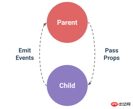
The most common thing among Vue components is the relationship between parent and child components: component A uses component B in its template.
They must communicate with each other: the parent component may need to send data to the child component, and the child component may need to inform the parent component of what is happening inside it. However, it is also important to decouple parent and child components as much as possible through a well-defined interface. This ensures that the code of each component can be written and understood in a relatively isolated environment, thereby improving its maintainability and reusability.
In Vue, the relationship between parent and child components can be summarized as props are passed downwards and events are passed upwards. The parent component sends data to the child component through props, and the child component sends messages to the parent component through events.
3. Encapsulation implementation
1.Introducing Swiper
First, you need to install Swiper.
npm install --save swiper
Then, two files need to be referenced.
import Swiper from "swiper";
import "swiper/dist/css/swiper.min.css";
2.HTML code
Set the html layout of the carousel image in the template.
<template>
<p class="swiper-container" :class="swipeid">
<p class="swiper-wrapper">
<!-- 存放具体的轮播内容 -->
<slot name ="swiper-con"></slot>
</p>
<!-- 分页器 -->
<p :class="{'swiper-pagination':pagination}"></p>
</p>
</template>It uses named slots to improve decoupling, so that when the parent component is used, different carousel content can be set according to different situations.
In addition, you need to set up a paginator, which is a page indicator in the image carousel. Common ones are small dots or digital indicators.
3. Initialize Swiper
Since Swiper is encapsulated to implement the carousel chart, and Swiper has been installed before, it needs to be initialized now.
Before initialization, based on the understanding of Swiper usage, first determine the attribute information required by the carousel component, and then pass it to the encapsulated Swiper component through the parent component.
You need to use props at this time.
props: {
  swipeid: {
   type: String,
   default: ""
  },
  effect: {
   type: String,
   default: "slide"
  },
  loop: {
   type: Boolean,
   default: false
  },
  direction: {
   type: String,
   default: "horizontal"
  },
  pagination: {
   type: Boolean,
   default: true
  },
  paginationType: {
   type: String,
   default: "bullets"
  },
  autoPlay: {
   type: Number,
   default: 3000
  }
}The meaning of each attribute is explained one by one below.
| Attribute | Meaning |
|---|---|
| Carousel container class attribute class name. | |
| The switching effect of the picture, the default is "slide", and can also be set to "fade", "cube", "coverflow", "flip", See effect for details. | |
| Set to true to enable loop mode. Loop mode: several pictures will be copied before and after the original picture and switched at the appropriate time, making Swiper appear to be looping. For details, see loop. | |
| The sliding direction of the picture can be set to horizontal (horizontal) or vertical (vertical). For details, see direction. | |
| Use pagination navigation, see pagination for details. | |
| paginationType | 分页器样式类型,可设置为"bullets", "fraction", "progressbar", "custom",详情见type。 |
| autoPlay | 设置为true启动自动切换,并使用默认的切换设置,详情见autoplay。 |
了解了上面每个属性的含义,下面就可以初始化Swiper,并设置具体的属性。
初始化Swiper时,需要传入两个参数。
轮播容器的类名
代表图片轮播组件详细功能的对象
var that = this;
  this.dom = new Swiper("." + that.swipeid, {
   //循环
   loop: that.loop,
   //分页器
   pagination: {
    el: ".swiper-pagination",
    bulletClass : 'swiper-pagination-bullet',
      },
   //分页类型
   paginationType: that.paginationType,
   //自动播放
   autoPlay: that.autoPlay,
   //方向
   direction: that.direction,
   //特效
   effect: that.effect,
   //用户操作swiper之后,不禁止autoplay
   disableOnInteraction: false,
   //修改swiper自己或子元素时,自动初始化swiper
   observer: true,
   //修改swiper的父元素时,自动初始化swiper
   observeParents: true
  });
}四、自定义轮播效果
经过上面的步骤,轮播器就封装好了。我们可以自定义实现自己想要的轮播器效果。下面以知乎的API为例,实现图片轮播。
1.HTML代码
<m-swipe swipeid="swipe" ref="swiper" :autoPlay="3000" effect="slide">
   <p v-for="top in tops" :key="top.id" class="swiper-slide" slot="swiper-con" >
    <img :src="top.image">
    <h3>{{top.title}}</h3>
   </p>
</m-swipe>首先要引用注册组件,这里就不详细写出。
其中 m-swipe 就是前面实现的图片轮播组件,而其中的子组件就是通过具名插槽插入的轮播内容。
2.CSS代码
.swiper-container {
  width: 100%;
 }
 .swiper-slide {
  height: 8rem;
  overflow: hidden;
  position: relative;
 }
.swiper-slide {
 p {
  top: 0;
  left: 0;
  width: 100%;
  height: 100%;
  opacity: 0.4;
  position: absolute;
  background-color: @blue;
 }
 img {
  top: 50%;
  position: relative;
  transform: translate(0, -50%);
 }
 h3 {
  width: 70%;
  color: #fff;
  margin: 0;
  font-size: 0.5rem;
  line-height: 1rem;
  right: 5%;
  bottom: 2.6rem;
  text-align: right;
  position: absolute;
  text-shadow: 1px 1px 10px rgba(0, 0, 0, 0.5);
  &:before {
   content: "";
   width: 3rem;
   bottom: -0.6rem;
   right: 0;
   display: block;
   position: absolute;
   border: 2px solid @yellow;
  }
 }
}
.swiper-pagination-bullet-active {
 background: #fff;
}
.swiper-container-horizontal > .swiper-pagination-bullets {
  bottom: 1rem;
  width: 95%;
  text-align: right;
}其中 swiper-pagination-bullet-active 代表分页器中当前指示的小圆点的类名。 .swiper-pagination-bullets 代表分页器的类名,详情见pagination分页器内元素的类名 。
关于网络请求数据展示的代码就不贴了,下面有源码地址。
3.效果
这只是一个简单的封装效果,想要实现更多的效果,可以通过Swiper中提供的更多功能来实现。
相关推荐:
The above is the detailed content of Vue encapsulates Swiper to implement code sharing for image carousel effects. For more information, please follow other related articles on the PHP Chinese website!

Hot AI Tools

Undresser.AI Undress
AI-powered app for creating realistic nude photos

AI Clothes Remover
Online AI tool for removing clothes from photos.

Undress AI Tool
Undress images for free

Clothoff.io
AI clothes remover

AI Hentai Generator
Generate AI Hentai for free.

Hot Article
Hot Tools

Notepad++7.3.1
Easy-to-use and free code editor

SublimeText3 Chinese version
Chinese version, very easy to use

Zend Studio 13.0.1
Powerful PHP integrated development environment

Dreamweaver CS6
Visual web development tools

SublimeText3 Mac version
God-level code editing software (SublimeText3)
Hot Topics


 Users encounter rare glitches: Samsung Watch smartwatches suddenly experience white screen issues
Apr 03, 2024 am 08:13 AM
Users encounter rare glitches: Samsung Watch smartwatches suddenly experience white screen issues
Apr 03, 2024 am 08:13 AM
You may have encountered the problem of green lines appearing on the screen of your smartphone. Even if you have never seen it, you must have seen related pictures on the Internet. So, have you ever encountered a situation where the smart watch screen turns white? On April 2, CNMO learned from foreign media that a Reddit user shared a picture on the social platform, showing the screen of the Samsung Watch series smart watches turning white. The user wrote: "I was charging when I left, and when I came back, it was like this. I tried to restart, but the screen was still like this during the restart process." Samsung Watch smart watch screen turned white. The Reddit user did not specify the smart watch. Specific model. However, judging from the picture, it should be Samsung Watch5. Previously, another Reddit user also reported
 How to solve the problem of automatically saving pictures when publishing on Xiaohongshu? Where is the automatically saved image when posting?
Mar 22, 2024 am 08:06 AM
How to solve the problem of automatically saving pictures when publishing on Xiaohongshu? Where is the automatically saved image when posting?
Mar 22, 2024 am 08:06 AM
With the continuous development of social media, Xiaohongshu has become a platform for more and more young people to share their lives and discover beautiful things. Many users are troubled by auto-save issues when posting images. So, how to solve this problem? 1. How to solve the problem of automatically saving pictures when publishing on Xiaohongshu? 1. Clear the cache First, we can try to clear the cache data of Xiaohongshu. The steps are as follows: (1) Open Xiaohongshu and click the "My" button in the lower right corner; (2) On the personal center page, find "Settings" and click it; (3) Scroll down and find the "Clear Cache" option. Click OK. After clearing the cache, re-enter Xiaohongshu and try to post pictures to see if the automatic saving problem is solved. 2. Update the Xiaohongshu version to ensure that your Xiaohongshu
 How to post pictures in TikTok comments? Where is the entrance to the pictures in the comment area?
Mar 21, 2024 pm 09:12 PM
How to post pictures in TikTok comments? Where is the entrance to the pictures in the comment area?
Mar 21, 2024 pm 09:12 PM
With the popularity of Douyin short videos, user interactions in the comment area have become more colorful. Some users wish to share images in comments to better express their opinions or emotions. So, how to post pictures in TikTok comments? This article will answer this question in detail and provide you with some related tips and precautions. 1. How to post pictures in Douyin comments? 1. Open Douyin: First, you need to open Douyin APP and log in to your account. 2. Find the comment area: When browsing or posting a short video, find the place where you want to comment and click the "Comment" button. 3. Enter your comment content: Enter your comment content in the comment area. 4. Choose to send a picture: In the interface for entering comment content, you will see a "picture" button or a "+" button, click
 6 Ways to Make Pictures Sharper on iPhone
Mar 04, 2024 pm 06:25 PM
6 Ways to Make Pictures Sharper on iPhone
Mar 04, 2024 pm 06:25 PM
Apple's recent iPhones capture memories with crisp detail, saturation and brightness. But sometimes, you may encounter some issues that may cause the image to look less clear. While autofocus on iPhone cameras has come a long way, allowing you to take photos quickly, the camera can mistakenly focus on the wrong subject in certain situations, making the photo blurry in unwanted areas. If your photos on your iPhone look out of focus or lack sharpness overall, the following post should help you make them sharper. How to Make Pictures Clearer on iPhone [6 Methods] You can try using the native Photos app to clean up your photos. If you want more features and options
 How to make ppt pictures appear one by one
Mar 25, 2024 pm 04:00 PM
How to make ppt pictures appear one by one
Mar 25, 2024 pm 04:00 PM
In PowerPoint, it is a common technique to display pictures one by one, which can be achieved by setting animation effects. This guide details the steps to implement this technique, including basic setup, image insertion, adding animation, and adjusting animation order and timing. Additionally, advanced settings and adjustments are provided, such as using triggers, adjusting animation speed and order, and previewing animation effects. By following these steps and tips, users can easily set up pictures to appear one after another in PowerPoint, thereby enhancing the visual impact of the presentation and grabbing the attention of the audience.
 How to convert pdf documents into jpg images with Foxit PDF Reader - How to convert pdf documents into jpg images with Foxit PDF Reader
Mar 04, 2024 pm 05:49 PM
How to convert pdf documents into jpg images with Foxit PDF Reader - How to convert pdf documents into jpg images with Foxit PDF Reader
Mar 04, 2024 pm 05:49 PM
Are you also using Foxit PDF Reader software? So do you know how Foxit PDF Reader converts pdf documents into jpg images? The following article brings you how Foxit PDF Reader converts pdf documents into jpg images. For those who are interested in the method of converting jpg images, please come and take a look below. First start Foxit PDF Reader, then find "Features" on the top toolbar, and then select the "PDF to Others" function. Next, open a web page called "Foxit PDF Online Conversion". Click the "Login" button on the upper right side of the page to log in, and then turn on the "PDF to Image" function. Then click the upload button and add the pdf file you want to convert into an image. After adding it, click "Start Conversion"
 How to arrange two pictures side by side in wps document
Mar 20, 2024 pm 04:00 PM
How to arrange two pictures side by side in wps document
Mar 20, 2024 pm 04:00 PM
When using WPS office software, we found that not only one form is used, tables and pictures can be added to the text, pictures can also be added to the table, etc. These are all used together to make the content of the entire document look richer. , if you need to insert two pictures into the document and they need to be arranged side by side. Our next course can solve this problem: how to place two pictures side by side in a wps document. 1. First, you need to open the WPS software and find the picture you want to adjust. Left-click the picture and a menu bar will pop up, select "Page Layout". 2. Select "Tight wrapping" in text wrapping. 3. After all the pictures you need are confirmed to be set to "Tight text wrapping", you can drag the pictures to the appropriate position and click on the first picture.
 What should I do if the images on the webpage cannot be loaded? 6 solutions
Mar 15, 2024 am 10:30 AM
What should I do if the images on the webpage cannot be loaded? 6 solutions
Mar 15, 2024 am 10:30 AM
Some netizens found that when they opened the browser web page, the pictures on the web page could not be loaded for a long time. What happened? I checked that the network is normal, so where is the problem? The editor below will introduce to you six solutions to the problem that web page images cannot be loaded. Web page images cannot be loaded: 1. Internet speed problem The web page cannot display images. It may be because the computer's Internet speed is relatively slow and there are more softwares opened on the computer. And the images we access are relatively large, which may be due to loading timeout. As a result, the picture cannot be displayed. You can turn off the software that consumes more network speed. You can go to the task manager to check. 2. Too many visitors. If the webpage cannot display pictures, it may be because the webpages we visited were visited at the same time.
