

Html5 IphoneX adaptation method sharing

The key to adapting to IphoneX is how to adapt the page to the "bangs", bottom operating area and large rounded corners issues. Compared with other mobile phones, the difference between IphoneX and IphoneX is that although the device also has one screen, it is actually divided into several modules. This article mainly introduces to you the relevant information on the Html5 IphoneX adaptation method. The editor thinks it is quite good. Now Share it with everyone and give it as a reference. Let’s follow the editor to take a look, I hope it can help everyone.
We move a normal web page to ?
Solution
1. Add a background-color to the body
Why add background-color? What is the use? Notice that we just mentioned that there will be white patches on the head and bottom. In fact, it is not accurate to say that it is white, because this color actually comes from the background color of the body. In addition, when we pull up or pull down the content, the content and color at the bottom of the web page will be displayed, which is actually the background color of the body. So if you want to modify these two effects, you can set the background color of the body.
2. Add the tag of viewport-fit = cover
This step is extremely critical. Let’s take a look at the results first:
Copy code
The code is as follows:
<meta name="viewport" content="initial-scale=1.0, minimum-scale=1.0, maximum-scale=1.0, user-scalable=0,
width=device-width, viewport-fit=cover" />
Why is it so critical? The main problem of iphoneX is that web content cannot be displayed elsewhere except in the safe area, and it is tailor-made to solve this problem. When the above content is set, the head and bottom can be opened for the web page to display content.
But after using it, you will find that the area is open, but the content (often the navigation bar) is partially blocked because of the "bangs", and you find that the originally set 100% height is not What should I do if it takes up all the height space?
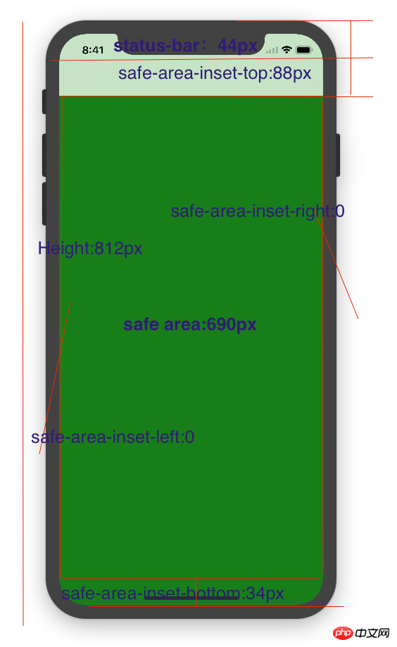
For the height of the head and the height of the bottom, there are actually matching values, as shown below:
So, we have the following solution:
1. Modify the height of our navigation bar and add the height of safe-area-inset-top to the original height, which is 44px; specifically, it can be written like this:
height: calc(navHeight + 44px); , and reset the position of the copy on the navigation bar.
2. The browser chromium kernel of IOS 11 provides the following content, which are the values we marked in the picture above:
safe-area-inset- top
safe-area-inset-right
safe-area-inset-left
safe-area-inset-bottom
How to use it? It's very simple:
body {
    padding-top: constant(safe-area-inset-top);   //为导航栏+状态栏的高度 88px
    padding-left: constant(safe-area-inset-left);   //如果未竖屏时为0
    padding-right: constant(safe-area-inset-right); //如果未竖屏时为0
    padding-bottom: constant(safe-area-inset-bottom);//为底下圆弧的高度 34px
}Maybe you haven't seen constant, and I haven't seen it before. It is also a value specially designed for iphoneX. Note that it can only be used when your tag is added with viewport. -fit=cover is required for this value to take effect. Of course, on an android phone, it will not be recognized.
3. Only effective for IphoneX
Note that the adaptation we made is only effective for IphoneX and cannot affect other phones, so we need to make a responsive layout, that is , use media query, as follows:
// 注意这里采用的是690px(safe area高度),不是812px;
@media only screen and (width: 375px) and (height: 690px){
    body {
        height: 100vh;
    }
}There is information that the above method is OK, but it has no effect when I use it, so I relaxed the conditions and made the following modifications:
@media only screen and (width: 375px) and (min-height: 690px){
    body {
       height: 100vh;
    }
}The difference is that I identify devices with a width of 375px and a height greater than 690px as IphoneX. Of course, currently only the X device meets this condition.
4. Web page height changes
First of all, let me emphasize that I am not sure about this part. I encountered it myself, so I would like to explain it:
After setting up viewport-fit, You will find that the originally set 100% height is not as expected, and only takes up part of the screen space. In fact, there is no rush, you only need to make the following modifications:
@media only screen and (width: 375px) and (min-height: 690px) {
    body {
        height: 100vh;
    }
}vh is to check the viewport, which is the height of the viewport, 1vh = 1% viewport height, which is an absolute unit. Setting 100vh means taking up the full screen height
5. The navigation bar is at the top and the taskbar is at the bottom
The page content can be pulled. If the navigation bar also slides, the effect will be ugly. This We need to achieve the navigation bar ceiling effect. I won’t go into details since everyone knows how to implement it. Here is one of my cases:
@media only screen and (width: 375px) and (min-height: 690px){
  p {
    position: fixed;
    display: block;
    z-index: 300;
  }
  .bg {
    height: calc(3.5rem + 44px);
  }
  p {
    margin-top: 44px;
  }
}The same goes for the taskbar. This article simply describes the specific steps on how to deal with the IphoneX adaptation problem. If you want to understand the principles more deeply, you are welcome to communicate in the comment area.
Related recommendations:
Detailed explanation of html5 page rem layout adaptation method
Detailed explanation of mobile REM layout of H5 activity page Adaptation method
How to use rem+scss for adaptation on the mobile phone
The above is the detailed content of Html5 IphoneX adaptation method sharing. For more information, please follow other related articles on the PHP Chinese website!

Hot AI Tools

Undresser.AI Undress
AI-powered app for creating realistic nude photos

AI Clothes Remover
Online AI tool for removing clothes from photos.

Undress AI Tool
Undress images for free

Clothoff.io
AI clothes remover

AI Hentai Generator
Generate AI Hentai for free.

Hot Article
Hot Tools

Notepad++7.3.1
Easy-to-use and free code editor

SublimeText3 Chinese version
Chinese version, very easy to use

Zend Studio 13.0.1
Powerful PHP integrated development environment

Dreamweaver CS6
Visual web development tools

SublimeText3 Mac version
God-level code editing software (SublimeText3)
Hot Topics
 1378
1378
 52
52

 Table Border in HTML
Sep 04, 2024 pm 04:49 PM
Table Border in HTML
Sep 04, 2024 pm 04:49 PM
Guide to Table Border in HTML. Here we discuss multiple ways for defining table-border with examples of the Table Border in HTML.
 HTML margin-left
Sep 04, 2024 pm 04:48 PM
HTML margin-left
Sep 04, 2024 pm 04:48 PM
Guide to HTML margin-left. Here we discuss a brief overview on HTML margin-left and its Examples along with its Code Implementation.
 Nested Table in HTML
Sep 04, 2024 pm 04:49 PM
Nested Table in HTML
Sep 04, 2024 pm 04:49 PM
This is a guide to Nested Table in HTML. Here we discuss how to create a table within the table along with the respective examples.
 HTML Table Layout
Sep 04, 2024 pm 04:54 PM
HTML Table Layout
Sep 04, 2024 pm 04:54 PM
Guide to HTML Table Layout. Here we discuss the Values of HTML Table Layout along with the examples and outputs n detail.
 HTML Input Placeholder
Sep 04, 2024 pm 04:54 PM
HTML Input Placeholder
Sep 04, 2024 pm 04:54 PM
Guide to HTML Input Placeholder. Here we discuss the Examples of HTML Input Placeholder along with the codes and outputs.
 HTML Ordered List
Sep 04, 2024 pm 04:43 PM
HTML Ordered List
Sep 04, 2024 pm 04:43 PM
Guide to the HTML Ordered List. Here we also discuss introduction of HTML Ordered list and types along with their example respectively
 Moving Text in HTML
Sep 04, 2024 pm 04:45 PM
Moving Text in HTML
Sep 04, 2024 pm 04:45 PM
Guide to Moving Text in HTML. Here we discuss an introduction, how marquee tag work with syntax and examples to implement.
 HTML onclick Button
Sep 04, 2024 pm 04:49 PM
HTML onclick Button
Sep 04, 2024 pm 04:49 PM
Guide to HTML onclick Button. Here we discuss their introduction, working, examples and onclick Event in various events respectively.
