

Clip implements ring progress bar in css3

This article mainly introduces to you the relevant information about the sample code of css3 clip to implement the ring progress bar. The editor thinks it is quite good, so I will share it with you now and give it as a reference. Let’s follow the editor to take a look, I hope it can help everyone.
There is a property in CSS called clip, which means trimming.
The clip property clips absolutely positioned elements. This property is used to define a clipping rectangle. For an absolutely defined element, only the content within the rectangle is visible. Content outside this clipping area will be processed according to the value of overflow.
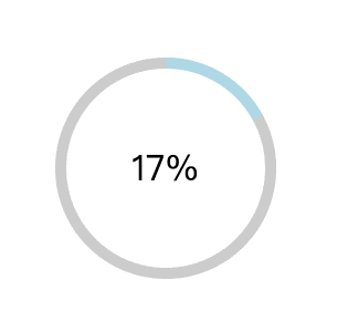
Ring progress bar.gif
How to achieve the effect of such a ring progress bar, you can use canvas, svg, GIF, etc., today Let’s talk about how to implement it using css3.
Implementation ideas
The circle is very simple. One line of cssborder-radius:50% can be realized, and there is no compatibility problem. What, you said IE, let it Get out...
We need three rings here, one full and two half. I roughly drew the picture below
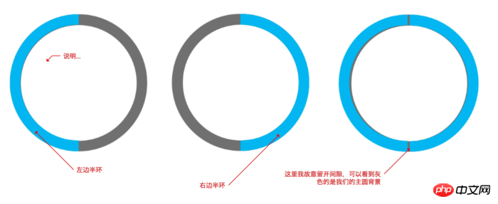
I used clip to cut the semicircle here. The main code is as follows,
.left{
    width: 200px;
    height: 200px;
    border-radius: 50%;
    border: 10px solid lightblue;
    position:absolute;
    top: -10px;   /* 10的原因是因为边框是10个像素 */
    right: -10px;
    clip: rect(0 100px 200px 0);  /* 上面为0 右边到100px 下面200px 左边到0 这个区域的我们裁剪出来 */
}The right side is similar except that the cropping position has been changed
.right{
    width: 200px;
    height: 200px;
    border-radius: 50%;
    border: 10px solid lightblue;
    position:absolute;
    top: -10px;  /* 10的原因是因为边框是10个像素 */
    right: -10px;
    clip: rect(0 200px 200px 100px);  /* 位置更改,计算可以参考上图 */
}Complete code
<!DOCTYPE html>
<html lang="en">
<head>
<meta charset="UTF-8">
<meta name="viewport" content="width=device-width, initial-scale=1.0">
<meta http-equiv="X-UA-Compatible" content="ie=edge">
<title>Document</title>
<style>
p{
box-sizing: border-box;
}
.box{
width: 200px;
height: 200px;
position: relative;
background-color: #ccc;
border-radius: 50%;
left: 40%;
top: 200px;
}
.num{
position: absolute;
top: 50%;
left: 50%;
background: #fff;
border-radius: 50%;
width: 180px;
height: 180px;
transform: translate(-50%, -50%);
text-align: center;
line-height: 180px;
font-size: 32px;
}
.clip{
width: 200px;
height: 200px;
position: absolute;
border: 10px solid #ccc;
border-radius: 50%;
clip: rect(0, 200px, 200px, 100px);
}
.left{
width: 200px;
height: 200px;
position: absolute;
border: 10px solid lightblue;
border-radius: 50%;
clip: rect(0 100px 200px 0);
top: -10px;
left: -10px;
}
.right{
width: 200px;
height: 200px;
position: absolute;
border: 10px solid lightblue;
border-radius: 50%;
clip: rect(0 200px 200px 100px);
top: -10px;
left: -10px;
}
.width-none{
width: 0;
}
.auto{
clip: auto;
}
</style>
</head>
<body>
<p class="box">
<p class="clip">
<p class="left"></p>
<p class="right width-none"></p>
</p>
<p class="num">
</p>
</p>
<script >
let clip = document.querySelector('.clip'),
left = document.querySelector('.left'),
right = document.querySelector('.right'),
num = document.querySelector('.num'),
rotate = 0;
let loop = setInterval(() => {
if(rotate >= 100){
rotate = 0;
right.classList.add('width-none');
clip.classList.remove('auto');
} else if(rotate > 50){
right.classList.remove('width-none');
clip.classList.add('auto');
}
rotate++;
left.style.transform = 'rotate('+ 3.6*rotate + 'deg)';
num.innerHTML = `${rotate}%`
},100)
</script>
</body>
</html>Let’s briefly talk about the above Code
1. First, the right semicircle is hidden. This is because what we need to rotate is the left semicircle. We can wait for the left semicircle to move to the position of the right circle and then display the right side, that is, wait until it is rotated to 180 degrees. when.
2. At the same time, we see that the clip: rect(0, 200px, 200px, 100px); cropping style is added to the main circle. This is because by default our progress is 0%, and we can only hide it if we display the right side. On the left, but isn't our right hidden? Then what does it show? Because when you rotate it to the left, you can see the circle that turns to the right. It's a bit convoluted, please combine it with the code and understand it more
3. When the left side is rotated 180 degrees, we need to display the right side, and set the cropping of the box element to the default value, which is no cropping, so that it can be displayed completely. The two circles on the left and right.
4. Finally, we use js to control the rotation angle and display the percentage on the page
Write at the end
If you can’t see the above explanation Understand, just don't read it, put the code in local debugging, and understand it yourself.
Don’t be too impatient, code is the best language.
Related recommendations:
css3 method of realizing circular progress bar
Detailed explanation of canvas to realize arc and circular progress bar Example method
Using CSS clip to implement audio playback ring progress bar tutorial example
The above is the detailed content of Clip implements ring progress bar in css3. For more information, please follow other related articles on the PHP Chinese website!

Hot AI Tools

Undresser.AI Undress
AI-powered app for creating realistic nude photos

AI Clothes Remover
Online AI tool for removing clothes from photos.

Undress AI Tool
Undress images for free

Clothoff.io
AI clothes remover

Video Face Swap
Swap faces in any video effortlessly with our completely free AI face swap tool!

Hot Article
Hot Tools

Notepad++7.3.1
Easy-to-use and free code editor

SublimeText3 Chinese version
Chinese version, very easy to use

Zend Studio 13.0.1
Powerful PHP integrated development environment

Dreamweaver CS6
Visual web development tools

SublimeText3 Mac version
God-level code editing software (SublimeText3)
Hot Topics
 1390
1390
 52
52

 How to use bootstrap in vue
Apr 07, 2025 pm 11:33 PM
How to use bootstrap in vue
Apr 07, 2025 pm 11:33 PM
Using Bootstrap in Vue.js is divided into five steps: Install Bootstrap. Import Bootstrap in main.js. Use the Bootstrap component directly in the template. Optional: Custom style. Optional: Use plug-ins.
 The Roles of HTML, CSS, and JavaScript: Core Responsibilities
Apr 08, 2025 pm 07:05 PM
The Roles of HTML, CSS, and JavaScript: Core Responsibilities
Apr 08, 2025 pm 07:05 PM
HTML defines the web structure, CSS is responsible for style and layout, and JavaScript gives dynamic interaction. The three perform their duties in web development and jointly build a colorful website.
 How to write split lines on bootstrap
Apr 07, 2025 pm 03:12 PM
How to write split lines on bootstrap
Apr 07, 2025 pm 03:12 PM
There are two ways to create a Bootstrap split line: using the tag, which creates a horizontal split line. Use the CSS border property to create custom style split lines.
 Understanding HTML, CSS, and JavaScript: A Beginner's Guide
Apr 12, 2025 am 12:02 AM
Understanding HTML, CSS, and JavaScript: A Beginner's Guide
Apr 12, 2025 am 12:02 AM
WebdevelopmentreliesonHTML,CSS,andJavaScript:1)HTMLstructurescontent,2)CSSstylesit,and3)JavaScriptaddsinteractivity,formingthebasisofmodernwebexperiences.
 How to use bootstrap button
Apr 07, 2025 pm 03:09 PM
How to use bootstrap button
Apr 07, 2025 pm 03:09 PM
How to use the Bootstrap button? Introduce Bootstrap CSS to create button elements and add Bootstrap button class to add button text
 How to resize bootstrap
Apr 07, 2025 pm 03:18 PM
How to resize bootstrap
Apr 07, 2025 pm 03:18 PM
To adjust the size of elements in Bootstrap, you can use the dimension class, which includes: adjusting width: .col-, .w-, .mw-adjust height: .h-, .min-h-, .max-h-
 How to set up the framework for bootstrap
Apr 07, 2025 pm 03:27 PM
How to set up the framework for bootstrap
Apr 07, 2025 pm 03:27 PM
To set up the Bootstrap framework, you need to follow these steps: 1. Reference the Bootstrap file via CDN; 2. Download and host the file on your own server; 3. Include the Bootstrap file in HTML; 4. Compile Sass/Less as needed; 5. Import a custom file (optional). Once setup is complete, you can use Bootstrap's grid systems, components, and styles to create responsive websites and applications.
 How to insert pictures on bootstrap
Apr 07, 2025 pm 03:30 PM
How to insert pictures on bootstrap
Apr 07, 2025 pm 03:30 PM
There are several ways to insert images in Bootstrap: insert images directly, using the HTML img tag. With the Bootstrap image component, you can provide responsive images and more styles. Set the image size, use the img-fluid class to make the image adaptable. Set the border, using the img-bordered class. Set the rounded corners and use the img-rounded class. Set the shadow, use the shadow class. Resize and position the image, using CSS style. Using the background image, use the background-image CSS property.
