
The implementation of responsive layout relies on media queries (Media Queries). Select the width size of mainstream devices as breakpoints to write additional styles for adaptation. However, this will be more troublesome and can only be done on a few selected ones. Perfect fit for mainstream device sizes. Even if adaptation is implemented through rem units, a script needs to be embedded to dynamically calculate the size of the root element.
This article mainly introduces to you the relevant information on the method of using vw and vh to implement self-adaptation in pure CSS3. The editor thinks it is quite good, so I will share it with you now and give it as a reference. Let’s follow the editor to take a look, I hope it can help everyone.
In recent years, as the support for viewport units on mobile terminals has become more mature and widespread, we can try a new method to truly adapt to all device sizes.
Understanding Viewport units
First, we need to understand what a viewport is.
In the industry, a highly respected theory is the explanation about the viewport proposed by Peter-Paul Koch (known as the "PPK Master" in the world) - on the desktop, the viewport refers to the desktop, It refers to the visible area of the browser; on the mobile side, it is more complicated, and it involves three viewports: Layout Viewport (layout viewport), Visual Viewport (visual viewport), and Ideal Viewport.
The "viewport" in the viewport unit undoubtedly refers to the visible area of the browser on the desktop; but on the mobile side, it refers to the Layout among the three Viewports. Viewport.

The "viewport" in the viewport unit
According to the CSS3 specification, the viewport unit mainly includes the following four:
vw : 1vw is equal to 1% of the viewport width
vh : 1vh is equal to 1% of the viewport height
vmin: Select the smallest one between vw and vh
vmax: Select the largest one between vw and vh
View The port unit is different from the % unit. The viewport unit depends on the size of the viewport and is defined as a percentage of the viewport size; while the % unit depends on the ancestor element of the element.
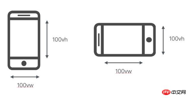
Measured in viewport units, the viewport width is 100vw and the height is 100vh (the left side is the vertical screen situation, the right side is the horizontal screen situation)
For example, if the viewport size of the desktop browser is 650px, then 1vw = 650 * 1% = 6.5px (this is theoretically calculated. If the browser does not support 0.5px, the actual rendering result may be 7px).
Compatibility
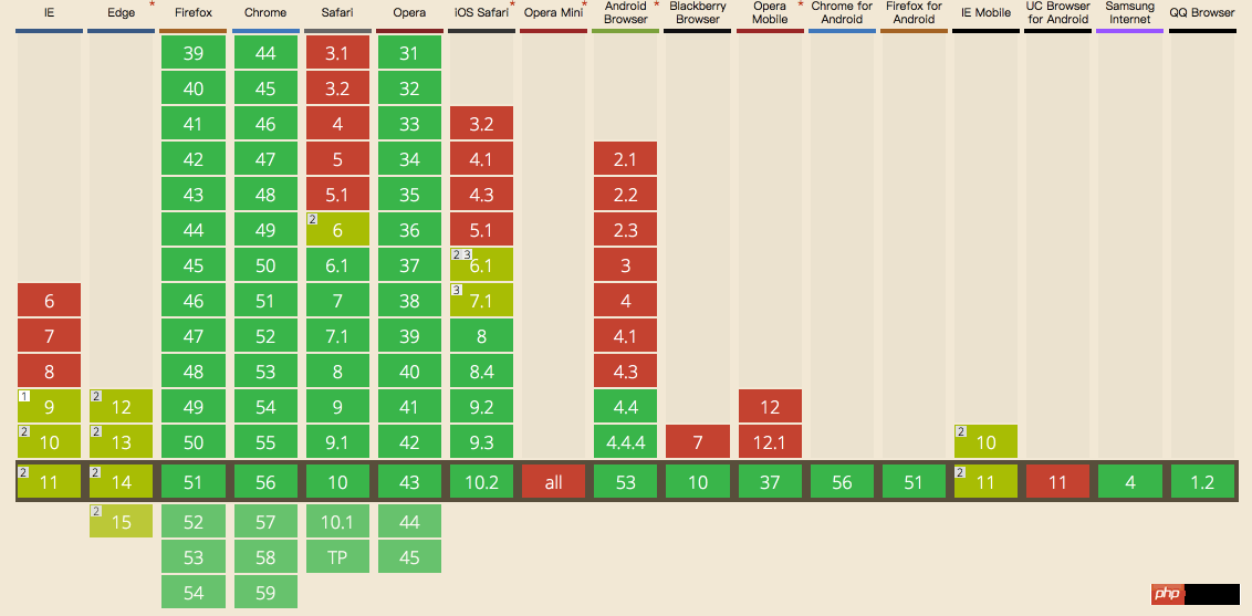
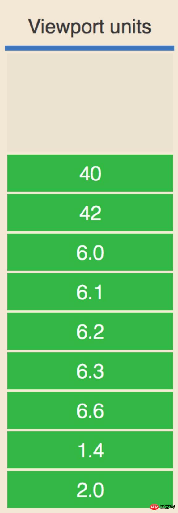
The compatibility is shown in the figure below. You can know that: it is supported on the mobile terminal ios 8 and above and Android 4.4 and above, and in the WeChat x5 kernel Also perfectly supported across the board.
Use the viewport unit to adapt the page
For mobile development, The most important point is how to adapt the page to achieve multi-terminal compatibility. Different adaptation methods have their own advantages and disadvantages.
As far as mainstream responsive layouts and elastic layouts are concerned, the layout implemented through Media Queries requires multiple response breakpoints, and the experience it brings is also very unfriendly to users: the layout is at the response breakpoints The resolution remains unchanged within the range, but at the moment of responding to breakpoint switching, the layout brings about discontinuous switching changes, like a cassette record player "clicking" again and again.
The elastic layout that uses dynamic calculation of rem units requires a script embedded in the header to monitor changes in resolution and dynamically change the font size of the root element, coupling CSS and JS. Together.
Is there any way to solve this problem?
The answer is yes. By using the viewport unit to implement adaptive pages, it can not only solve the problem of responsive faults but also solve the problem of script dependency.
Approach 1: Only use vw as the CSS unit
In this approach of only using the vw unit as the only CSS unit applied, we comply with:
1. To convert the size of the design draft into vw units, we use the Sass function to compile
//iPhone 6尺寸作为设计稿基准
$vm_base: 375;
@function vw($px) {
    @return ($px / 375) * 100vw;
}2. Whether it is text or layout height, width, spacing, etc. Both use vw as the CSS unit
.mod_nav {
    background-color: #fff;
    &_list {
        display: flex;
        padding: vm(15) vm(10) vm(10); // 内间距
        &_item {
            flex: 1;
            text-align: center;
            font-size: vm(10); // 字体大小
            &_logo {
                display: block;
                margin: 0 auto;
                width: vm(40); // 宽度
                height: vm(40); // 高度
                img {
                    display: block;
                    margin: 0 auto;
                    max-width: 100%;
                }
            }
            &_name {
                margin-top: vm(2);
            }
        }
    }
}3.1 The physical pixel line (that is, 1px under ordinary screens and 0.5px under high-definition screens) is implemented using the transform attribute scale.
//code from http://caibaojian.com/vw-vh.html
.mod_grid {
    position: relative;
    &::after {
        // 实现1物理像素的下边框线
        content: '';
        position: absolute;
        z-index: 1;
        pointer-events: none;
        background-color: #ddd;
        height: 1px;
        left: 0;
        right: 0;
        top: 0;
        @media only screen and (-webkit-min-device-pixel-ratio: 2) {
            -webkit-transform: scaleY(0.5);
            -webkit-transform-origin: 50% 0%;
        }
    }
    ...
}4. For pictures that need to maintain the aspect ratio, padding-top should be used instead
.mod_banner {
    position: relative;
    padding-top: percentage(100/700); // 使用padding-top
    height: 0;
    overflow: hidden;
    img {
        width: 100%;
        height: auto;
        position: absolute;
        left: 0;
        top: 0;
    }
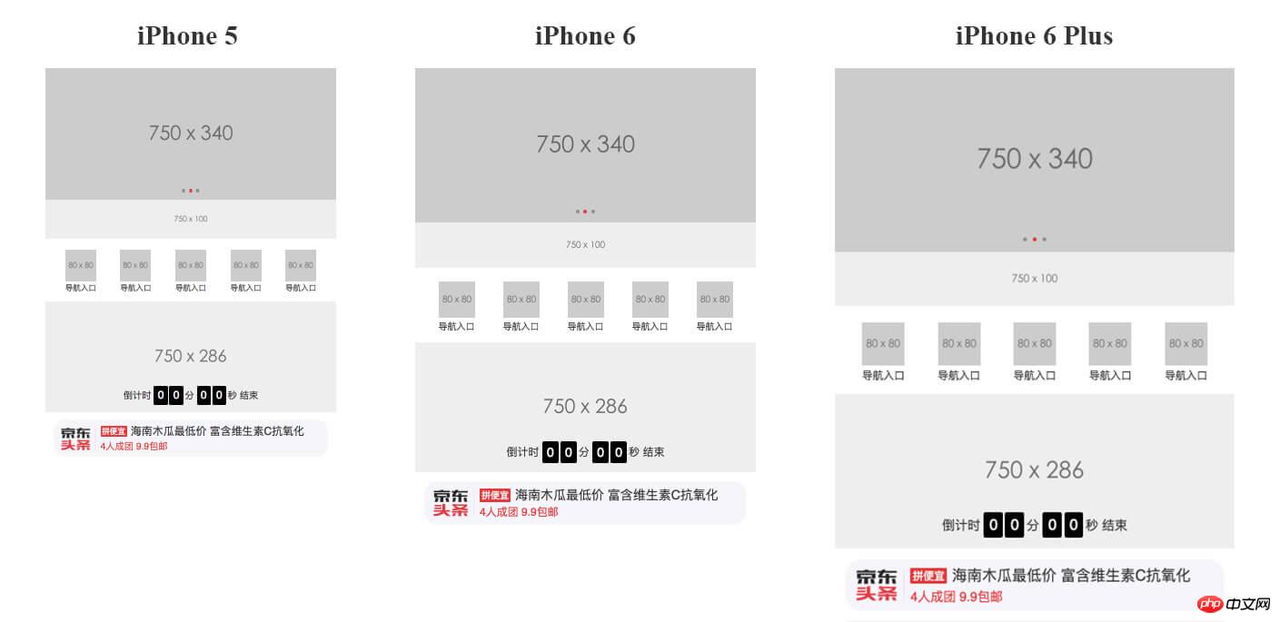
}From this, we can achieve a common layout page effect as follows:
做法二:搭配vw和rem,布局更优化
这样的页面虽然看起来适配得很好,但是你会发现由于它是利用视口单位实现的布局,依赖于视口大小而自动缩放,无论视口过大还是过小,它也随着视口过大或者过小,失去了最大最小宽度的限制。
当然,你可以不在乎这样微小的不友好用户体验,但我们还是尝试下追求修复这样的小瑕疵吧。
于是,联想到不如结合rem单位来实现布局?rem 弹性布局的核心在于动态改变根元素大小,那么我们可以通过:
给根元素大小设置随着视口变化而变化的 vw 单位,这样就可以实现动态改变其大小。
限制根元素字体大小的最大最小值,配合 body 加上最大宽度和最小宽度
这样我们就能够实现对布局宽度的最大最小限制。因此,根据以上条件,我们可以得出代码实现如下:
// rem 单位换算:定为 75px 只是方便运算,750px-75px、640-64px、1080px-108px,如此类推
$vm_fontsize: 75; // iPhone 6尺寸的根元素大小基准值
@function rem($px) {
     @return ($px / $vm_fontsize ) * 1rem;
}
// 根元素大小使用 vw 单位
$vm_design: 750;
html {
    font-size: ($vm_fontsize / ($vm_design / 2)) * 100vw;
    // 同时,通过Media Queries 限制根元素最大最小值
    @media screen and (max-width: 320px) {
        font-size: 64px;
    }
    @media screen and (min-width: 540px) {
        font-size: 108px;
    }
}
// body 也增加最大最小宽度限制,避免默认100%宽度的 block 元素跟随 body 而过大过小
body {
    max-width: 540px;
    min-width: 320px;
}小结
相对于做法一,个人比较推崇做法二,有以下两点原因:
第一,做法二相对来说用户视觉体验更好,增加了最大最小宽度的限制;
第二,更重要是,如果选择主流的rem弹性布局方式作为项目开发的适配页面方法,那么做法二更适合于后期项目从 rem 单位过渡到 vw 单位。只需要通过改变根元素大小的计算方式,你就可以不需要其他任何的处理,就无缝过渡到另一种CSS单位,更何况vw单位的使用必然会成为一种更好适配方式,目前它只是碍于兼容性的支持而得不到广泛的应用。
The above is the detailed content of css3 uses vw and vh to implement adaptive methods. For more information, please follow other related articles on the PHP Chinese website!


