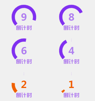
Many answer H5 interfaces have a rotating countdown effect, an animation that continuously rotates and decreases, similar to the picture below. This article mainly introduces to you how to implement the circular rotation countdown function in CSS3. Friends who need it can refer to it. I hope it can help everyone.

I studied it today and it can be obtained through border rotation. Generally we can get a four-segment circle through border.

See the Pen circle by stoneniqiu (@stoneniqiu) on CodePen.
Next, you can rotate it to form a Countdown effect:
See the Pen circle-rotate by stoneniqiu (@stoneniqiu) on CodePen.
The initial rotation is 45 degrees to make the semicircle just stand upright. Then rotate one hundred and eighty degrees.
 .rightcircle{
                border-top: .4rem solid #8731fd;
                border-right: .4rem solid #8731fd;
                right: 0;
                transform: rotate(45deg)
            }
 .right_cartoon {
                -webkit-animation: circleProgressLoad_right 10s linear infinite forwards;
                animation: circleProgressLoad_right 10s linear infinite forwards;
            }
 @keyframes circleProgressLoad_right {
                0% {
                    -webkit-transform: rotate(46deg);
                    transform: rotate(46deg)
                }
                50%,to {
                    -webkit-transform: rotate(-136deg);
                    transform: rotate(-136deg)
                }
}After all, it is not a real reduction. If one color dominates, it can be pieced together by two semicircles.
See the Pen circle-timer by stoneniqiu (@stoneniqiu) on CodePen.

 @keyframes circleProgressLoad_left {
                0%,50% {
                    -webkit-transform: rotate(46deg);
                    transform: rotate(46deg)
                }
                to {
                    -webkit-transform: rotate(-136deg);
                    transform: rotate(-136deg)
                }
}Notice that the right line rotates for 5 seconds, and then waits for another five seconds on the left side. The effect of the CSS animation here is slightly different. The right side starts at 0%, 50%, to. The left side is 0%, 50%, and then to, which achieves a 5-second wait. This is the effect of the rotating countdown. Finally, you can modify the border-left color of the left half ring to highlight the emergency situation in the last few seconds.
Related recommendations:
WeChat applet verification code to obtain countdown effect code sharing
canvas gorgeous countdown implementation code sharing
jquery countdown applet implementation code
The above is the detailed content of CSS3 realizes circular rotation countdown code sharing. For more information, please follow other related articles on the PHP Chinese website!


