

Detailed explanation of CSS padding and margins code

This article mainly shares with you the inner margin and outer margin of CSS. This article uses multiple examples and codes. I hope it can help everyone.
Margin:
margin
左边距 margin-left:数值 | autoauto:即距离这个边最远的距离
右边距: margin-right:数值 | auto上边距: margin-top:数值  这里不能用auto下边距: margin-bottom:数值 这里也不能用auto外边距 复合写法1:margin: 0px(上) 0px(右) 0px(下) 0px(左)2:margin: 0px(上) 0px(左右) 0px(下)3:margin: 0px(上下边距) 0px(左右边距)4:margin: 0px(上下左右边距都是0px)
Code example:
<!DOCTYPE html><html lang="en"><head>
    <meta charset="UTF-8">
    <title>外边距</title>
    <link rel="stylesheet" href="index.css"/>   </head><body>
    <p class="p1">我是p1</p>
    <p class="p2">我是p2</p></body></html>p{
    width: 200px;
    height: 200px;
    background: red;
}
.p1{
    margin-left: 100px;
    margin-top: 100px;
    margin-bottom: 0px;
}
.p2{
    background: blue;
    margin-right: auto;
    margin-left: auto;
    /* margin-left: 300px;
    margin-top: -200px; */
}Weibo three-column layout
模仿页面 简单实现三列<!DOCTYPE html><html lang="en"><head>
    <meta charser="utf-8"/>
    <title>微博三列布局</title>
    <style>
        .content{            width : 900px;            height : 1200px;            background-color:yellow;        }
        .p1{            width:200px;            height:1200px;            background-color:red;        }
        .p2{            width:500px;            height:1200px;            background-color:green;            margin-left:220px;            margin-top:-1200px;        }
        .p3{            width:160px;            height:1200px;            background-color:blue;            margin-left:auto;            margin-top:-1200px;        }
    </style></head><body>
    <p class="content">
        <p class="p1"></p>
        <p class="p2"></p>
        <p class="p3"></p>
    </p></body></html>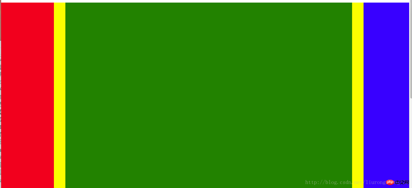
Inner margin
<!DOCTYPE html><html lang="en"><head>
    <meta charset="UTF-8">
    <title>内边距</title>
    <link rel="stylesheet" href="index.css"/></head><body>
    <!-- 内边距 padding -->
    <!-- 左内距 padding-left:数值 -->
    <!-- 右内距 padding-right:数值 -->
    <!-- 上内距 padding-top -->
    <!-- 下内距 padding-bottom -->

    <!-- 内边距 复合写法 -->
    <!-- 1:padding: 0px(上) 0px(右) 0px(下) 0px(左) -->
    <!-- 2:padding: 0px(上) 0px(左右) 0px(下) -->
    <!-- 3:padding: 0px(上下边距) 0px(左右边距) -->
    <!-- 4:padding: 0px (上下左右边距都是0px)-->
<p>xxxx</p></body></html>Background color style:
背景样式:background
背景颜色 background-color:颜色值
背景图片 background-image:url("图片路径")
背景图片平铺 backgroud-repeat:repeat-x(沿着x轴平铺) | repeat-y(沿着Y轴平铺) | no-repeat(不平铺)
背景图片定位 background-position: x y
x轴: 支持left center right 支持百分比
y轴: 支持top center bottom 支持百分比
背景图片尺寸 background-size: x y | cover | contain
background:复合写法
background:background-color background-image background-position background-repeat定义多张图片的复合写法
background:url("timg.jpg") 0px 0px/100px 100px repeat, url("timg.jpg") 30% 30%/100px 100px no-repeat,
url("timg.jpg") 60% 60%/100px 100px no-repeat, gold url(timg.jpg) 90% 90%/100px 100px no-repeat;Outer margin pit:
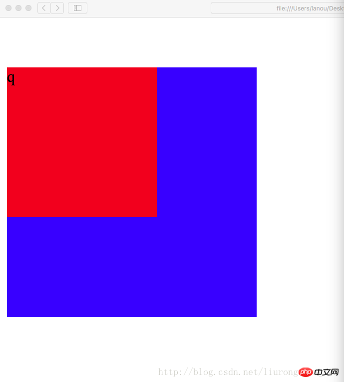
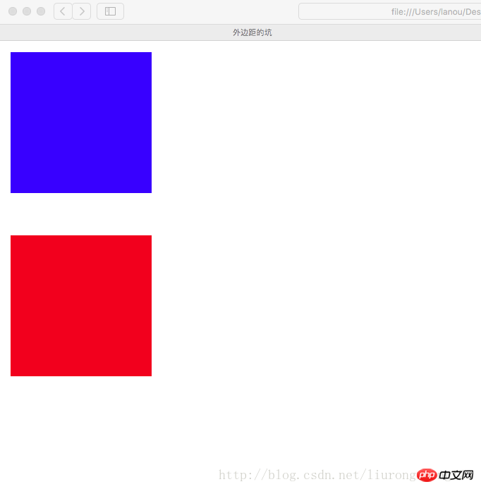
父子同级结构下,父级与子级都设置了上边距的情况下,如果父级没有设置border的情况下,会引起塌陷问题,
即父级框会向下移动一段距离(这段距离是子级设置的上边距的长度)
For example, code without border:
<!DOCTYPE html><html lang="en"><head>
    <meta charset="utf-8"/>
    <title>外边距的坑</title>
    <style>
        .p1{            width:250px;            height:250px;            margin-top:5px;            background-color:blue;        }
        .p2{            width:150px;            height:150px;            margin-top:50px;            background-color:red;        }
    </style></head><body>
    <p class="p1">
        <p class="p2">
            <p class="p3">q</p>
        </p>
</p></body></html>Screenshot of the result at this time :
当设置了border时,这个塌陷问题将得到完美解决,这个塌陷问题是系统的原因,我们只负责解决
解决后的代码:
<!DOCTYPE html><html lang="en"><head>
    <meta charset="utf-8"/>
    <title>外边距的坑</title>
    <style>
        .p1{            width:250px;            height:250px;            margin-top:5px;            background-color:blue;            border:1px gold dashed;        }
        .p2{            width:150px;            height:150px;            margin-top:50px;            background-color:red;        }
    </style></head><body>
        <p class="p1">
            <p class="p2">
                <p class="p3">q</p>
            </p>
</p></body></html>Screenshot of the running result at this time:
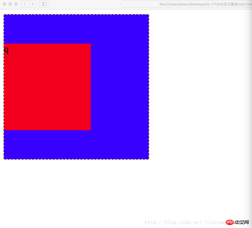
从截图中可以看到,父级的位置恢复为原来的位置(原来位置:即没有创建p2的时候,p1所在的位置),塌陷问题得到解决.
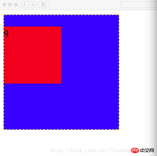
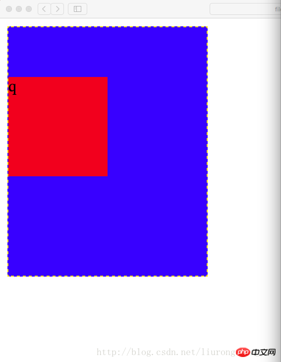
设置内边距问题
一个p即可以设置外边距也可以设置内边距,当设置内边距时,该框体会在该方向上扩大相应的距离
比如初始情况为:
<!DOCTYPE html><html lang="en"><head>
    <meta charset="utf-8"/>
    <title>外边距的坑</title>
    <style>
        .p1{            width:200px;            height:200px;            margin-top:5px;            background-color:blue;            border:1px gold dashed;        }
        .p2{            width:100px;            height:100px;            margin-top:20px;            background-color:red;        }
    </style></head><body>
        <p class="p1">
            <p class="p2">
                <p class="p3">q</p>
            </p>
</p></body></html>Screenshot of the result: This result is when the width is 200 and the height is 200 As a result, the padding is not set at this time
The code when setting the padding: At this time, the padding on the top edge of the border is set to 50
Code example:
<!DOCTYPE html><html lang="en"><head>
    <meta charset="utf-8"/>
    <title>外边距的坑</title>
    <style>
        .p1{            width:200px;            height:200px;            margin-top:5px;            padding-top:50px;            background-color:blue;            border:1px gold dashed;        }
        .p2{            width:100px;            height:100px;            margin-top:20px;            background-color:red;        }
    </style></head><body>
        <p class="p1">
            <p class="p2">
                <p class="p3">q</p>
            </p>
</p></body></html>Result screenshot: At this time, the height of the outer border becomes 250, and the distance between the top edge of the outer border and the top edge of the inner border is 20+50=70 pixels
此时要想设置内边距同时又不想改变框体的大小,需要提前从外边框的高度中减去要设置的内边距的长度,即200-50=150,即外边框的属性设置为宽200像素,高150像素
代码示例
<!DOCTYPE html><html lang="en"><head>
    <meta charset="utf-8"/>
    <title>外边距的坑</title>
    <style>
        .p1{            width:200px;            height:150px;            margin-top:5px;            padding-top:50px;            background-color:blue;            border:1px gold dashed;        }
        .p2{            width:100px;            height:100px;            margin-top:20px;            background-color:red;        }
    </style></head><body>
        <p class="p1">
            <p class="p2">
                <p class="p3">q</p>
            </p>
</p></body></html>Screenshot of the result: The result at this time is restored to the outer border in a straight shape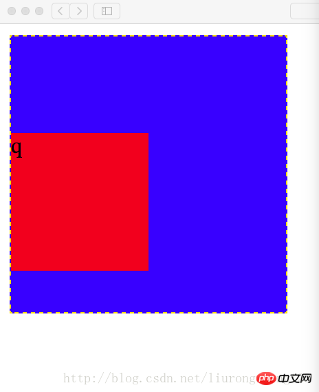 ##
##
此时如果将子级的上边框也设置内边距,则也需要提前将子级的高减去相应的距离
代码示例:代码中高已经减去相应的内边距;如果子级边框不设置边框顶边的内边距,设置边框底边的内边距,此时为了确保边框不因为内边距为改变,任然需要减去相应的内边距
代码为设置边框定边的内边距
<!DOCTYPE html><html lang="en"><head>
    <meta charset="utf-8"/>
    <title>外边距的坑</title>
    <style>
        .p1{            width:200px;            height:150px;            margin-top:5px;            padding-top:50px;            background-color:blue;            border:1px gold dashed;        }
        .p2{            width:100px;            height:80px;            margin-top:20px;            padding-top:20px;            background-color:red;        }
    </style></head><body>
        <p class="p1">
            <p class="p2">
                <p class="p3">q</p>
            </p>
        </p></body></html>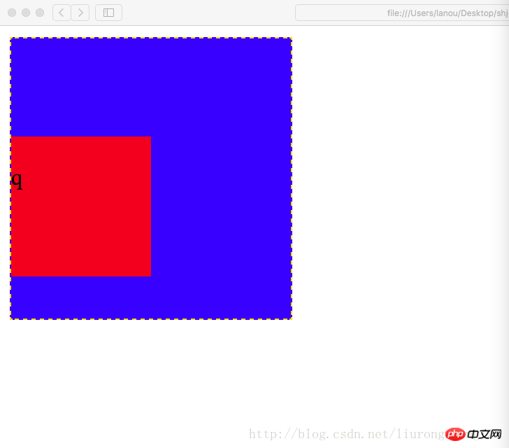
同级结构下(注意不是父子结构,上面那个坑是父子级结构),外边距冲突的情况下(即两个同级的p,一个在上面,一个在下面,
你设置了外边距即magin-bottom,我也设置了外边距即(magin-top),此时两个外边距在一起会起冲突,
他们两个的距离会是两个边距中的较大者,而不是两个边距的值相加
代码示例:
Copy after login<!DOCTYPE html><html lang="en"><head>
<meta charset="utf-8"/>
<title>外边距的坑</title>
<style>
.p1{ width:100px; height:100px; margin-bottom:20px; background-color:blue; }
.p2{ width:100px; height:100px; margin-top:30px; background-color:red; }
</style></head><body>
<p class="p1"></p>
<p class="p2"></p></body></html>Copy after login
Result screenshot:同级结构下(注意不是父子结构,上面那个坑是父子级结构),外边距冲突的情况下(即两个同级的p,一个在上面,一个在下面, 你设置了外边距即magin-bottom,我也设置了外边距即(magin-top),此时两个外边距在一起会起冲突, 他们两个的距离会是两个边距中的较大者,而不是两个边距的值相加 代码示例:
<!DOCTYPE html><html lang="en"><head>
    <meta charset="utf-8"/>
    <title>外边距的坑</title>
    <style>
        .p1{            width:100px;            height:100px;            margin-bottom:20px;            background-color:blue;        }
        .p2{            width:100px;            height:100px;            margin-top:30px;            background-color:red;        }
    </style></head><body>
    <p class="p1"></p>
<p class="p2"></p></body></html>##
盒模型的构成需要:<!-- 盒模型:构成:容器尺寸+padding+border+margin -->
 Six-ring exercise
<!DOCTYPE html><html lang="en"><head>
    <meta charset="UTF-8">
    <title>六环</title>
    <style>
        .p1{            border: 1px dashed black;            width: 600px;            height: 554px;            margin: 0 auto;            padding-top: 46px;        }
        .p2{            border: 4px lightblue solid;            background: gray;            width: 500px;            height: 475px;            margin: 0 auto;            padding-top: 25px;        }
        .p3{            background: pink;            width:450px;            height: 425px;            margin: 0 auto;            padding-top: 25px;        }
        .p4{            border: 1px dotted white;            width: 400px;            height: 380px;            margin: 0 auto;            padding-top: 20px;        }
        .p5{            border: 1px dashed white;            width: 340px;            height: 320px;            margin: 0 auto;            padding: 20px;        }
        .p6{            width:300px;            height:300px;            margin:auto;            background-color: red;        }
    </style></head><body>
    <p class="p1">
        <p class="p2">
            <p class="p3">
                <p class="p4">
                    <p class="p5">
                        <p class="p6"></p>
                    </p>
                </p>
            </p>
        </p>
</p></body></html>Related recommendations:
Use the box-sizing property of CSS3 to solve the problem of div width and height being stretched by the inner margin Summary of css margin properties and usageIn-depth understanding of CSS margin elementsThe above is the detailed content of Detailed explanation of CSS padding and margins code. For more information, please follow other related articles on the PHP Chinese website!

Hot AI Tools

Undresser.AI Undress
AI-powered app for creating realistic nude photos

AI Clothes Remover
Online AI tool for removing clothes from photos.

Undress AI Tool
Undress images for free

Clothoff.io
AI clothes remover

AI Hentai Generator
Generate AI Hentai for free.

Hot Article
Hot Tools

Notepad++7.3.1
Easy-to-use and free code editor

SublimeText3 Chinese version
Chinese version, very easy to use

Zend Studio 13.0.1
Powerful PHP integrated development environment

Dreamweaver CS6
Visual web development tools

SublimeText3 Mac version
God-level code editing software (SublimeText3)
Hot Topics


 What does placeholder mean in vue
May 07, 2024 am 09:57 AM
What does placeholder mean in vue
May 07, 2024 am 09:57 AM
In Vue.js, the placeholder attribute specifies the placeholder text of the input element, which is displayed when the user has not entered content, provides input tips or examples, and improves form accessibility. Its usage is to set the placeholder attribute on the input element and customize the appearance using CSS. Best practices include being relevant to the input, being short and clear, avoiding default text, and considering accessibility.
 What does span mean in js
May 06, 2024 am 11:42 AM
What does span mean in js
May 06, 2024 am 11:42 AM
The span tag can add styles, attributes, or behaviors to text. It is used to: add styles, such as color and font size. Set attributes such as id, class, etc. Associated behaviors such as clicks, hovers, etc. Mark text for further processing or citation.
 What does rem mean in js
May 06, 2024 am 11:30 AM
What does rem mean in js
May 06, 2024 am 11:30 AM
REM in CSS is a relative unit relative to the font size of the root element (html). It has the following characteristics: relative to the root element font size, not affected by the parent element. When the root element's font size changes, elements using REM will adjust accordingly. Can be used with any CSS property. Advantages of using REM include: Responsiveness: Keep text readable on different devices and screen sizes. Consistency: Make sure font sizes are consistent throughout your website. Scalability: Easily change the global font size by adjusting the root element font size.
 How to introduce images into vue
May 02, 2024 pm 10:48 PM
How to introduce images into vue
May 02, 2024 pm 10:48 PM
There are five ways to introduce images in Vue: through URL, require function, static file, v-bind directive and CSS background image. Dynamic images can be handled in Vue's computed properties or listeners, and bundled tools can be used to optimize image loading. Make sure the path is correct otherwise a loading error will appear.
 What is the function of span tag
Apr 30, 2024 pm 01:54 PM
What is the function of span tag
Apr 30, 2024 pm 01:54 PM
The SPAN tag is an inline HTML tag that is used to highlight text by applying attributes such as style, color, and font size. This includes emphasizing text, grouping text, adding hover effects, and dynamically updating content. It is used by placing <span> and </span> tags around the text you want to emphasize, and is manipulated via CSS styling or JavaScript. The benefits of SPAN tags include semantic clarity, styling flexibility, and ease of maintenance.
 How to wrap prompt in js
May 01, 2024 am 06:24 AM
How to wrap prompt in js
May 01, 2024 am 06:24 AM
When using the prompt() method in JavaScript, you can achieve line breaks through the following three methods: 1. Insert the "\n" character at the position where you want to break the line; 2. Use the line break character in the prompt text; 3. Use CSS's "white" -space: pre" style forces line breaks.
 What language is the browser plug-in written in?
May 08, 2024 pm 09:36 PM
What language is the browser plug-in written in?
May 08, 2024 pm 09:36 PM
Browser plug-ins are usually written in the following languages: Front-end languages: JavaScript, HTML, CSS Back-end languages: C++, Rust, WebAssembly Other languages: Python, Java
 What is node in js
May 07, 2024 pm 09:06 PM
What is node in js
May 07, 2024 pm 09:06 PM
Nodes are entities in the JavaScript DOM that represent HTML elements. They represent a specific element in the page and can be used to access and manipulate that element. Common node types include element nodes, text nodes, comment nodes, and document nodes. Through DOM methods such as getElementById(), you can access nodes and operate on them, including modifying properties, adding/removing child nodes, inserting/replacing nodes, and cloning nodes. Node traversal helps navigate within the DOM structure. Nodes are useful for dynamically creating page content, event handling, animation, and data binding.
