Key and difficult issues in HTML and CSS
This article mainly shares with you the key and difficult issues of HTML and CSS, hoping to help everyone.
1. How to center a p with variable width and height vertically and horizontally?
Using Flex
just need to Parent box settings: display: flex; justify-content: center;align-items: center;
Use CSS3 transform
Parent box settings: display:relative
p settings: transform: translate(- 50%, -50%); position: absolute; top: 50%; left: 50%;
Use display:table-cell method
Parent box settings: display:table-cell; text- align:center;vertical-align:middle;
p Settings: display:inline-block;vertical-align:middle;
2. The role of several position attributes
static:Default location. Under normal circumstances, we do not need to declare it specifically, but sometimes when encountering inheritance, we do not want to see the attributes inherited by the element affect itself, so we can use Position:static to cancel the inheritance, that is, restore The default value for element positioning. An element set to static will always be at the position given by the page flow (static elements ignore any top, bottom, left or right declarations). Generally not commonly used.
relative: relative positioning. Relative positioning is relative to the default position of the element. Its offset top, right, bottom, and left values are all offset based on its original position, regardless of what will happen to other elements. Note that the relative moved element still occupies space in its original position.
absolute: Absolute positioning. For an element set to absolute, if its parent container has the position attribute set, and the position attribute value is absolute or relative, it will be offset according to the parent container. If its parent container does not set the position property, the offset is based on body. Note that elements with the absolute attribute set do not occupy a position in the standard flow.
fixed: Fixed positioning. Elements whose position is set to fixed can be positioned at specified coordinates relative to the browser window. The element will stay in that position whether the window is scrolled or not. It is always based on body. Note that elements with the fixed attribute set do not occupy a position in the standard flow.
3. Floating and clearing float
right: The element floats to the right.
none: Default value. The element is not floated and appears where it appears in the text.
Characteristics of floating:
Regardless of whether an element is an inline element or a block-level element, if it is set to float, the floating element will generate a block-level box, and its width and height can be set. Therefore, float is often used to create horizontally arranged menus. Set size and align horizontally.
The display of floating elements will have different rules under different circumstances:
If one of the two elements floats to the left and the other floats to the right, the marginRight of the left floating element will not be adjacent to the marginLeft of the right floating element.
If there are multiple floating elements, the floating elements will be arranged in order without overlap.
If there are multiple floating elements, the height of the following element will not exceed the previous element, and will not exceed the containing block.
If there are non-floating elements and floating elements at the same time, and the non-floating elements are in front, the floating elements will not be higher than the non-floating elements
The floating elements will be aligned to the top, left or right as much as possible
Overlap problem
When a block-level element overlaps a floating element, the border and background will be displayed Under the floating element, the content will be displayed above the floating element
clear attribute
clear attribute: Ensure that there are no floating elements on the left and right sides of the current element. clear only affects the layout of the element itself.
Values: left, right, both
Solve the problem of parent element height collapse: a block If the height of a level element is not set, its height is expanded by its child elements. After using float on a child element, the child element will break away from the standard document flow. That is to say, there is no content in the parent element to expand its height, so the height of the parent element will be ignored. This is the so-called height collapse.
Principle: Define a fixed height (height) for the parent p, which can solve the problem that the parent p cannot obtain the height Got a problem.
Advantages: Simple code
Disadvantages: The height is fixed, so it is suitable for modules with fixed content. (Not recommended)
Method 2: Use empty elements, such as
(.clear{clear:both})
Principle: Add a pair of empty p tags and use css The clear:both attribute clears the float so that the parent p can obtain the height.
Advantages: Good browser support
Disadvantages: There are a lot of empty p tags. If there are many floating modules on the page, there will be a lot of empty p tags, which does not seem very satisfactory. (Not recommended)
Method 3: Let the parent p also float
This can initially solve the current floating problem. But it also makes the parent float, which will cause new floating problems. Not recommended
Method 4: Parent p definition display:table
Principle: Force the p attribute into a table
Advantages: Puzzling
Disadvantages: New unknown problems will arise. (Not recommended)
Method 5: Parent element setting overflow: hidden, auto;
Principle: The key to this method is to trigger BFC. In IE6, it is also necessary to trigger hasLayout (zoom: 1)
Advantages: Code introduction, no structural and semantic problems
Disadvantages: Unable to display elements that need to overflow (not recommended)
Method 6: Parent p defines pseudo-classes: after and zoom
.clearfix:after{
content:’.’;
display:block;
height:0;
clear:both;
visibility: hidden;
}
.clearfix {zoom:1;}
Principle: Only IE8 and above and non-IE browsers support: after. The principle is somewhat similar to method 2, zoom (IE transfer has attributes) Can solve the floating problem of ie6 and ie7
Advantages: The structure and semantics are completely correct, the code amount is moderate, and the reusability rate (it is recommended to define a public class)
Disadvantages: The code is not very concise (highly recommended)
Jingyiqiujing writing method
.clearfix:after {
content:”\200B”;
display:block;
height:0;
clear:both;
}
.clearfix { *zoom:1; } Take care of IE6, IE7 will be fine
For detailed knowledge about floating, please refer to this article:
http://luopq.com/2015/11/08/C…
4.BFC related knowledge
Definition: BFC (Block formatting context) is literally translated as "block-level formatting context". It is an independent rendering area, with only Block-level boxes participating. It specifies how the internal Block-level Boxes are laid out and has nothing to do with the outside of this area.
BFC layout rules
BFC is an isolated independent container on the page. The sub-elements in the container will not affect the elements outside. And vice versa.
The vertical margins of the BFC element will overlap. The vertical distance is determined by margin, and the maximum value is taken.
The BFC area will not overlap with the floating box (clear the floating principle).
When calculating the height of BFC, floating elements also participate in the calculation.
Which elements will generate BFC
Root element
float attribute is not none
position is absolute or fixed
display is inline-block, table-cell, table-caption, flex , inline-flex
overflow is not visible
5.What is box-sizing
Set the CSS box model to the standard model or IE model. The width of the standard model only includes content, and the second IE model includes border and padding
box-sizing attribute can be one of three values:
content-box, the default value, only calculates the width of the content, border and padding are not calculated into the width
padding-box, padding is calculated into the width
border-box, border and padding are calculated into the width
6. The difference between px, em, rem
px Pixel. Absolute unit. Pixel px is relative to the monitor screen resolution. It is a virtual length unit and the digital image length unit of the computer system. If px is to be converted into physical length, the precision DPI needs to be specified.
em is a relative length unit, relative to the font size of the text within the current object. If the current font size for inline text has not been manually set, it will be relative to the browser's default font size. It inherits the font size of the parent element, so it is not a fixed value.
rem is a new relative unit (root em) in CSS3. When using rem to set the font size for an element, it is still a relative size, but it is only relative to the HTML root element.
7.What are the ways to introduce CSS? What is the difference between link and @import?
There are four types: inline (style attribute on the element), inline Embed (style tag), external link (link), import (@import) The difference between
link and @import:
link is an XHTML tag. In addition to loading CSS, you can also define other transactions such as RSS ; @import belongs to the CSS category and can only load CSS.
When link refers to CSS, it is loaded at the same time when the page is loaded; @import requires the page to be loaded after the page is completely loaded.
link is an XHTML tag and has no compatibility issues; @import was proposed in CSS2.1 and is not supported by lower version browsers.
link supports using Javascript to control the DOM to change the style; @import does not support it.
8. The difference between fluid layout and responsive layout
Flow layout
Use non-fixed pixels to define web page content, that is, percentage layout. The width of the box is set to a percentage to
scale according to the width of the screen, and is not limited by fixed pixels. Content is padded to both sides.
Responsive development
Use Media Query in CSS3 to specify the web page layout of a certain width range by querying the width of the screen.
Ultra small screen (mobile device) 768px or below
Small screen device 768px-992px
Medium screen 992px-1200px
Wide screen device 1200px or above
Because responsive development is more cumbersome, Generally, third-party responsive frameworks are used, such as bootstrap, to complete part of the work. Of course, you can also write responsive ones yourself.
Difference
Flow layout Responsive development
Development method Mobile Web development + PC development Responsive development
Application scenarios Generally, there is already a PC side When developing a mobile website, you only need to develop the mobile terminal separately. For some newly built websites, it is now required to adapt to the mobile terminal, so a set of pages is compatible with various terminals
Development has strong alignment and high development efficiency and is compatible with various Terminal, low efficiency
Adaptation Only suitable for mobile devices, the experience on the pad is relatively poor. Can be adapted to various terminals
Efficiency The code is simple and fast to load The code is relatively complex and slow to load
9. Progressive enhancement and graceful degradation
#The key difference is what they focus on, and the difference in workflow caused by this difference
The graceful degradation perspective believes that Websites should be designed for the most advanced and complete browsers.
The progressive enhancement perspective believes that we should focus on the content itself, giving priority to lower versions.
10. Several ways and differences of CSS hidden elements
display:none
The element will disappear completely on the page, and the space originally occupied by the element will be occupied by other elements, and That is to say it will cause the browser to reflow and redraw.
The click event will not be triggered
visibility:hidden
The difference between display:none is that after the element disappears from the page, the space it occupies will still be retained, so it will only cause browsing The renderer is redrawn without reflowing.
Cannot trigger its click event
Applicable to scenarios where the page layout is not expected to change after the element is hidden
opacity:0
After setting the transparency of the element to 0, after our user In the eyes, the elements are also hidden, which is a way to hide the elements. One thing that
and visibility:hidden have in common is that the element still occupies space after being hidden, but we all know that after setting the transparency to 0, the element is just invisible, and it still exists on the page.
Click events can be triggered
Set the height, width and other box model properties to 0
Simply put, set the element's margin, border, padding, height and width and other properties that affect the element box model to 0. If there are sub-elements or content within the element, you should also set its overflow:hidden to hide its sub-elements. This is a kind of trick.
If the border, padding and other attributes of the element are set to non-0, obviously, the element can still be seen on the page, and there is no problem in triggering the click event of the element. If all attributes are set to 0, it is obvious that this element disappears, that is, the click event cannot be triggered.
This method is neither practical nor may have some problems. But some page effects we usually use may be completed in this way, such as jquery's slideUp animation, which sets the overflow:hidden of the element, and then continuously sets the height and margin-top of the element through a timer. , margin-bottom, border-top, border-bottom, padding-top, padding-bottom are 0, thus achieving the slideUp effect.
Other creative methods
Set the element's position and left, top, bottom, right, etc., and move the element out of the screen
Set the element's position and z-index, and set the z-index into as small a negative number as possible.
The above is the detailed content of Key and difficult issues in HTML and CSS. For more information, please follow other related articles on the PHP Chinese website!

Hot AI Tools

Undresser.AI Undress
AI-powered app for creating realistic nude photos

AI Clothes Remover
Online AI tool for removing clothes from photos.

Undress AI Tool
Undress images for free

Clothoff.io
AI clothes remover

AI Hentai Generator
Generate AI Hentai for free.

Hot Article

Hot Tools

Notepad++7.3.1
Easy-to-use and free code editor

SublimeText3 Chinese version
Chinese version, very easy to use

Zend Studio 13.0.1
Powerful PHP integrated development environment

Dreamweaver CS6
Visual web development tools

SublimeText3 Mac version
God-level code editing software (SublimeText3)

Hot Topics
 Table Border in HTML
Sep 04, 2024 pm 04:49 PM
Guide to Table Border in HTML. Here we discuss multiple ways for defining table-border with examples of the Table Border in HTML.
 Nested Table in HTML
Sep 04, 2024 pm 04:49 PM
This is a guide to Nested Table in HTML. Here we discuss how to create a table within the table along with the respective examples.
 HTML margin-left
Sep 04, 2024 pm 04:48 PM
Guide to HTML margin-left. Here we discuss a brief overview on HTML margin-left and its Examples along with its Code Implementation.
 HTML Table Layout
Sep 04, 2024 pm 04:54 PM
Guide to HTML Table Layout. Here we discuss the Values of HTML Table Layout along with the examples and outputs n detail.
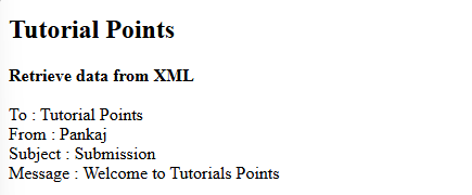 How do you parse and process HTML/XML in PHP?
Feb 07, 2025 am 11:57 AM
This tutorial demonstrates how to efficiently process XML documents using PHP. XML (eXtensible Markup Language) is a versatile text-based markup language designed for both human readability and machine parsing. It's commonly used for data storage an
 HTML Ordered List
Sep 04, 2024 pm 04:43 PM
Guide to the HTML Ordered List. Here we also discuss introduction of HTML Ordered list and types along with their example respectively
 Moving Text in HTML
Sep 04, 2024 pm 04:45 PM
Guide to Moving Text in HTML. Here we discuss an introduction, how marquee tag work with syntax and examples to implement.
 HTML onclick Button
Sep 04, 2024 pm 04:49 PM
Guide to HTML onclick Button. Here we discuss their introduction, working, examples and onclick Event in various events respectively.


