Detailed explanation of the margin attribute of css
As front-end dogs, we have to deal with web pages every day. When the UI sends you a design draft, knowledge of CSS is particularly important. However, CSS, a markup language, often gives me a headache: it has no logic and is full of all kinds of hidden rules. So every time I work on a project, most of my time and energy are wasted on adjusting the layout and layout. In terms of style, for details, please click on Why is CSS so difficult to learn on Zhihu?
Text
margin can be regarded as a strong-willed attribute. Below, I will explain the scary aspects of margin from various aspects.
Influence of element size
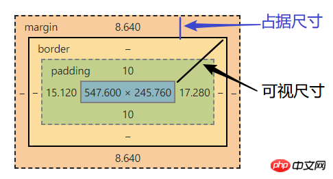
Usually the size of an element can be divided into: visible size and occupied size
Visible size-clientWidth (border - padding - size)
Occupied size - outerWidth (border - margin)

How does margin affect these two sizes?
First of all, both sizes need to meet certain conditions.
Influence conditions of visual size
Applicable to block-level elements that do not have width/height set (width and height are set to death, how can it be affected?)
Does not include float absolute fixed elements, inline horizontal, table-cell elementsOnly applicable to horizontal dimensions (margin-left/margin-right)
Influence conditions of occupying size
Applies to block/inline-block horizontal elements
Applies to any direction
It has nothing to do with the width/height value
The inline element only affects the horizontal direction (will be mentioned later)
Influence example
margin affects the visual horizontal size of the element
Margin's visual size examplemargin affects the occupied size, This can be said to be the natural skill of margin, so I won’t give an example.
Percent unit
Generally speaking, among the units of margin, the percentage unit is the most likely to make people dizzy.
-
The percentage margins of ordinary elements are calculated relative to the width of the container
<style>
  #parent {
  margin: 20px 400px;
  width: 100px;
  height: 200px;
}
#child {
  /* 等价于 margin: 5% * 父元素的宽度  10% * 父元素的宽度; */
  margin: 5% 10%;
  /* 父元素的宽度 * 50% */
  width: 50%;
  /* 父元素的高度 * 50% */
  height: 50%;
}
</style>
<p id="parent">
  <p id="child"></p>
</p>
Copy after login -
The percentage margin of absolute positioning It is calculated relative to the width of the first ancestor element with positioning attribute (relative/absolute/fixed)
<style>
  #parent {
  width: 100px;
}
#child {
  /* 注意子元素已增加绝对定位,则百分比按照定位属性的祖先元素的宽度计算,
    本例中是浏览器视口 */
  position:absolute;
  /* 等价于 margin: 5% * 父元素的宽度  10% * 父元素的宽度; */
  margin: 5% 10%;
}
</style>
<p id="parent">
  <p id="child"></p>
</p>
Copy after login
Overlap details
Overlap is the most important unspoken rule in margin.
What happens
Adjacent sibling elements
Parent and first/last child element
Empty block-level elements (self and self)
Overlapping conditions
Block-level elements ( Excluding float and absolute elements)
Does not consider writing-mode, only occurs in the vertical direction (margin-top/margin-bottom)
Parent-child overlap condition
margin-top overlap
margin-bottom overlap
The parent element's non-formatting context element has no overflow:hidden setting
The parent element has no border-bottom setting
The parent element has no padding-bottom setting
There is no inline element separation between the parent element and the first child element
The parent element has no height, min-height, max-height restrictions
Parent element non-formatting context element is not set overflow:hidden
Parent element has no border-top Set
The parent element has no padding-top. Set
There is no inline element separation between the parent element and the first child element
Empty block-level element margin overlap condition
1. 元素没有 border 设置
2. 元素没有 padding 设置
3. 里面没有 inline 元素
4. 没有 height,或者 min-height
Calculation rules
-
Taking the largest positive value
<style>
#top{
  margin-top:30px;
}
#bottom{
  margin-bottom:20px;
}
</style>
<p id="bottom"></p>
<p id="top"></p>
两个元素垂直距离为 : #top元素的 margin-top值
Copy after login -
Add positive and negative values
<style>
 #top{
  margin-top:-30px;
}
#bottom{
  margin-bottom:20px;
}
</style>
<p id="bottom"></p>
<p id="top"></p>
两个元素垂直距离为: #top元素的margin-top值 加上 #bottom元素的margin-bottom值
Copy after login -
negative most negative value
<style>
#top{
  margin-top:-30px;
}
#bottom{
  margin-bottom:-20px;
}
</style>
<p id="bottom"></p>
<p id="top"></p>
两个元素垂直距离为 : #top元素的 margin-top值
Copy after login Parent The level overlaps with the first/last child element
Setting a vertical margin for the child element is equivalent to setting the same vertical margin attribute for the parent element.
That is to say, when the margin of the parent and child elements overlaps , they both share a margin attribute
Overlapping meaning
Continuous paragraphs or lists, etc., if there is no margin overlap, the layout will be unnatural.
Nesting or directly placing any empty p anywhere on the page will not affect the original layout.
Missing any number of empty p elements will not affect the original reading layout.
margin auto
When you use margin auto, you should think of one word: fill
A block-level element without set width and height will automatically fill the widthIf one side is a fixed value and one side is auto, then auto is the size of the remaining space
If both sides are auto, then the remaining space will be divided equally
The example is as follows:
<style>
#demo{
  width: 500px;
  margin-right:100px;
  /* margin-left: 100vw - margin-right - width*/
  margin-left:auto;
}
</style>
<p id="demo"></p>margin:auto 0 !== 垂直居中
以上,我们可得当一个块级元素设置了 margin: 0 auto 可以实现水平居中,
而为什么 margin:auto 0 不会垂直居中?
答:一个块级元素会自动填充可用的水平尺寸,但不会填充垂直尺寸,是因为其根本没有任何可用的垂直空间。也就是说 margin: 0 auto , 总是有尺寸可以来填充的! 而 margin: auto 0 是没有任何尺寸的可以来填充的。
失效情况
当子元素的宽度大于父元素的宽度 ,是无法通过 margin: 0 auto 实现居中的
因为,这个时候已经没有任何空间可以填充了,当宽度超出父元素时,margin 已经为负值了。
垂直居中
-
writing-mode 与垂直居中
<style>
.father{
  writing-mode: vertical-lr;/* 更改流的方向为 垂直方向 */
}
.son{
  margin: auto;
}
</style>
<p class="father">
  <p class="son"></p>
</p>
Copy after login -
绝对定位元素
<style>
.parent{
  position: relative;
}
.child{
  position: absolute;
  top: 0; bottom: 0; left: 0; right: 0;
  margin:auto;
}
</style>
<p class="parent">
  <p class="child"></p>
</p>
Copy after login
失效情景
inline 水平元素的垂直margin 无效(margin-top/margin-bottom)
margin 重叠发生
绝对定位元素非定位方位的 margin值 "无效"
因为 绝对定位元素 脱离了文档流,与相邻元素没有关系,所以它不可能像普通元素一样,设置margin,推走其他元素margin 鞭长莫及
因为 有某些元素破坏了 文档流,设置了 float absolute,造成了假象,margin不会根据 这些破坏元素作为标准display:table-cell/display:table-row 等声明的margin无效!某些替换元素除外,根据各个浏览器的实现方式作为区分。比如,给 button 元素声明 display:table-cell,但在 chrome 中,button 的 display 属性是 inline-block 。
内联特性导致 margin 失效
margin-top: 负无穷, 但是,小到 1em 便无效了。
因为它是内联元素,默认是基线对齐,x字母下边缘对齐,margin 值再大,也不会起作用。
margin负无穷情景解析
其他属性
margin-start
正常流向,margin-start 等同于 margin-left,两者重叠不相加
如果水平流向是从右向左,margin-start 等同于 margin-right
在垂直流下 ( writing-mode:vertical-*; ) margin-start 等同于 margin-top
margin-end 与 margin-start 相对
margin-before 默认情况等同于 margin-top
margin-after 默认情况等同于 margin-bottom
margin-collapse
-
margin-collapse:collapse;
(默认值) 发生重叠
-
margin-collapse:discard;
取消重叠,margin 重叠部分为 0 ,没有margin
-
margin-collapse:separate;
不发生重叠,margin 重叠部分为 margin-top + margin-bottom
相关推荐:
The above is the detailed content of Detailed explanation of the margin attribute of css. For more information, please follow other related articles on the PHP Chinese website!

Hot AI Tools

Undresser.AI Undress
AI-powered app for creating realistic nude photos

AI Clothes Remover
Online AI tool for removing clothes from photos.

Undress AI Tool
Undress images for free

Clothoff.io
AI clothes remover

AI Hentai Generator
Generate AI Hentai for free.

Hot Article

Hot Tools

Notepad++7.3.1
Easy-to-use and free code editor

SublimeText3 Chinese version
Chinese version, very easy to use

Zend Studio 13.0.1
Powerful PHP integrated development environment

Dreamweaver CS6
Visual web development tools

SublimeText3 Mac version
God-level code editing software (SublimeText3)

Hot Topics
 The width of emsp spaces in HTML is inconsistent. How to reliably implement text indentation?
Apr 04, 2025 pm 11:57 PM
Regarding the problem of inconsistent width of emsp spaces in HTML and Chinese characters in many web tutorials, it is mentioned that occupying the width of a Chinese character, but the actual situation is not...
 How to achieve gap effect on the card and coupon layout with gradient background?
Apr 05, 2025 am 07:48 AM
Realize the gap effect of card coupon layout. When designing card coupon layout, you often encounter the need to add gaps on card coupons, especially when the background is gradient...
 How to achieve segmentation effect with 45 degree curve border?
Apr 04, 2025 pm 11:48 PM
Tips for Implementing Segmenter Effects In user interface design, segmenter is a common navigation element, especially in mobile applications and responsive web pages. ...
 How to make the height of adjacent columns in the Element UI automatically adapt to the content?
Apr 05, 2025 am 06:12 AM
How to make the height of adjacent columns of the same row automatically adapt to the content? In web design, we often encounter this problem: when there are many in a table or row...
 How to increase the height of the input and position the text at the bottom?
Apr 05, 2025 am 06:03 AM
How to increase the height of input and make the text at the bottom? When developing web pages, you often encounter the need to adjust the style of form elements. Especially when...
 How to use CSS3 and JavaScript to achieve the effect of scattering and enlarging the surrounding pictures after clicking?
Apr 05, 2025 am 06:15 AM
To achieve the effect of scattering and enlarging the surrounding images after clicking on the image, many web designs need to achieve an interactive effect: click on a certain image to make the surrounding...
 How to adjust the background icon and color settings through CSS to solve the problem of the icon being blocked when the mouse is suspended?
Apr 05, 2025 am 06:24 AM
How to solve the problem that the background icon is blocked by the background color when the mouse is suspended. When designing a web page, you often encounter this problem: when the mouse is suspended...
 How to achieve the gap effect in card and coupon layout under a gradient background?
Apr 05, 2025 am 06:33 AM
How to achieve the gap effect in the card layout? When designing card voucher layout, it is a common requirement to achieve the gap effect on the edge of card voucher. If the background is pure...


