

Code sharing for realizing spotlight effect using css

Introduction
CSS Variables, a thing that is not so new, but is definitely a revolution for css.
When using variables before, we needed to use preprocessing tools such as sass and less. Now we can directly use css to declare variables.
Compatibility
Old rules, let’s look at compatibility first
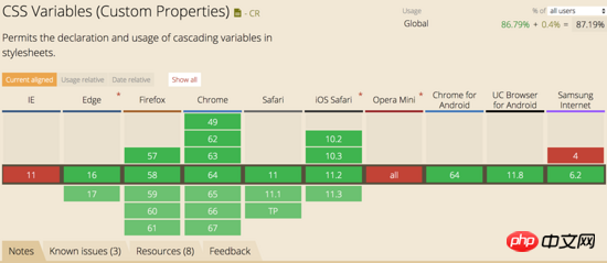
Compatibility is green and red Aren't there two more? How can you stick to small details when doing big things? Just let it go.
Syntax
The syntax is a bit ugly but very simple, --* to declare variable names, var(--*) to use, maybe you want to ask, why use -- instead of $, alas, isn’t that the two products of sass and less?
Declarations and uses must be placed in {} code blocks
body{
    --bg-color: lightblue;
    background-color: var(--bg-color);
}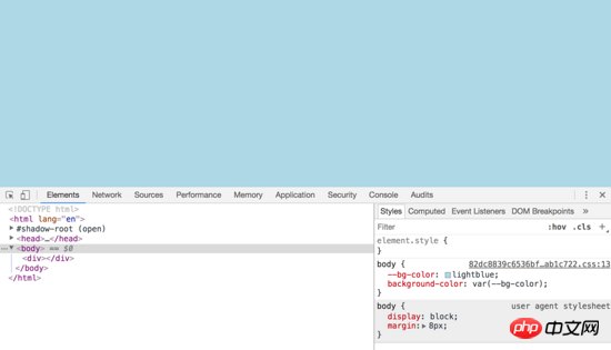
Is the code very simple? , you can see the effect directly, so I won’t go into details.
Global variables and variable coverage
The variables declared in the :root code block are global variables, and local variables will overwrite global variables
:root{
    --bg-color: red;
}
body{
    --bg-color: lightblue;
    background-color: var(--bg-color);
}The last thing that takes effect is --bg-color: lightblue, and the value of the bg-color variable becomes lightblue
Default value of variable
Complete variable usage syntaxvar( [, ]? ), when When the variable is not defined, the subsequent value will be used. Look at the example below
body{
--1: red;
color:var(--2, blue);
}The above code will search for the --2 variable in the scope of body, if not, it will It will search the whole world, and if there is none, it will use the later value, so the final color that takes effect is blue
. As you can see, our variable name above directly uses the number:joy:, and the css variable is very handy. Not only numbers, but also Chinese characters are acceptable.
Participate in calculation
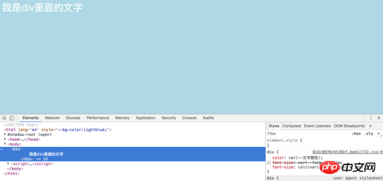
:root{
    --bg-color: lightblue;
    --文字颜色: white;
    --fong-size: 30;
}
body{
    background-color: var(--bg-color);
}
p{
    color: var(--文字颜色);
    font-size: var(--fong-size)px;
}What is the size of the text in p at this time? It is the default size of the browser. Why is it not 30px as we imagined? This is because there will be a space at the end when the variable is converted. var(--fong-size)px will be converted to 30 px
We can honestly declare the variable with the unit
--fong-size: 30px;
or use calc() to calculate Attribute
font-size: calc(var(--fong-size) * 1px);
js acquisition and assignment
We can use js to obtain and assign values CSS variables, you see, they are so convenient, old man.
:root{
     --bg-color: lightblue;
}

 // 获取
getComputedStyle(document.documentElement).getPropertyValue('--bg-color')  // lightblue

 // 赋值
document.documentElement.style.setProperty('--bg-color', 'yellowgreen')Simple application
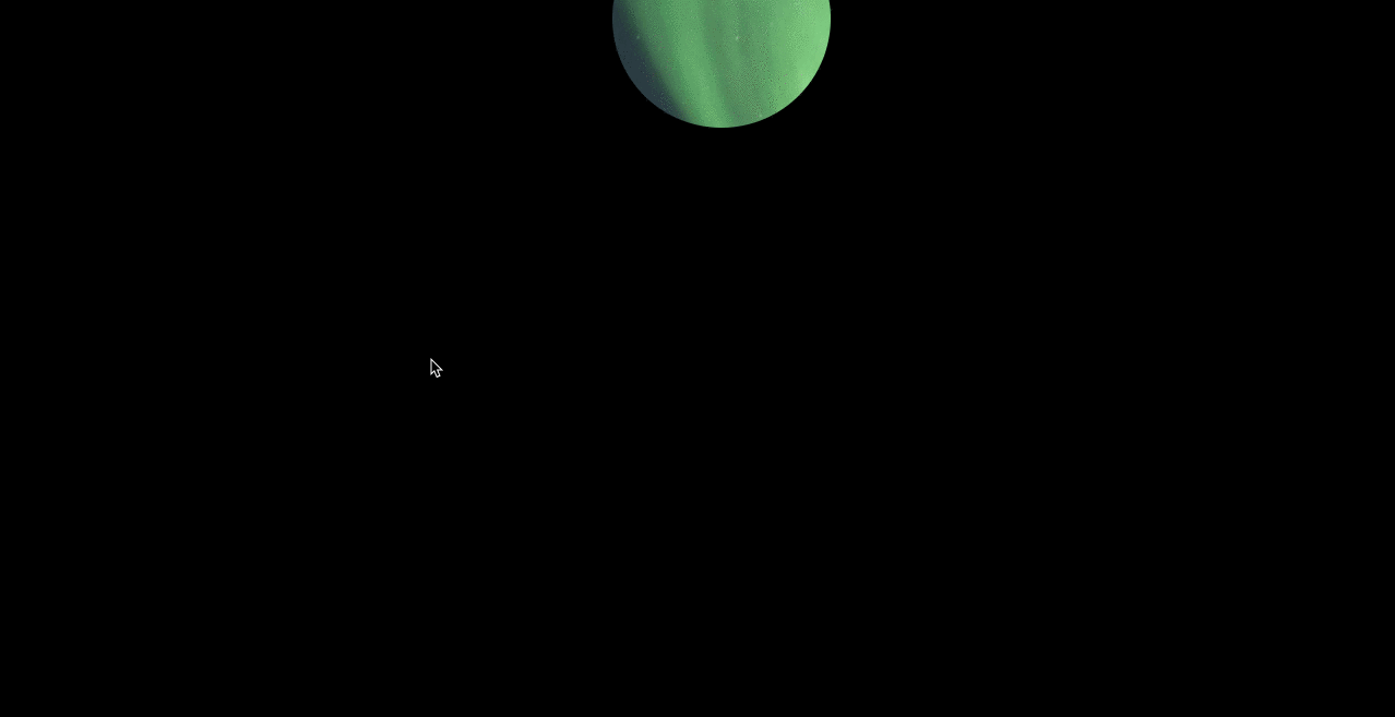
Above we introduced the declaration and use of css variables and the use of js to obtain and assign values. Next, we complete the spotlight effect (I made it blindly, I don’t know what to call it), no, it looks like this. The GIF image is a bit stuck:angry:, please wait and see
Before writing the code, let’s sort out the ideas and how to achieve this effect. There are mainly the following steps 1 , declare global css variables 2. Set the body to a pure black background, add p and set the background image 3. Use clip-path to crop the background image of p, and use variables to set the center position of the circle 4. Add mouse events , dynamically change the css variable, which is the center position of the circle
Next, start writing code
The layout is very simple, it is just a p, we mainly talk about the css style
:root{
    --x: 40;
    --y: 40;
}
*{
    padding: 0;
    margin: 0;
}
body{
    width: 100vw;
    height: 100vh;
    background: #000;
}
p{
    width: 100%;
    height: 100%;
    background: url('../images/bg.png') 0 0 no-repeat;
    clip-path: circle(100px at calc(var(--x) * 1px ) calc(var(--y) * 1px));
    background-size: cover;
} Use the * wildcard to simply and rudely remove the browser default style. The body is set to 100%. The vw and vh units are used here, indicating that the The viewport is divided into 100 equal parts, 100vw means that 100 parts of width are 100% wide, vh is the same.
Here comes the key point, use css to declare two variables --x and --y, and then use them when cropping in the p style clip-path: circle(100px at calc(var(--x) * 1px ) calc(var(--y) * 1px)) , we use clip-path to crop A circle is created, its syntax is as follows
clip-path: circle(半径 at 圆心X轴坐标 圆心Y轴坐标 )
At this time, such a circle is displayed on the page

In the last step, we add the mouse follow event and change the values of --x and --y
document.addEventListener('mouseover', function(e){
     document.documentElement.style.setProperty('--x', e.clientX)
     document.documentElement.style.setProperty('--y', e.clientY)
})At this time, We have used css variables to achieve a simple effect. There are more usage scenarios for css variables, please feel free to use them.
For detailed code, please move to github
Summary
1、可以嵌套使用
:root{
    --green: green;
    --bgcolor: var(--green);
}2、变量的不合法
p {
  --color: 10px;
  background-color: yellow;
  background-color: var(--color, green);
}此时p的背景色是什么呢?
A rgba(0,0,0,0) B 10px C yellow D green
答案是 A
简单来说是变量声明的时候不是合法的,背景色显然不能是 10px ,所以浏览器就会使用默认值,这个默认值并不是使用变量的默认值,是浏览器自己的默认值 background-color: var(--color, green) 就会变成 background-color: rgba(0,0,0,0)
相关推荐:
The above is the detailed content of Code sharing for realizing spotlight effect using css. For more information, please follow other related articles on the PHP Chinese website!

Hot AI Tools

Undresser.AI Undress
AI-powered app for creating realistic nude photos

AI Clothes Remover
Online AI tool for removing clothes from photos.

Undress AI Tool
Undress images for free

Clothoff.io
AI clothes remover

AI Hentai Generator
Generate AI Hentai for free.

Hot Article
Hot Tools

Notepad++7.3.1
Easy-to-use and free code editor

SublimeText3 Chinese version
Chinese version, very easy to use

Zend Studio 13.0.1
Powerful PHP integrated development environment

Dreamweaver CS6
Visual web development tools

SublimeText3 Mac version
God-level code editing software (SublimeText3)
Hot Topics
 1385
1385
 52
52

 How to use bootstrap in vue
Apr 07, 2025 pm 11:33 PM
How to use bootstrap in vue
Apr 07, 2025 pm 11:33 PM
Using Bootstrap in Vue.js is divided into five steps: Install Bootstrap. Import Bootstrap in main.js. Use the Bootstrap component directly in the template. Optional: Custom style. Optional: Use plug-ins.
 The Roles of HTML, CSS, and JavaScript: Core Responsibilities
Apr 08, 2025 pm 07:05 PM
The Roles of HTML, CSS, and JavaScript: Core Responsibilities
Apr 08, 2025 pm 07:05 PM
HTML defines the web structure, CSS is responsible for style and layout, and JavaScript gives dynamic interaction. The three perform their duties in web development and jointly build a colorful website.
 How to write split lines on bootstrap
Apr 07, 2025 pm 03:12 PM
How to write split lines on bootstrap
Apr 07, 2025 pm 03:12 PM
There are two ways to create a Bootstrap split line: using the tag, which creates a horizontal split line. Use the CSS border property to create custom style split lines.
 How to resize bootstrap
Apr 07, 2025 pm 03:18 PM
How to resize bootstrap
Apr 07, 2025 pm 03:18 PM
To adjust the size of elements in Bootstrap, you can use the dimension class, which includes: adjusting width: .col-, .w-, .mw-adjust height: .h-, .min-h-, .max-h-
 Understanding HTML, CSS, and JavaScript: A Beginner's Guide
Apr 12, 2025 am 12:02 AM
Understanding HTML, CSS, and JavaScript: A Beginner's Guide
Apr 12, 2025 am 12:02 AM
WebdevelopmentreliesonHTML,CSS,andJavaScript:1)HTMLstructurescontent,2)CSSstylesit,and3)JavaScriptaddsinteractivity,formingthebasisofmodernwebexperiences.
 How to set up the framework for bootstrap
Apr 07, 2025 pm 03:27 PM
How to set up the framework for bootstrap
Apr 07, 2025 pm 03:27 PM
To set up the Bootstrap framework, you need to follow these steps: 1. Reference the Bootstrap file via CDN; 2. Download and host the file on your own server; 3. Include the Bootstrap file in HTML; 4. Compile Sass/Less as needed; 5. Import a custom file (optional). Once setup is complete, you can use Bootstrap's grid systems, components, and styles to create responsive websites and applications.
 How to insert pictures on bootstrap
Apr 07, 2025 pm 03:30 PM
How to insert pictures on bootstrap
Apr 07, 2025 pm 03:30 PM
There are several ways to insert images in Bootstrap: insert images directly, using the HTML img tag. With the Bootstrap image component, you can provide responsive images and more styles. Set the image size, use the img-fluid class to make the image adaptable. Set the border, using the img-bordered class. Set the rounded corners and use the img-rounded class. Set the shadow, use the shadow class. Resize and position the image, using CSS style. Using the background image, use the background-image CSS property.
 How to use bootstrap button
Apr 07, 2025 pm 03:09 PM
How to use bootstrap button
Apr 07, 2025 pm 03:09 PM
How to use the Bootstrap button? Introduce Bootstrap CSS to create button elements and add Bootstrap button class to add button text
