Example of implementing select drop-down list in Vue.js
Goal: Use the ul-li tag combined with Vue.js knowledge to create a drop-down option list that imitates the select tag. This article mainly shares an example of making a select drop-down list with Vue.js (ul-li tag imitates the select tag). I hope it can help you.
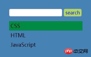
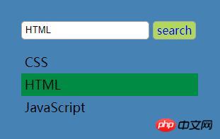
Rendering:
1. Before any operation is performed, the drop-down list is hidden

2. Click the input box to display the drop-down list List

3. Click the list item, and the input box value will change accordingly

PS: To demonstrate the two data1 and data2 Binding of group data, two lists are created in the example

html code:
<!DOCTYPE html> <html> <head> <meta charset="UTF-8"> <title>ul-li模仿select下拉菜单</title> <link rel="stylesheet" type="text/css" href="style.css" rel="external nofollow" /> <script src="https://unpkg.com/vue/dist/vue.js"></script> </head> <body> <p id="demo"> <my-select btn-name='search' v-bind:list='data1' style='float: left;margin-right: 2rem;'></my-select> <my-select btn-name='搜索' v-bind:list='data2' style='float: left;'></my-select> </p> </body> </html>
JavaScript code
<script type="text/javascript">
//注册全局组件
//在my-select组件中套用ul-select组件,my-select为父组件ul-select为子组件
Vue.component('my-select', {
//组件中data要写成函数形式
data() {
return {
ulShow: false, //默认ul不显示,单击input改变ul的显示状态
selectVal: '' //选项值,input的值与选项值动态绑定
}
},
//父组件向子组件通信用props
props: ['btnName', 'list'],
template: `
<p id="selectWrap">
<p class="searchBox">
<input type="text" :value="selectVal" @click='ulShow = !ulShow'/>
<a href="#" rel="external nofollow" class="search" v-text='btnName'></a>
</p>
<my-ul v-show='ulShow' v-bind:list='list' v-on:receive='changeVal'></my-ul>
</p>
`,
methods: {
changeVal(value) {
this.selectVal = value
}
}
})
//子组件
Vue.component('my-ul', {
props: ['list'],
template: `
<ul class="skill">
<li v-for='item of list' v-on:click='selectLi(item)'>{{item}}</li>
</ul>
`,
methods: {
selectLi: function(item) {
//$emit触发当前实例上的自定义事件 receive
this.$emit('receive', item);
}
}
})
//创建Vue实例
new Vue({
el: '#demo',
//定义两组数据分别传递到两个组件的li中,两个列表的操作互不影响
data: {
data1: ['CSS', 'HTML', 'JavaScript'],
data2: ['Vue.js', 'Node.js', 'Sass'],
}
})
</script>CSS style
ul, li {
 margin: 0;
 padding: 0;
 list-style: none;
}
#selectWrap {
 width: 250px;
 padding: 2rem;
 background: #4682b4;
}
.searchBox input, .searchBox a {
 line-height: 1.5rem;
 height: 1.5rem;
 margin-bottom: 1rem;
 padding: 0 5px;
 vertical-align: middle;
 border: 1px solid #aaa;
 border-radius: 5px;
 outline: none;
}
.searchBox a {
 display: inline-block;
 text-decoration: none;
 background-color: #b1d85c;
}
.skill li {
 font-size: 18px;
 line-height: 2rem;
 height: 2rem;
 padding-left: 5px;
 cursor: pointer;
}
.skill li:hover {
 background-color: #008b45;
}Related recommendations:
Explanation on the multiselect drop-down list function in bootstrap
php Get the select drop-down list box Value
About the selected attribute of the select drop-down list
The above is the detailed content of Example of implementing select drop-down list in Vue.js. For more information, please follow other related articles on the PHP Chinese website!

Hot AI Tools

Undresser.AI Undress
AI-powered app for creating realistic nude photos

AI Clothes Remover
Online AI tool for removing clothes from photos.

Undress AI Tool
Undress images for free

Clothoff.io
AI clothes remover

AI Hentai Generator
Generate AI Hentai for free.

Hot Article

Hot Tools

Notepad++7.3.1
Easy-to-use and free code editor

SublimeText3 Chinese version
Chinese version, very easy to use

Zend Studio 13.0.1
Powerful PHP integrated development environment

Dreamweaver CS6
Visual web development tools

SublimeText3 Mac version
God-level code editing software (SublimeText3)

Hot Topics
 How to implement an online speech recognition system using WebSocket and JavaScript
Dec 17, 2023 pm 02:54 PM
How to use WebSocket and JavaScript to implement an online speech recognition system Introduction: With the continuous development of technology, speech recognition technology has become an important part of the field of artificial intelligence. The online speech recognition system based on WebSocket and JavaScript has the characteristics of low latency, real-time and cross-platform, and has become a widely used solution. This article will introduce how to use WebSocket and JavaScript to implement an online speech recognition system.
 WebSocket and JavaScript: key technologies for implementing real-time monitoring systems
Dec 17, 2023 pm 05:30 PM
WebSocket and JavaScript: Key technologies for realizing real-time monitoring systems Introduction: With the rapid development of Internet technology, real-time monitoring systems have been widely used in various fields. One of the key technologies to achieve real-time monitoring is the combination of WebSocket and JavaScript. This article will introduce the application of WebSocket and JavaScript in real-time monitoring systems, give code examples, and explain their implementation principles in detail. 1. WebSocket technology
 How to implement an online reservation system using WebSocket and JavaScript
Dec 17, 2023 am 09:39 AM
How to use WebSocket and JavaScript to implement an online reservation system. In today's digital era, more and more businesses and services need to provide online reservation functions. It is crucial to implement an efficient and real-time online reservation system. This article will introduce how to use WebSocket and JavaScript to implement an online reservation system, and provide specific code examples. 1. What is WebSocket? WebSocket is a full-duplex method on a single TCP connection.
 How to use JavaScript and WebSocket to implement a real-time online ordering system
Dec 17, 2023 pm 12:09 PM
Introduction to how to use JavaScript and WebSocket to implement a real-time online ordering system: With the popularity of the Internet and the advancement of technology, more and more restaurants have begun to provide online ordering services. In order to implement a real-time online ordering system, we can use JavaScript and WebSocket technology. WebSocket is a full-duplex communication protocol based on the TCP protocol, which can realize real-time two-way communication between the client and the server. In the real-time online ordering system, when the user selects dishes and places an order
 Simple JavaScript Tutorial: How to Get HTTP Status Code
Jan 05, 2024 pm 06:08 PM
JavaScript tutorial: How to get HTTP status code, specific code examples are required. Preface: In web development, data interaction with the server is often involved. When communicating with the server, we often need to obtain the returned HTTP status code to determine whether the operation is successful, and perform corresponding processing based on different status codes. This article will teach you how to use JavaScript to obtain HTTP status codes and provide some practical code examples. Using XMLHttpRequest
 JavaScript and WebSocket: Building an efficient real-time weather forecasting system
Dec 17, 2023 pm 05:13 PM
JavaScript and WebSocket: Building an efficient real-time weather forecast system Introduction: Today, the accuracy of weather forecasts is of great significance to daily life and decision-making. As technology develops, we can provide more accurate and reliable weather forecasts by obtaining weather data in real time. In this article, we will learn how to use JavaScript and WebSocket technology to build an efficient real-time weather forecast system. This article will demonstrate the implementation process through specific code examples. We
 How to get HTTP status code in JavaScript the easy way
Jan 05, 2024 pm 01:37 PM
Introduction to the method of obtaining HTTP status code in JavaScript: In front-end development, we often need to deal with the interaction with the back-end interface, and HTTP status code is a very important part of it. Understanding and obtaining HTTP status codes helps us better handle the data returned by the interface. This article will introduce how to use JavaScript to obtain HTTP status codes and provide specific code examples. 1. What is HTTP status code? HTTP status code means that when the browser initiates a request to the server, the service
 How to implement change event binding of select elements in jQuery
Feb 23, 2024 pm 01:12 PM
jQuery is a popular JavaScript library that can be used to simplify DOM manipulation, event handling, animation effects, etc. In web development, we often encounter situations where we need to change event binding on select elements. This article will introduce how to use jQuery to bind select element change events, and provide specific code examples. First, we need to create a dropdown menu with options using labels:


