
I believe that many students will encounter the problem of intercepting characters that are too long when writing front-end pages. The easiest way is to intercept them manually, but this feels too low. Tonight, I will talk about using css. Intercept characters. Students who don’t know how to intercept CSS can come and take a look with us!
Preface
Recently, when designing a responsive system, I encountered the effect of intercepting multiple lines of text in the title, as shown below:
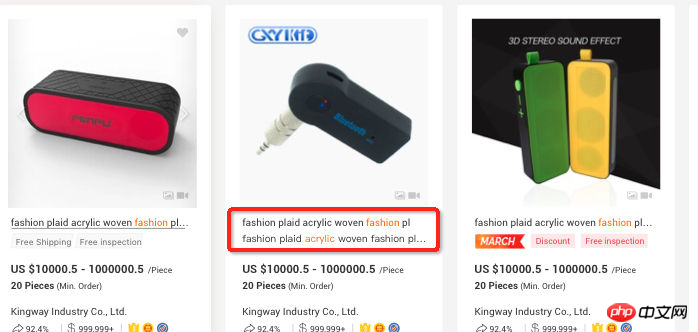
It seems that the title truncation effect is very simple, but there is no unified CSS attribute implementation standard. Some ingenious tricks are needed to achieve it. Generally speaking, when doing When it comes to text truncation effects like this, we hope for:
1. Good compatibility and good support for major mainstream browsers
2. Responsive truncation, based on different widths Adjustment
3. The ellipsis will be displayed only when the text exceeds the range. Otherwise, the ellipsis will not be displayed.
4. The ellipsis position will be displayed just right.
Based on the above guidelines, I will introduce various Techniques are used to achieve the truncation effect and the optimal solution is obtained based on the above evaluation criteria.
Single line text truncationtext-overflow
Text overflow What we often use should be text-overflow: ellipsis I believe you are all familiar with it. You can achieve single-line text truncation with just a few lines of code.
div {
  white-space: nowrap;
  overflow: hidden;
text-overflow: ellipsis;}Achievement effect: demo address
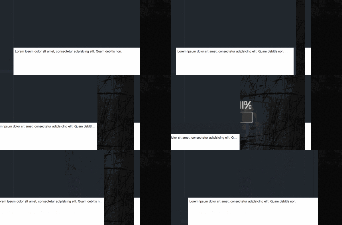
Attribute browser native support, good compatibility with major browsers, the disadvantage is that it only Single-line text truncation is supported, but multi-line text truncation is not supported.
Applicable scenarios: Single-line text truncation is the easiest to implement and has the best effect, so you can use it with confidence.
If it is a multi-line text interception effect, it is not so easy to implement.
-webkit-line-clamp implementation
Let’s first introduce the first way, which is to implement it through the -webkit-line-clamp attribute. The specific method is as follows:
div {
  display: -webkit-box;
  overflow: hidden;
  -webkit-line-clamp: 2;
-webkit-box-orient: vertical;}It needs to be used in conjunction with display, -webkit-box-orient and overflow:
1. display: -webkit-box; must be combined with the attributes of the object. Displayed as elastic scaling box model.
2. -webkit-box-orient; must be combined with the attribute to set or retrieve the arrangement of the sub-elements of the flex box object.
3. text-overflow: ellipsis; optional attribute, It can be used in the case of multi-line text, using the ellipsis "..." to hide the text that exceeds the range.
Achievement effect: demo address
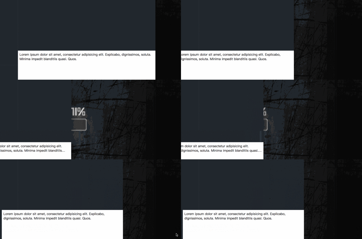
From the effect point of view, its advantages are:
1. Responsive truncation, adjusted according to different widths
2. The ellipses will be displayed only when the text exceeds the range, otherwise the ellipses will not be displayed
3. The browser implements native implementation, so the ellipsis position is displayed just right
But the disadvantage is also very direct, because -webkit-line-clamp is an unstandardized attribute and it does not appear in the CSS specification draft. In other words, only browsers with webkit core support this attribute. Browsers such as Firefox and IE do not support this attribute, and the browser compatibility is not good.
Usage scenarios: Mostly used for mobile pages, because mobile device browsers are more based on the webkit kernel. In addition to poor compatibility, the truncation effect is good.
Positioning elements to implement multi-line text truncation
Another reliable and simple method is to set the height of the relatively positioned container, using The element simulation implementation of ellipsis (...) is implemented as follows:
p {
    position: relative;
    line-height: 18px;
    height: 36px;
    overflow: hidden;}p::after {
    content:"...";
    font-weight:bold;
    position:absolute;
    bottom:0;
    right:0;
    padding:0 20px 1px 45px;

    /* 为了展示效果更好 */
    background: -webkit-gradient(linear, left top, right top, from(rgba(255, 255, 255, 0)), to(white), color-stop(50%, white));
    background: -moz-linear-gradient(to right, rgba(255, 255, 255, 0), white 50%, white);
    background: -o-linear-gradient(to right, rgba(255, 255, 255, 0), white 50%, white);
    background: -ms-linear-gradient(to right, rgba(255, 255, 255, 0), white 50%, white);
background: linear-gradient(to right, rgba(255, 255, 255, 0), white 50%, white);}The implementation principle is easy to understand, which is to use the pseudo element to absolutely position to the end of the line and cover the text, and then through overflow: hidden hides redundant text.
Implementation effect:demo address
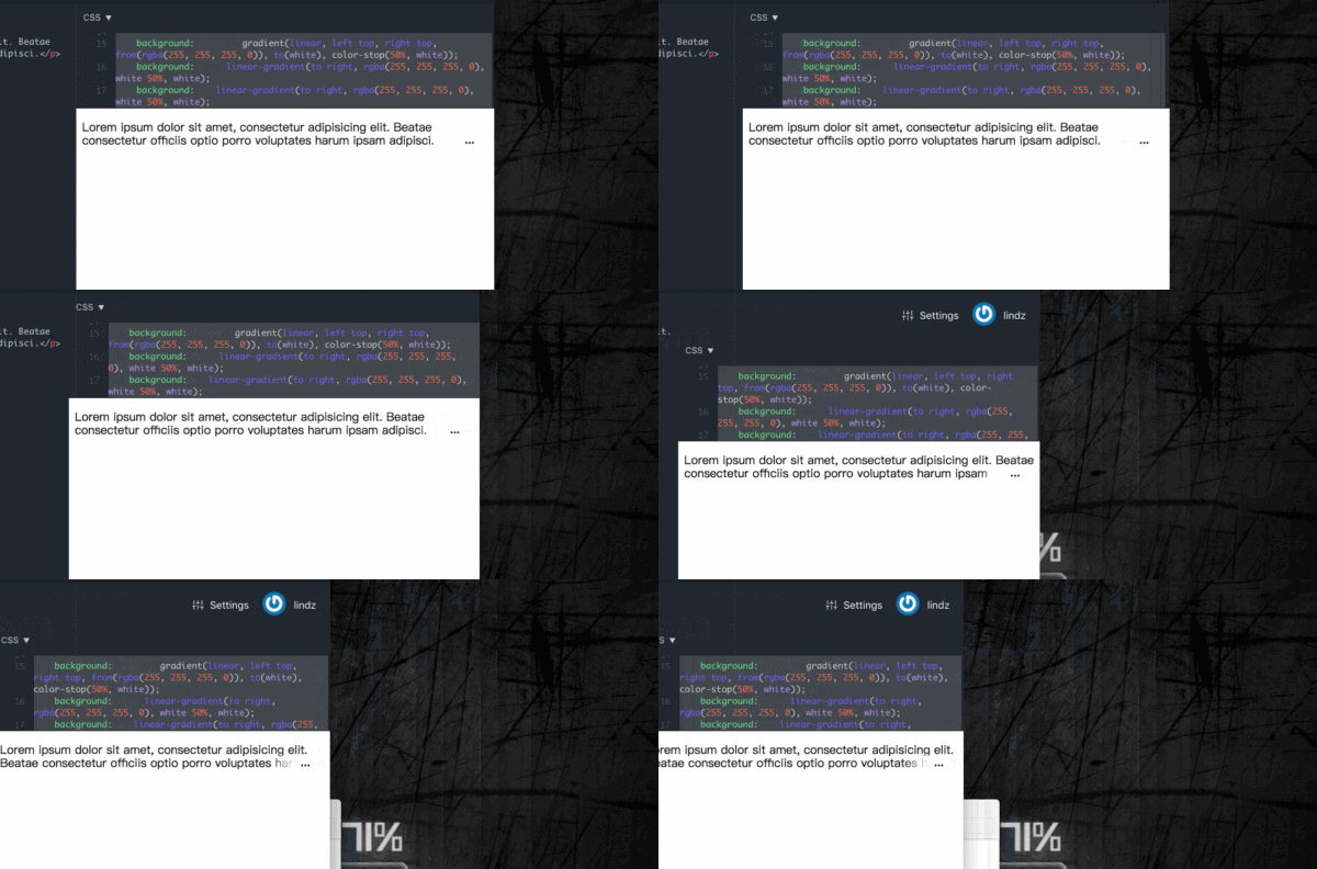
From the perspective of implementation effect, its advantages:
1. Good compatibility, good support for major mainstream browsers
2. Responsive truncation, adjust according to different widths
但是它无法识别文字的长短,即文本超出范围才显示省略号,否则不显示省略号。还有因为是我们人为地在文字末尾添加一个省略号效果,就会导致它跟文字其实没有贴合的很紧密,遇到这种情况可以通过添加 word-break: break-all; 使一个单词能够在换行时进行拆分。
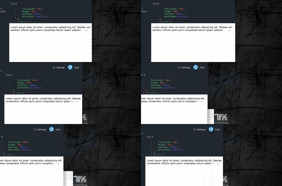
适合场景:文字内容较多,确定文字内容一定会超过容器的,那么选择这种方式不错。
float 特性实现多行文本截断
回到一开始我要做的内容是多行标题文字截取效果,显然是无法控制标题的长度的,显然是无法使用上述的方式。回到事情的本质来看:我们希望 CSS 能够有一种属性,能够在文字溢出的情况下显示省略号,不溢出时不显示省略号。(两种形式,两种效果)
正当我以为 CSS 已经无能为力,只能通过 JS 去实现的时候,后来看到了一个方法非常巧妙,而且能够满足上述提到的所有准则,下面我就介绍如何通过 float 特性实现多行文本截断效果。
基本原理:
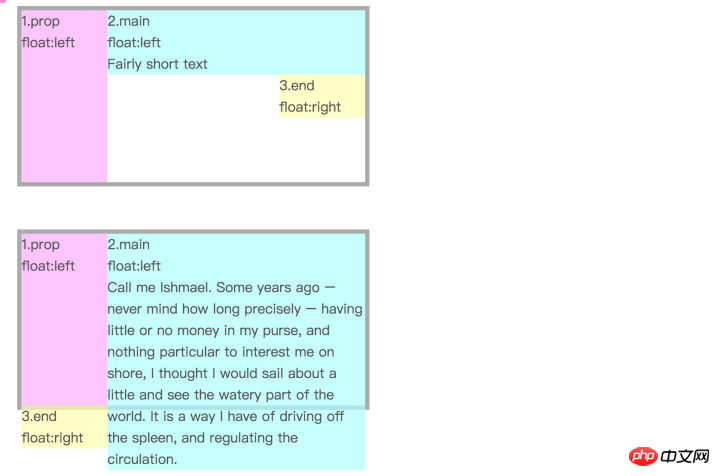
有个三个盒子 div,粉色盒子左浮动,浅蓝色盒子和黄色盒子右浮动,
1、当浅蓝色盒子的高度低于粉色盒子,黄色盒子仍会处于浅蓝色盒子右下方。
2、如果浅蓝色盒子文本过多,高度超过了粉色盒子,则黄色盒子不会停留在右下方,而是掉到了粉色盒子下。
好了,这样两种状态的两种展示形式已经区分开了,那么我们可以将黄色盒子进行相对定位,将内容溢出的黄色盒子移动到文本内容右下角,而未溢出的则会被移到外太空去了,只要我们使用 overflow: hidden 就可以隐藏掉。
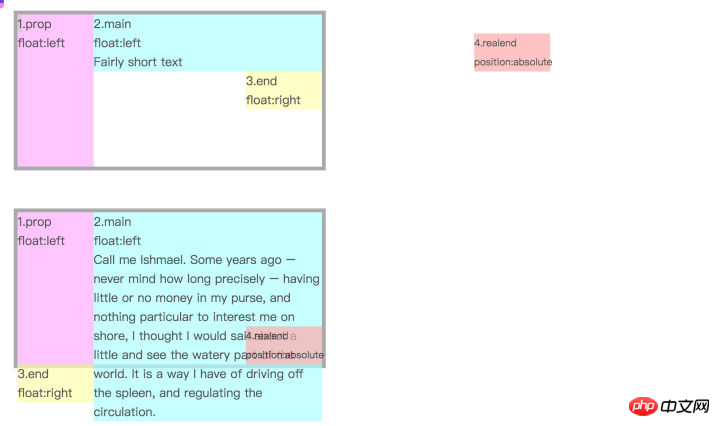
基本原理就是这样,我们可以将浅蓝色区域想象成标题,黄色区域想象为省略号效果。那么你可能会觉得粉色盒子占了空间,那岂不是标题会整体延后了吗,这里可以通过 margin 的负值来出来,设置浅蓝色盒子的 margin-left 的负值与粉色盒子的宽度相同,标题也能正常显示。
那么我们将前面的 DOM 结构简化下,变成下面这样:
<div class="wrap">
  <div class="text">Lorem ipsum dolor sit amet, consectetur adipisicing elit. Dignissimos labore sit vel itaque delectus atque quos magnam assumenda quod architecto perspiciatis animi.</div>
</div>
刚才的粉色盒子和黄色盒子都可以用伪元素来代替。
.wrap {
  height: 40px;
  line-height: 20px;
  overflow: hidden;}.wrap .text {
  float: right;
  margin-left: -5px;
  width: 100%;
  word-break: break-all;}.wrap::before {
  float: left;
  width: 5px;
  content: '';
  height: 40px;}.wrap::after {
  float: right;
  content: "...";
  height: 20px;
  line-height: 20px;
  /* 为三个省略号的宽度 */
  width: 3em;
  /* 使盒子不占位置 */
  margin-left: -3em;
  /* 移动省略号位置 */
  position: relative;
  left: 100%;
  top: -20px;
padding-right: 5px;}实现效果:demo 地址
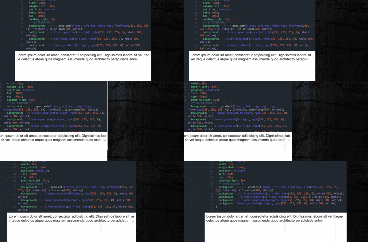
这里我目前看到最巧妙的方式了。只需要支持 CSS 2.1 的特性就可以了,它的优点有:
1、兼容性好,对各大主流浏览器有好的支持
2、响应式截断,根据不同宽度做出调整
3、文本超出范围才显示省略号,否则不显示省略号
至于缺点,因为我们是模拟省略号,所以显示位置有时候没办法刚刚好,所以可以考虑:
1、加一个渐变效果,贴合文字,就像上述 demo 效果一样
2、添加 word-break: break-all; 使一个单词能够在换行时进行拆分,这样文字和省略号贴合效果更佳。
这个方法应该是我看到最好的用纯 CSS 处理的方式了,大家可以尝试的去测试一下。
相关推荐:
The above is the detailed content of Detailed explanation of CSS multi-line character interception method. For more information, please follow other related articles on the PHP Chinese website!


