

Detailed explanation of css implementation of box model

This article talks about the css implementation Box Model. If you don’t know about the css implementation of the box model or are interested in the css implementation of the box model, then let’s take a look at this article together. Okay Let’s cut the nonsense and get to the point
The box model is the core basic knowledge in html+css. Only by understanding this important concept can we type better and lay out the page. The following is the knowledge I have accumulated and summarized about css box model. I hope it will be useful to beginners.
1. Concept of css box model
CSS css box model is also called box model (Box Model), including It includes several elements such as element content (content), padding (padding), border (border), and outer margin (margin). As shown in the picture:

The innermost box in the picture is the actual content of the element, that is, the element box, and the innermost box is next to the outside of the element box. The padding, followed by the border, and then the outermost layer are the margins, which form the box model. Usually the background display area we set is the range of content, padding, and borders. The outer margin is transparent and will not block other surrounding elements.
Then, the total width of the element box = the width of the element (element) + the value of the left and right margins of the padding + the values of the left and right margins of the margin + the left and right margins of the border Width;
The total height of the element box = the height of the element + the value of the top and bottom margins of padding + the value of the top and bottom margins + the top and bottom width of the border.
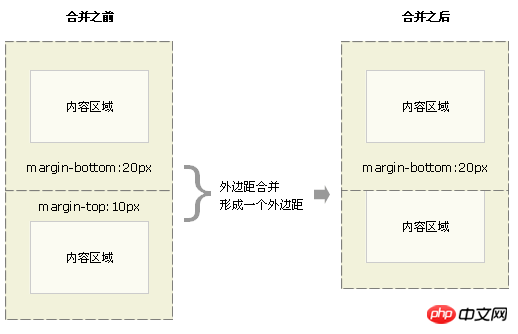
2. CSS margin merging (overlay)
Two adjacent element boxes in the upper and lower directions meet vertically When , the margins will be merged, and the height of the merged margins is equal to the higher of the two merged margins, as shown in the figure:
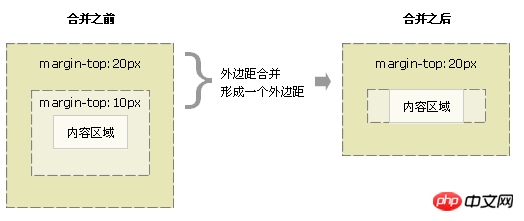
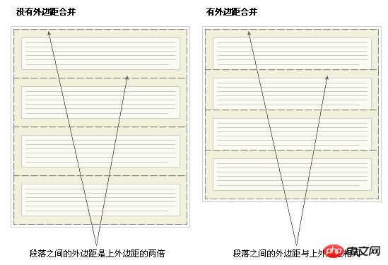
is relatively easy to understand, so sometimes you need to consider this factor when encountering actual situations on the page. Of course, merging margins also has meaning, as shown below:
It should be noted that only the vertical margins of block boxes in ordinary document flow will be merged. Margins between inline boxes, floated boxes, or absolutely positioned will not be merged.
css reset is also often used
* {
  margin : 0;
  padding : 0;
}3. box-sizing Attribute introduction
The box-sizing attribute is one of the user interface attributes. The reason why it is introduced is because this attribute is related to the box model and is included in css reset. Might use it.
box-sizing : content-box|border-box|inherit;
(1) content-box ,Default value allows the set width and height values to be applied to the element's content box. The width of the box only contains the content.
That is, the total width=margin+border+padding+width
(2) border-box, set The width value is actually the total width of border+padding+element except margin. The width of the box includes border+padding+content
That is, the total width=margin+width
##Many CSS frameworks will calculate the box model Simplify.
(3) inherit , stipulates that the value of the box-sizing attribute should be inherited from the parent element
About border-box Usage:
1 A box width is 100%, and you want inner spacing on both sides, it is better to use it at this time2 Global setting border-box is very good, first of all, it is intuitive , Secondly, it can save the need for addition and subtraction again and again. It also has a key function - allowing the bordered box to use the percentage width normally.
4. Applications and minor problems related to the frame model encountered in actual development.
1 Margin out of bounds (the margin-top of the first child element and the margin-bottom of the last child element are out of bounds)
以第一个子元素的margin-top 为例:
当父元素没有边框border时,设置第一个子元素的margin-top值的时候,会出现margin-top值加在父元素上的现象,解决方法有四个:
(1)给父元素加边框border (副作用)
(2)给父元素设置padding值 (副作用)
(3)父元素添加 overflow:hidden (副作用)
(4)父元素加前置内容生成。(推荐)
以第四种方法为例:
.parent {
     width : 500px;
     height : 500px;
     background-color : red;
}.parent : before {
     content : " ";
     display : table;
}.child {
     width : 200px;
     height : 200px;
     background-color : green;
     margin-top : 50px;
}<p class="parent"> <p class="child"></p> </p>
2 浏览器间的盒子模型。
(1)ul标签在Mozilla中默认是有padding值的,而在IE中只有margin有值。
(2)标准盒子模型与IE模型之间的差异:
标准的盒子模型就是上述介绍的那种,而IE模型更像是 box-sizing : border-box; 其内容宽度还包含了border和padding。解决办法就是:在html模板中加doctype声明。
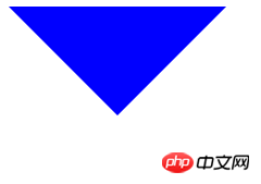
3 用盒子模型画三角形
<!DOCTYPE html><html>
  <head>
    <style>
        .triangle {
            width : 0;
            height: 0;
            border : 100px solid transparent;
            border-top : 100px solid blue; /*这里可以设置border的top、bottom、left、right四个方向的三角*/
        }
    </style>
  </head>
  <body>
    <p class="triangle"></p>
</body></html>页面显示结果为:
以上就是本篇文章的所有内容,大家要是还不太了解的话,可以自己多实现两边就很容易掌握了哦!
相关推荐:
The above is the detailed content of Detailed explanation of css implementation of box model. For more information, please follow other related articles on the PHP Chinese website!

Hot AI Tools

Undresser.AI Undress
AI-powered app for creating realistic nude photos

AI Clothes Remover
Online AI tool for removing clothes from photos.

Undress AI Tool
Undress images for free

Clothoff.io
AI clothes remover

Video Face Swap
Swap faces in any video effortlessly with our completely free AI face swap tool!

Hot Article
Hot Tools

Notepad++7.3.1
Easy-to-use and free code editor

SublimeText3 Chinese version
Chinese version, very easy to use

Zend Studio 13.0.1
Powerful PHP integrated development environment

Dreamweaver CS6
Visual web development tools

SublimeText3 Mac version
God-level code editing software (SublimeText3)
Hot Topics
 1386
1386
 52
52

 How to use bootstrap in vue
Apr 07, 2025 pm 11:33 PM
How to use bootstrap in vue
Apr 07, 2025 pm 11:33 PM
Using Bootstrap in Vue.js is divided into five steps: Install Bootstrap. Import Bootstrap in main.js. Use the Bootstrap component directly in the template. Optional: Custom style. Optional: Use plug-ins.
 The Roles of HTML, CSS, and JavaScript: Core Responsibilities
Apr 08, 2025 pm 07:05 PM
The Roles of HTML, CSS, and JavaScript: Core Responsibilities
Apr 08, 2025 pm 07:05 PM
HTML defines the web structure, CSS is responsible for style and layout, and JavaScript gives dynamic interaction. The three perform their duties in web development and jointly build a colorful website.
 How to write split lines on bootstrap
Apr 07, 2025 pm 03:12 PM
How to write split lines on bootstrap
Apr 07, 2025 pm 03:12 PM
There are two ways to create a Bootstrap split line: using the tag, which creates a horizontal split line. Use the CSS border property to create custom style split lines.
 Understanding HTML, CSS, and JavaScript: A Beginner's Guide
Apr 12, 2025 am 12:02 AM
Understanding HTML, CSS, and JavaScript: A Beginner's Guide
Apr 12, 2025 am 12:02 AM
WebdevelopmentreliesonHTML,CSS,andJavaScript:1)HTMLstructurescontent,2)CSSstylesit,and3)JavaScriptaddsinteractivity,formingthebasisofmodernwebexperiences.
 How to insert pictures on bootstrap
Apr 07, 2025 pm 03:30 PM
How to insert pictures on bootstrap
Apr 07, 2025 pm 03:30 PM
There are several ways to insert images in Bootstrap: insert images directly, using the HTML img tag. With the Bootstrap image component, you can provide responsive images and more styles. Set the image size, use the img-fluid class to make the image adaptable. Set the border, using the img-bordered class. Set the rounded corners and use the img-rounded class. Set the shadow, use the shadow class. Resize and position the image, using CSS style. Using the background image, use the background-image CSS property.
 How to resize bootstrap
Apr 07, 2025 pm 03:18 PM
How to resize bootstrap
Apr 07, 2025 pm 03:18 PM
To adjust the size of elements in Bootstrap, you can use the dimension class, which includes: adjusting width: .col-, .w-, .mw-adjust height: .h-, .min-h-, .max-h-
 How to set up the framework for bootstrap
Apr 07, 2025 pm 03:27 PM
How to set up the framework for bootstrap
Apr 07, 2025 pm 03:27 PM
To set up the Bootstrap framework, you need to follow these steps: 1. Reference the Bootstrap file via CDN; 2. Download and host the file on your own server; 3. Include the Bootstrap file in HTML; 4. Compile Sass/Less as needed; 5. Import a custom file (optional). Once setup is complete, you can use Bootstrap's grid systems, components, and styles to create responsive websites and applications.
 How to use bootstrap button
Apr 07, 2025 pm 03:09 PM
How to use bootstrap button
Apr 07, 2025 pm 03:09 PM
How to use the Bootstrap button? Introduce Bootstrap CSS to create button elements and add Bootstrap button class to add button text
