Home > Web Front-end > JS Tutorial > body text

How to make counterclockwise rotating countdown in css3

php中世界最好的语言
Release: 2018-03-16 10:36:25
Original
1969 people have browsed it

This time I will show you how to make a counterclockwise rotation countdown in CSS3. What are the precautions for making a counterclockwise rotation countdown in CSS3? The following is a practical case, let’s take a look.

Many answer H5 interfaces have a rotating countdown effect, a

animation that continuously rotates and decreases, similar to the picture below.
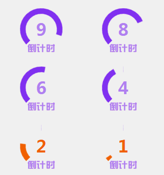
I studied it today and it can be obtained through border rotation. Generally we can get a four-segment circle through border.

See the Pen circle by stoneniqiu (@stoneniqiu) on CodePen.

Next, you can create a countdown effect by rotating:

See the Pen circle-rotate by stoneniqiu (@stoneniqiu) on CodePen.

The initial rotation is 45 degrees to make the semicircle just stand up. Then rotate one hundred and eighty degrees.

  .rightcircle{
                border-top: .4rem solid #8731fd;
                border-right: .4rem solid #8731fd;
                right: 0;
                transform: rotate(45deg)            }
 .right_cartoon {
                -webkit-animation: circleProgressLoad_right 10s linear infinite forwards;
                animation: circleProgressLoad_right 10s linear infinite forwards;
            }
 @keyframes circleProgressLoad_right {
                0% {
                    -webkit-transform: rotate(46deg);
                    transform: rotate(46deg)                }
                50%,to {
                    -webkit-transform: rotate(-136deg);
                    transform: rotate(-136deg)                }
            }
Copy after login
After all, it is not a real reduction. If one color dominates, it can be pieced together by two semicircles.

See the Pen circle-

timer by stoneniqiu (@stoneniqiu) on CodePen.

 @keyframes circleProgressLoad_left {
                0%,50% {
                    -webkit-transform: rotate(46deg);
                    transform: rotate(46deg)                }
            
                to {
                    -webkit-transform: rotate(-136deg);
                    transform: rotate(-136deg)                }
            }
Copy after login
Notice that it is the right line turn 5 seconds, and then wait for another five seconds on the left. The effect of the css animation here is slightly different. On the right, it starts at 0%, 50%, to. The left side is 0%, 50%, and then to, which achieves a 5-second wait. This is the effect of the rotating countdown. Finally, you can modify the border-left color of the left half ring to highlight the emergency situation in the last few seconds.

I believe you have mastered the method after reading the case in this article. For more exciting information, please pay attention to other related articles on the php Chinese website!

Recommended reading:

Can the DataTable plug-in implement asynchronous loading?

The API that jQuery must master

The above is the detailed content of How to make counterclockwise rotating countdown in css3. For more information, please follow other related articles on the PHP Chinese website!

Related labels:
source:php.cn
Statement of this Website
The content of this article is voluntarily contributed by netizens, and the copyright belongs to the original author. This site does not assume corresponding legal responsibility. If you find any content suspected of plagiarism or infringement, please contact admin@php.cn
Popular Tutorials
More>
Latest Downloads
More>
Web Effects
Website Source Code
Website Materials
Front End Template