HTML5 implements layered screen adaptation
This article mainly introduces to you the relevant information on the html5 layered screen adaptation method. The editor thinks it is quite good, so I will share it with you now and give it as a reference. Let’s follow the editor to take a look, I hope it can help everyone.
Screen adaptation
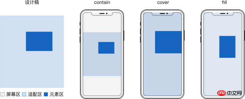
Screen adaptation should refer to the adaptation relationship between the content adaptation area and the screen area.
Single-screen adaptation includes contain, cover or fill, and multi-screen adaptation is common with yikuan.
contain and cover also need positioning to handle white space and excess content.
Different content in the same H5 often uses different adaptation methods, that is, layering.


##Preferred CSS
- js is often required after the page is loaded A delay of at least 70ms is required to obtain the correct webview width and height
- css is often executed first, and the parsing of cssom is often built in parallel with the dom at the beginning
- js will wait for dom and cssom to be processed before it can be executed, while css only needs to wait for dom
- Compared with js, when switching between horizontal and vertical screens, it has to switch 2 processes to redraw. No need to switch to css
Whole layer adaptation
To ensure that the elements of each layer are scaled synchronously and without distortion, the adaptation area of each layer should be equal to the size of the design draft. The direct implementation is to construct a container with the same size as the adaptation area and adapt the entire layer. There can be several elements with the same adaptation method in the container. Takesvg implementation as an example:
##
<!doctype html>
<html>
<body>
<style>
.layer {
  position: absolute;
  top: 0;
  left: 0;
  width: 100%;
  height: 100%;
}
</style>
<!-- fill -->
<svg class="layer" viewBox="0 0 1080 1920" preserveAspectRatio="none"> <!-- 容器 -->
  <rect x="0" y="0" width="1080" height="1920" fill="rgba(96,96,96,.08)"/>  <!-- 元素 -->
</svg>
<!-- contain 居中 -->
<svg class="layer" viewBox="0 0 1080 1920" preserveAspectRatio="xMidYMid meet"> <!-- 容器 -->
  <rect x="0" y="233" width="1080" height="1407" fill="#1565C0"/>  <!-- 元素 -->
</svg>
<!-- contain 居底 -->
<svg class="layer" viewBox="0 0 1080 1920" preserveAspectRatio="xMidYMax meet"> <!-- 容器 -->
  <rect x="444" y="1779" width="191" height="39" fill="#1565C0"/>  <!-- 元素 -->
</svg>
</body>
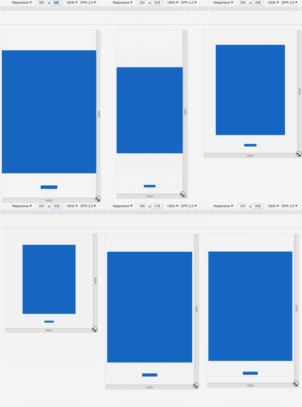
</html>Actual effect:
 The entire layer adaptation is simple to implement, and the design draft values can be read directly during development, which can meet the needs of most static pages.
But when there are many h5 animations, you have to consider the smoothness of the animation and the performance of the page.
Use replaceable elements such as
<object> <svg> etc. as containers, and use background images to make Elements, There are performance defects when applying css animation:
- Applying css animation to elements in the container will cause frequent rearrangement and redrawing, resulting in lag.
- The memory occupied when promoting a container with the same size as the adaptation area to a composition layer is too large, and the memory will be doubled as many layers as there are.
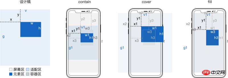
- In order to improve the performance of these implementation solutions, we need to focus on container animation and reduce the size of the container. It is best to be equal to the minimum total area of all elements in a layer, so as to be streamlined and suitable. Equipped with

For the derivation process, see H5 Layering Derivation of screen adaptation formula
设计稿
  宽 v
  高 g

适配前元素
  横坐标 x
  纵坐标 y
  宽 w
  高 h

适配后容器
  横坐标 x3 = x*u/v
  纵坐标 y3 = y*f/g

适配后元素
  横坐标 x4 = m*u + (x - m*v)/w*w1 = m*v/w*w3 + (x - m*v)/w*w1
  纵坐标 y4 = n*f + (y - n*g)/h*h1 = n*g/h*h3 + (y - n*g)/h*h1
  宽 w3 = (w/v)*u
  高 h3 = (h/g)*f
  当 contain 方式适配时
    缩放值 s = Math.min(f/g, u/v)
    横向左留白占总留白 o = (m*v - x)/w
    纵向上留白占总留白 p =  (n*g - y)/h
  当 cover 方式适配时
    缩放值 s = Math.max(f/g, u/v)
    横向左超出占总超出 o = (x - m*v)/w
    纵向上超出占总超出 p =  (y - n*g)/h

适配区
  垂直居顶时 m = 0
  垂直居中时 m = .5
  垂直居底时 m = 1
  水平居左时 n = 0
  水平居中时 n = .5
  水平居右时 n = 1

相比整层适配内存优化 (w3*h3)/(v1*g1) >= w*h/(v*g)When max-width is w/v, max-height is h/g corresponds to contain adaptation. When min-width is set to w/v and min-height is set to h/g, it corresponds to cover adaptation.
When width is set to w/v and height is h/g, it means fill adaptation.
contain When adapting, if the original size of the image is smaller than max-width and max-height, use zoom: 10 to enlarge or directly modify the original size of the image.
When covering adaptation, if the original size of the image is larger than min-width and min-height, use zoom: .1 to reduce or directly modify the original size of the image.
Because the percentage in top left is relative to the screen width u and height f, corresponding to m*u and n*f
Because the percentage in transform is relative to the width w1 and height h1 of the element after adaptation, it corresponds to (m*v + x)/w*w1 and (n*f + y)/h*h1
<!doctype html>
<html>
<body>
<style>
img {
  /* min-width 和 min-height 构成了虚拟的容器 */
  min-width: 50.37037037037037%; /* w3 = (w/v)*u 其中 w = 544,v = 1080 */
  min-height: 7.395833333333333%; /* h3 = (h/g)*f 其中 h = 142,g = 1920 */
  zoom: .1;
  /* x4 = m*u + (x - m*v)/w*w1 */
  /* y4 = n*f + (y - n*g)/h*h1 */
  position: absolute;
  left: 50%; /* m*u 其中 m = .5*/
  top: 50%; /* n*f 其中 n = .5 */
  transform:
    translateX(-48.34558823529412%) /* (x - m*v)/w*w1 其中 x = 277,m = .5,v = 1080,w = 544 */
    translateY(378.8732394366197%); /* (y - n*g)/h*h1 其中 y = 1498,n = .5,g = 1920,h = 142 */
}
</style>
<img src="http://ui.qzone.com/544x142"/> <!-- 元素 -->
</body>
</html>background implementation example
- background-size
When the value is
contain, it corresponds to contain adaptation. - background-size
When the value is
cover, it corresponds to cover adaptation. - background-size
When the value is
100% 100%, it corresponds to `fill adaptation. - background-position
percentage has the same meaning as
op
<!doctype html>
<html>
<body>
<style>
p {
  position: absolute;
  width: 50.37037037037037%; /* w3 = w/v*u 其中 w = 544,v = 1080 */
  height: 7.395833333333333%; /* h3 = h/g*f 其中 h = 142,g = 1920 */
  background: url(http://ui.qzone.com/544x142) no-repeat; /* 背景图做元素 */
  background-size: cover;
  left: 25.64814814814815%; /* x3 = x/v*u 其中 x = 277, v = 1080 */
  top: 78.02083333333333%; /* y3 = y/g*f 其中 y = 1498, g = 1920 */
  background-position-x: -48.34558823529412%; /* o = (x - m*v)/w 其中 m = .5 , v = 1080,x = 277,w = 544*/
  background-position-y: 378.8732394366197%; /* p = (y - n*g)/h 其中 n = .5 , g = 1920,y = 1498,h = 142*/
}
</style>
<p></p> <!-- 容器 -->
</body>
</html><svg> Implementation example
- preserveAspectRatio
of
meetOrSliceismeetcorresponds to contain adaptation. - preserveAspectRatio
corresponds to cover adaptation when
meetOrSliceisslice. - preserveAspectRatio
corresponds to fill adaptation when the value is
none.</li><li><p>这里 <code>preserveAspectRatio的meetOrSlice相对的是容器,不是 适配区 这里用transform来定位,而preserveAspectRatio的meetOrSlice固定为xMinYMin。
<!doctype html>
<html>
<body>
<style>
svg {
  position: absolute;
  width: 50.37037037037037%;
  height: 7.395833333333333%;
  /* x4 = m*v/w*w3 + (x - m*v)/w*w1 */
  /* y4 = n*g/h*h3 + (y - n*g)/h*h1 */
  top: 0;
  left: 0;
  transform:
    translateX(99.26470588235294%) /* m*v/w*w3 其中 m = .5,v = 1080,w = 544 */
    translateY(676.056338028169%); /* n*g/h*h3 其中 n = .5,g = 1920,h = 142 */
    overflow: visible;
}
svg image {
  transform:
    translateX(-48.34558823529412%) /* (x - m*v)/w*w1 其中 x = 277,m = .5,v = 1080,w = 544 */
    translateY(378.8732394366197%); /* (y - n*g)/h*h1 其中 y = 1498,n = .5,g = 1920,h = 142 */
}
</style>
<svg viewBox="0 0 544 142" preserveAspectRatio="xMinYMin meet"> <!-- 容器 -->
  <image width="544" height="142" xlink:href="http://ui.qzone.com/544x142"/> <!-- 元素 -->
</svg>
</body>
</html>辅助工具
手动计算百分比及写 css 很麻烦,可以借助 sass 等工具来辅助简化。
设计稿宽 v 高 g 一般是页面级常量。
只需读取设计稿里每个 元素 的横坐标 x 、纵坐标 y 、宽 w 和 高 h,然后工具生成 css 即可。
这下妈妈再也不用担心我还原问题、屏幕适配问题了。
文字处理
文字固定或单行不固定,svg 的 text 标签可以处理
文字固定或单行不固定还可以将文字转为图片
文字多行不固定,可以借助 svg 的 foreignObject 嵌入普通 p
方案对比
屏幕适配方案非常多,选哪种方式实现 整层适配 或 精简适配,下面是对比
| 方案 | 缩放 | 定位 | 文字缩放 | 兼容 |
|---|---|---|---|---|
| padding-top 百分比 | 只能依宽 | ✓ | ✗ | ✓ |
| viewport | ✓ | ✗ | ✓ | 支持情况复杂 |
| object-fit | ✓ | ✓ | ✗ | 移动端 android 4.4.4+ |
| svg preserveRatio | ✓ | ✓ | ✓ | 移动端 android 3.0+ |
| (max/min)-(width/height) | ✓ | ✓ | 固定文字 | ✓ |
| background-size | ✓ | ✓ | 文字转图片 | ✓ |
相关推荐:
JavaScript强化教程 —— Cocos2d-JS的屏幕适配方案
The above is the detailed content of HTML5 implements layered screen adaptation. For more information, please follow other related articles on the PHP Chinese website!

Hot AI Tools

Undresser.AI Undress
AI-powered app for creating realistic nude photos

AI Clothes Remover
Online AI tool for removing clothes from photos.

Undress AI Tool
Undress images for free

Clothoff.io
AI clothes remover

AI Hentai Generator
Generate AI Hentai for free.

Hot Article

Hot Tools

Notepad++7.3.1
Easy-to-use and free code editor

SublimeText3 Chinese version
Chinese version, very easy to use

Zend Studio 13.0.1
Powerful PHP integrated development environment

Dreamweaver CS6
Visual web development tools

SublimeText3 Mac version
God-level code editing software (SublimeText3)

Hot Topics
 Nested Table in HTML
Sep 04, 2024 pm 04:49 PM
This is a guide to Nested Table in HTML. Here we discuss how to create a table within the table along with the respective examples.
 Table Border in HTML
Sep 04, 2024 pm 04:49 PM
Guide to Table Border in HTML. Here we discuss multiple ways for defining table-border with examples of the Table Border in HTML.
 HTML margin-left
Sep 04, 2024 pm 04:48 PM
Guide to HTML margin-left. Here we discuss a brief overview on HTML margin-left and its Examples along with its Code Implementation.
 HTML Table Layout
Sep 04, 2024 pm 04:54 PM
Guide to HTML Table Layout. Here we discuss the Values of HTML Table Layout along with the examples and outputs n detail.
 HTML Ordered List
Sep 04, 2024 pm 04:43 PM
Guide to the HTML Ordered List. Here we also discuss introduction of HTML Ordered list and types along with their example respectively
 Moving Text in HTML
Sep 04, 2024 pm 04:45 PM
Guide to Moving Text in HTML. Here we discuss an introduction, how marquee tag work with syntax and examples to implement.
 HTML Input Placeholder
Sep 04, 2024 pm 04:54 PM
Guide to HTML Input Placeholder. Here we discuss the Examples of HTML Input Placeholder along with the codes and outputs.
 HTML onclick Button
Sep 04, 2024 pm 04:49 PM
Guide to HTML onclick Button. Here we discuss their introduction, working, examples and onclick Event in various events respectively.


