

css adaptive layout
This time I will bring you the adaptive layout of css. What are the precautions for css adaptive layout? The following is a practical case, let’s take a look.
First of all, I don’t know who came up with this ridiculous and pretentious name. The general idea is that the content in the middle performs width adaptive operations according to the different widths of the browser, while the content on both sides has a fixed width. . Come on, let’s demonstrate the last code: 1 <style> 2 *{ 3 margin: 0; 4 padding: 0; 5 } 6 .wrap { 7 background-color: #FBD570; 8 overflow: hidden; 9 }10 .left {11 float: left;12 width: 100px;13 background: #00f;14 height: 180px;15 }16 .right {17 float: right;18 width: 150px;19 background: #0f0;20 height: 200px;21 }22 .center {23 background: #B373DA;24 height: 150px;25 margin-left: 100px;26 margin-right: 150px;27 }28 </style>29 </head>30 <body>31 <p class="wrap">32 <p class="center">center,可以自适应浏览器宽度,高度可固定也可以由内容撑开。</p>33 <p class="left">left,宽度固定,高度可固定也可以由内容撑开</p>34 <p class="right">right,宽度固定,高度可固定也可以由内容撑开</p>35 </p>36 </body>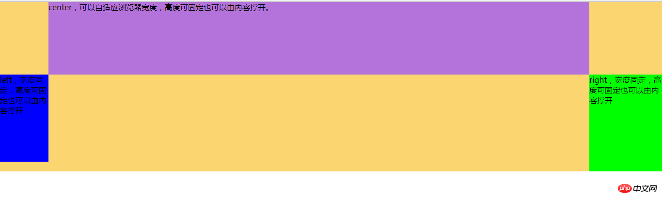

1 <style> 2 *{ 3 margin: 0; 4 padding: 0; 5 } 6 .wrap { 7 background-color: #FBD570; 8 padding: 0 150px 0 100px; 9 overflow: hidden;10 }11 .left {12 float: left;13 width: 100px;14 background: #00f;15 height: 180px;16 margin-left: -100%;17 position: relative;18 left:-100px;19 }20 .right {21 float: right;22 width: 150px;23 background: #0f0;24 height: 200px;25 margin-left: -150px;26 position: relative;27 right:-150px;28 }29 .center {30 background: #B373DA;31 height: 150px;32 float: left;33 width: 100%;34 }35 </style>36 </head>37 <body>38 <p class="wrap">39 <p class="center">center,可以自适应浏览器宽度,高度可固定也可以由内容撑开。</p>40 <p class="left">left,宽度固定,高度可固定也可以由内容撑开</p>41 <p class="right">right,宽度固定,高度可固定也可以由内容撑开</p>42 </p>43 </body>.left {margin-left:- 100%;}. In this way, the left box can be moved to the far left. To make the box on the right go up
.right {margin-left: -150px;}. In this way, the right box can display itself on the rightmost side of the row.
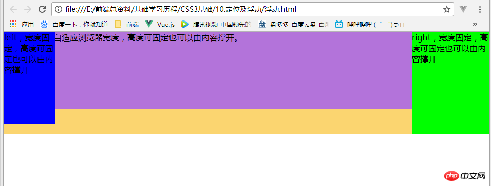
.left{ position: relative; left: -100px;}
.right{position: relative;right: -150px;}
The solution to the problem that the text in the Safari browser select drop-down list is too long and does not wrap
The above is the detailed content of css adaptive layout. For more information, please follow other related articles on the PHP Chinese website!

Hot AI Tools

Undresser.AI Undress
AI-powered app for creating realistic nude photos

AI Clothes Remover
Online AI tool for removing clothes from photos.

Undress AI Tool
Undress images for free

Clothoff.io
AI clothes remover

AI Hentai Generator
Generate AI Hentai for free.

Hot Article
Hot Tools

Notepad++7.3.1
Easy-to-use and free code editor

SublimeText3 Chinese version
Chinese version, very easy to use

Zend Studio 13.0.1
Powerful PHP integrated development environment

Dreamweaver CS6
Visual web development tools

SublimeText3 Mac version
God-level code editing software (SublimeText3)
Hot Topics
 1377
1377
 52
52

 How to use bootstrap button
Apr 07, 2025 pm 03:09 PM
How to use bootstrap button
Apr 07, 2025 pm 03:09 PM
How to use the Bootstrap button? Introduce Bootstrap CSS to create button elements and add Bootstrap button class to add button text
 How to resize bootstrap
Apr 07, 2025 pm 03:18 PM
How to resize bootstrap
Apr 07, 2025 pm 03:18 PM
To adjust the size of elements in Bootstrap, you can use the dimension class, which includes: adjusting width: .col-, .w-, .mw-adjust height: .h-, .min-h-, .max-h-
 How to view the date of bootstrap
Apr 07, 2025 pm 03:03 PM
How to view the date of bootstrap
Apr 07, 2025 pm 03:03 PM
Answer: You can use the date picker component of Bootstrap to view dates in the page. Steps: Introduce the Bootstrap framework. Create a date selector input box in HTML. Bootstrap will automatically add styles to the selector. Use JavaScript to get the selected date.
 How to write split lines on bootstrap
Apr 07, 2025 pm 03:12 PM
How to write split lines on bootstrap
Apr 07, 2025 pm 03:12 PM
There are two ways to create a Bootstrap split line: using the tag, which creates a horizontal split line. Use the CSS border property to create custom style split lines.
 How to set up the framework for bootstrap
Apr 07, 2025 pm 03:27 PM
How to set up the framework for bootstrap
Apr 07, 2025 pm 03:27 PM
To set up the Bootstrap framework, you need to follow these steps: 1. Reference the Bootstrap file via CDN; 2. Download and host the file on your own server; 3. Include the Bootstrap file in HTML; 4. Compile Sass/Less as needed; 5. Import a custom file (optional). Once setup is complete, you can use Bootstrap's grid systems, components, and styles to create responsive websites and applications.
 How to insert pictures on bootstrap
Apr 07, 2025 pm 03:30 PM
How to insert pictures on bootstrap
Apr 07, 2025 pm 03:30 PM
There are several ways to insert images in Bootstrap: insert images directly, using the HTML img tag. With the Bootstrap image component, you can provide responsive images and more styles. Set the image size, use the img-fluid class to make the image adaptable. Set the border, using the img-bordered class. Set the rounded corners and use the img-rounded class. Set the shadow, use the shadow class. Resize and position the image, using CSS style. Using the background image, use the background-image CSS property.
 How to verify bootstrap date
Apr 07, 2025 pm 03:06 PM
How to verify bootstrap date
Apr 07, 2025 pm 03:06 PM
To verify dates in Bootstrap, follow these steps: Introduce the required scripts and styles; initialize the date selector component; set the data-bv-date attribute to enable verification; configure verification rules (such as date formats, error messages, etc.); integrate the Bootstrap verification framework and automatically verify date input when form is submitted.
 How to use bootstrap in vue
Apr 07, 2025 pm 11:33 PM
How to use bootstrap in vue
Apr 07, 2025 pm 11:33 PM
Using Bootstrap in Vue.js is divided into five steps: Install Bootstrap. Import Bootstrap in main.js. Use the Bootstrap component directly in the template. Optional: Custom style. Optional: Use plug-ins.
