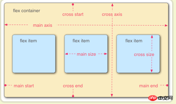
This time I will bring you the use of flex layout. What are the precautions when using flex layout? The following is a practical case, let’s take a look.
The traditional solution for layout is based on the box model and relies on the display attribute + position attribute + float attribute. It is very inconvenient for those special layouts. For example, vertical centering is not easy to achieve. In 2009, W3C proposed a new solution - Flex layout, which can implement various page layouts simply, completely and responsively. Currently, it is supported by all browsers, which means it is now safe to use this feature.
Flex is the abbreviation of Flexible Box, which means "flexible layout" and is used to provide maximum flexibility for box-shaped models. Any container can be designated as a Flex layout. Note that after is set to Flex layout, the float, clear and <a href="http://www.php.cn/wiki/869.html" target="_blank">vertical-align</a> attributes of the child elements will Invalid.

Elements that adopt Flex layout are called Flex containers (flex containers), or "containers" for short. All its child elements automatically become container members, called Flex items (flex items), or "items" for short.

flex-direction There are four values: row | row -reverse | column | column-reverse;
nowrap | wrap | wrap-reverse;
Flex-Direction Properties and Flex-wrap Attributes, the default value is Row Nowrap,
flex-start | flex-end | center | space-between | space-around;
flex-start | flex-end | center | baseline | stretch;
0, that is, if there is remaining space, it will not be enlarged. <code>
flex-shrink and <code>flex-basis, the default value is 0 1 auto. The last two properties are optional.
I believe you have mastered the method after reading the case in this article, and there are more exciting things Please pay attention to other related articles on php Chinese website!
input checkbox Style modification
The above is the detailed content of Use of flex layout. For more information, please follow other related articles on the PHP Chinese website!


