

Pure CSS to achieve Tab page switching effect
This time I will bring you pure CSS to achieve the Tab page switching effect. What are the precautions to achieve the Tab page switching effect with pure CSS? The following is a practical case, let's take a look.
When I cut a page recently, it involved a tab switching part. Because I didn’t want to use js, I thought about whether I could use a pure CSS selector to achieve the switching effect. After searching, there are roughly three ways of writing: 1. Use:hover selectorDisadvantages: The effect is only effective when the mouse is on the element, and the effect of selecting and displaying a certain one by default cannot be achieved2. Using the anchor point of the a tag + :target selectorDisadvantages: Because the anchor point will scroll the selected element to the top of the page, it needs to be moved every time the position is switched, and the experience is extremely poor. 3. Use the binding relationship between label and radio and the :checked when radio is selected to achieve the effectDisadvantages: HTML structural elements are more complex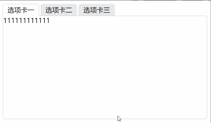
- Binding label and radio: Needless to say binding id and for attributes
- Hide radio button: This method has many uses for you Just use your imagination. The methods I have seen include setting display:none; to hide, setting
- Hide redundant tab pages: In the same way as above, you can also set hierarchical relationships through z-index to block each other.
- Set the default item: Add the checked="checked" attribute to the default button
- Set the selection effect: Use the + selector and ~ to select Use the tool to set the style of the tab page below when the corresponding element is selected to achieve the selection effect
/* 当radio为选中状态时设置它的test-label兄弟元素的属性 */
input[type="radio"]:checked+.test-label {
    /* 为了修饰存在的边框背景属性 */
    border-color: #cbcccc;
    border-bottom-color: #fff;
    background: #fff;
    /* 为了修饰存在的层级使下边框遮挡下方p的上边框 */
    z-index: 10;
}
/* 当radio为选中状态时设置与它同级的tab-box元素的显示层级 */
input[type="radio"]:checked~.tab-box {
    /* 选中时提升层级,遮挡其他tab页达到选中切换的效果 */
    z-index: 5;
}<!DOCTYPE html>
<html lang="en">
<head>
<meta charset="UTF-8">
<meta name="viewport" content="width=device-width, initial-scale=1.0">
<meta http-equiv="X-UA-Compatible" content="ie=edge">
<title>CSS实现Tab切换效果</title>
<style>
ul {
margin: 0;
padding: 0;
}
.clearfloat {
zoom: 1;
}
.clearfloat::after {
display: block;
clear: both;
content: "";
visibility: hidden;
height: 0;
}
.tab-list {
position: relative;
}
.tab-list .tab-itom {
float: left;
list-style: none;
margin-right: 4px;
}
.tab-itom .test-label {
position: relative;
display: block;
width: 85px;
height: 27px;
border: 1px solid transparent;
border-top-left-radius: 5px;
border-top-right-radius: 5px;
line-height: 27px;
text-align: center;
background: #e7e8eb;
}
.tab-itom .tab-box {
/* 设置绝对定位方便定位相对于tab-list栏的位置,同时为了可以使用z-index属性 */
position: absolute;
left: 0;
top: 28px;
width: 488px;
height: 248px;
border: 1px solid #cbcccc;
border-radius: 5px;
border-top-left-radius: 0px;
background: #fff;
/* 设置层级最低方便选中状态遮挡 */
z-index: 0;
}
/* 用绝对定位使按钮脱离文档流,透明度设置为0将其隐藏 */
input[type="radio"] {
position: absolute;
opacity: 0;
}
/* 利用选择器实现 tab切换 */
/* 当radio为选中状态时设置它的test-label兄弟元素的属性 */
input[type="radio"]:checked + .test-label {
/* 为了修饰存在的边框背景属性 */
border-color: #cbcccc;
border-bottom-color: #fff;
background: #fff;
/* 为了修饰存在的层级使下边框遮挡下方p的上边框 */
z-index: 10;
}
/* 当radio为选中状态时设置与它同级的tab-box元素的显示层级 */
input[type="radio"]:checked ~ .tab-box {
/* 选中时提升层级,遮挡其他tab页达到选中切换的效果 */
z-index: 5;
}
</style>
</head>
<body class="clearfloat">
<ul class="tab-list clearfloat">
<li class="tab-itom">
<input type="radio" id="testTabRadio1" class="test-radio" name="tab" checked="checked">
<label class="test-label" for="testTabRadio1">选项卡一</label>
<p class="tab-box">
111111111111
</p>
</li>
<li class="tab-itom">
<input type="radio" id="testTabRadio2" class="test-radio" name="tab">
<label class="test-label" for="testTabRadio2">选项卡二</label>
<p class="tab-box">
2222222222222
</p>
</li>
<li class="tab-itom">
<input type="radio" id="testTabRadio3" class="test-radio" name="tab">
<label class="test-label" for="testTabRadio3">选项卡三</label>
<p class="tab-box">
33333333333333
</p>
</li>
</ul>
</body>
</html>Tips for using max-width and min-width
How text-align achieves alignment at both ends
MySQL reset Root password on Mac system
The above is the detailed content of Pure CSS to achieve Tab page switching effect. For more information, please follow other related articles on the PHP Chinese website!

Hot AI Tools

Undresser.AI Undress
AI-powered app for creating realistic nude photos

AI Clothes Remover
Online AI tool for removing clothes from photos.

Undress AI Tool
Undress images for free

Clothoff.io
AI clothes remover

Video Face Swap
Swap faces in any video effortlessly with our completely free AI face swap tool!

Hot Article
Hot Tools

Notepad++7.3.1
Easy-to-use and free code editor

SublimeText3 Chinese version
Chinese version, very easy to use

Zend Studio 13.0.1
Powerful PHP integrated development environment

Dreamweaver CS6
Visual web development tools

SublimeText3 Mac version
God-level code editing software (SublimeText3)
Hot Topics
 1387
1387
 52
52

 How to use bootstrap in vue
Apr 07, 2025 pm 11:33 PM
How to use bootstrap in vue
Apr 07, 2025 pm 11:33 PM
Using Bootstrap in Vue.js is divided into five steps: Install Bootstrap. Import Bootstrap in main.js. Use the Bootstrap component directly in the template. Optional: Custom style. Optional: Use plug-ins.
 The Roles of HTML, CSS, and JavaScript: Core Responsibilities
Apr 08, 2025 pm 07:05 PM
The Roles of HTML, CSS, and JavaScript: Core Responsibilities
Apr 08, 2025 pm 07:05 PM
HTML defines the web structure, CSS is responsible for style and layout, and JavaScript gives dynamic interaction. The three perform their duties in web development and jointly build a colorful website.
 How to write split lines on bootstrap
Apr 07, 2025 pm 03:12 PM
How to write split lines on bootstrap
Apr 07, 2025 pm 03:12 PM
There are two ways to create a Bootstrap split line: using the tag, which creates a horizontal split line. Use the CSS border property to create custom style split lines.
 Understanding HTML, CSS, and JavaScript: A Beginner's Guide
Apr 12, 2025 am 12:02 AM
Understanding HTML, CSS, and JavaScript: A Beginner's Guide
Apr 12, 2025 am 12:02 AM
WebdevelopmentreliesonHTML,CSS,andJavaScript:1)HTMLstructurescontent,2)CSSstylesit,and3)JavaScriptaddsinteractivity,formingthebasisofmodernwebexperiences.
 How to resize bootstrap
Apr 07, 2025 pm 03:18 PM
How to resize bootstrap
Apr 07, 2025 pm 03:18 PM
To adjust the size of elements in Bootstrap, you can use the dimension class, which includes: adjusting width: .col-, .w-, .mw-adjust height: .h-, .min-h-, .max-h-
 How to use bootstrap button
Apr 07, 2025 pm 03:09 PM
How to use bootstrap button
Apr 07, 2025 pm 03:09 PM
How to use the Bootstrap button? Introduce Bootstrap CSS to create button elements and add Bootstrap button class to add button text
 How to set up the framework for bootstrap
Apr 07, 2025 pm 03:27 PM
How to set up the framework for bootstrap
Apr 07, 2025 pm 03:27 PM
To set up the Bootstrap framework, you need to follow these steps: 1. Reference the Bootstrap file via CDN; 2. Download and host the file on your own server; 3. Include the Bootstrap file in HTML; 4. Compile Sass/Less as needed; 5. Import a custom file (optional). Once setup is complete, you can use Bootstrap's grid systems, components, and styles to create responsive websites and applications.
 How to insert pictures on bootstrap
Apr 07, 2025 pm 03:30 PM
How to insert pictures on bootstrap
Apr 07, 2025 pm 03:30 PM
There are several ways to insert images in Bootstrap: insert images directly, using the HTML img tag. With the Bootstrap image component, you can provide responsive images and more styles. Set the image size, use the img-fluid class to make the image adaptable. Set the border, using the img-bordered class. Set the rounded corners and use the img-rounded class. Set the shadow, use the shadow class. Resize and position the image, using CSS style. Using the background image, use the background-image CSS property.
