

S5 allows layered screens to adapt
This time I will bring you S5 to adapt to layered screens. What are the precautions for S5 to adapt to layered screens? The following is a practical case, let’s take a look.
The design is great, this time it is really "according to the design draft", because now, any machine is a standard machine according to the design draft! Developer classmates, now you can just read the design draft annotations directly!Screen adaptation
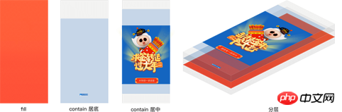
Screen adaptation should refer to the adaptation relationship between the content adaptation area and the screen area. Single-screen adaptation includes contain, cover or fill, and multi-screen adaptation is common with yikuan. contain and cover also need positioning to handle white space and excess content. Different content in the same H5 often uses different adaptation methods, that is, layering.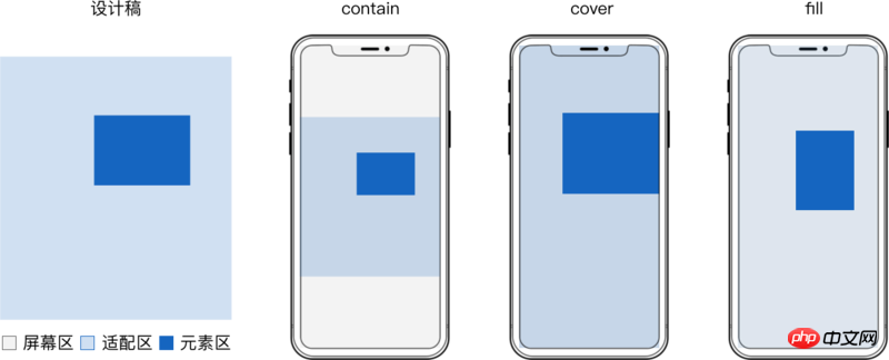
- js is often required after the page is loaded A delay of at least 70ms is required to obtain the correct webview width and height
- css is often executed first, and the parsing of cssom is often built in parallel with the dom at the beginning
- js will wait for dom and cssom to be processed before it can be executed, while css only needs to wait for dom
- Compared with js, when switching between horizontal and vertical screens, it has to switch 2 processes to redraw. No need to switch to css
- For performance issues such as screen adaptation, if it can be implemented with css, it should be implemented with css.
To ensure that the elements of each layer are scaled synchronously and without distortion, the adaptation area of each layer should be equal to the size of the design draft.
The direct implementation is to construct a container with the same size as the adaptation area and adapt the entire layer.
There can be several elements with the same adaptation method in the container.
Take
svg implementation as an example: <div class="code" style="position:relative; padding:0px; margin:0px;"><pre class="brush:php;toolbar:false"><!doctype html>
<html>
<body>
<style>
.layer {
position: absolute;
top: 0;
left: 0;
width: 100%;
height: 100%;
}
</style>
<!-- fill -->
<svg class="layer" viewBox="0 0 1080 1920" preserveAspectRatio="none"> <!-- 容器 -->
<rect x="0" y="0" width="1080" height="1920" fill="rgba(96,96,96,.08)"/> <!-- 元素 -->
</svg>
<!-- contain 居中 -->
<svg class="layer" viewBox="0 0 1080 1920" preserveAspectRatio="xMidYMid meet"> <!-- 容器 -->
<rect x="0" y="233" width="1080" height="1407" fill="#1565C0"/> <!-- 元素 -->
</svg>
<!-- contain 居底 -->
<svg class="layer" viewBox="0 0 1080 1920" preserveAspectRatio="xMidYMax meet"> <!-- 容器 -->
<rect x="444" y="1779" width="191" height="39" fill="#1565C0"/> <!-- 元素 -->
</svg>
</body>
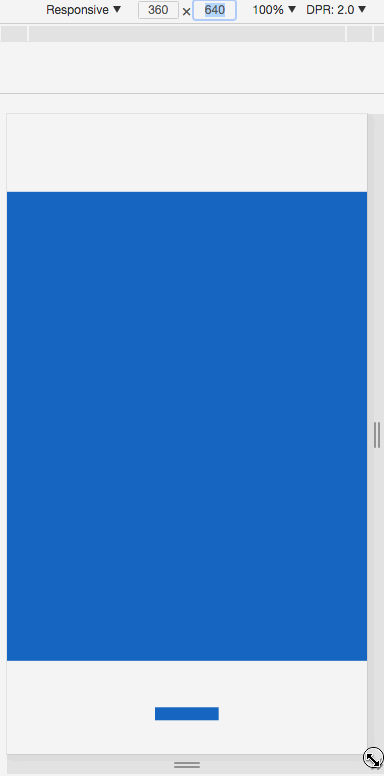
</html></pre><div class="contentsignin">Copy after login</div></div>Actual effect:
 The entire layer adaptation is simple to implement, Directly reading the design draft values during development can meet the needs of most static pages.
But when there are many h5 animations, you have to consider the smoothness of the animation and the performance of the page.
Use replaceable elements such as
<object> <svg> etc. as containers, and use background images to make Elements, There are performance defects when applying css animation:
- Applying css animation to elements in the container will cause frequent rearrangement and redrawing, resulting in lag.
- The memory occupied when promoting a container with the same size as the adaptation area to a composition layer is too large, and the memory will be doubled as many layers as there are.
- In order to improve the performance of these implementation solutions, we need to focus on container animation and reduce the size of the container. It is best to be equal to the minimum total area of all elements in a layer to make it streamlined and suitable. Equipped with
For the derivation process, see H5 Layering Derivation of screen adaptation formula
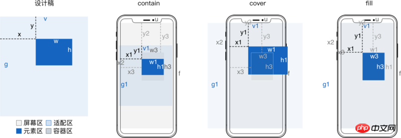
设计稿
  宽 v
  高 g

适配前元素
  横坐标 x
  纵坐标 y
  宽 w
  高 h
适配后容器
  横坐标 x3 = x*u/v
  纵坐标 y3 = y*f/g
适配后元素
  横坐标 x4 = m*u + (x - m*v)/w*w1 = m*v/w*w3 + (x - m*v)/w*w1
  纵坐标 y4 = n*f + (y - n*g)/h*h1 = n*g/h*h3 + (y - n*g)/h*h1
  宽 w3 = (w/v)*u
  高 h3 = (h/g)*f
  当 contain 方式适配时
    缩放值 s = Math.min(f/g, u/v)
    横向左留白占总留白 o = (m*v - x)/w
    纵向上留白占总留白 p =  (n*g - y)/h
  当 cover 方式适配时
    缩放值 s = Math.max(f/g, u/v)
    横向左超出占总超出 o = (x - m*v)/w
    纵向上超出占总超出 p =  (y - n*g)/h
适配区
  垂直居顶时 m = 0
  垂直居中时 m = .5
  垂直居底时 m = 1
  水平居左时 n = 0
  水平居中时 n = .5
  水平居右时 n = 1
相比整层适配内存优化 (w3*h3)/(v1*g1) >= w*h/(v*g)
When max-width is w/v and max-height is h/g, it corresponds to contain adaptation. When min-width is set to w/v,
min-height
is set to h/g, it corresponds to cover adaptation. When width is set to w/v and height is h/g, it means fill adaptation. contain When adapting, if the original size of the image is smaller than max-width and max-height, use zoom: 10 to enlarge or directly modify the original size of the image.
When covering adaptation, if the original size of the image is larger than min-width and min-height, use zoom: .1 to reduce or directly modify the original size of the image.
Because the percentage in top left is relative to the screen width u and height f, corresponding to m*u and n*f
Because the percentage in transform is relative to the width w1 and height h1 of the element after adaptation, it corresponds to (m*v + x)/w*w1 and (n*f + y)/h*h1
<!doctype html>
<html>
<body>
<style>
img {
  /* min-width 和 min-height 构成了虚拟的容器 */
  min-width: 50.37037037037037%; /* w3 = (w/v)*u 其中 w = 544,v = 1080 */
  min-height: 7.395833333333333%; /* h3 = (h/g)*f 其中 h = 142,g = 1920 */
  zoom: .1;
  /* x4 = m*u + (x - m*v)/w*w1 */
  /* y4 = n*f + (y - n*g)/h*h1 */
  position: absolute;
  left: 50%; /* m*u 其中 m = .5*/
  top: 50%; /* n*f 其中 n = .5 */
  transform:
    translateX(-48.34558823529412%) /* (x - m*v)/w*w1 其中 x = 277,m = .5,v = 1080,w = 544 */
    translateY(378.8732394366197%); /* (y - n*g)/h*h1 其中 y = 1498,n = .5,g = 1920,h = 142 */
}
</style>
<img src="http://ui.qzone.com/544x142"/> <!-- 元素 -->
</body>
</html>background Implementation example <svg> 实现示例 这里 辅助工具 手动计算百分比及写 css 很麻烦,可以借助 sass 等工具来辅助简化。 文字处理 文字固定或单行不固定, 文字固定或单行不固定还可以将文字转为图片 文字多行不固定,可以借助 方案对比 屏幕适配方案非常多,选哪种方式实现 整层适配 或 精简适配,下面是对比 相信看了本文案例你已经掌握了方法,更多精彩请关注php中文网其它相关文章! 推荐阅读:
<a href="http://www.php.cn/code/872.html" target="_blank">background-size</a> 值为 contain 时对应 contain 适配。background-size 值为 cover 时对应 cover 适配。background-size 值为 100% 100% 时对应 `fill 适配。<a href="http://www.php.cn/wiki/896.html" target="_blank">background-position</a> 百分比和 o p 意义相同<!doctype html>
<html>
<body>
<style>
p {
position: absolute;
width: 50.37037037037037%; /* w3 = w/v*u 其中 w = 544,v = 1080 */
height: 7.395833333333333%; /* h3 = h/g*f 其中 h = 142,g = 1920 */
background: url(http://ui.qzone.com/544x142) no-repeat; /* 背景图做元素 */
background-size: cover;
left: 25.64814814814815%; /* x3 = x/v*u 其中 x = 277, v = 1080 */
top: 78.02083333333333%; /* y3 = y/g*f 其中 y = 1498, g = 1920 */
background-position-x: -48.34558823529412%; /* o = (x - m*v)/w 其中 m = .5 , v = 1080,x = 277,w = 544*/
background-position-y: 378.8732394366197%; /* p = (y - n*g)/h 其中 n = .5 , g = 1920,y = 1498,h = 142*/
}
</style>
<p></p> <!-- 容器 -->
</body>
</html>
preserveAspectRatio 的 meetOrSlice 为 meet 时对应 contain 适配。preserveAspectRatio 的 meetOrSlice 为 slice 时对应 cover 适配。preserveAspectRatio 值为 none 时对应 fill 适配。preserveAspectRatio 的 meetOrSlice 相对的是容器,不是 适配区 这里用 transform 来定位,而 preserveAspectRatio 的 meetOrSlice 固定为 xMinYMin。<!doctype html>
<html>
<body>
<style>
svg {
position: absolute;
width: 50.37037037037037%;
height: 7.395833333333333%;
/* x4 = m*v/w*w3 + (x - m*v)/w*w1 */
/* y4 = n*g/h*h3 + (y - n*g)/h*h1 */
top: 0;
left: 0;
transform:
translateX(99.26470588235294%) /* m*v/w*w3 其中 m = .5,v = 1080,w = 544 */
translateY(676.056338028169%); /* n*g/h*h3 其中 n = .5,g = 1920,h = 142 */
overflow: visible;
}
svg image {
transform:
translateX(-48.34558823529412%) /* (x - m*v)/w*w1 其中 x = 277,m = .5,v = 1080,w = 544 */
translateY(378.8732394366197%); /* (y - n*g)/h*h1 其中 y = 1498,n = .5,g = 1920,h = 142 */
}
</style>
<svg viewBox="0 0 544 142" preserveAspectRatio="xMinYMin meet"> <!-- 容器 -->
<image width="544" height="142" xlink:href="http://ui.qzone.com/544x142"/> <!-- 元素 -->
</svg>
</body>
</html>
设计稿宽 v 高 g 一般是页面级常量。
只需读取设计稿里每个 元素 的横坐标 x 、纵坐标 y 、宽 w 和 高 h,然后工具生成 css 即可。
这下妈妈再也不用担心我还原问题、屏幕适配问题了。svg 的 text 标签可以处理svg 的 foreignObject 嵌入普通 p
方案
缩放
定位
文字缩放
兼容
padding-top 百分比
只能依宽
✓
✗
✓
viewport
✓
✗
✓
支持情况复杂
object-fit
✓
✓
✗
移动端 android 4.4.4+
svg preserveRatio
✓
✓
✓
移动端 android 3.0+
(max/min)-(width/height)
✓
✓
固定文字
✓
background-size
✓
✓
文字转图片
✓
The above is the detailed content of S5 allows layered screens to adapt. For more information, please follow other related articles on the PHP Chinese website!

Hot AI Tools

Undresser.AI Undress
AI-powered app for creating realistic nude photos

AI Clothes Remover
Online AI tool for removing clothes from photos.

Undress AI Tool
Undress images for free

Clothoff.io
AI clothes remover

Video Face Swap
Swap faces in any video effortlessly with our completely free AI face swap tool!

Hot Article
Hot Tools

Notepad++7.3.1
Easy-to-use and free code editor

SublimeText3 Chinese version
Chinese version, very easy to use

Zend Studio 13.0.1
Powerful PHP integrated development environment

Dreamweaver CS6
Visual web development tools

SublimeText3 Mac version
God-level code editing software (SublimeText3)
Hot Topics
 1387
1387
 52
52

 How to show the time under the lock screen wallpaper on iPhone
Dec 18, 2023 am 11:27 AM
How to show the time under the lock screen wallpaper on iPhone
Dec 18, 2023 am 11:27 AM
Depth Effect is a cool lock screen feature on iOS where part of the wallpaper covers the digital clock. This basically provides a mirage-like effect where the wallpaper appears to be interacting with lock screen elements. In this article, we will explain what the depth effect is all about and how to get the lock screen time/clock behind wallpaper on iPhone. What is the depth effect on iPhone lock screen? Depth effect adds multiple layers of depth to your wallpaper. When you apply a lock screen wallpaper, iOS uses the iPhone's neural network engine to detect depth information in the image you apply. If successful, your iPhone will be able to separate the subject you want to focus on from other elements of the wallpaper. Once a subject is detected, the depth of field effect will
 Teach you how to turn off the automatic screen lock function in win10
Jan 08, 2024 am 11:49 AM
Teach you how to turn off the automatic screen lock function in win10
Jan 08, 2024 am 11:49 AM
Many friends need to turn off the screen to protect the screen when they leave the computer, but they don’t want to lock the screen because they turn off the screen. When they come back, they have to enter a password to enter the system. In fact, we can complete this step through settings. Let’s take a look at it together. Bar. Tutorial on turning off the screen without locking the screen in win10 1. First enter settings and select "Personalization" 2. Click "Lock Screen" on the left 3. Select "Screen Saver Settings" below 4. Uncheck "Show login on recovery" Screen" 5. Then click "Change Power Settings" 6. Select the icon settings on the left. 7. Set a time to turn off the monitor, and then change the sleep status to "Never" 8. Then return to the power settings just now and select the sleep time below. 9. Use the same as above
 iPhone screenshots not working: How to fix it
May 03, 2024 pm 09:16 PM
iPhone screenshots not working: How to fix it
May 03, 2024 pm 09:16 PM
Screenshot feature not working on your iPhone? Taking a screenshot is very easy as you just need to hold down the Volume Up button and the Power button at the same time to grab your phone screen. However, there are other ways to capture frames on the device. Fix 1 – Using Assistive Touch Take a screenshot using the Assistive Touch feature. Step 1 – Go to your phone settings. Step 2 – Next, tap to open Accessibility settings. Step 3 – Open Touch settings. Step 4 – Next, open the Assistive Touch settings. Step 5 – Turn on Assistive Touch on your phone. Step 6 – Open “Customize Top Menu” to access it. Step 7 – Now you just need to link any of these functions to your screen capture. So click on the first
 Does miniled screen hurt eyes?
Feb 07, 2024 pm 03:48 PM
Does miniled screen hurt eyes?
Feb 07, 2024 pm 03:48 PM
What many users are most concerned about is whether the miniLED screen will hurt the eyes. In fact, although the brightness of this screen can reach extremely high, it will not hurt the eyes and can still be used normally. Does the miniled screen hurt your eyes? Answer: It does not hurt your eyes. Although the brightness of the miniLED screen will be higher, it will not continue to maintain this brightness during daily use. It will only be displayed when the brightness needs to be increased, so it will not always maintain high brightness and hurt the eyes. This peak brightness is also for better Good presentation and expression. MiniLED screen introduction 1. MiniLED backlight display technology uses backlight, so the biggest difference from LCD is the backlight layer 2. Compared with LCD screen, the performance of miniLED will be higher.
 How to adjust the color when the screen turns black and white. Detailed introduction: How to exit black and white mode on your mobile phone.
Mar 21, 2024 pm 01:12 PM
How to adjust the color when the screen turns black and white. Detailed introduction: How to exit black and white mode on your mobile phone.
Mar 21, 2024 pm 01:12 PM
When many friends are using their mobile phones, they suddenly find that the operation interface of the mobile phone has turned into "black and white" color. They don't know what causes it or how to solve it. This article uses Android mobile phones as an example to teach you how to make it work. The color of the mobile phone's operating interface returns to normal. 1. Set up the interface of the mobile phone and find the "gear-shaped" icon in the operation interface. As shown below: Click this icon to enter the phone’s settings interface. 2. Options The operating interface of the mobile phone has changed to black and white, which is related to the "Display" setting of the mobile phone. After entering the settings interface of the mobile phone, find the "Display and Theme" option in the drop-down menu, as shown below: Then click "Display and Theme" option to enter the details page. 3. After changing the screen color and entering the "Display and Theme" option, find the "
 How to Undo Delete from Home Screen in iPhone
Apr 17, 2024 pm 07:37 PM
How to Undo Delete from Home Screen in iPhone
Apr 17, 2024 pm 07:37 PM
Deleted something important from your home screen and trying to get it back? You can put app icons back on the screen in a variety of ways. We have discussed all the methods you can follow and put the app icon back on the home screen. How to Undo Remove from Home Screen in iPhone As we mentioned before, there are several ways to restore this change on iPhone. Method 1 – Replace App Icon in App Library You can place an app icon on your home screen directly from the App Library. Step 1 – Swipe sideways to find all apps in the app library. Step 2 – Find the app icon you deleted earlier. Step 3 – Simply drag the app icon from the main library to the correct location on the home screen. This is the application diagram
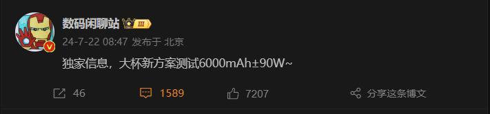 6000 mAh silicon negative battery! Xiaomi 15Pro upgrade leaked again
Jul 24, 2024 pm 12:45 PM
6000 mAh silicon negative battery! Xiaomi 15Pro upgrade leaked again
Jul 24, 2024 pm 12:45 PM
According to news on July 23, blogger Digital Chat Station broke the news that the battery capacity of Xiaomi 15 Pro has been increased to 6000mAh and supports 90W wired flash charging. This will be the Pro model with the largest battery in Xiaomi’s digital series. Digital Chat Station previously revealed that the battery of Xiaomi 15Pro has ultra-high energy density and the silicon content is much higher than that of competing products. After silicon-based batteries are tested on a large scale in 2023, second-generation silicon anode batteries have been identified as the future development direction of the industry. This year will usher in the peak of direct competition. 1. The theoretical gram capacity of silicon can reach 4200mAh/g, which is more than 10 times the gram capacity of graphite (the theoretical gram capacity of graphite is 372mAh/g). For the negative electrode, the capacity when the lithium ion insertion amount reaches the maximum is the theoretical gram capacity, which means that under the same weight
 How to close the 'Do not cover the top of the screen' Detailed explanation: How to close the 'Do not cover the top of the screen' message that appears frequently on your phone
Mar 03, 2024 pm 01:31 PM
How to close the 'Do not cover the top of the screen' Detailed explanation: How to close the 'Do not cover the top of the screen' message that appears frequently on your phone
Mar 03, 2024 pm 01:31 PM
I believe many friends have encountered the problem that their mobile phones suddenly prompt: Do not cover the top of the screen. So why does the mobile phone suddenly appear like this? Let’s take a look together below. In fact, when this happens, something is blocking the distance sensor of the phone, so this prompt is received on the screen of the phone. So why did I suddenly receive such a prompt? In fact, it may be that you have accidentally turned on the [anti-accidental touch mode] on your phone, so this problem occurs. So how do we close it? In fact, the method is very simple. Let’s take a look at it together. Method 1: Directly follow the on-screen prompts to close using the shortcut key combination. Method 2: If the above method does not work, you can also open the phone’s [Settings]
