before :after how to output a small triangle
This time I will show you how to output a small triangle before :after, what are the precautions for before :after to output a small triangle, the following is a practical case, let's take a look.
The triangles written before are always in the same color and have no border style. As follows:
.tri-up{width: 0;height:0;border-left:20px solid transparent;border-right: 20px solid transparent;border-bottom: 20px solid red;  }
.tri-left{width: 0;height:0;border-top:20px solid transparent;border-bottom: 20px solid transparent;border-left: 20px solid red;}
.tri-right{width: 0;height:0;border-top:20px solid transparent;border-bottom: 20px solid transparent;border-right: 20px solid red;}
.tri-down{width: 0;height:0;border-left:20px solid transparent;border-right: 20px solid transparent;border-top: 20px solid red; }:before :after
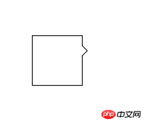
#demo {
            margin: 100px;;
            width: 100px;
            height: 100px;
            background-color: #fff;
            position: relative;
            border: 2px solid #333;
        } //方框的样式
        #demo:after, #demo:before {
            border: solid transparent;
            content: ' ';
            height: 0;
            left: 100%;    //根据三角形的位置,可以随意更改。
            position: absolute;
            width: 0;
        }
        #demo:after {
            border-width: 10px;
            border-left-color: #fff;
            top: 20px;//根据三角的位置改变
        }//此处是一个白色的三角
        #demo:before {
            border-width: 12px;
            border-left-color: #000;
            top: 18px;
        }此处是一个黑色的三角
//当#demo:after和#demo:before的样式重合以后,由于top值的大小不同,就可以得到中间是白色,但是边框的三角形。如上图。<p id="demo"></p>
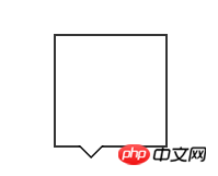
#demo {
            margin: 100px;;
            width: 100px;
            height: 100px;
            background-color: #fff;
            position: relative;
            border: 2px solid #333;
        }
        #demo:after, #demo:before {
            border: solid transparent;
            content: ' ';
            height: 0;
            top: 100%;
            position: absolute;
            width: 0;
        }
        #demo:after {
            border-width: 10px;
            border-top-color: #fff;
            left: 20px;
        }
        #demo:before {
            border-width: 12px;
            border-top-color: #000;
            left: 18px;
}h5 implements multiple image preview uploads and clickable drag controls
Detailed explanation of the use of CSS3 mixed mode
The above is the detailed content of before :after how to output a small triangle. For more information, please follow other related articles on the PHP Chinese website!

Hot AI Tools

Undresser.AI Undress
AI-powered app for creating realistic nude photos

AI Clothes Remover
Online AI tool for removing clothes from photos.

Undress AI Tool
Undress images for free

Clothoff.io
AI clothes remover

Video Face Swap
Swap faces in any video effortlessly with our completely free AI face swap tool!

Hot Article

Hot Tools

Notepad++7.3.1
Easy-to-use and free code editor

SublimeText3 Chinese version
Chinese version, very easy to use

Zend Studio 13.0.1
Powerful PHP integrated development environment

Dreamweaver CS6
Visual web development tools

SublimeText3 Mac version
God-level code editing software (SublimeText3)

Hot Topics
 1386
1386
 52
52
 How to run the h5 project
Apr 06, 2025 pm 12:21 PM
Running the H5 project requires the following steps: installing necessary tools such as web server, Node.js, development tools, etc. Build a development environment, create project folders, initialize projects, and write code. Start the development server and run the command using the command line. Preview the project in your browser and enter the development server URL. Publish projects, optimize code, deploy projects, and set up web server configuration.
 What exactly does H5 page production mean?
Apr 06, 2025 am 07:18 AM
H5 page production refers to the creation of cross-platform compatible web pages using technologies such as HTML5, CSS3 and JavaScript. Its core lies in the browser's parsing code, rendering structure, style and interactive functions. Common technologies include animation effects, responsive design, and data interaction. To avoid errors, developers should be debugged; performance optimization and best practices include image format optimization, request reduction and code specifications, etc. to improve loading speed and code quality.
 How to make h5 click icon
Apr 06, 2025 pm 12:15 PM
The steps to create an H5 click icon include: preparing a square source image in the image editing software. Add interactivity in the H5 editor and set the click event. Create a hotspot that covers the entire icon. Set the action of click events, such as jumping to the page or triggering animation. Export H5 documents as HTML, CSS, and JavaScript files. Deploy the exported files to a website or other platform.
 What is the H5 programming language?
Apr 03, 2025 am 12:16 AM
H5 is not a standalone programming language, but a collection of HTML5, CSS3 and JavaScript for building modern web applications. 1. HTML5 defines the web page structure and content, and provides new tags and APIs. 2. CSS3 controls style and layout, and introduces new features such as animation. 3. JavaScript implements dynamic interaction and enhances functions through DOM operations and asynchronous requests.
 What application scenarios are suitable for H5 page production
Apr 05, 2025 pm 11:36 PM
H5 (HTML5) is suitable for lightweight applications, such as marketing campaign pages, product display pages and corporate promotion micro-websites. Its advantages lie in cross-platformity and rich interactivity, but its limitations lie in complex interactions and animations, local resource access and offline capabilities.
 How to make pop-up windows with h5
Apr 06, 2025 pm 12:12 PM
H5 pop-up window creation steps: 1. Determine the triggering method (click, time, exit, scroll); 2. Design content (title, text, action button); 3. Set style (size, color, font, background); 4. Implement code (HTML, CSS, JavaScript); 5. Test and deployment.
 What Does H5 Refer To? Exploring the Context
Apr 12, 2025 am 12:03 AM
H5referstoHTML5,apivotaltechnologyinwebdevelopment.1)HTML5introducesnewelementsandAPIsforrich,dynamicwebapplications.2)Itsupportsmultimediawithoutplugins,enhancinguserexperienceacrossdevices.3)SemanticelementsimprovecontentstructureandSEO.4)H5'srespo
 Is H5 page production a front-end development?
Apr 05, 2025 pm 11:42 PM
Yes, H5 page production is an important implementation method for front-end development, involving core technologies such as HTML, CSS and JavaScript. Developers build dynamic and powerful H5 pages by cleverly combining these technologies, such as using the <canvas> tag to draw graphics or using JavaScript to control interaction behavior.


