

How to make a thin line less than one pixel in css3
This time I will show you how to make a thin line less than one pixel in css3. What are the things to pay attention to in css3?. Here is a practical case. Let’s take a look. .
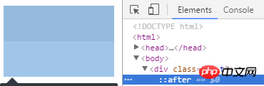
CSS3 in Webapp implements 0.5px thin lineIt feels like I haven’t written a blog for a long time. My life has been relatively stable recently, so I have to start writing again. One is to make some records, because I am afraid that one day I will forget it, look back at the blog, and pick it up again. Memory, that's it. I have seen e-commerce mobile websites such as Taobao, JD.com, Yixun, Yihaodian, etc. The common features of these large e-commerce sites are exquisite workmanship and good user experience. Among them, in terms of layout , a 0.5px line looks much more refined than a 1px line.Method 1: Use gradients to do
html code:<p></p>
.bd-t{
position:relative;
}
.bd-t::after {
content: " ";
position: absolute;
left: 0;
top: 0;
width: 100%;
height: 1px;
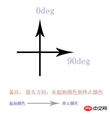
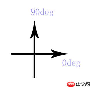
background-image: linear-gradient(0deg, transparent 50%, #e0e0e0 50%);
}-webkit-linear-gradient -ms-linear-gradient -o-linear-gradient
0deg, transparent 50%, #e0e0e0 50% and use the latest version of chrome to test.
border-top: 0.5px solid #e0e0e0;, use after as a hook, width 100%, height 1px, The background gradient, half transparent and half colored, is ok. In the same way, the thin lines on the bottom, left and right are all the same. Of course, if you need to use it in combination, nesting between boxes is also possible, or you have your own ideas (of course there are many ways to do it!)...
Method 2: Use zoom
html code:<p></p>
.bd-t{
position:relative;
}
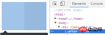
.bd-t:after{
content: " ";
position: absolute;
left: 0;
top: 0;
width: 100%;
height: 1px;
background-color: #e0e0e0;
/* 如果不用 background-color, 使用 border-top:1px solid #e0e0e0; */
-webkit-transform: scaleY(.5);
transform:scaleY(.5);
}If you feel that the effect is not very good, here is a fallback or workaround, whatsoever: It is the method commented out above: you can try using
border-top:1px solid #e0e0e0; instead of background- This is how JD.com does color (if it has not been revised): http://m.jd.com/
Expansion of method two: If you want to achieve 0.5px lines all around Words:
html code:<p class='bd-all'></p>
  .bd-all{
      position:relative;
  }
 .bd-all:after{
      content: "  ";
      position: absolute;
      left: 0;
      top: 0;
      z-index:-1;
      width: 200%;
      height:200%;
      border:1px solid #e0e0e0;
      -webkit-transform-origin: 0 0;
      transform-origin: 0 0;
      -webkit-transform: scale(.5, .5);
      transform: scale(.5, .5);
}z-index can be adjusted according to different needs. If possible, it is okay not to use it.
Method 3: Using background-image and css3 nine-square grid cutting
京东之前是这么做的,现在已经不被使用了。具体做法,请看下面demo结构:
├─demo/ ························ demo 目录
        └─┬─ test.html  ··············· test.html 文件
        └─── pic.png ·················· png 图片文件
在test.html 中 有如下关键代码:
html 结构:
<p class="bd-t"></p>
css 结构:
.bd-t{
   position: relative;
}
.bd-t::after {
content: " ";
position: absolute;
left: 0;
top: 0;
width: 100%;
border-top: 1px solid transparent;
/* 下面用 stretch 和 round 都可以 */
border-image: url('pic.png') 2 1 1 1 stretch;
-webkit-border-image: url('pic.png') 2 1 1 1 stretch;
}而 pic.png 的九宫格切法,如下图:
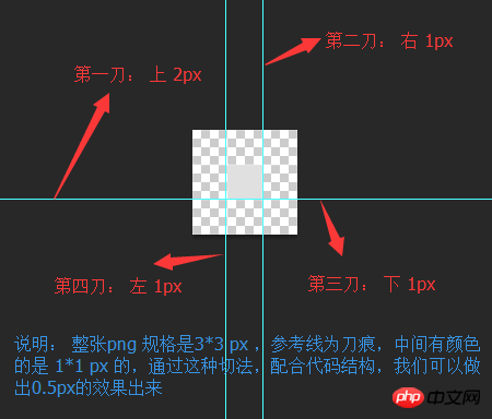
具体有关 border-image 的用法,网上有很多:
w3c 上的这个讲的不是很具体:http://www.jb51.net/w3school/cssref/pr_border-image.htm
在 MDN 上 有明确的介绍,并且有很多配图,包括兼容性等等:https://developer.mozilla.org/en-US/docs/Web/CSS/border-image
但是不推荐这种写法,毕竟图片质量比较大,能用代码解决的,不用图片。在这里border-width 是 1px , 但是 背景是有2px的距离,所以在1px的border-top上,显示出有颜色的高度就是0.5px, 同理,底边,左边和右边的0.5px,也都很容易实现。 这个就是css3的魅力体现(这个现在兼容性也不是很好,在一些较低端的安卓浏览器和一些版本的safari 支持的也不是很好)。
方式四 (推荐): weui的实现方式 :
这是一款微信团队开发的UI 组件 详情见: weui , 它的使用方式是这样的:
.weui-cell:before{
   content: " ";
   position: absolute;
   left: 0;
   top: 0;
   right: 0;
   height: 1px;
   border-top: 1px solid #D9D9D9;
   color: #D9D9D9;
   -webkit-transform-origin: 0 0;
   transform-origin: 0 0;
   -webkit-transform: scaleY(0.5);
   transform: scaleY(0.5);
}方式五: 使用同周边相似的浅色,利用视觉效果,让用户产生错觉
这个就考验设计师的功力了 :)
其他说明:不是很推荐使用渐变来做 , 在移动设备上可以看到,但在一些浏览器上看不到,不便于调试。
相信看了本文案例你已经掌握了方法,更多精彩请关注php中文网其它相关文章!
推荐阅读:
The above is the detailed content of How to make a thin line less than one pixel in css3. For more information, please follow other related articles on the PHP Chinese website!

Hot AI Tools

Undresser.AI Undress
AI-powered app for creating realistic nude photos

AI Clothes Remover
Online AI tool for removing clothes from photos.

Undress AI Tool
Undress images for free

Clothoff.io
AI clothes remover

AI Hentai Generator
Generate AI Hentai for free.

Hot Article
Hot Tools

Notepad++7.3.1
Easy-to-use and free code editor

SublimeText3 Chinese version
Chinese version, very easy to use

Zend Studio 13.0.1
Powerful PHP integrated development environment

Dreamweaver CS6
Visual web development tools

SublimeText3 Mac version
God-level code editing software (SublimeText3)
Hot Topics
 1371
1371
 52
52

 How to use bootstrap button
Apr 07, 2025 pm 03:09 PM
How to use bootstrap button
Apr 07, 2025 pm 03:09 PM
How to use the Bootstrap button? Introduce Bootstrap CSS to create button elements and add Bootstrap button class to add button text
 How to resize bootstrap
Apr 07, 2025 pm 03:18 PM
How to resize bootstrap
Apr 07, 2025 pm 03:18 PM
To adjust the size of elements in Bootstrap, you can use the dimension class, which includes: adjusting width: .col-, .w-, .mw-adjust height: .h-, .min-h-, .max-h-
 How to insert pictures on bootstrap
Apr 07, 2025 pm 03:30 PM
How to insert pictures on bootstrap
Apr 07, 2025 pm 03:30 PM
There are several ways to insert images in Bootstrap: insert images directly, using the HTML img tag. With the Bootstrap image component, you can provide responsive images and more styles. Set the image size, use the img-fluid class to make the image adaptable. Set the border, using the img-bordered class. Set the rounded corners and use the img-rounded class. Set the shadow, use the shadow class. Resize and position the image, using CSS style. Using the background image, use the background-image CSS property.
 How to upload files on bootstrap
Apr 07, 2025 pm 01:09 PM
How to upload files on bootstrap
Apr 07, 2025 pm 01:09 PM
The file upload function can be implemented through Bootstrap. The steps are as follows: introduce Bootstrap CSS and JavaScript files; create file input fields; create file upload buttons; handle file uploads (using FormData to collect data and then send to the server); custom style (optional).
 How to remove the default style in Bootstrap list?
Apr 07, 2025 am 10:18 AM
How to remove the default style in Bootstrap list?
Apr 07, 2025 am 10:18 AM
The default style of the Bootstrap list can be removed with CSS override. Use more specific CSS rules and selectors, follow the "proximity principle" and "weight principle", overriding the Bootstrap default style. To avoid style conflicts, more targeted selectors can be used. If the override is unsuccessful, adjust the weight of the custom CSS. At the same time, pay attention to performance optimization, avoid overuse of !important, and write concise and efficient CSS code.
 How to change the size of a Bootstrap list?
Apr 07, 2025 am 10:45 AM
How to change the size of a Bootstrap list?
Apr 07, 2025 am 10:45 AM
The size of a Bootstrap list depends on the size of the container that contains the list, not the list itself. Using Bootstrap's grid system or Flexbox can control the size of the container, thereby indirectly resizing the list items.
 How to verify bootstrap date
Apr 07, 2025 pm 03:06 PM
How to verify bootstrap date
Apr 07, 2025 pm 03:06 PM
To verify dates in Bootstrap, follow these steps: Introduce the required scripts and styles; initialize the date selector component; set the data-bv-date attribute to enable verification; configure verification rules (such as date formats, error messages, etc.); integrate the Bootstrap verification framework and automatically verify date input when form is submitted.
 How to layout bootstrap
Apr 07, 2025 pm 02:24 PM
How to layout bootstrap
Apr 07, 2025 pm 02:24 PM
To use Bootstrap to layout a website, you need to use a grid system to divide the page into containers, rows, and columns. First add the container, then add the rows in it, add the columns within the row, and finally add the content in the column. Bootstrap's responsive layout function automatically adjusts the layout according to breakpoints (xs, sm, md, lg, xl). Different layouts under different screen sizes can be achieved by using responsive classes.
