

How to use css3 to achieve shock wave effect
This time I will bring you css3 to achieve the shock wave effect. What are the precautions to achieve the shock wave effect with css3? The following is a practical case, let’s take a look.
Recently, the following shock wave effect will appear when clicking many browser buttons. Out of curiosity, I studied and implemented this effect by referring to the information on the Internet.Implementation ideas:
Observe that the wave changes from small to large. The css3 attribute changes involved include width, height, left, top, and opacity. First, implement the shock wave through pseudo-classes layer. At the same time, you need to set the center point position before and after the shock wave (a little mathematical knowledge is involved here: draw a picture to calculate the position of the two points). Finally, set the transition-duration: 0 to achieve instantaneous changes. PS learned that you can use a:active to simulate the mouse. The effect of clicking Simply draw the picture below (very easy):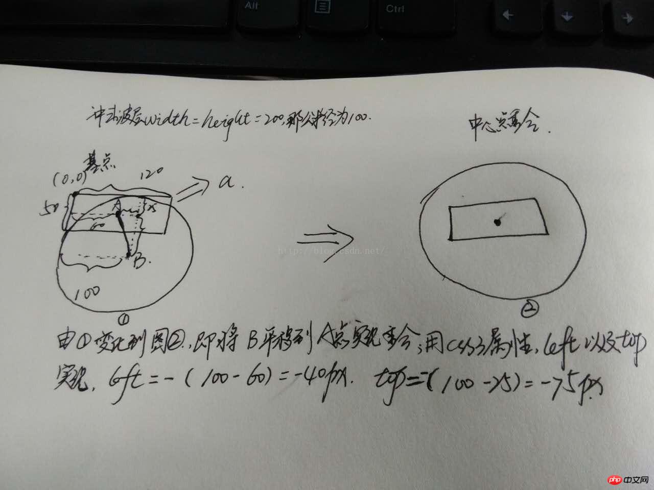
  <html>
  <head>
  <meta charset="UTF-8">
  <title>实现冲击波--数学知识很重要</title>
  <style>
  *{
  margin:0;
  padding:0;
  box-sizing:border-box;
  }
  html,body{
  font-family:"微软雅黑";
  }
  .wave{
  position:relative;
  float:left;
  width:50%;
  height:420px;
  }
  .wave a{
  position:absolute;
  top:50%;
  left:50%;
  transform:translate(-50%,-50%);
  display:inline-block;
  width:120px;
  height:50px;
  /*margin-left:-60px;
  margin-top:-25px;*/
  line-height:50px;
  text-align:center;
  border-radius:5px;
  color:#fff;
  font-size:16px;
  cursor:pointer;
  /*overflow:hidden;*/

  }
  #wave1{
  background-color:#00BFFF;
  }
  #wave2{
  background-color:#009955;
  }
  #wave1 a{
  background-color:burlywood;
  }
  #wave2 a{/*宽度不确定长度*/
  width:50%;
  height:50px;
  background-color:cadetblue;
  }
  .wave a:after{
  /*画图
 ,假设left:0;top:0然后画出两个中心点的水平和垂直距离*/
  content: "";
  display: block;
  position: absolute;
  left: -40px;
  top: -75px;
  width: 200px;
  height: 200px;
  background: rgba(255,255,255,0.8);
  border-radius: 50%;
  opacity:0;
  transition: all 1s;
  }
  .wave a:active:after{
  /*位于中间即是a的中点*/
  width: 0;
  height: 0;
  left:60px;
  top: 25px;
  opacity: 1;
  transition-duration: 0s;
  }

  #wave2 a:after{
  left:50%;
  top:50%;
  transform:translate(-50%,-50%);
  }
  #wave2 a:active:after{
  left:50%;
  top:50%;
  transform:translate(-50%,-50%);
  }
  </style>
  </head>
  <body>
  <!--实现冲击波按钮确定长度-->
  <p class="wave" id="wave1">
  <a>点我</a>
  </p>
  <!--实现冲击波按钮不确定长度时-->
  <p class="wave" id="wave2">
  <a>点我哈哈</a>
  </p>
  </body>
  </html>
How to use CSS to set and record user passwords
Configuring H5 scroll bar style
The above is the detailed content of How to use css3 to achieve shock wave effect. For more information, please follow other related articles on the PHP Chinese website!

Hot AI Tools

Undresser.AI Undress
AI-powered app for creating realistic nude photos

AI Clothes Remover
Online AI tool for removing clothes from photos.

Undress AI Tool
Undress images for free

Clothoff.io
AI clothes remover

AI Hentai Generator
Generate AI Hentai for free.

Hot Article
Hot Tools

Notepad++7.3.1
Easy-to-use and free code editor

SublimeText3 Chinese version
Chinese version, very easy to use

Zend Studio 13.0.1
Powerful PHP integrated development environment

Dreamweaver CS6
Visual web development tools

SublimeText3 Mac version
God-level code editing software (SublimeText3)
Hot Topics
 1386
1386
 52
52

 How to achieve wave effect with pure CSS3? (code example)
Jun 28, 2022 pm 01:39 PM
How to achieve wave effect with pure CSS3? (code example)
Jun 28, 2022 pm 01:39 PM
How to achieve wave effect with pure CSS3? This article will introduce to you how to use SVG and CSS animation to create wave effects. I hope it will be helpful to you!
 Use CSS skillfully to realize various strange-shaped buttons (with code)
Jul 19, 2022 am 11:28 AM
Use CSS skillfully to realize various strange-shaped buttons (with code)
Jul 19, 2022 am 11:28 AM
This article will show you how to use CSS to easily realize various weird-shaped buttons that appear frequently. I hope it will be helpful to you!
 How to hide elements in css without taking up space
Jun 01, 2022 pm 07:15 PM
How to hide elements in css without taking up space
Jun 01, 2022 pm 07:15 PM
Two methods: 1. Using the display attribute, just add the "display:none;" style to the element. 2. Use the position and top attributes to set the absolute positioning of the element to hide the element. Just add the "position:absolute;top:-9999px;" style to the element.
 How to implement lace borders in css3
Sep 16, 2022 pm 07:11 PM
How to implement lace borders in css3
Sep 16, 2022 pm 07:11 PM
In CSS, you can use the border-image attribute to achieve a lace border. The border-image attribute can use images to create borders, that is, add a background image to the border. You only need to specify the background image as a lace style; the syntax "border-image: url (image path) offsets the image border width inward. Whether outset is repeated;".
 It turns out that text carousel and image carousel can also be realized using pure CSS!
Jun 10, 2022 pm 01:00 PM
It turns out that text carousel and image carousel can also be realized using pure CSS!
Jun 10, 2022 pm 01:00 PM
How to create text carousel and image carousel? The first thing everyone thinks of is whether to use js. In fact, text carousel and image carousel can also be realized using pure CSS. Let’s take a look at the implementation method. I hope it will be helpful to everyone!
 How to enlarge the image by clicking the mouse in css3
Apr 25, 2022 pm 04:52 PM
How to enlarge the image by clicking the mouse in css3
Apr 25, 2022 pm 04:52 PM
Implementation method: 1. Use the ":active" selector to select the state of the mouse click on the picture; 2. Use the transform attribute and scale() function to achieve the picture magnification effect, the syntax "img:active {transform: scale(x-axis magnification, y Axis magnification);}".
 How to set animation rotation speed in css3
Apr 28, 2022 pm 04:32 PM
How to set animation rotation speed in css3
Apr 28, 2022 pm 04:32 PM
In CSS3, you can use the "animation-timing-function" attribute to set the animation rotation speed. This attribute is used to specify how the animation will complete a cycle and set the speed curve of the animation. The syntax is "element {animation-timing-function: speed attribute value;}".
 Does css3 animation effect have deformation?
Apr 28, 2022 pm 02:20 PM
Does css3 animation effect have deformation?
Apr 28, 2022 pm 02:20 PM
The animation effect in css3 has deformation; you can use "animation: animation attribute @keyframes ..{..{transform: transformation attribute}}" to achieve deformation animation effect. The animation attribute is used to set the animation style, and the transform attribute is used to set the deformation style. .
