

Detailed explanation of transform function in CSS3
This time I will bring you a detailed explanation of the transform function in CSS3. What are the precautions of the transform function in CSS3. The following is a practical case, let's take a look.
Deformation function in CSS3: In CSS3, you can use the transform function to realize four types of deformation functions: rotation, scaling, tilting, and movement of text or images.
1. How to use the transform function:
(1) Implement the transform function through the transform attribute in CSS3:
(2) Transform function Usage:
transform:function;
-ms-transform:function;/*IE9*/
-moz-transform:function;/*Firefox*/
-webkit-transform:function; /*Safari and chrome*/
-o-transform: function;/*Opera*/
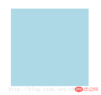
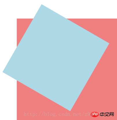
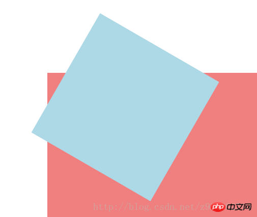
2. rotate, specify the angle in the parameter (rotate means clockwise rotation, deg is the angle unit in CSS3):
(1) How to use:
-ms-transform:rotate(angle);/*IE9*/
-moz-transform: rotate(angle);/*Firefox*/
-webkit-transform:rotate(angle);/*Safari and chrome*/
-o-transform:rotate(angle);/*Opera*/
(2) Rotate application:
1) HTML code:
<p></p>
2) CSS code:
p{
    width: 300px;
    height: 300px;
    background-color: lightblue;
    -ms-transform:rotate(45deg);/*IE9*/
    -moz-transform:rotate(45deg);/*Firefox*/
    -webkit-transform:rotate(45deg);/*Safari和chrome*/
    -o-transform:rotate(45deg);/*Opera*/
}3) The rendering is as follows:

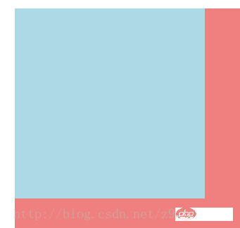
3. Scale scaling conversion:
(1) Usage method: transform:scale(value), its value is specified Zoom ratio, for example, 0.5 means zooming by 50%, 1 means zooming by 100%, and 1.5 means zooming by 150%;
-ms-transform:scale(value);/*IE9*/
-moz-transform :scale(value);/*Firefox*/
-webkit-transform:scale(value);/*Safari and chrome*/
-o-transform:scale(value);/*Opera*/
(2) Possible values:
1) scale(x,y) causes the element to scale on both the X and Y axes at the same time;
2) scale(x) causes the element to scale only on the X axis Scaling;
3) scale(y) makes the element scale only on the Y axis;
(3) Application of scale scaling transformation:
1) HTML code:
<p></p>
2) CSS code:
p{
    width: 300px;
    height: 300px;
    background-color: lightblue;
    /*缩放值X与Y为正整数时*/
    -ms-transform:scale(2,2);/*IE9*/
    -moz-transform:scale(2,2);/*Firefox*/
    -webkit-transform:scale(2,2);/*Safari和chrome*/
    -o-transform:scale(2,2);/*Opera*/

    /*缩放值X与Y均为小于1的浮点数时*/
    /*-ms-transform:scale(0.5,0.5);*//*IE9*/
    /*-moz-transform:scale(0.5,0.5);*//*Firefox*/
    /*-webkit-transform:scale(0.5,0.5);*//*Safari和chrome*/
    /*-o-transform:scale(0.5,0.5);*//*Opera*/

    /*缩放值仅X为小于1的浮点数时*/
    /*-ms-transform:scaleX(0.5);*//*IE9*/
    /*-moz-transform:scaleX(0.5);*//*Firefox*/
    /*-webkit-transform:scaleX(0.5);*//*Safari和chrome*/
    /*-o-transform:scaleX(0.5);*//*Opera*/

    /*缩放值仅Y为小于1的浮点数时*/
    /*-ms-transform:scaleY(0.5);*//*IE9*/
    /*-moz-transform:scaleY(0.5);*//*Firefox*/
    /*-webkit-transform:scaleY(0.5);*//*Safari和chrome*/
    /*-o-transform:scaleY(0.5);*//*Opera*/
}3) The rendering is as follows:
①The rendering without scaling:
②Zoom The rendering when the values X and Y are positive integers:
③ The rendering when the scaling values X and Y are both floating point numbers less than 1:
④The rendering when the scaling value is only when X is a floating point number less than 1:

⑤The scaling value is only when Y is less than 1 Rendering of floating point numbers:

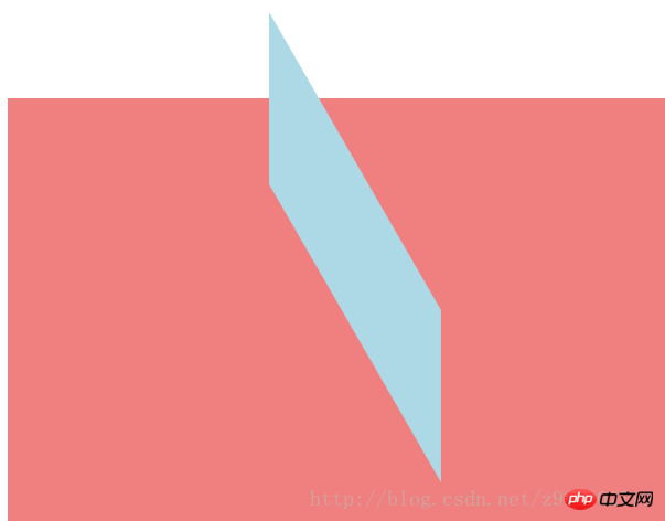
4. Skew:
(1) Usage:
transform:skew(angle); Its value is the angle;
-ms-transform:skew(angle);/*IE9*/
-moz-transform:skew(angle);/*Firefox*/
-webkit-transform:skew(angle);/*Safari and chrome*/
-o-transform:skew(angle);/*Opera*/
(2) Possible values :
1) skew(x,y) causes the element to twist in the horizontal and vertical directions at the same time (the X-axis and the Y-axis are twisted and deformed according to a certain angle value at the same time). When there is only one parameter, it is only horizontal Slant in the direction;
2) skewX(x) only causes the element to distort in the horizontal direction (X-axis distortion)
3) skewY(y) only causes the element to distort in the vertical direction (Y-axis distortion) Deformation)
(3) Application of skew:
1) HTML code:
<p></p>
2) CSS code:
p{
    width: 300px;
    height: 300px;
    background-color: lightblue;

    /*X轴与Y轴均倾斜*/
    -ms-transform:skew(30deg,30deg);
    -moz-transform:skew(30deg,30deg);
    -webkit-transform:skew(30deg,30deg);
    -o-transform:skew(30deg,30deg);

    /*设置一个值相当于仅X轴倾斜*/
    /*-ms-transform:skew(30deg);*//*IE9*/
    /*-moz-transform:skew(30deg);*//*Firefox*/
    /*-webkit-transform:skew(30deg);*//*Safari和chrome*/
    /*-o-transform:skew(30deg);*//*Opera*/

    /*仅X轴倾斜*/
    /*-ms-transform:skewX(30deg);*//*IE9*/
    /*-moz-transform:skewX(30deg);*//*Firefox*/
    /*-webkit-transform:skewX(30deg);*//*Safari和chrome*/
    /*-o-transform:skewX(30deg);*//*Opera*/

    /*仅Y轴倾斜*/
    /*-ms-transform:skewY(30deg);*//*IE9*/
    /*-moz-transform:skewY(30deg);*//*Firefox*/
    /*-webkit-transform:skewY(30deg);*//*Safari和chrome*/
    /*-o-transform:skewY(30deg);*//*Opera*/
}3) Rendering As follows:
① Untilted rendering:

② Rendering with both X-axis and Y-axis tilted:
③设置一个值相当于仅X轴倾斜的效果图:

④仅X轴倾斜的效果图:

⑤仅Y轴倾斜的效果图:

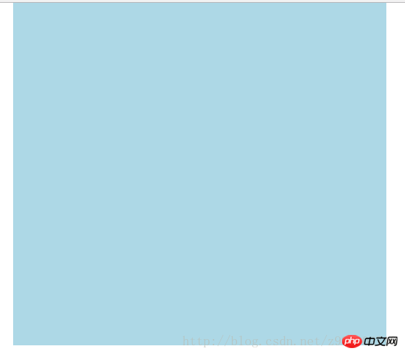
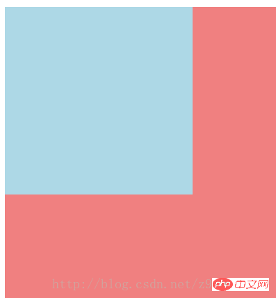
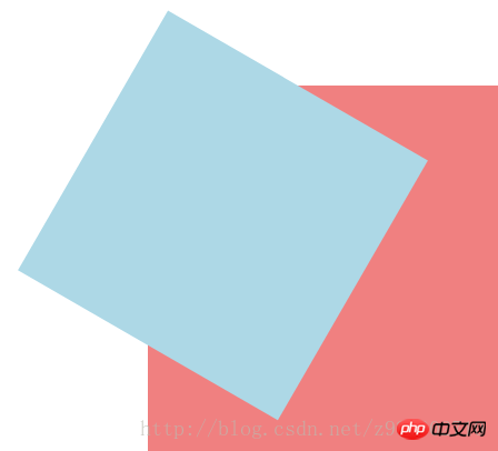
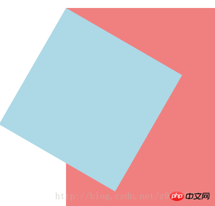
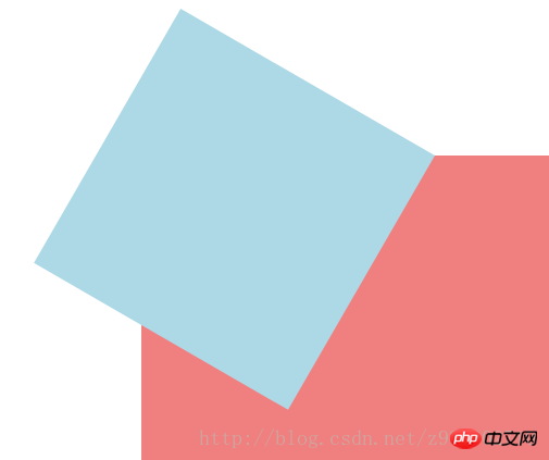
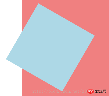
5、移动translate:
(1)使用方法:
transform:translate(值);它的值是指定移动的距离;
-ms-transform:translate(值);/*IE9*/
-moz-transform:translate(值);/*Firefox*/
-webkit-transform:translate(值);/*Safari和chrome*/
-o-transform:translate(值);/*Opera*/
(2)可能的值:
1)translate(x,y)水平方向与垂直方向同时移动(也就是X轴和Y轴同时移动)只有一个参数的时候,只在水平方向上移动;
2)translateX(x)仅水平方向(X轴移动)
3)translateY(y)仅垂直方向(Y轴移动)
(3)移动translate的应用:
1)HTML代码:
<p class="main">
    <p class="p"></p>
</p>
2)CSS代码:
.main{
    width: 100%;
    height: 500px;
    background-color: lightcoral;
}
.p{
    width: 300px;
    height: 300px;
    background-color: lightblue;

    /*在X轴与Y轴上均移动*/
    -ms-transform:translate(50px,50px);/*IE9*/
    -moz-transform:translate(50px,50px);/*Firefox*/
    -webkit-transform:translate(50px,50px);/*Safari和chrome*/
    -o-transform:translate(50px,50px);/*Opera*/

    /*设置一个值相当于仅在X轴上移动*/
    /*-ms-transform:translate(50px);*//*IE9*/
    /*-moz-transform:translate(50px);*//*Firefox*/
    /*-webkit-transform:translate(50px);*//*Safari和chrome*/
    /*-o-transform:translate(50px);*//*Opera*/

    /*仅在X轴上移动*/
    /*-ms-transform:translateX(50px);*//*IE9*/
    /*-moz-transform:translateX(50px);*//*Firefox*/
    /*-webkit-transform:translateX(50px);*//*Safari和chrome*/
    /*-o-transform:translateX(50px);*//*Opera*/

    /*仅在Y轴上移动*/
    /*-ms-transform:translateY(50px);*//*IE9*/
    /*-moz-transform:translateY(50px);*//*Firefox*/
    /*-webkit-transform:translateY(50px);*//*Safari和chrome*/
    /*-o-transform:translateY(50px);*//*Opera*/
}3)效果图如下:
①未移动的效果图:
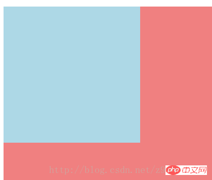
②在X轴与Y轴上均移动时的效果图:
③设置一个值相当于仅在X轴上移动时的效果图:
④仅在X轴上移动时的效果图:
⑤仅在Y轴上移动时的效果图:

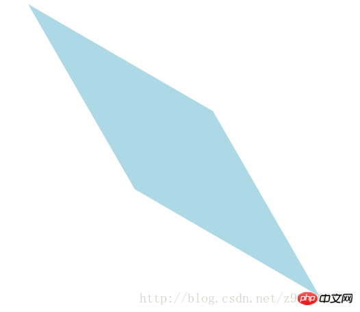
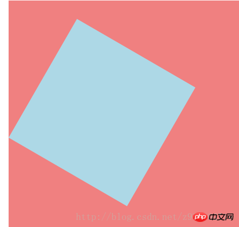
6、对一个元素使用多种变形方法:(同样的方法只能使用一次)
(1)使用方法:
transform:方法1 方法2 方法3 方法4;
-ms-transform:方法1 方法2 方法3 方法4;/*IE9*/
-moz-transform:方法1 方法2 方法3 方法4;/*Firefox*/
-webkit-transform:方法1 方法2 方法3 方法4;/*Safari和chrome*/
-o-transform:方法1 方法2 方法3 方法4;/*Opera*/
(2)对一个元素使用多种变形方法的应用:
1)HTML代码:
<p class="main">
    <p class="p"></p>
</p>
2)CSS代码:
.main{
    width: 100%;
    height: 500px;
    background-color: lightcoral;
}
.p{
    width: 300px;
    height: 300px;
    background-color: lightblue;
    -ms-transform:translateX(200px) rotate(30deg) skew(30deg,30deg) scaleY(0.5);/*IE9*/
    -moz-transform:translateX(200px) rotate(30deg) skew(30deg,30deg) scaleY(0.5);/*Firefox*/
    -webkit-transform:translateX(200px) rotate(30deg) skew(30deg,30deg) scaleY(0.5);/*Safari和chrome*/
    -o-transform:translateX(200px) rotate(30deg) skew(30deg,30deg) scaleY(0.5);/*Opera*/
}3)效果图如下:
①未添加方法时的效果图:
②添加了多种方法时的效果图:
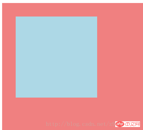
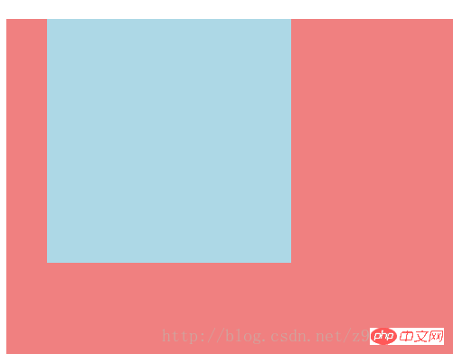
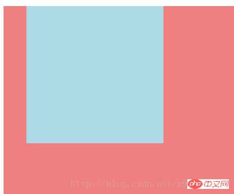
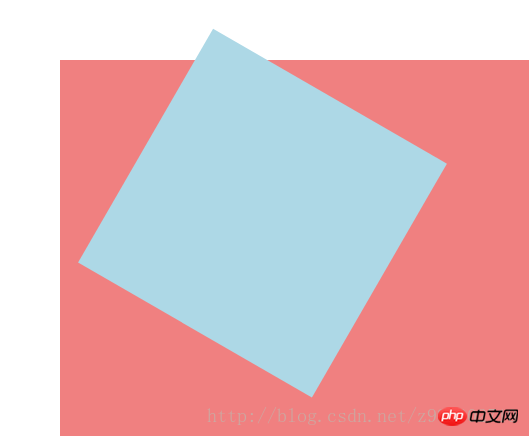
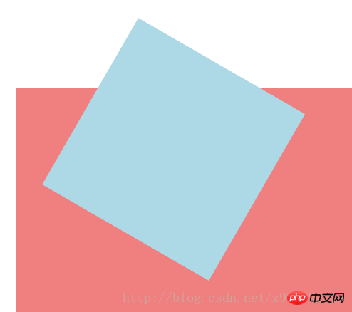
7、改变元素基点transform-origin:
(1)可能的值:
| top left | top | right top |
| left | center | right |
| bottom left | bottom | bottom right |
(2)默认情况下transform属性变化的基点是center,但是可以通过transform-origin改变transform属性变化的基点;
(3)改变元素基点transform-origin的应用:
1)HTML代码:
<p class="main">
    <p class="p"></p>
</p>
2)CSS代码:
.main{
    width: 100%;
    height: 500px;
    background-color: lightcoral;
    margin-left: 140px;
    margin-top: 180px;
}
.p{
    width: 300px;
    height: 300px;
    background-color: lightblue;
    -ms-transform:rotate(30deg);/*IE9*/
    -moz-transform:rotate(30deg);/*Firefox*/
    -webkit-transform:rotate(30deg);/*Safari和chrome*/
    -o-transform:rotate(30deg);/*Opera*/

    transform-origin: center;
    /*transform-origin: top;*/
    /*transform-origin: top left;*/
    /*transform-origin: right top;*/
    /*transform-origin: left;*/
    /*transform-origin: right;*/
    /*transform-origin: bottom left;*/
    /*transform-origin: bottom;*/
    /*transform-origin: bottom right;*/
}3)效果图如下:
①未添加变形功能的效果图:
②添加旋转功能的效果图:
③以center为基点旋转的效果图:
④以top为基点旋转的效果图:
⑤以top left为基点旋转的效果图:
⑥以right top为基点旋转的效果图:
⑦以left为基点旋转的效果图:
⑧以right为基点旋转的效果图:
⑨以bottom left为基点旋转的效果图:
⑩以bottom为基点旋转的效果图:
⑪以bottom right为基点旋转的效果图:
相信看了本文案例你已经掌握了方法,更多精彩请关注php中文网其它相关文章!
推荐阅读:
The above is the detailed content of Detailed explanation of transform function in CSS3. For more information, please follow other related articles on the PHP Chinese website!

Hot AI Tools

Undresser.AI Undress
AI-powered app for creating realistic nude photos

AI Clothes Remover
Online AI tool for removing clothes from photos.

Undress AI Tool
Undress images for free

Clothoff.io
AI clothes remover

AI Hentai Generator
Generate AI Hentai for free.

Hot Article
Hot Tools

Notepad++7.3.1
Easy-to-use and free code editor

SublimeText3 Chinese version
Chinese version, very easy to use

Zend Studio 13.0.1
Powerful PHP integrated development environment

Dreamweaver CS6
Visual web development tools

SublimeText3 Mac version
God-level code editing software (SublimeText3)
Hot Topics
 1386
1386
 52
52

 How to achieve wave effect with pure CSS3? (code example)
Jun 28, 2022 pm 01:39 PM
How to achieve wave effect with pure CSS3? (code example)
Jun 28, 2022 pm 01:39 PM
How to achieve wave effect with pure CSS3? This article will introduce to you how to use SVG and CSS animation to create wave effects. I hope it will be helpful to you!
 How to use CSS to achieve the rotating background animation effect of elements
Nov 21, 2023 am 09:05 AM
How to use CSS to achieve the rotating background animation effect of elements
Nov 21, 2023 am 09:05 AM
How to use CSS to implement rotating background image animation effects of elements. Background image animation effects can increase the visual appeal and user experience of web pages. This article will introduce how to use CSS to achieve the rotating background animation effect of elements, and provide specific code examples. First, we need to prepare a background image, which can be any picture you like, such as a picture of the sun or an electric fan. Save the image and name it "bg.png". Next, create an HTML file and add a div element in the file, setting it to
 Use CSS skillfully to realize various strange-shaped buttons (with code)
Jul 19, 2022 am 11:28 AM
Use CSS skillfully to realize various strange-shaped buttons (with code)
Jul 19, 2022 am 11:28 AM
This article will show you how to use CSS to easily realize various weird-shaped buttons that appear frequently. I hope it will be helpful to you!
 How to hide elements in css without taking up space
Jun 01, 2022 pm 07:15 PM
How to hide elements in css without taking up space
Jun 01, 2022 pm 07:15 PM
Two methods: 1. Using the display attribute, just add the "display:none;" style to the element. 2. Use the position and top attributes to set the absolute positioning of the element to hide the element. Just add the "position:absolute;top:-9999px;" style to the element.
 How to implement lace borders in css3
Sep 16, 2022 pm 07:11 PM
How to implement lace borders in css3
Sep 16, 2022 pm 07:11 PM
In CSS, you can use the border-image attribute to achieve a lace border. The border-image attribute can use images to create borders, that is, add a background image to the border. You only need to specify the background image as a lace style; the syntax "border-image: url (image path) offsets the image border width inward. Whether outset is repeated;".
 It turns out that text carousel and image carousel can also be realized using pure CSS!
Jun 10, 2022 pm 01:00 PM
It turns out that text carousel and image carousel can also be realized using pure CSS!
Jun 10, 2022 pm 01:00 PM
How to create text carousel and image carousel? The first thing everyone thinks of is whether to use js. In fact, text carousel and image carousel can also be realized using pure CSS. Let’s take a look at the implementation method. I hope it will be helpful to everyone!
 How to enlarge the image by clicking the mouse in css3
Apr 25, 2022 pm 04:52 PM
How to enlarge the image by clicking the mouse in css3
Apr 25, 2022 pm 04:52 PM
Implementation method: 1. Use the ":active" selector to select the state of the mouse click on the picture; 2. Use the transform attribute and scale() function to achieve the picture magnification effect, the syntax "img:active {transform: scale(x-axis magnification, y Axis magnification);}".
 How to compress and format images in Vue?
Aug 25, 2023 pm 11:06 PM
How to compress and format images in Vue?
Aug 25, 2023 pm 11:06 PM
How to compress and format images in Vue? In front-end development, we often encounter the need to compress and format images. Especially in mobile development, in order to improve page loading speed and save user traffic, it is critical to compress and format images. In the Vue framework, we can use some tool libraries to compress and format images. Compression using the compressor.js library compressor.js is a JavaS for compressing images
