

Detailed explanation of CSS three-column layout
This time I will bring you a detailed explanation of the CSS three-column layout. What are the precautions of the CSS three-column layout? Here are practical cases, let’s take a look.
This article introduces the classic CSS three-column layout scheme, share it with everyone, and make a note for yourself. The details are as follows:
Three-column layout, as the name suggests, is fixed on both sides and adaptive in the middle. Three-column layout is very common in development
1. Float layout
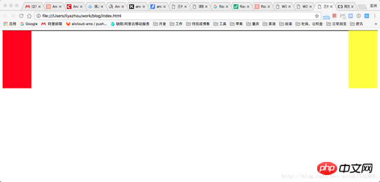
The simplest three-column layout is to use float for layout. First, draw the left and right columns:
    <style>
      .left {
        float: left;
        width: 100px;
        height: 200px;
        background-color: red;
      }

      .right {
        float: right;
        width: 100px;
        height: 200px;
        background-color: yellow;
      }
    </style>

      <p class="container">
        <p class="left"></p>
        <p class="right"></p>
        <p class="main"></p>
</p>At this time, you can get the distribution of the left and right columns:
Next, let’s look at how to deal with the middle column. We know that float elements will break away from the document flow, and other boxes will ignore this element. (But the text in other boxes will still make room for this element and surround it.) So at this time, you only need to add a normal p in the container container, which will ignore the left and right and fill the entire container. Just In addition, the margin is left right and the space flows out:
   <style>
      .left {
        float: left;
        width: 100px;
        height: 200px;
        background-color: red;
      }

      .right {
        float: right;
        width: 100px;
        height: 200px;
        background-color: yellow;
      }

      .main {
        background-color: green;
        height: 200px;
        margin-left: 120px;
        margin-right: 120px;
      }

      .container {
        border: 1px solid black;
      }

      <p class="container">
      <p class="left"></p>
      <p class="right"></p>
      <p class="main"></p>
      </p>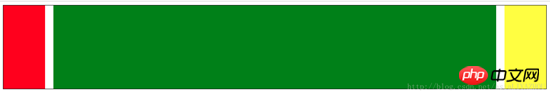
Advantages: Simple
Disadvantages: The middle part is loaded last, which affects the experience when there is a lot of content
2. BFC rules
BFC (Block Formatting Context) rules stipulate that BFC will not overlap floating elements. So if you set the main element as a BFC element:
    <style>
      .left {
        float: left;
        width: 100px;
        height: 200px;
        background-color: red;
      }

      .right {
        float: right;
        width: 100px;
        height: 200px;
        background-color: yellow;
      }

      .main {
        background-color: green;
        height: 200px;
        overflow: hidden;
      }

      <p class="container">
        <p class="left"></p>
        <p class="right"></p>
        <p class="main"></p>
</p>3. Holy Grail Layout
The core of the Holy Grail layout is that the left, middle, and right columns all pass float is floated and then adjusted by negative margin.
The first step is to take a look at the basic layout
    <style>
        .left {
            float: left;
            width: 100px;
            height: 200px;
            background-color: red;
        }
        .right {
            float: left;
            width: 100px;
            height: 200px;
            background-color: yellow;
        }
        .main {
            float: left;
            width: 100%;
            height: 200px;
            background-color: blue;
        }
    </style>
    <body>
        <p class="container">
            <p class="main"></p>
            <p class="left"></p>
            <p class="right"></p>
        </p>
    </body>
The effect you see at this time is: the left and right columns are squeezed to the second OK. This is because main's width is 100%. Next, we put the left, center, and right in one line by adjusting the margins of the left and right columns:
        .left {
            float: left;
            width: 100px;
            height: 200px;
            margin-left: -100%;
            background-color: red;
        }
        .right {
            float: left;
            width: 100px;
            height: 200px;
            margin-left: -100px;
            background-color: yellow;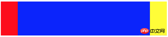
}The second step is to set the margin-left of left to -100%. At this time, the left The column will move to the beginning of the first row. Then set the margin-left of right to the negative value of its width: -100px, and the right column will also be moved to the same line as the left and middle columns:
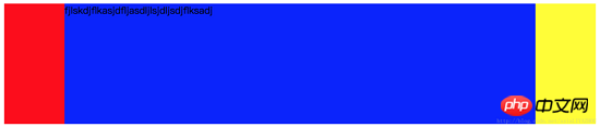
However It’s not done yet, let’s try to add some text to main:
    <body>
        <p class="container">
            <p class="main">fjlskdjflkasjdfljasdljlsjdljsdjflksadj</p>
            <p class="left"></p>
            <p class="right"></p>
        </p>
    </body>

You can see that the text is suppressed, and we need to solve this problem next.
The third step is to give the container a padding. The padding should be exactly equal to the width of the left and right columns:
        .container {
            padding-left: 100px;
            padding-right: 100px;
}The result you see at this time is that the left, middle and right columns are all integrated It shrank, but the text was still suppressed.

The fourth step is to add relative layout to the left and right columns, and then move outward by setting the left and right values:
        .left {
            float: left;
            width: 100px;
            height: 200px;
            margin-left: -100%;
            position: relative;
            left: -100px;
            background-color: red;
        }
        .right {
            float: left;
            width: 100px;
            height: 200px;
            margin-left: -100px;
            position: relative;
            right: -100px;
            background-color: yellow;
}to So far, you’re done:
4. Double Flying Wing Layout
The first two steps of the double flying wing layout are the same as the Holy Grail layout, except The solution to the problem of partial content in the middle column being blocked is different:
Since the content in the main part will be blocked, add another content inside the main and set its margin to avoid occlusion. The problem This can be solved:
<!DOCTYPE html>
<html lang="en">
<head>
    <style>
        .main {
        float: left;
        width: 100%;
        }
        .content {
        height: 200px;
        margin-left: 110px;
        margin-right: 220px;
        background-color: green;
        }

        .main::after {
        display: block;
        content: '';
        font-size: 0;
        height: 0;
        clear: both;
        zoom: 1;
        }
    .left {
        float: left;
        height: 200px;
        width: 100px;
        margin-left: -100%;
        background-color: red;
    }
    .right {
        width: 200px;
        height: 200px;
        float: left;
        margin-left: -200px;
        background-color: blue;
    }
    </style>
</head>
<body>
    <p class="main">
        <p class="content"></p>
    </p>
    <p class="left"></p>
    <p class="right"></p>
</body>
</html>The only thing to note is that you need to add an element after main to clear the float.
5. Flex layout
Flex layout is the trend. It is also very simple to use flex to implement three-column layout, but you need to pay attention to browser compatibility:
        <style type="text/css">
            .container {
                display: flex;
                flex-direction: row;
            }
            .middle {
                height: 200px;
                background-color: red;
                flex-grow: 1;
            }
            .left {
                height: 200px;
                order: -1;
                margin-right: 20px;
                background-color: yellow;
                flex: 0 1 200px;
            }
            .right {
                height: 200px;
                margin-left: 20px;
                background-color: green;
                flex: 0 1 200px;
            }
        </style>
    </head>
    <body>
        <p class="container">
            <p class="middle">fsdfjksdjflkasjdkfjsdkljfklsjadfkljaksdljfskljffjksldfjldsfdskjflsdjfkljsdlfjsldjfklsjdkflj</p>
            <p class="left"></p>
            <p class="right"></p>
        </p>
</body>There are a few points to note:
main要首先加载就必须写在第一位,但因为left需要显示在最左侧,所以需要设置left的order为-1
flex属性的完整写法是:flex: flex-grow flex-shrink flex-basis 。这也是flex实现三栏布局的核心,main设置flex-grow为1,说明多余空间全部给main,而空间不够时,仅缩小left right部分,同时因为指定了left right部分的flex-basis,所以指定了两者的宽度,保证其显示效果
6. 绝对定位
绝对定位的方式也比较简单,而且可以优先加载主体:
        <style type="text/css">
            .container {
            }
            .middle {
                position: absolute;
                left: 200px;
                right: 200px;
                height: 300px;
                background-color: yellow;
            }
            .left {
                position: absolute;
                left: 0px;
                width: 200px;
                height: 300px;
                background-color: red;
            }
            .right {
                position: absolute;
                right: 0px;
                width: 200px;
                background-color: green;
                height: 300px;
            }
        </style>
    </head>
    <body>
        <p class="container">
            <p class="middle">fsdfjksdjflkasjdkfjsdkljfklsjadfkljaksdljfskljffjksldfjldsfdskjflsdjfkljsdlfjsldjfklsjdkflj</p>
            <p class="left"></p>
            <p class="right"></p>
        </p>
</body>相信看了本文案例你已经掌握了方法,更多精彩请关注php中文网其它相关文章!
推荐阅读:
The above is the detailed content of Detailed explanation of CSS three-column layout. For more information, please follow other related articles on the PHP Chinese website!

Hot AI Tools

Undresser.AI Undress
AI-powered app for creating realistic nude photos

AI Clothes Remover
Online AI tool for removing clothes from photos.

Undress AI Tool
Undress images for free

Clothoff.io
AI clothes remover

AI Hentai Generator
Generate AI Hentai for free.

Hot Article
Hot Tools

Notepad++7.3.1
Easy-to-use and free code editor

SublimeText3 Chinese version
Chinese version, very easy to use

Zend Studio 13.0.1
Powerful PHP integrated development environment

Dreamweaver CS6
Visual web development tools

SublimeText3 Mac version
God-level code editing software (SublimeText3)
Hot Topics
 1375
1375
 52
52

 How to use bootstrap button
Apr 07, 2025 pm 03:09 PM
How to use bootstrap button
Apr 07, 2025 pm 03:09 PM
How to use the Bootstrap button? Introduce Bootstrap CSS to create button elements and add Bootstrap button class to add button text
 How to insert pictures on bootstrap
Apr 07, 2025 pm 03:30 PM
How to insert pictures on bootstrap
Apr 07, 2025 pm 03:30 PM
There are several ways to insert images in Bootstrap: insert images directly, using the HTML img tag. With the Bootstrap image component, you can provide responsive images and more styles. Set the image size, use the img-fluid class to make the image adaptable. Set the border, using the img-bordered class. Set the rounded corners and use the img-rounded class. Set the shadow, use the shadow class. Resize and position the image, using CSS style. Using the background image, use the background-image CSS property.
 How to resize bootstrap
Apr 07, 2025 pm 03:18 PM
How to resize bootstrap
Apr 07, 2025 pm 03:18 PM
To adjust the size of elements in Bootstrap, you can use the dimension class, which includes: adjusting width: .col-, .w-, .mw-adjust height: .h-, .min-h-, .max-h-
 How to set up the framework for bootstrap
Apr 07, 2025 pm 03:27 PM
How to set up the framework for bootstrap
Apr 07, 2025 pm 03:27 PM
To set up the Bootstrap framework, you need to follow these steps: 1. Reference the Bootstrap file via CDN; 2. Download and host the file on your own server; 3. Include the Bootstrap file in HTML; 4. Compile Sass/Less as needed; 5. Import a custom file (optional). Once setup is complete, you can use Bootstrap's grid systems, components, and styles to create responsive websites and applications.
 How to set the bootstrap navigation bar
Apr 07, 2025 pm 01:51 PM
How to set the bootstrap navigation bar
Apr 07, 2025 pm 01:51 PM
Bootstrap provides a simple guide to setting up navigation bars: Introducing the Bootstrap library to create navigation bar containers Add brand identity Create navigation links Add other elements (optional) Adjust styles (optional)
 How to verify bootstrap date
Apr 07, 2025 pm 03:06 PM
How to verify bootstrap date
Apr 07, 2025 pm 03:06 PM
To verify dates in Bootstrap, follow these steps: Introduce the required scripts and styles; initialize the date selector component; set the data-bv-date attribute to enable verification; configure verification rules (such as date formats, error messages, etc.); integrate the Bootstrap verification framework and automatically verify date input when form is submitted.
 How to upload files on bootstrap
Apr 07, 2025 pm 01:09 PM
How to upload files on bootstrap
Apr 07, 2025 pm 01:09 PM
The file upload function can be implemented through Bootstrap. The steps are as follows: introduce Bootstrap CSS and JavaScript files; create file input fields; create file upload buttons; handle file uploads (using FormData to collect data and then send to the server); custom style (optional).
 How to view the date of bootstrap
Apr 07, 2025 pm 03:03 PM
How to view the date of bootstrap
Apr 07, 2025 pm 03:03 PM
Answer: You can use the date picker component of Bootstrap to view dates in the page. Steps: Introduce the Bootstrap framework. Create a date selector input box in HTML. Bootstrap will automatically add styles to the selector. Use JavaScript to get the selected date.
