Detailed explanation of the use of new units in css3
This time I will bring you a detailed explanation of the use of new units in css3. What are the precautions for using new units in css3. Here are actual cases, let’s take a look.
This article introduces the detailed explanation of the use of css3 new units vw, vh, vmin, and vmax, and shares it with everyone. The details are as follows:
1, the meaning of vw, vh, vmin, and vmax
(1) vw, vh, vmin, and vmax are window units and relative units. It is not relative to the parent node or the root node of the page. It is determined by the size of the viewport. The unit is 1, which means something like 1%.
The viewport is the area where your browser actually displays content—in other words, your web browser without toolbars and buttons.
(2) The specific description is as follows:
vw: the percentage of the window width (1vw represents the width of the window is 1%)
vh: the percentage of the window height
vmin: current The smaller value of vw and vh
vmax: The larger value of the current vw and vh
2, the difference between vw, vh and % percentage
(1)% is the ratio set relative to the size of the parent element, vw and vh are determined by the size of the window.
(2) The advantage of vw and vh is that they can directly obtain the height. However, using % cannot correctly obtain the height of the visual area without setting the body height, so this is quite good. The advantages.
3, vmin, vmax use
When doing mobile page development, if you use vw, wh to set the font size (such as 5vw), in the portrait and landscape states The font sizes shown below are different.
Since vmin and vmax are the current smaller vw and vh and the current larger vw and vh. Here you can use vmin and vmax. Make the text size consistent in both horizontal and vertical screens.
4, Browser compatibility
(1) Desktop PC
Chrome: Perfectly supported since version 26 (February 2013)
Firefox: Perfectly supported since version 19 (January 2013)
Safari: Perfectly supported since version 6.1 (October 2013)
Opera: Perfectly supported since version 15 (2013 July 2017)
IE: Since IE10 (including Edge) it is still only partially supported (vmax is not supported, and vm replaces vmin)
(2) Mobile devices
Android : Perfectly supported since version 4.4 (December 2013)
iOS: Perfectly supported since iOS8 version (September 2014)
2. A simple sample Example
1, page code
In addition to setting the width and height of elements, the Viewport unit can also be used in text. Next, use vw to set the font size to implement responsive text.
<!DOCTYPE html>
<html>
  <head>
    <meta charset="utf-8">
    <title>hangge.com</title>
    <style>
      html, body, p, span, h1, h2, h3 {
        margin: 0;
        padding: 0;
        border: 0;
      }

      .demo {
       width: 100vw;
       font-size: 5vw;
       margin: 0 auto;
       background-color: #50688B;
       color: #FFF;
      }

      .demo2 {
       width: 80vw;
       font-size: 5vw;
       margin: 0 auto;
       background-color: #ff6a00;
      }

      .demo3 {
       width: 50vw;
       height: 50vh;
       font-size: 1vw;
       margin: 0 auto;
       background-color: #ff006e;
       color: #FFF;
      }
    </style>
  </head>
  <body>
      <p class="demo">
          <h1>宽度100%, 字体5%</h1>
      </p>
      <p class="demo2">
          <h2>宽度80%, 字体5%</h2>
      </p>
      <p class="demo3">
          <h3>宽度50%, 高度50%, 字体1%</h3>
      </p>
  </body>
</html>2, renderings

3. Mask layer to achieve complete coverage
Sometimes to highlight the pop-up box, or to prevent page elements from being clicked. We need a translucent mask that covers the entire visible area, which can be easily achieved using vw and vh.
1, sample code
<!DOCTYPE html>
<html>
<head>
<meta charset="utf-8">
<title>hangge.com</title>
<style>
html, body, p, span, button {
margin: 0;
padding: 0;
border: 0;
}
button {
width: 120px;
height: 30px;
color: #FFFFFF;
font-family: "微软雅黑";
font-size: 14px;
background: #28B995;
}
#mask {
width: 100vw;
height: 100vh;
position: fixed;
top: 0;
left: 0;
background: #000000;
opacity: 0.5;
display: none;
}
</style>
</head>
<body>
<button onclick="document.getElementById('mask').style.display='inline'">点击显示遮罩</button>
<p id="mask" onclick="document.getElementById('mask').style.display='none'"/></p>
</body>
</html>2, rendering
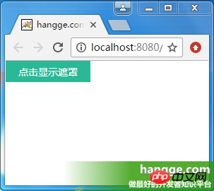
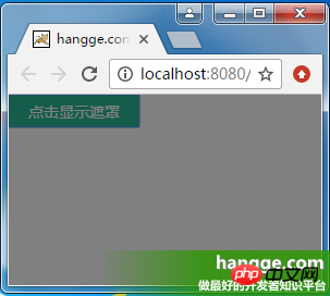
4. Implement centering The displayed pop-up box
1, the size of the pop-up box adapts to the content
(1) Sample rendering
After clicking the pop-up button, it will Displays a popup centered on the entire screen.
The size of the pop-up box is adaptive according to the size of the content (logo picture). At the same time, there is a translucent mask layer behind the pop-up box that covers the entire screen.
After clicking the close button, the pop-up box will be hidden.

(2) Sample code
The mask layer uses vw and vh to achieve full-screen coverage. The popover is added to the mask layer and centered.
<!DOCTYPE html>
<html>
<head>
<meta charset="utf-8">
<title>hangge.com</title>
<script type="text/javascript" src="js/jquery.js"></script>
<style>
html, body, p, span, button {
margin: 0;
padding: 0;
border: 0;
}
button {
width: 120px;
height: 30px;
color: #FFFFFF;
font-family: "微软雅黑";
font-size: 14px;
background: #28B995;
}
.dialog-container {
display: none;
width: 100vw;
height: 100vh;
background-color: rgba(0,0,0,.35);
text-align: center;
position: fixed;
top: 0;
left: 0;
z-index: 10;
}
.dialog-container:after {
display: inline-block;
content: '';
width: 0;
height: 100%;
vertical-align: middle;
}
.dialog-box {
display: inline-block;
border: 1px solid #ccc;
text-align: left;
vertical-align: middle;
position: relative;
}
.dialog-title {
line-height: 28px;
padding-left: 5px;
padding-right: 5px;
border-bottom: 1px solid #ccc;
background-color: #eee;
font-size: 12px;
text-align: left;
}
.dialog-close {
position: absolute;
top: 5px;
right: 5px;
font-size: 12px;
}
.dialog-body {
background-color: #fff;
}
</style>
</head>
<body>
<button onclick="$('#dialogContainer').show();">点击显示弹出框</button>
<p id="dialogContainer" class="dialog-container">
<p class="dialog-box">
<p class="dialog-title">居中弹出框</p>
<a onclick="$('#dialogContainer').hide();" class="dialog-close">关闭</a>
<p class="dialog-body">
<img src="logo.png" class="demo-image" />
</p>
</p>
</p>
</body>
</html>2, the size of the pop-up box changes with the size of the window
(1)样例效果图
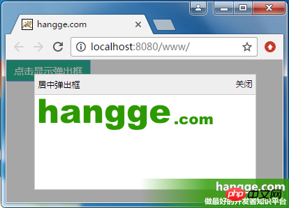
点击弹出按钮后,会显示一个在整个屏幕上居中显示的弹出框。
弹出框的大小不再由内容的大小决定,而是随视窗大小改变(宽高均为屏幕可视区域的 80%)。
点击关闭按钮后,则隐藏弹出框。

(2)样例代码
遮罩层使用 vw、vh 实现全屏覆盖。而弹出框的尺寸位置同样使用 vw、vh 设置。
<!DOCTYPE html>
<html>
<head>
<meta charset="utf-8">
<title>hangge.com</title>
<script type="text/javascript" src="js/jquery.js"></script>
<style>
html, body, p, span, button {
margin: 0;
padding: 0;
border: 0;
}
button {
width: 120px;
height: 30px;
color: #FFFFFF;
font-family: "微软雅黑";
font-size: 14px;
background: #28B995;
}
.dialog-container {
display: none;
width: 100vw;
height: 100vh;
background-color: rgba(0,0,0,.35);
text-align: center;
position: fixed;
top: 0;
left: 0;
z-index: 10;
}
.dialog-box {
top:10vh;
left:10vw;
width: 80vw;
height: 80vh;
text-align: left;
position: absolute;
border: 1px solid #ccc;
display: flex;
flex-direction: column;
}
.dialog-title {
line-height: 28px;
padding-left: 5px;
padding-right: 5px;
border-bottom: 1px solid #ccc;
background-color: #eee;
font-size: 12px;
text-align: left;
}
.dialog-close {
position: absolute;
top: 5px;
right: 5px;
font-size: 12px;
}
.dialog-body {
background-color: #fff;
flex:1;
overflow: auto;
}
</style>
</head>
<body>
<button onclick="$('#dialogContainer').show();">点击显示弹出框</button>
<p id="dialogContainer" class="dialog-container">
<p class="dialog-box">
<p class="dialog-title">居中弹出框</p>
<a onclick="$('#dialogContainer').hide();" class="dialog-close">关闭</a>
<p class="dialog-body">
<img src="logo.png" class="demo-image" />
</p>
</p>
</p>
</body>
</html>五、显示大图时限制其最大尺寸
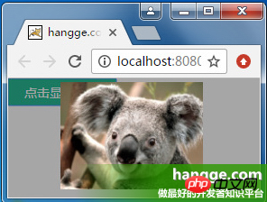
我们还可以通过视图单位来限制一些元素的最大宽度或高度,避尺寸过大而超出屏幕。
1,效果图
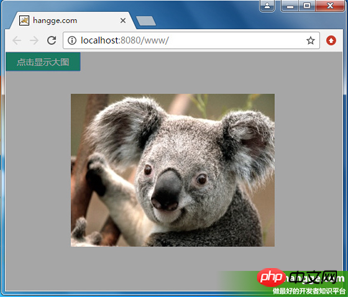
(1)点击按钮,在屏幕中央显示原始图片的大图。
(2)如果图片原始宽高均不超过屏幕宽高的 90%,则显示图片的默认大小。
(3)如果图片原始宽高均超过屏幕宽高的 90%,则限制为屏幕的 90%,使其能够完全显示。
2,样例代码
<!DOCTYPE html>
<html>
<head>
<meta charset="utf-8">
<title>hangge.com</title>
<script type="text/javascript" src="js/jquery.js"></script>
<style>
html, body, p, span, button {
margin: 0;
padding: 0;
border: 0;
}
button {
width: 120px;
height: 30px;
color: #FFFFFF;
font-family: "微软雅黑";
font-size: 14px;
background: #28B995;
}
.dialog-container {
display: none;
width: 100vw;
height: 100vh;
background-color: rgba(0,0,0,.35);
text-align: center;
position: fixed;
top: 0;
left: 0;
z-index: 10;
}
.dialog-container:after {
display: inline-block;
content: '';
width: 0;
height: 100%;
vertical-align: middle;
}
.dialog-box {
display: inline-block;
text-align: left;
vertical-align: middle;
position: relative;
}
.demo-image {
max-width: 90vw;
max-height: 90vh;
}
</style>
</head>
<body>
<button onclick="$('#dialogContainer').show();">点击显示大图</button>
<p id="dialogContainer" class="dialog-container" onclick="$('#dialogContainer').hide();">
<p class="dialog-box">
<img src="image.jpg" class="demo-image" />
</p>
</p>
</body>
</html>六、实现 Word 文档页面效果
1,效果图
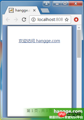
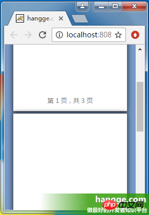
(1)使用 vh 单位,我们可把 web 页面做得像 Office 文档那样,一屏正好一页。改变浏览器窗口尺寸,每页的大小也会随之变化。
(2)拖动滚动条,我们可以一直往下看到最后一页。
2,样例代码
<!DOCTYPE html>
<html>
  <head>
    <meta charset="utf-8">
    <title>hangge.com</title>
    <script type="text/javascript" src="js/jquery.js"></script>
    <style>
      html, body, p, span, button {
        margin: 0;
        padding: 0;
        border: 0;
      }

      body {
        background-color: #789BC9;
      }

      page {
        display: block;
        height: 98vh;
        width: 69.3vh;
        margin: 1vh auto;
        padding: 12vh;
        border: 1px solid #646464;
        box-shadow: 0 0 15px rgba(0,0,0,.75);
        box-sizing: border-box;
        background-color: white;
        position: relative;
      }

      page:after {
        content: attr(data-page);
        color: graytext;
        font-size: 12px;
        text-align: center;
        bottom: 4vh;
        position: absolute;
        left: 10vh;
        right: 10vh;
      }

      a {
        color: #34538b;
        font-size: 14px;
      }
    </style>
    <script type="text/javascript">
      $(document).ready(function(){
        var lenPage = $("page").length;
        //自动添加每页底部的页码
        $("page").each(function(i){
          $(this).attr("data-page", "第 "+ (i+1) +" 页,共 "+ lenPage +" 页");
        });
      });
    </script>
  </head>
  <body>
    <page><a href="http://hangge.com">欢迎访问 hangge.com</a></page>
    <page></page>
    <page></page>
  </body>
</html>相信看了本文案例你已经掌握了方法,更多精彩请关注php中文网其它相关文章!
推荐阅读:
The above is the detailed content of Detailed explanation of the use of new units in css3. For more information, please follow other related articles on the PHP Chinese website!

Hot AI Tools

Undresser.AI Undress
AI-powered app for creating realistic nude photos

AI Clothes Remover
Online AI tool for removing clothes from photos.

Undress AI Tool
Undress images for free

Clothoff.io
AI clothes remover

AI Hentai Generator
Generate AI Hentai for free.

Hot Article

Hot Tools

Notepad++7.3.1
Easy-to-use and free code editor

SublimeText3 Chinese version
Chinese version, very easy to use

Zend Studio 13.0.1
Powerful PHP integrated development environment

Dreamweaver CS6
Visual web development tools

SublimeText3 Mac version
God-level code editing software (SublimeText3)

Hot Topics
 How to use the locally installed 'Jingnan Mai Round Body' on a web page and solve the display problem?
Apr 05, 2025 pm 02:06 PM
How to use locally installed font files on web pages In web development, users may want to use specific fonts installed on their computers to enhance the network...
 How to adapt and adjust the label size of the Element-UI horizontal menu el-menu on the PC and mobile side?
Apr 05, 2025 am 10:12 AM
The adaptation issues of the Element-UI menu component el-menu and label size adjustment During the development process of using the Element-UI framework, the flexibility and ease of use of the el-menu component...
 Element-UI el-menu component: How to adjust the size of menu labels and control the display of submenu in different modes?
Apr 05, 2025 am 10:36 AM
The label size adjustment of the Element-UI menu component el-menu and the behavior differences under the mode attributes of the Element-UI menu component will be used to determine the different mode modes of the el-menu component in the Element-UI framework...
 How to use CSS to achieve a gradient effect of the background color transition from left to right and gradually becoming lighter from top to bottom?
Apr 05, 2025 pm 12:57 PM
CSS gradient color effect implementation: Gradient background color from top to bottom In web design, how to transition from left to right in the search box and the background color under the carousel image...
 How to customize resize symbols through CSS to match background color?
Apr 05, 2025 pm 02:09 PM
How to customize resize symbols with CSS to match background color? In web design, the details of the user experience can often significantly improve the overall effect. For example...
 How to solve the problem of page jitter caused by dynamically setting elements to fixed in JavaScript?
Apr 05, 2025 am 11:39 AM
How to solve the problem of page jitter caused by dynamically setting elements to fixed by JS. When dynamically setting elements to fixed by JavaScript, you sometimes encounter page jitter...
 Under a fixed width layout, what is the relationship between the font size and the letter width?
Apr 05, 2025 pm 12:51 PM
Under fixed width layout, the subtle relationship between font size and letter width When designing web pages, we often encounter the need to line up in fixed width containers...
 How to implement a custom theme by overriding the SCSS variable of Element?
Apr 05, 2025 pm 01:45 PM
How to implement a custom theme by overriding the SCSS variable of Element? Using Element...


