

CSS filter to achieve flame effect
This time I will bring you the CSS filter to achieve the flame effect. What are the precautions for CSS filter to achieve the flame effect? The following is a practical case, let's take a look.
Last time we learned some basic knowledge of css filters, CSS filter filterThis time we will use css filters to implement a flame Effect. Explanation
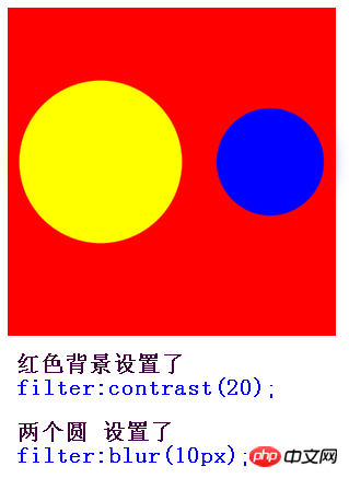
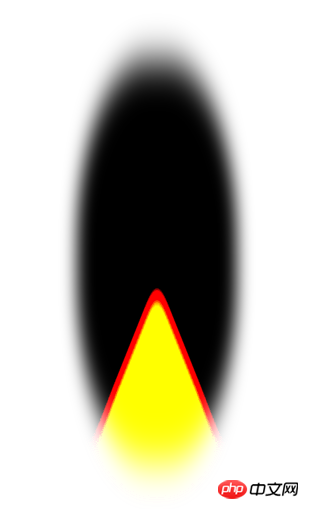
filter:contrast(20); This is very important, the two circles filter:blur(10px); If it’s not clear yet, let’s compare it.

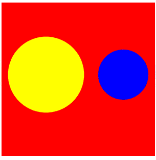
1. First draw a triangle with a border
You must know that if width is 0, height is also 0, If only the border is used, the border is triangular. Let's see what the element looks like when width and height are both 0, but the border width is 100px
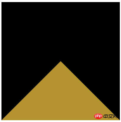
2. Adjust the size and color of the triangle to achieve a flame-like appearance
This step is very simple, we only need to Add these three lines of code to the triangle that has been implemented aboveborder-radius: 45%; transform: scaleX(.4); filter: blur(20px) contrast(30);
Rendering
3. Let the flame move
This step is more troublesome, but it is easy to understand. It is just to use the fusion effect mentioned above to make many small circles randomly pass through the triangle. Take a look at the following You can understand the principle by looking at the picture.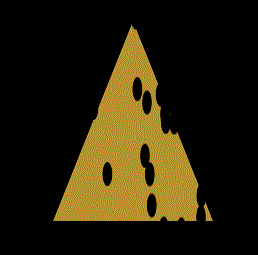
Complete code
<!doctype html>
<html lang="en">
<head>
<meta charset="UTF-8">
<style>
body {
background: #000;
}
.container {
position: relative;
width: 300px;
height: 300px;
margin: 0 auto;
background-color: #000;
}
.fire {
position: absolute;
bottom: 0;
left: 50%;
border-radius: 45%;
box-sizing: border-box;
border: 200px solid #000;
border-bottom: 200px solid #b5932f;
transform: translate(-50%, 0) scaleX(.4);
filter: blur(20px) contrast(30);
}
/* 小圆的样式 */
.dot {
position: absolute;
bottom: -110px;
left: 0;
width: 24px;
height: 24px;
background: #000;
border-radius: 50%;
}
@keyframes move {
100% {
transform: translateY(-350px);
}
}
</style>
</head>
<body>
<p class="container">
<p class="fire">
</p>
</p>
<script>
//创建一个元素,放所有的小圆
var circleBox = document.createElement('p');
//获取随机数 from 参数表示从哪个数开始 to参数表示到哪个数结束 from<= num <= to
function randomNum(from, to) {
from = Number(from);
to = Number(to);
var Range = to - from;
var num = from + Math.round(Math.random() * Range); //四舍五入
return num;
};
for (var i = 0; i < 40; i++) {
//创建小圆
var circle = document.createElement('p');
// 下面的4个变量 代表小圆随机位置 和 随机持续时间和延迟
var bottom = randomNum(-300, -250);
var left = randomNum(-200, 200);
var duration = randomNum(10, 30) / 10;
var delay = randomNum(0, 50) / 10;
//给生成的每个小圆 加上动画和位置属性
circle.style.cssText += `animation:move ${duration}s linear ${delay}s infinite;bottom:${bottom}px;left:${left}px;`;
circle.className += " dot";
//把每个小圆 都加入这个p
circleBox.appendChild(circle);
};
var fire = document.querySelector(".fire");
//把有40个随机小圆的 p 加入DOM树
fire.appendChild(circleBox);
</script>
</body>
</html>Pure css to realize the 3D effect of the photo wall
CSS loading animation effect tutorial
CSS3 rem (set font size) tutorial
The above is the detailed content of CSS filter to achieve flame effect. For more information, please follow other related articles on the PHP Chinese website!

Hot AI Tools

Undresser.AI Undress
AI-powered app for creating realistic nude photos

AI Clothes Remover
Online AI tool for removing clothes from photos.

Undress AI Tool
Undress images for free

Clothoff.io
AI clothes remover

Video Face Swap
Swap faces in any video effortlessly with our completely free AI face swap tool!

Hot Article
Hot Tools

Notepad++7.3.1
Easy-to-use and free code editor

SublimeText3 Chinese version
Chinese version, very easy to use

Zend Studio 13.0.1
Powerful PHP integrated development environment

Dreamweaver CS6
Visual web development tools

SublimeText3 Mac version
God-level code editing software (SublimeText3)
Hot Topics
 1386
1386
 52
52

 How to use bootstrap in vue
Apr 07, 2025 pm 11:33 PM
How to use bootstrap in vue
Apr 07, 2025 pm 11:33 PM
Using Bootstrap in Vue.js is divided into five steps: Install Bootstrap. Import Bootstrap in main.js. Use the Bootstrap component directly in the template. Optional: Custom style. Optional: Use plug-ins.
 The Roles of HTML, CSS, and JavaScript: Core Responsibilities
Apr 08, 2025 pm 07:05 PM
The Roles of HTML, CSS, and JavaScript: Core Responsibilities
Apr 08, 2025 pm 07:05 PM
HTML defines the web structure, CSS is responsible for style and layout, and JavaScript gives dynamic interaction. The three perform their duties in web development and jointly build a colorful website.
 How to write split lines on bootstrap
Apr 07, 2025 pm 03:12 PM
How to write split lines on bootstrap
Apr 07, 2025 pm 03:12 PM
There are two ways to create a Bootstrap split line: using the tag, which creates a horizontal split line. Use the CSS border property to create custom style split lines.
 Understanding HTML, CSS, and JavaScript: A Beginner's Guide
Apr 12, 2025 am 12:02 AM
Understanding HTML, CSS, and JavaScript: A Beginner's Guide
Apr 12, 2025 am 12:02 AM
WebdevelopmentreliesonHTML,CSS,andJavaScript:1)HTMLstructurescontent,2)CSSstylesit,and3)JavaScriptaddsinteractivity,formingthebasisofmodernwebexperiences.
 How to insert pictures on bootstrap
Apr 07, 2025 pm 03:30 PM
How to insert pictures on bootstrap
Apr 07, 2025 pm 03:30 PM
There are several ways to insert images in Bootstrap: insert images directly, using the HTML img tag. With the Bootstrap image component, you can provide responsive images and more styles. Set the image size, use the img-fluid class to make the image adaptable. Set the border, using the img-bordered class. Set the rounded corners and use the img-rounded class. Set the shadow, use the shadow class. Resize and position the image, using CSS style. Using the background image, use the background-image CSS property.
 How to set up the framework for bootstrap
Apr 07, 2025 pm 03:27 PM
How to set up the framework for bootstrap
Apr 07, 2025 pm 03:27 PM
To set up the Bootstrap framework, you need to follow these steps: 1. Reference the Bootstrap file via CDN; 2. Download and host the file on your own server; 3. Include the Bootstrap file in HTML; 4. Compile Sass/Less as needed; 5. Import a custom file (optional). Once setup is complete, you can use Bootstrap's grid systems, components, and styles to create responsive websites and applications.
 How to resize bootstrap
Apr 07, 2025 pm 03:18 PM
How to resize bootstrap
Apr 07, 2025 pm 03:18 PM
To adjust the size of elements in Bootstrap, you can use the dimension class, which includes: adjusting width: .col-, .w-, .mw-adjust height: .h-, .min-h-, .max-h-
 How to use bootstrap button
Apr 07, 2025 pm 03:09 PM
How to use bootstrap button
Apr 07, 2025 pm 03:09 PM
How to use the Bootstrap button? Introduce Bootstrap CSS to create button elements and add Bootstrap button class to add button text
