

Sticky Footer The absolute bottom method
This time I will bring you the method of achieving the absolute bottom of Sticky Footer. What are the precautions to achieve the absolute bottom of Sticky Footer. The following is a practical case, let’s take a look.
I have interviewed several front-ends recently, with varying work experience. I don’t even know what the absolute bottom is, and no one can tell me a way to achieve it. I can’t help feeling that the front-end field is uneven.
Absolute bottom, or Sticky Footer, is an old and classic page effect:
When the page content exceeds the screen, the footer module will be pushed below the content like a normal page. Drag the scroll bar to see
And when the page content is smaller than the screen height, the footer module will be fixed at the bottom of the screen, just like a fixed positioning with a zero bottom margin

1. Classic routine
The idea of this routine is to set min-height: 100 for the content area %, push the footer to the bottom of the screen
and then add margin-top to the footer, whose value is the negative value of the footer height, so that the footer can return to the bottom of the screen
HTML:
<p class="wrap">
  <p class="content">
    <p>填充内容</p>
  </p>
</p>
<p class="footer">
  <p>这是页脚</p>
</p>
CSS:
html,body {
  height: 100%;
}

body > .wrap {
  min-height: 100%;
}

.content {
  /* padding-bottom 等于 footer 的高度 */
  padding-bottom: 60px;
}

.footer {
  width: 100%;
  height: 60px;
  /* margin-top 为 footer 高度的负值 */
  margin-top: -60px;
}What needs to be noted is the padding of the content area, the height and margin of the footer, which must be consistent
The compatibility of this writing method Very good, tested IE7 can also display normally
But if the main layout of the page has other compatibility issues, Sticky Footer needs to make some corresponding modifications
2. Flexbox
It must be said that CSS3 has brought about a change in the front-end, and Flexbox has brought about a change in web page layout
Although compatibility limits Flexbox Promotion in China, but it is undeniable that Flexbox is a major trend in front-end layout
HTML:
<p class="content">
  <p>填充内容</p>
  <hr />
</p>
<p class="footer">
  <p>这是页脚@WiseWrong</p>
</p>
CSS:
html, body {
  display: flex;
  height: 100%;
  flex-direction: column;
}
body > .content {
  flex: 1;
}Compared with the classic routine, first of all It is the HTML part, and the content area content no longer needs a wrap container
Then the CSS part has successfully lost weight. Using only four lines of code, it has solved the problem that once troubled a generation
And using Flexbox, There is no need to limit the height of the footer, making page layout more flexible
Of course the shortcomings are also obvious, only IE10 and above browsers support flex layout
Believe it or not After reading the case in this article, you have mastered the method. For more exciting information, please pay attention to other related articles on the PHP Chinese website!
Recommended reading:
Pure css to realize the 3D effect of the photo wall
The above is the detailed content of Sticky Footer The absolute bottom method. For more information, please follow other related articles on the PHP Chinese website!

Hot AI Tools

Undresser.AI Undress
AI-powered app for creating realistic nude photos

AI Clothes Remover
Online AI tool for removing clothes from photos.

Undress AI Tool
Undress images for free

Clothoff.io
AI clothes remover

Video Face Swap
Swap faces in any video effortlessly with our completely free AI face swap tool!

Hot Article
Hot Tools

Notepad++7.3.1
Easy-to-use and free code editor

SublimeText3 Chinese version
Chinese version, very easy to use

Zend Studio 13.0.1
Powerful PHP integrated development environment

Dreamweaver CS6
Visual web development tools

SublimeText3 Mac version
God-level code editing software (SublimeText3)
Hot Topics
 1386
1386
 52
52

 How to delete WeChat friends? How to delete WeChat friends
Mar 04, 2024 am 11:10 AM
How to delete WeChat friends? How to delete WeChat friends
Mar 04, 2024 am 11:10 AM
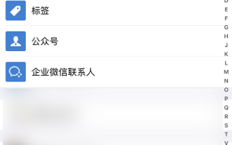
WeChat is one of the mainstream chat tools. We can meet new friends, contact old friends and maintain the friendship between friends through WeChat. Just as there is no such thing as a banquet that never ends, disagreements will inevitably occur when people get along with each other. When a person extremely affects your mood, or you find that your views are inconsistent when you get along, and you can no longer communicate, then we may need to delete WeChat friends. How to delete WeChat friends? The first step to delete WeChat friends: tap [Address Book] on the main WeChat interface; the second step: click on the friend you want to delete and enter [Details]; the third step: click [...] in the upper right corner; Step 4: Click [Delete] below; Step 5: After understanding the page prompts, click [Delete Contact]; Warm
 How to write a novel in the Tomato Free Novel app. Share the tutorial on how to write a novel in Tomato Novel.
Mar 28, 2024 pm 12:50 PM
How to write a novel in the Tomato Free Novel app. Share the tutorial on how to write a novel in Tomato Novel.
Mar 28, 2024 pm 12:50 PM
Tomato Novel is a very popular novel reading software. We often have new novels and comics to read in Tomato Novel. Every novel and comic is very interesting. Many friends also want to write novels. Earn pocket money and edit the content of the novel you want to write into text. So how do we write the novel in it? My friends don’t know, so let’s go to this site together. Let’s take some time to look at an introduction to how to write a novel. Share the Tomato novel tutorial on how to write a novel. 1. First open the Tomato free novel app on your mobile phone and click on Personal Center - Writer Center. 2. Jump to the Tomato Writer Assistant page - click on Create a new book at the end of the novel.
 How to enter bios on Colorful motherboard? Teach you two methods
Mar 13, 2024 pm 06:01 PM
How to enter bios on Colorful motherboard? Teach you two methods
Mar 13, 2024 pm 06:01 PM
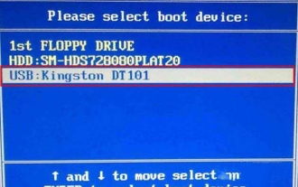
Colorful motherboards enjoy high popularity and market share in the Chinese domestic market, but some users of Colorful motherboards still don’t know how to enter the bios for settings? In response to this situation, the editor has specially brought you two methods to enter the colorful motherboard bios. Come and try it! Method 1: Use the U disk startup shortcut key to directly enter the U disk installation system. The shortcut key for the Colorful motherboard to start the U disk with one click is ESC or F11. First, use Black Shark Installation Master to create a Black Shark U disk boot disk, and then turn on the computer. When you see the startup screen, continuously press the ESC or F11 key on the keyboard to enter a window for sequential selection of startup items. Move the cursor to the place where "USB" is displayed, and then
 How to recover deleted contacts on WeChat (simple tutorial tells you how to recover deleted contacts)
May 01, 2024 pm 12:01 PM
How to recover deleted contacts on WeChat (simple tutorial tells you how to recover deleted contacts)
May 01, 2024 pm 12:01 PM
Unfortunately, people often delete certain contacts accidentally for some reasons. WeChat is a widely used social software. To help users solve this problem, this article will introduce how to retrieve deleted contacts in a simple way. 1. Understand the WeChat contact deletion mechanism. This provides us with the possibility to retrieve deleted contacts. The contact deletion mechanism in WeChat removes them from the address book, but does not delete them completely. 2. Use WeChat’s built-in “Contact Book Recovery” function. WeChat provides “Contact Book Recovery” to save time and energy. Users can quickly retrieve previously deleted contacts through this function. 3. Enter the WeChat settings page and click the lower right corner, open the WeChat application "Me" and click the settings icon in the upper right corner to enter the settings page.
 How to set font size on mobile phone (easily adjust font size on mobile phone)
May 07, 2024 pm 03:34 PM
How to set font size on mobile phone (easily adjust font size on mobile phone)
May 07, 2024 pm 03:34 PM
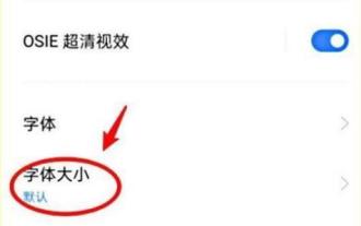
Setting font size has become an important personalization requirement as mobile phones become an important tool in people's daily lives. In order to meet the needs of different users, this article will introduce how to improve the mobile phone use experience and adjust the font size of the mobile phone through simple operations. Why do you need to adjust the font size of your mobile phone - Adjusting the font size can make the text clearer and easier to read - Suitable for the reading needs of users of different ages - Convenient for users with poor vision to use the font size setting function of the mobile phone system - How to enter the system settings interface - In Find and enter the "Display" option in the settings interface - find the "Font Size" option and adjust it. Adjust the font size with a third-party application - download and install an application that supports font size adjustment - open the application and enter the relevant settings interface - according to the individual
 Summary of methods to obtain administrator rights in Win11
Mar 09, 2024 am 08:45 AM
Summary of methods to obtain administrator rights in Win11
Mar 09, 2024 am 08:45 AM
A summary of how to obtain Win11 administrator rights. In the Windows 11 operating system, administrator rights are one of the very important permissions that allow users to perform various operations on the system. Sometimes, we may need to obtain administrator rights to complete some operations, such as installing software, modifying system settings, etc. The following summarizes some methods for obtaining Win11 administrator rights, I hope it can help you. 1. Use shortcut keys. In Windows 11 system, you can quickly open the command prompt through shortcut keys.
 The secret of hatching mobile dragon eggs is revealed (step by step to teach you how to successfully hatch mobile dragon eggs)
May 04, 2024 pm 06:01 PM
The secret of hatching mobile dragon eggs is revealed (step by step to teach you how to successfully hatch mobile dragon eggs)
May 04, 2024 pm 06:01 PM
Mobile games have become an integral part of people's lives with the development of technology. It has attracted the attention of many players with its cute dragon egg image and interesting hatching process, and one of the games that has attracted much attention is the mobile version of Dragon Egg. To help players better cultivate and grow their own dragons in the game, this article will introduce to you how to hatch dragon eggs in the mobile version. 1. Choose the appropriate type of dragon egg. Players need to carefully choose the type of dragon egg that they like and suit themselves, based on the different types of dragon egg attributes and abilities provided in the game. 2. Upgrade the level of the incubation machine. Players need to improve the level of the incubation machine by completing tasks and collecting props. The level of the incubation machine determines the hatching speed and hatching success rate. 3. Collect the resources required for hatching. Players need to be in the game
 Detailed explanation of Oracle version query method
Mar 07, 2024 pm 09:21 PM
Detailed explanation of Oracle version query method
Mar 07, 2024 pm 09:21 PM
Detailed explanation of Oracle version query method Oracle is one of the most popular relational database management systems in the world. It provides rich functions and powerful performance and is widely used in enterprises. In the process of database management and development, it is very important to understand the version of the Oracle database. This article will introduce in detail how to query the version information of the Oracle database and give specific code examples. Query the database version of the SQL statement in the Oracle database by executing a simple SQL statement
