
This time I will bring you the implementation of CSS3's Transition smooth transition menu bar. What are the precautions for implementing Transition smooth transition menu bar? The following is a practical case, let's take a look.
The three major properties of CSS3 animation (Transform, Transition, Animation) are introduced below. The Transition property. The transition property is a shorthand property with four properties: transition-property, transition-duration, transition-timing-function, and transition-delay.Syntax
transition: property duration timing-function delay;
| Description | |
|---|---|
| Specify the name of the CSS property, transition effect | |
| The transition effect needs to specify how many seconds or milliseconds it takes to complete | |
| Specify the speed curve of the transition effect | |
| When defining the transition effect at the beginning |
First look at the rendering:
 Principle illustration:
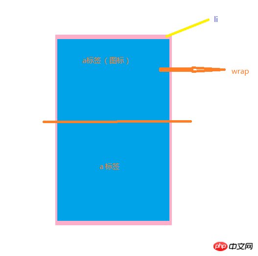 When the mouse moves into the menu list, add a hover style. That is, set the top value of p.wrap to a negative value. Then use the transition attribute to make it a smooth transition.
<!--html-->
<style>
 .menu{
        margin: 100px auto;
    }
    .menu ul li{
        float:left;
        width: 50px;
        height: 25px;
        background-color: #2aabd2;
        margin-right: 5px;
        line-height: 25px;
        position: relative;
        overflow: hidden;
    }
    .menu ul li a{
        display: block;
        height:25px;
        width: 50px;
        text-align: center;
        line-height: 25px;
        color: white;
    }
    .menu ul li .awrap{
        position: absolute;
        top:0;
        left: 0;
    }
    .menu ul li .awrap:hover{
        transition: all .3s ease-in;
        top:-25px;
    }
</style>
<p>
    </p>
I believe you have read the case in this article You have mastered the method. For more exciting information, please pay attention to other related articles on the php Chinese website!
Recommended reading:
Detailed explanation of the use of pointer-events in css3Detailed explanation of the use of focus-withinCSS3 to make seamless carousel adsThe above is the detailed content of CSS3 Transition smooth transition menu bar implementation. For more information, please follow other related articles on the PHP Chinese website!


![[Web front-end] Node.js quick start](https://img.php.cn/upload/course/000/000/067/662b5d34ba7c0227.png)


