

Detailed explanation of CSS double flying wing layout
This time I will bring you a detailed explanation of the CSS double-flying wing layout. What are the precautions for implementing the CSS double-flying wing layout? The following is a practical case, let’s take a look.
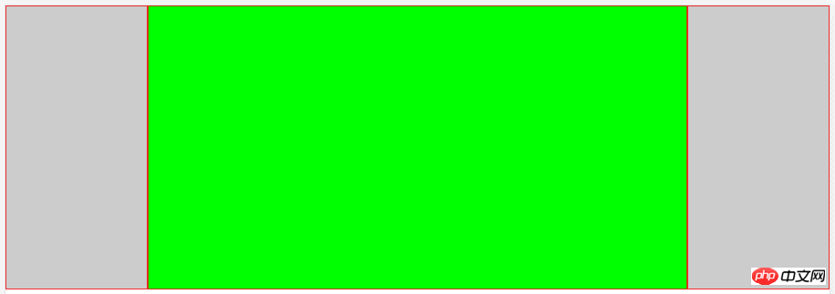
Double flying wing layout is a three-column layout with fixed width and height at both ends and adaptive middle one.
Let’s take a picture first. The gray blocks on the left and right have fixed width and height. The green area in the middle is width and height adaptive
Method 1: Implemented through flex elastic layout
Look at the code
//HTML结构,p2是中间的自适应区域
...
<body>
    <p class="wrap">
        <p class="p1"></p>
        <p class="p2"></p>
        <p class="p3"></p>
    </p>
</body>
...
*{  //先简单粗暴的解决一下浏览器的默认样式
    margin: 0;
    padding: 0;
    border: 0;
    box-sizing:border-box;   //使用border-box,盒模型好计算,妈妈再也不用担心我算不清块宽高了
}
.wrap{
    width: 100%;
    height: 100%;
    display: flex;     //使用弹性布局
    flex-flow:row nowrap;  //以沿主轴方向行显示,不换行,从而来显示3个块
    justify-content:space-around;  //这一个加和不叫其实也没事,加上去的意思就是两端对齐
}

[class^='p']{  // 给所有的p都加上高和边框样式,方便观看,不然都缩成一条线了
    height: 400px;
    border: 1px solid #f00;
}

.p1,.p3{  //给两端的p固定的宽
    width: 200px;
    background-color: #ccc;
    flex-shrink: 1; //默认是1,所以不用写也没事,写出来自是表达这个意思
}
.p2{
    background-color: #0f0;
    flex-grow:1;  //这个比较重要,作用是让第二个块的宽度撑满剩余的空间
}
Method 2: Achieve through positioning
HTML structure remains unchanged, look at the style
.wrap{
    width: 100%;  //同样实现宽高100%铺开
    height: 100%;
    position: relative;  //父层添加相对定位,让子元素相对父层来定位
}
[class^='p']{
    height: 400px;
    border: 1px solid #f00;
}
.p1,.p3{
    position: absolute;
    width: 200px;
    background-color: #ccc;
}
.p1{
    left: 0;  //固定在父层的左侧
    top: 0;
}
.p3{
    right: 0;  //固定在父层的右侧
    top: 0;
}
.p2{
    background-color: #0f0;
    /*这个是关键,我们没有给中间的p2添加过宽属性,所以默认占用父层宽的100%,
     由于两侧块宽是固定的,所以中间的自适应块左右分别200px的外边距中间的content区域就会实现自适应*/
    margin: 0 200px;
}
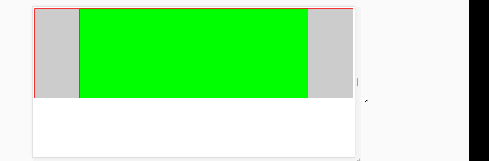
Effect
I believe you have mastered the method after reading the case in this article. For more exciting information, please pay attention to other related matters on the php Chinese website article!
Recommended reading:
Transition smooth transition menu bar of css3 realizes
Simulates the effect of heart beating every second
The above is the detailed content of Detailed explanation of CSS double flying wing layout. For more information, please follow other related articles on the PHP Chinese website!

Hot AI Tools

Undresser.AI Undress
AI-powered app for creating realistic nude photos

AI Clothes Remover
Online AI tool for removing clothes from photos.

Undress AI Tool
Undress images for free

Clothoff.io
AI clothes remover

Video Face Swap
Swap faces in any video effortlessly with our completely free AI face swap tool!

Hot Article
Hot Tools

Notepad++7.3.1
Easy-to-use and free code editor

SublimeText3 Chinese version
Chinese version, very easy to use

Zend Studio 13.0.1
Powerful PHP integrated development environment

Dreamweaver CS6
Visual web development tools

SublimeText3 Mac version
God-level code editing software (SublimeText3)
Hot Topics
 1387
1387
 52
52

 How to use bootstrap in vue
Apr 07, 2025 pm 11:33 PM
How to use bootstrap in vue
Apr 07, 2025 pm 11:33 PM
Using Bootstrap in Vue.js is divided into five steps: Install Bootstrap. Import Bootstrap in main.js. Use the Bootstrap component directly in the template. Optional: Custom style. Optional: Use plug-ins.
 The Roles of HTML, CSS, and JavaScript: Core Responsibilities
Apr 08, 2025 pm 07:05 PM
The Roles of HTML, CSS, and JavaScript: Core Responsibilities
Apr 08, 2025 pm 07:05 PM
HTML defines the web structure, CSS is responsible for style and layout, and JavaScript gives dynamic interaction. The three perform their duties in web development and jointly build a colorful website.
 How to write split lines on bootstrap
Apr 07, 2025 pm 03:12 PM
How to write split lines on bootstrap
Apr 07, 2025 pm 03:12 PM
There are two ways to create a Bootstrap split line: using the tag, which creates a horizontal split line. Use the CSS border property to create custom style split lines.
 Understanding HTML, CSS, and JavaScript: A Beginner's Guide
Apr 12, 2025 am 12:02 AM
Understanding HTML, CSS, and JavaScript: A Beginner's Guide
Apr 12, 2025 am 12:02 AM
WebdevelopmentreliesonHTML,CSS,andJavaScript:1)HTMLstructurescontent,2)CSSstylesit,and3)JavaScriptaddsinteractivity,formingthebasisofmodernwebexperiences.
 How to resize bootstrap
Apr 07, 2025 pm 03:18 PM
How to resize bootstrap
Apr 07, 2025 pm 03:18 PM
To adjust the size of elements in Bootstrap, you can use the dimension class, which includes: adjusting width: .col-, .w-, .mw-adjust height: .h-, .min-h-, .max-h-
 How to use bootstrap button
Apr 07, 2025 pm 03:09 PM
How to use bootstrap button
Apr 07, 2025 pm 03:09 PM
How to use the Bootstrap button? Introduce Bootstrap CSS to create button elements and add Bootstrap button class to add button text
 How to set up the framework for bootstrap
Apr 07, 2025 pm 03:27 PM
How to set up the framework for bootstrap
Apr 07, 2025 pm 03:27 PM
To set up the Bootstrap framework, you need to follow these steps: 1. Reference the Bootstrap file via CDN; 2. Download and host the file on your own server; 3. Include the Bootstrap file in HTML; 4. Compile Sass/Less as needed; 5. Import a custom file (optional). Once setup is complete, you can use Bootstrap's grid systems, components, and styles to create responsive websites and applications.
 How to insert pictures on bootstrap
Apr 07, 2025 pm 03:30 PM
How to insert pictures on bootstrap
Apr 07, 2025 pm 03:30 PM
There are several ways to insert images in Bootstrap: insert images directly, using the HTML img tag. With the Bootstrap image component, you can provide responsive images and more styles. Set the image size, use the img-fluid class to make the image adaptable. Set the border, using the img-bordered class. Set the rounded corners and use the img-rounded class. Set the shadow, use the shadow class. Resize and position the image, using CSS style. Using the background image, use the background-image CSS property.
