
 Web Front-end
CSS Tutorial
Use CSS to realize sharp corners, small triangles, and sharp corners in different directions on the page
Web Front-end
CSS Tutorial
Use CSS to realize sharp corners, small triangles, and sharp corners in different directions on the page
Use CSS to realize sharp corners, small triangles, and sharp corners in different directions on the page
This time I will show you how to use CSS to realize the sharp corners, small triangles, and sharp corners in different directions on the page. What are the precautions for using CSS to realize the sharp corners, small triangles, and sharp corners in different directions on the page? The following is a practical case. , let’s take a look.
Rendering:
Rendering of method one:

Rendering of method two:

Rendering of method three:
Method 1: Because of the background, everything is realized It is more convenient. The inside of the sharp corners can be of the same color without having to consider the occlusion problem
html:
<p id="first">
<p>带背景颜色的小三角实现是比较简单的!</p>
  <span id="top"></span>
</p>
css
#top {

    position: absolute;
    width: 0px;
    height: 0px;
    line-height: 0px;/*为了防止ie下出现题型*/
    border-bottom: 10px solid #89b007;
    border-left: 10px solid #fff;
    border-right: 10px solid #fff;
    left: 76px;
    top: -10px;
}
#first {
    border-radius:8px;
    -moz-border-radius:8px;-ms-border-radius:8px;-o-border-radius:8px;-webkit-border-radius:8px;
    position: absolute;
    height: 150px;
    width: 300px;
    background: #89b007;
    left: 22px;
    top: 33px;
}
#first p{ padding:10px; line-height:1.5; color:#FFF;}Method 2:
html
<p class="w">
  <p class="x">
    <p><a href="#">用面向对象的思想去书写css,用面向对象的心态去书写css。</a></p>
    <span class="z">◆</span> <span class="y">◆</span> </p>
</p>css
* {
margin: 0;
padding: 0;
}
a{ color:#666; text-decoration:none; line-height:25px; text-indent:24px;}
.w{ width:200px; position:absolute; background:#999; left:400px; top:200px; font-size:12px; text-align:left}/*模拟灰色阴影背景层*/
.x{ width:180px; position:relative; background:#fff;  border:1px solid #ccc; padding:10px; left:-4px; top:-4px;}/*内容p*/
.y , .z{
position: absolute;
left: 141px;
}
.y{
color: #ccc;
font-size: 19px;
top:-12px;
z-index:1;
}/*模拟小三角*/
.z{
color: #fff;
font-size: 19px;
top:-11px;  z-index:3;
}/*模拟小三角*/Method 3:
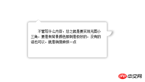
<p id="content"> <span class="out"></span><span class="iner"></span> <span class="right"></span>
  <p>不管写什么内容,总之就是要实现无图小三角,要是有背景颜色那倒是极好的,没有的话也可以,就是稍微麻烦一点</p>
</p>
#content {
text-indent: 2em;
box-shadow: 0px 0px 10px #999;
padding: 10px;
font-size: 12px;
line-height: 1.5;
border-radius: 5px;
height: 100px;
width: 250px;
position: relative;
margin: 200px auto;
border: 1px solid #CCC;
}
span {
position: absolute;
left: 25px;
height: 0px;
width: 0px;
}
/*上部小三角实现样式开始*/
span.out {
line-height: 0;
border-width: 10px;
border-color: transparent transparent #CCC transparent;
border-style: dashed dashed solid dashed;
top: -20px;
}
span.iner {
border-width: 10px;
border-color: #fff transparent #FFF transparent;
border-style: dashed dashed solid dashed;
top: -19px;
line-height: 0;
}
/*右部小三角实现样式开始*/
span.right {
background: #FFF;
border-width: 1px;
width: 16px;
height: 16px;
border-color: #CCC #CCC transparent transparent;
border-style: solid solid dashed dashed;
left: 270px;
top: 30px;
border-radius: 0 0 100% 0;/*这里radius的值不要选取绝对值因为在放大或者缩小的过程中会产生封不住口的现象*/
line-height: 0;
box-shadow: 5px 0 10px #aaa;
}I believe you have mastered the method after reading the case in this article. For more exciting information, please pay attention to other related articles on the php Chinese website !
Recommended reading:
Use CSS3 to achieve barrage effect
Unpopular CSS properties you don’t know
How to customize text omission using CSS
The above is the detailed content of Use CSS to realize sharp corners, small triangles, and sharp corners in different directions on the page. For more information, please follow other related articles on the PHP Chinese website!

Hot AI Tools

Undresser.AI Undress
AI-powered app for creating realistic nude photos

AI Clothes Remover
Online AI tool for removing clothes from photos.

Undress AI Tool
Undress images for free

Clothoff.io
AI clothes remover

Video Face Swap
Swap faces in any video effortlessly with our completely free AI face swap tool!

Hot Article
Hot Tools

Notepad++7.3.1
Easy-to-use and free code editor

SublimeText3 Chinese version
Chinese version, very easy to use

Zend Studio 13.0.1
Powerful PHP integrated development environment

Dreamweaver CS6
Visual web development tools

SublimeText3 Mac version
God-level code editing software (SublimeText3)
Hot Topics
 1386
1386
 52
52

 How to use bootstrap in vue
Apr 07, 2025 pm 11:33 PM
How to use bootstrap in vue
Apr 07, 2025 pm 11:33 PM
Using Bootstrap in Vue.js is divided into five steps: Install Bootstrap. Import Bootstrap in main.js. Use the Bootstrap component directly in the template. Optional: Custom style. Optional: Use plug-ins.
 The Roles of HTML, CSS, and JavaScript: Core Responsibilities
Apr 08, 2025 pm 07:05 PM
The Roles of HTML, CSS, and JavaScript: Core Responsibilities
Apr 08, 2025 pm 07:05 PM
HTML defines the web structure, CSS is responsible for style and layout, and JavaScript gives dynamic interaction. The three perform their duties in web development and jointly build a colorful website.
 How to write split lines on bootstrap
Apr 07, 2025 pm 03:12 PM
How to write split lines on bootstrap
Apr 07, 2025 pm 03:12 PM
There are two ways to create a Bootstrap split line: using the tag, which creates a horizontal split line. Use the CSS border property to create custom style split lines.
 Understanding HTML, CSS, and JavaScript: A Beginner's Guide
Apr 12, 2025 am 12:02 AM
Understanding HTML, CSS, and JavaScript: A Beginner's Guide
Apr 12, 2025 am 12:02 AM
WebdevelopmentreliesonHTML,CSS,andJavaScript:1)HTMLstructurescontent,2)CSSstylesit,and3)JavaScriptaddsinteractivity,formingthebasisofmodernwebexperiences.
 How to resize bootstrap
Apr 07, 2025 pm 03:18 PM
How to resize bootstrap
Apr 07, 2025 pm 03:18 PM
To adjust the size of elements in Bootstrap, you can use the dimension class, which includes: adjusting width: .col-, .w-, .mw-adjust height: .h-, .min-h-, .max-h-
 How to use bootstrap button
Apr 07, 2025 pm 03:09 PM
How to use bootstrap button
Apr 07, 2025 pm 03:09 PM
How to use the Bootstrap button? Introduce Bootstrap CSS to create button elements and add Bootstrap button class to add button text
 How to set up the framework for bootstrap
Apr 07, 2025 pm 03:27 PM
How to set up the framework for bootstrap
Apr 07, 2025 pm 03:27 PM
To set up the Bootstrap framework, you need to follow these steps: 1. Reference the Bootstrap file via CDN; 2. Download and host the file on your own server; 3. Include the Bootstrap file in HTML; 4. Compile Sass/Less as needed; 5. Import a custom file (optional). Once setup is complete, you can use Bootstrap's grid systems, components, and styles to create responsive websites and applications.
 How to insert pictures on bootstrap
Apr 07, 2025 pm 03:30 PM
How to insert pictures on bootstrap
Apr 07, 2025 pm 03:30 PM
There are several ways to insert images in Bootstrap: insert images directly, using the HTML img tag. With the Bootstrap image component, you can provide responsive images and more styles. Set the image size, use the img-fluid class to make the image adaptable. Set the border, using the img-bordered class. Set the rounded corners and use the img-rounded class. Set the shadow, use the shadow class. Resize and position the image, using CSS style. Using the background image, use the background-image CSS property.
