Detailed explanation of display attribute layout in CSS3
This time I will bring you a detailed explanation of the layout of the display attribute in CSS3. What are the precautions for the layout of the display attribute in CSS3? The following is a practical case, let's take a look.
Recently I am learning WeChat applet. When designing the layout of the homepage, I came across a new layout method display:flex .container {
display: flex;
flex-direction: column;
align-items: center;
background-color: #b3d4db;
}vertical-align attributes of child elements will be invalid.
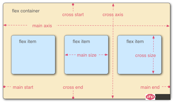
It can be applied to containers or inline elements. (The above description is combined with the WeChat developer tool description) In 2009, W3C proposed a new solution - Flex layout, which can implement various Elements that adopt Flex layout are called Flex containers (flex containers), or "containers" for short. All its child elements automatically become container members, called Flex items (flex items), referred to as "items". The container has two axes by default: the horizontal main axis and the vertical cross axis. The starting position of the main axis (the intersection with the border) is called main start, and the ending position is called main end; the starting position of the cross axis is called cross start, and the ending position is called cross end. Items are arranged along the main axis by default. The main axis space occupied by a single item is called main size, and the cross axis space occupied by a single item is called cross size.
- flex-direction The arrangement direction of the items in the container (default horizontal arrangement)
- flex-wrap The wrapping method of items in the container
- flex-flow The abbreviation of the above two properties
- justify-content How items are aligned on the main axis
- align-items How items are aligned on the cross axis
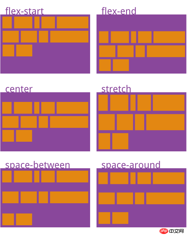
- align- content Defines the alignment of multiple axes. This property has no effect if the project has only one axis.
flex-direction
.box { 2 flex-direction: row | row-reverse | column | column-reverse; 3 }flex-wrap
.box{ 2 flex-wrap: nowrap | wrap | wrap-reverse; 3 }flex-flow
.box { 2 flex-flow: <flex-direction> || <flex-wrap>; 3 }justify-content
.box { 2 justify-content: flex-start | flex-end | center | space-between | space-around; 3 }align-items
.box { 2 align-items: flex-start | flex-end | center | baseline | stretch; 3 }
align-content
.box { 2 align-content: flex-start | flex-end | center | space-between | space-around | stretch; 3 }
order 项目的排列顺序。数值越小,排列越靠前,默认为0。
flex-grow 项目的放大比例,默认为0,即如果存在剩余空间,也不放大。
flex-shrink 项目的缩小比例,默认为1,即如果空间不足,该项目将缩小。
flex-basis 在分配多余空间之前,项目占据的主轴空间(main size)。浏览器根据这个属性,计算主轴是否有多余空间。它的默认值为auto,即项目的本来大小。
flex 是flex-grow, flex-shrink 和 flex-basis的简写,默认值为0 1 auto。后两个属性可选。
align-self 允许单个项目有与其他项目不一样的对齐方式,可覆盖align-items属性。默认值为auto,表示继承父元素的align-items属性,如果没有父元素,则等同于stretch。
order
     .item {
       order: <integer>;
}flex-grow
     .item {
       flex-grow: <number>; /* default 0 */
}flex-shrink
     .item {
       flex-shrink: <number>; /* default 1 */
}flex-basis
    .item {
       flex-basis: <length> | auto; /* default auto */
}flex
.item {
flex: none | [ <'flex-grow'> <'flex-shrink'>? || <'flex-basis'> ]
}align-self
     .item {
       align-self: auto | flex-start | flex-end | center | baseline | stretch;
}相信看了本文案例你已经掌握了方法,更多精彩请关注php中文网其它相关文章!
推荐阅读:
The above is the detailed content of Detailed explanation of display attribute layout in CSS3. For more information, please follow other related articles on the PHP Chinese website!

Hot AI Tools

Undresser.AI Undress
AI-powered app for creating realistic nude photos

AI Clothes Remover
Online AI tool for removing clothes from photos.

Undress AI Tool
Undress images for free

Clothoff.io
AI clothes remover

AI Hentai Generator
Generate AI Hentai for free.

Hot Article

Hot Tools

Notepad++7.3.1
Easy-to-use and free code editor

SublimeText3 Chinese version
Chinese version, very easy to use

Zend Studio 13.0.1
Powerful PHP integrated development environment

Dreamweaver CS6
Visual web development tools

SublimeText3 Mac version
God-level code editing software (SublimeText3)

Hot Topics
 How to achieve wave effect with pure CSS3? (code example)
Jun 28, 2022 pm 01:39 PM
How to achieve wave effect with pure CSS3? This article will introduce to you how to use SVG and CSS animation to create wave effects. I hope it will be helpful to you!
 Fujifilm X-M5 price expectations rise as leaked selfie display adds complexity to the formerly affordable camera line
Sep 07, 2024 am 09:34 AM
Fujifilm fans were recently very excited at the prospect of the X-T50, since it presented a relaunch of the budget-oriented Fujifilm X-T30 II that had become quite popular in the sub-$1,000 APS-C category. Unfortunately, as the Fujifilm X-T50's launc
 Use CSS skillfully to realize various strange-shaped buttons (with code)
Jul 19, 2022 am 11:28 AM
This article will show you how to use CSS to easily realize various weird-shaped buttons that appear frequently. I hope it will be helpful to you!
 Samsung: New, large display based on E Ink technology displays colors and communicates wirelessly
Jun 19, 2024 pm 03:37 PM
We frequently report on devices based on displays with electronic ink, such as e-readers. The technology offers a number of advantages: it can be read in bright environments without a backlight, and it only requires power when switching without light
 Comparison: Apple Studio Display vs Samsung Smart Monitor M8
May 11, 2023 pm 10:46 PM
Samsung Smart Display M8 vs. Apple Studio Display: Design and Size Since its launch, the Apple Studio Display has been compared to the iMac, consisting of a relatively thin panel on a relatively simple L-shaped stand. It's a well-known and well-loved aesthetic, and Samsung seems to have borrowed it for its presentation. The Samsung SmartMonitor M8 uses the same idea of a thin screen on a stand that looks very similar. Some minor elements are different, such as the small section in the lower left corner that sticks out a bit and the Samsung's chin is very thin, but they seem to be close in terms of basic design. Samsung seems to have taken a lot of inspiration from the 24-inch iMac. Apple's display is smaller than Samsung's
 Apple Studio Display's power cord is detachable, but requires special tools
May 17, 2023 pm 03:05 PM
Apple Studio Display is now officially available in stores, and many customers around the world have purchased the product. Unlike the ProDisplayXDR, the StudioDisplay has a unique power connector that appears to be non-removable. It turns out that the cable is removable, but you'll need a special tool to remove it. Apple says on its website that the Studio Display's power cord is not detachable -- and many users think so. That's because removing the cable with your hands seems impossible, but luckily the cable can be detached from the monitor. , Apple has a special tool for extracting information from its new StudioDispl
 How to implement lace borders in css3
Sep 16, 2022 pm 07:11 PM
In CSS, you can use the border-image attribute to achieve a lace border. The border-image attribute can use images to create borders, that is, add a background image to the border. You only need to specify the background image as a lace style; the syntax "border-image: url (image path) offsets the image border width inward. Whether outset is repeated;".
 It turns out that text carousel and image carousel can also be realized using pure CSS!
Jun 10, 2022 pm 01:00 PM
How to create text carousel and image carousel? The first thing everyone thinks of is whether to use js. In fact, text carousel and image carousel can also be realized using pure CSS. Let’s take a look at the implementation method. I hope it will be helpful to everyone!


