

The clever use of gradients in CSS
This time I will bring you the skillful use of gradients in CSS. What are the precautions for using gradients in CSS? The following is a practical case, let’s take a look.
Preface
This article mainly shares the relevant knowledge about linear-gradient and radial-gradient in CSS3, and brings you another way to use gradients. an angle. Interested friends, let’s take a look at the detailed introduction:
1. Linear gradient
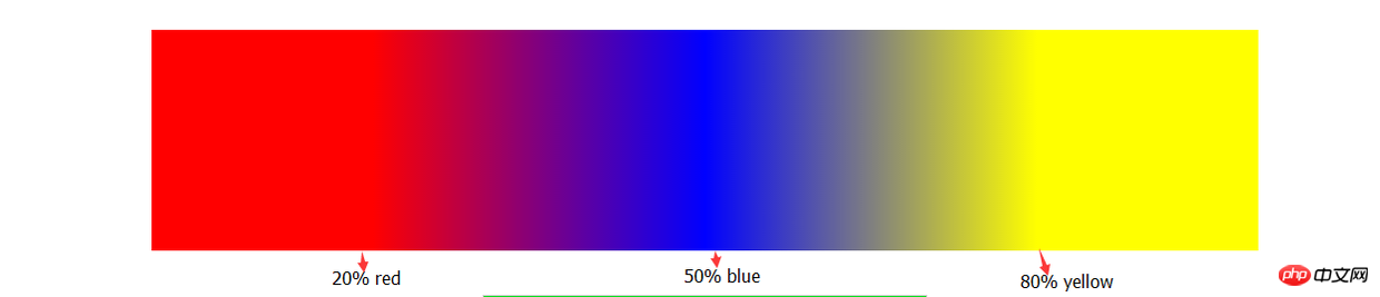
You need to go here first Let’s take a look at the basic syntax and then look at the following examples.linear-gradient(90deg,red 20%,blue 50%,yellow 80%);
Next, we have to do something. We overlap the color separation points.
    width: 300px;
    height: 200px;
    background: linear-gradient(90deg,blue 100px,#fff 100px,#fff 200px,red 200px);
- background supports the declaration of multiple linear-gradients, separated by commas;
- When you declare multiple linear-gradients, the one declared first is closer to the user. (Here we need to consider the issue of covering, usually transparent);
- I haven’t mastered the abbreviation of background yet, but it doesn’t work; # A reasonable combination of
- ##background-repeat
, background-size and background-position.
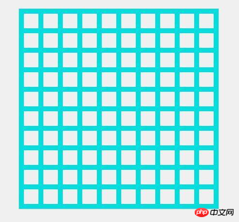
    width: 410px;
    height: 410px;
    background: linear-gradient(rgb(2,222,222) 10px, transparent 10px) repeat left top / 40px,
                linear-gradient(90deg,rgb(2,222,222) 10px, transparent 10px) repeat left top / 40px;
Copy after loginLook, in the past, to achieve such an effect, we could only beg the artist to cut the image. Now in the wave of CSS3, we can be self-sufficient (^_^).
And through gradient we can animate the background color without consuming additional
to achieve the desired effect. Example:
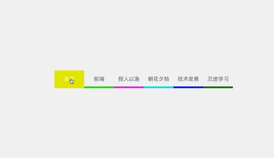
    /*
     *  这里用scss写的,对新手不太友好,抱歉(-_-)
     */
    @mixin menuaction($color) {
        background: linear-gradient($color 100%, transparent 100%) no-repeat center bottom / 100% 10%;
        &:hover {
            background-size: 100% 100%;
            color: #fff;
        }
}2. Radial gradient
Basically, radial gradient is similar to linear gradient, except It spreads outward from the center point. So I won’t go into details here.
Without further ado, let’s draw concentric circles first:
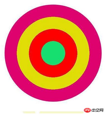
    border-radius: 50%;
    background: radial-gradient(circle,rgb(22,222,111) 0,rgb(22,222,111) 50px,red 50px,red 100px, rgb(222,222,1) 100px, rgb(222,222,1) 150px,rgb(222,2,111) 150px);
What will it end with, haha, various discounts recently Coupon, then let’s use the knowledge of gradients to get a coupon:

The core code is as follows:
    width: 300px;
    height: 120px;
    background: radial-gradient(transparent 0, transparent 5px, rgb(247,245,201) 5px) no-repeat,
                radial-gradient(transparent 0, transparent 5px, rgb(247,245,201) 5px) no-repeat,
                radial-gradient(transparent 0, transparent 5px, rgb(247,245,201) 5px) no-repeat,
                radial-gradient(transparent 0, transparent 5px, rgb(247,245,201) 5px) no-repeat,
                radial-gradient(transparent 0, transparent 5px, rgb(247,245,201) 5px) no-repeat,
                radial-gradient(transparent 0, transparent 5px, rgb(247,245,201) 5px) no-repeat,
                radial-gradient(#fff 0, #fff 10px, rgb(247,245,201) 10px) no-repeat,
                radial-gradient(#fff 0, #fff 10px, rgb(247,245,201) 10px) no-repeat,
                linear-gradient(90deg,transparent 10px, rgb(247,245,201) 10px);
            background-size: 20px 20px,20px 20px,20px 20px,20px 20px,20px 20px,20px 20px,60px 60px,60px 60px,100% 100%;
            background-position: -10px 0,-10px 20px,-10px 40px,-10px 60px,-10px 80px,-10px 100px,60px -30px,60px 90px,left center;
I believe you will read the case in this article You have mastered the method. For more exciting information, please pay attention to other related articles on the php Chinese website!
Recommended reading:
Unpopular CSS properties you don’t know
The above is the detailed content of The clever use of gradients in CSS. For more information, please follow other related articles on the PHP Chinese website!

Hot AI Tools

Undresser.AI Undress
AI-powered app for creating realistic nude photos

AI Clothes Remover
Online AI tool for removing clothes from photos.

Undress AI Tool
Undress images for free

Clothoff.io
AI clothes remover

Video Face Swap
Swap faces in any video effortlessly with our completely free AI face swap tool!

Hot Article
Hot Tools

Notepad++7.3.1
Easy-to-use and free code editor

SublimeText3 Chinese version
Chinese version, very easy to use

Zend Studio 13.0.1
Powerful PHP integrated development environment

Dreamweaver CS6
Visual web development tools

SublimeText3 Mac version
God-level code editing software (SublimeText3)
Hot Topics
 1386
1386
 52
52

 How to use bootstrap in vue
Apr 07, 2025 pm 11:33 PM
How to use bootstrap in vue
Apr 07, 2025 pm 11:33 PM
Using Bootstrap in Vue.js is divided into five steps: Install Bootstrap. Import Bootstrap in main.js. Use the Bootstrap component directly in the template. Optional: Custom style. Optional: Use plug-ins.
 The Roles of HTML, CSS, and JavaScript: Core Responsibilities
Apr 08, 2025 pm 07:05 PM
The Roles of HTML, CSS, and JavaScript: Core Responsibilities
Apr 08, 2025 pm 07:05 PM
HTML defines the web structure, CSS is responsible for style and layout, and JavaScript gives dynamic interaction. The three perform their duties in web development and jointly build a colorful website.
 How to write split lines on bootstrap
Apr 07, 2025 pm 03:12 PM
How to write split lines on bootstrap
Apr 07, 2025 pm 03:12 PM
There are two ways to create a Bootstrap split line: using the tag, which creates a horizontal split line. Use the CSS border property to create custom style split lines.
 Understanding HTML, CSS, and JavaScript: A Beginner's Guide
Apr 12, 2025 am 12:02 AM
Understanding HTML, CSS, and JavaScript: A Beginner's Guide
Apr 12, 2025 am 12:02 AM
WebdevelopmentreliesonHTML,CSS,andJavaScript:1)HTMLstructurescontent,2)CSSstylesit,and3)JavaScriptaddsinteractivity,formingthebasisofmodernwebexperiences.
 How to set up the framework for bootstrap
Apr 07, 2025 pm 03:27 PM
How to set up the framework for bootstrap
Apr 07, 2025 pm 03:27 PM
To set up the Bootstrap framework, you need to follow these steps: 1. Reference the Bootstrap file via CDN; 2. Download and host the file on your own server; 3. Include the Bootstrap file in HTML; 4. Compile Sass/Less as needed; 5. Import a custom file (optional). Once setup is complete, you can use Bootstrap's grid systems, components, and styles to create responsive websites and applications.
 How to insert pictures on bootstrap
Apr 07, 2025 pm 03:30 PM
How to insert pictures on bootstrap
Apr 07, 2025 pm 03:30 PM
There are several ways to insert images in Bootstrap: insert images directly, using the HTML img tag. With the Bootstrap image component, you can provide responsive images and more styles. Set the image size, use the img-fluid class to make the image adaptable. Set the border, using the img-bordered class. Set the rounded corners and use the img-rounded class. Set the shadow, use the shadow class. Resize and position the image, using CSS style. Using the background image, use the background-image CSS property.
 How to resize bootstrap
Apr 07, 2025 pm 03:18 PM
How to resize bootstrap
Apr 07, 2025 pm 03:18 PM
To adjust the size of elements in Bootstrap, you can use the dimension class, which includes: adjusting width: .col-, .w-, .mw-adjust height: .h-, .min-h-, .max-h-
 How to use bootstrap button
Apr 07, 2025 pm 03:09 PM
How to use bootstrap button
Apr 07, 2025 pm 03:09 PM
How to use the Bootstrap button? Introduce Bootstrap CSS to create button elements and add Bootstrap button class to add button text
