

css3 mobile properties
This time I will bring you the mobile attribute of css3. What are the precautions for using css3 mobile attribute? The following is a practical case, let’s take a look.
transform functionZoom
Use the sacle method to realize the scaling of text or images, specified in the parameters Zoom ratio, for example, sacle(0.5) means to reduce the size by 50%. The example is as follows:<!DOCTYPE html>
<html lang="en">
<head>
<meta charset="UTF-8">
<title>scale方法使用示例</title>
<style>
p {
width: 300px;
margin: 150px auto;
background-color: yellow;
text-align: center;
-webkit-transform: scale(0.5);
-moz-transform: scale(0.5);
-o-transform: scale(0.5);
}
</style>
</head>
<body>
<p>示例文字</p>
</body>
</html><!DOCTYPE html>
<html lang="en">
<head>
<meta charset="UTF-8">
<title>scale方法使用示例</title>
<style>
p {
width: 300px;
margin: 150px auto;
background-color: yellow;
text-align: center;
-webkit-transform: scale(0.5,2);
-moz-transform: scale(0.5,2);
-o-transform: scale(0.5,2);
}
</style>
</head>
<body>
<p>示例文字</p>
</body>
</html>Tilt
Use the skew method to implement tilt processing of text or images. Specify the tilt angle in the horizontal direction and the tilt angle in the vertical direction in the parameters. , for example, "skew(30deg,30deg)" means a tilt of 30 degrees in the horizontal direction and a tilt of 30 degrees in the vertical direction. The example is as follows:<!DOCTYPE html>
<html lang="en">
<head>
<meta charset="UTF-8">
<title>skew方法使用示例</title>
<style>
p {
width: 300px;
margin: 150px auto;
background-color: yellow;
text-align: center;
-webkit-transform: skew(30deg, 30deg);
-moz-transform: skew(30deg,30deg);
-o-transform: skew(30deg,30deg);
}
</style>
</head>
<body>
<p>示例文字</p>
</body>
</html>Rotation
Use the rotate method to rotate the element. There is one parameter "angle". The unit deg means degrees. Positive numbers mean clockwise rotation, and negative numbers mean counterclockwise rotation. Examples are as follows:<!DOCTYPE html>
<html lang="en">
<head>
<meta charset="UTF-8">
<title>对元素使用多重变形的示例</title>
<style>
p {
margin: 100px;
width: 300px;
background-color: yellow;
text-align: center;
-webkit-transform:rotate(30deg);
-moz-transform:rotate(30deg);
-o-transform:rotate(30deg);
}
</style>
</head>
<body>
<p>示例文字</p>
</body>
</html>Move
Use the translate method to move text or images, and specify the horizontal movement in the parameters. distance and vertical movement distance. For example:<!DOCTYPE html>
<html lang="en">
<head>
<meta charset="UTF-8">
<title>translate方法使用示例</title>
<style>
p {
width: 300px;
margin: 150px auto;
background-color: yellow;
text-align: center;
-webkit-transform: translate(50px,50px);
-moz-transform: translate(50px,50px);
-o-transform: translate(50px,50px);
}
</style>
</head>
<body>
<p>示例文字</p>
</body>
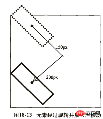
</html>Deformation example
Example 1:<!DOCTYPE html>
<html lang="en">
<head>
<meta charset="UTF-8">
<title>对元素使用多重变形的示例</title>
<style>
p {
width: 300px;
background-color: yellow;
text-align: center;
-webkit-transform: translate(150px,200px) rotate(45deg) scale(1.5);
-moz-transform: translate(50px,50px) rotate(45deg) scale(1.5);
-o-transform: translate(50px,50px) rotate(45deg) scale(1.5);
}
</style>
</head>
<body>
<p>示例文字</p>
</body>
</html>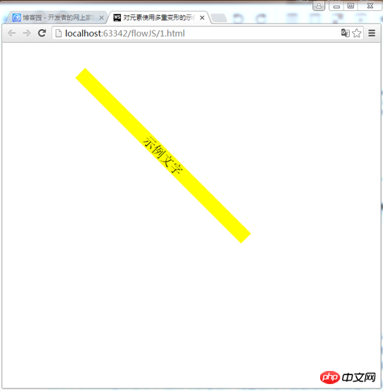
<!DOCTYPE html>
<html lang="en">
<head>
    <meta charset="UTF-8">
    <title>对元素使用多重变形的示例</title>
    <style>
        p {
            width: 300px;
            background-color: yellow;
            text-align: center;
            -webkit-transform:rotate(45deg) scale(1.5) translate(150px,200px);
            -moz-transform:rotate(45deg) scale(1.5) translate(150px,200px);
            -o-transform: rotate(45deg) scale(1.5) translate(150px,200px);
        }
    </style>
</head>
<body>
<p>示例文字</p>
</body>
</html>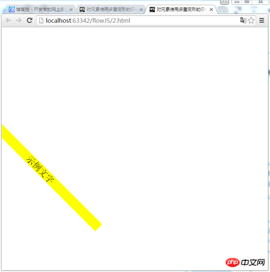
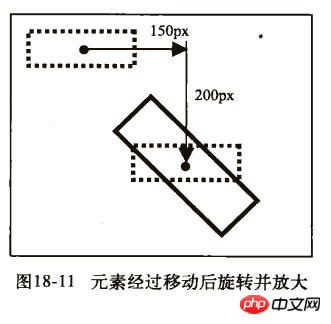
First example:
1) First move 150px to the right and 200px down. 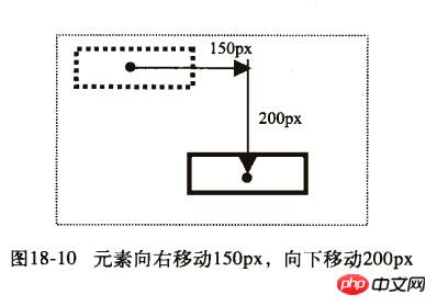
Second example:
1) First rotate 45 degrees and magnify 1.5 times. 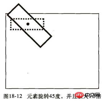
Detailed explanation of the use of Selector in CSS
Detailed explanation of the special usage skills of CSS margin
The above is the detailed content of css3 mobile properties. For more information, please follow other related articles on the PHP Chinese website!

Hot AI Tools

Undresser.AI Undress
AI-powered app for creating realistic nude photos

AI Clothes Remover
Online AI tool for removing clothes from photos.

Undress AI Tool
Undress images for free

Clothoff.io
AI clothes remover

Video Face Swap
Swap faces in any video effortlessly with our completely free AI face swap tool!

Hot Article
Hot Tools

Notepad++7.3.1
Easy-to-use and free code editor

SublimeText3 Chinese version
Chinese version, very easy to use

Zend Studio 13.0.1
Powerful PHP integrated development environment

Dreamweaver CS6
Visual web development tools

SublimeText3 Mac version
God-level code editing software (SublimeText3)
Hot Topics
 1386
1386
 52
52

 How to use bootstrap in vue
Apr 07, 2025 pm 11:33 PM
How to use bootstrap in vue
Apr 07, 2025 pm 11:33 PM
Using Bootstrap in Vue.js is divided into five steps: Install Bootstrap. Import Bootstrap in main.js. Use the Bootstrap component directly in the template. Optional: Custom style. Optional: Use plug-ins.
 The Roles of HTML, CSS, and JavaScript: Core Responsibilities
Apr 08, 2025 pm 07:05 PM
The Roles of HTML, CSS, and JavaScript: Core Responsibilities
Apr 08, 2025 pm 07:05 PM
HTML defines the web structure, CSS is responsible for style and layout, and JavaScript gives dynamic interaction. The three perform their duties in web development and jointly build a colorful website.
 How to write split lines on bootstrap
Apr 07, 2025 pm 03:12 PM
How to write split lines on bootstrap
Apr 07, 2025 pm 03:12 PM
There are two ways to create a Bootstrap split line: using the tag, which creates a horizontal split line. Use the CSS border property to create custom style split lines.
 Understanding HTML, CSS, and JavaScript: A Beginner's Guide
Apr 12, 2025 am 12:02 AM
Understanding HTML, CSS, and JavaScript: A Beginner's Guide
Apr 12, 2025 am 12:02 AM
WebdevelopmentreliesonHTML,CSS,andJavaScript:1)HTMLstructurescontent,2)CSSstylesit,and3)JavaScriptaddsinteractivity,formingthebasisofmodernwebexperiences.
 How to insert pictures on bootstrap
Apr 07, 2025 pm 03:30 PM
How to insert pictures on bootstrap
Apr 07, 2025 pm 03:30 PM
There are several ways to insert images in Bootstrap: insert images directly, using the HTML img tag. With the Bootstrap image component, you can provide responsive images and more styles. Set the image size, use the img-fluid class to make the image adaptable. Set the border, using the img-bordered class. Set the rounded corners and use the img-rounded class. Set the shadow, use the shadow class. Resize and position the image, using CSS style. Using the background image, use the background-image CSS property.
 How to set up the framework for bootstrap
Apr 07, 2025 pm 03:27 PM
How to set up the framework for bootstrap
Apr 07, 2025 pm 03:27 PM
To set up the Bootstrap framework, you need to follow these steps: 1. Reference the Bootstrap file via CDN; 2. Download and host the file on your own server; 3. Include the Bootstrap file in HTML; 4. Compile Sass/Less as needed; 5. Import a custom file (optional). Once setup is complete, you can use Bootstrap's grid systems, components, and styles to create responsive websites and applications.
 How to use bootstrap button
Apr 07, 2025 pm 03:09 PM
How to use bootstrap button
Apr 07, 2025 pm 03:09 PM
How to use the Bootstrap button? Introduce Bootstrap CSS to create button elements and add Bootstrap button class to add button text
 How to resize bootstrap
Apr 07, 2025 pm 03:18 PM
How to resize bootstrap
Apr 07, 2025 pm 03:18 PM
To adjust the size of elements in Bootstrap, you can use the dimension class, which includes: adjusting width: .col-, .w-, .mw-adjust height: .h-, .min-h-, .max-h-
