

CSS sets the style of the Checkbox checkbox
This time I will bring you the style of CSS setting Checkboxcheckbox, what are the notes of setting the style of Checkbox checkbox with CSS, the following is a practical case, let's take a look take a look.
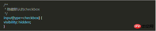
First, you need to add a piece of CSS to hide all Checkbox checkboxes. Next we will change its appearance. To do this you need to add a piece of code to your CSS file.
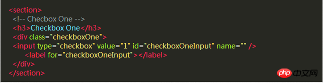
After hiding all the Checkbox check boxes, we need to add a label HTML element, we all know that when clicked there is a for attribute label, the corresponding Checkbox checkbox will be selected. This means that we can handle our Checkbox through the label's click event .
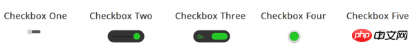
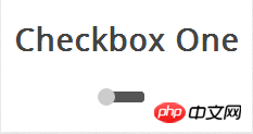
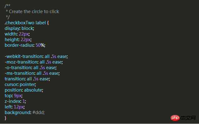
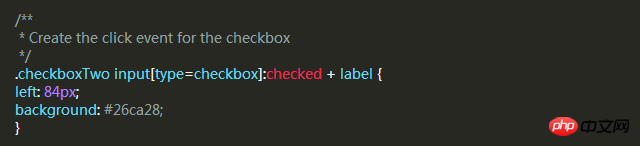
Style 1
Style 2

:before pseudo-class .
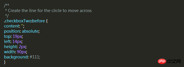
background attributes of the label when selected.
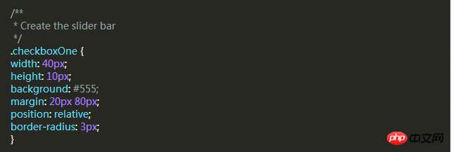
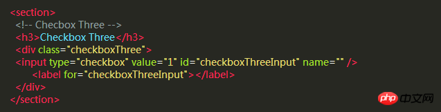
Style Three
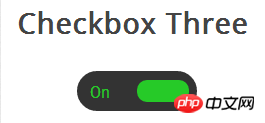
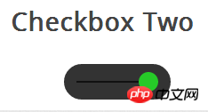
The style of this check box is more complex than style two. It will slide left and right like the previous example, and when changing the selected and unselected state, the slider slides to On the other side, the corresponding text is displayed in its original position.
First, we write the HTML code, which is the same as before.
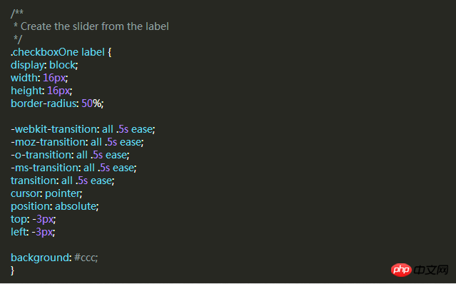
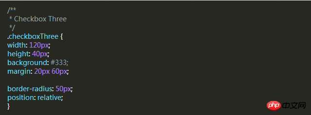
Then, we use p as the slider in the same way. The following code will create a black rounded strip where we can place the slider and text. in.
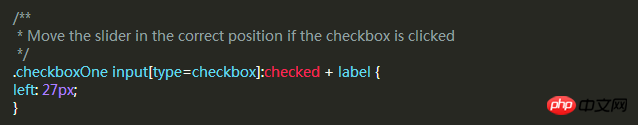
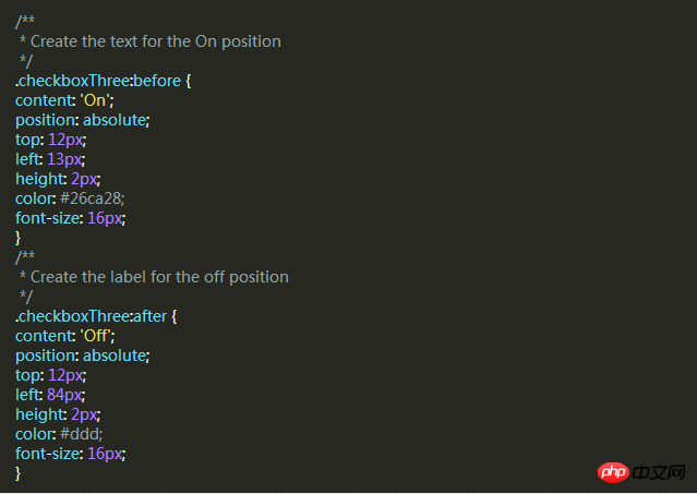
When the slider is unselected, the slider will be on the left and "OFF" is displayed on the right. When clicked, the slider moves to the right. "ON" is displayed on the left.
But the number of elements is not enough for us to implement these functions, so we have to use two pseudo-classes: before and :after to create two elements and place "ON" and "OFF" respectively.
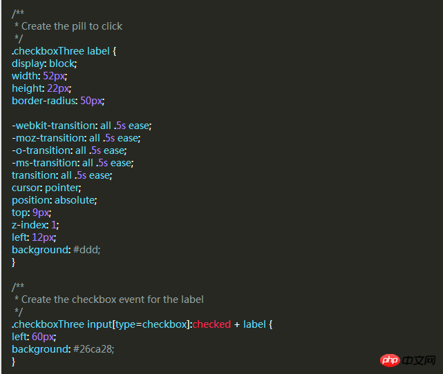
As before, let’s add a slider style that will move to the other side and change color when clicked.
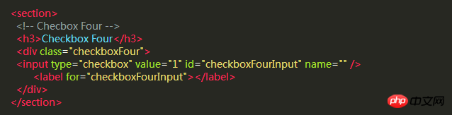
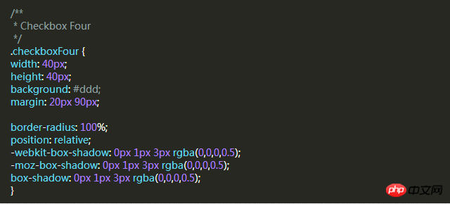
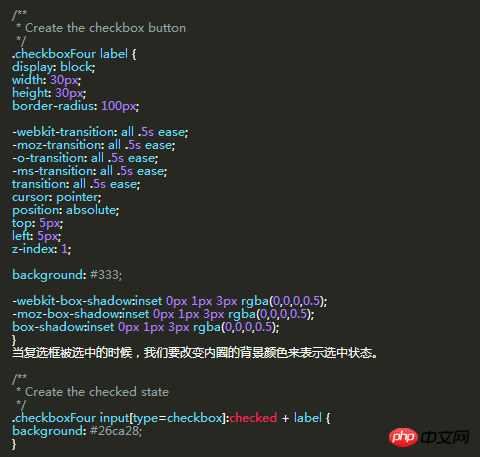
Style Four
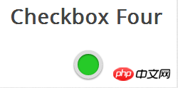
In this style, we Two circles will be created. When clicked, the color of the circle inside changes to indicate the selected or unselected state.
The same HTML code as before.
Next we need to create an outer circle for the checkbox, use the border-radius property of CSS, and set it to 100% to create a perfect circle.
Then we use the label element to create a smaller circle, which will change color according to the checkbox state.
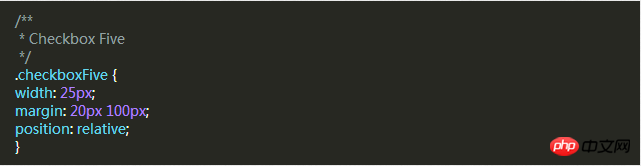
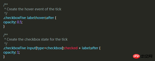
Style five
The style of this check box It is a little different. It only looks slightly better than the default checkbox style of the browser, but the difference is that we can define its style according to our own needs.
First of all, it’s still the same HTML code
In the previous example, we used p as the sliding strip or outer circle of the checkbox, but this time we don’t need it. Use the p element to set the area of the checkbox.
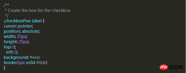
The label label is used for the Click event and the box style of the check box we want to define.
Next, we have to create the check mark in the box. For this, we can use the :after pseudo-class to create a new element. In order to achieve this style, We can create a 5px x 9px rectangle and add a border to it. At this time, after we remove the top and right borders, it will look like a letter L. Then we can use the CSS transform property to rotate it so it looks like a check mark.
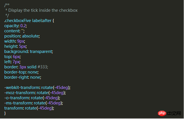
In the CSS above, we have set its transparency to 0.2, so you will see the checkbox has a semi-transparent tick. You can make it darker on hover and make it opaque when selected.
This will create a new checkbox style for you.
I believe you have mastered the method after reading the case in this article. For more exciting information, please pay attention to other related articles on the php Chinese website!
Recommended reading:
Detailed explanation of the use of Selector in CSS
Detailed explanation of the special usage skills of CSS margin
The above is the detailed content of CSS sets the style of the Checkbox checkbox. For more information, please follow other related articles on the PHP Chinese website!

Hot AI Tools

Undresser.AI Undress
AI-powered app for creating realistic nude photos

AI Clothes Remover
Online AI tool for removing clothes from photos.

Undress AI Tool
Undress images for free

Clothoff.io
AI clothes remover

Video Face Swap
Swap faces in any video effortlessly with our completely free AI face swap tool!

Hot Article
Hot Tools

Notepad++7.3.1
Easy-to-use and free code editor

SublimeText3 Chinese version
Chinese version, very easy to use

Zend Studio 13.0.1
Powerful PHP integrated development environment

Dreamweaver CS6
Visual web development tools

SublimeText3 Mac version
God-level code editing software (SublimeText3)
Hot Topics
 1386
1386
 52
52

 How to use bootstrap in vue
Apr 07, 2025 pm 11:33 PM
How to use bootstrap in vue
Apr 07, 2025 pm 11:33 PM
Using Bootstrap in Vue.js is divided into five steps: Install Bootstrap. Import Bootstrap in main.js. Use the Bootstrap component directly in the template. Optional: Custom style. Optional: Use plug-ins.
 The Roles of HTML, CSS, and JavaScript: Core Responsibilities
Apr 08, 2025 pm 07:05 PM
The Roles of HTML, CSS, and JavaScript: Core Responsibilities
Apr 08, 2025 pm 07:05 PM
HTML defines the web structure, CSS is responsible for style and layout, and JavaScript gives dynamic interaction. The three perform their duties in web development and jointly build a colorful website.
 How to write split lines on bootstrap
Apr 07, 2025 pm 03:12 PM
How to write split lines on bootstrap
Apr 07, 2025 pm 03:12 PM
There are two ways to create a Bootstrap split line: using the tag, which creates a horizontal split line. Use the CSS border property to create custom style split lines.
 Understanding HTML, CSS, and JavaScript: A Beginner's Guide
Apr 12, 2025 am 12:02 AM
Understanding HTML, CSS, and JavaScript: A Beginner's Guide
Apr 12, 2025 am 12:02 AM
WebdevelopmentreliesonHTML,CSS,andJavaScript:1)HTMLstructurescontent,2)CSSstylesit,and3)JavaScriptaddsinteractivity,formingthebasisofmodernwebexperiences.
 How to set up the framework for bootstrap
Apr 07, 2025 pm 03:27 PM
How to set up the framework for bootstrap
Apr 07, 2025 pm 03:27 PM
To set up the Bootstrap framework, you need to follow these steps: 1. Reference the Bootstrap file via CDN; 2. Download and host the file on your own server; 3. Include the Bootstrap file in HTML; 4. Compile Sass/Less as needed; 5. Import a custom file (optional). Once setup is complete, you can use Bootstrap's grid systems, components, and styles to create responsive websites and applications.
 How to resize bootstrap
Apr 07, 2025 pm 03:18 PM
How to resize bootstrap
Apr 07, 2025 pm 03:18 PM
To adjust the size of elements in Bootstrap, you can use the dimension class, which includes: adjusting width: .col-, .w-, .mw-adjust height: .h-, .min-h-, .max-h-
 How to insert pictures on bootstrap
Apr 07, 2025 pm 03:30 PM
How to insert pictures on bootstrap
Apr 07, 2025 pm 03:30 PM
There are several ways to insert images in Bootstrap: insert images directly, using the HTML img tag. With the Bootstrap image component, you can provide responsive images and more styles. Set the image size, use the img-fluid class to make the image adaptable. Set the border, using the img-bordered class. Set the rounded corners and use the img-rounded class. Set the shadow, use the shadow class. Resize and position the image, using CSS style. Using the background image, use the background-image CSS property.
 How to use bootstrap button
Apr 07, 2025 pm 03:09 PM
How to use bootstrap button
Apr 07, 2025 pm 03:09 PM
How to use the Bootstrap button? Introduce Bootstrap CSS to create button elements and add Bootstrap button class to add button text
