

Bootstrap implements price list

This article mainly introduces the use of Bootstrap to achieve a beautiful and concise CSS3 price list effect. The effect achieved is very good, and different screen sizes can be used. Friends in need can refer to it. Let’s take a look.
Preface
This is a beautiful and concise CSS3 price list style. The price list is laid out based on the Bootstrap grid system. Simple CSS3 code is used to beautify the price list. The style is very fashionable and beautiful, and can display good effects on different screens.
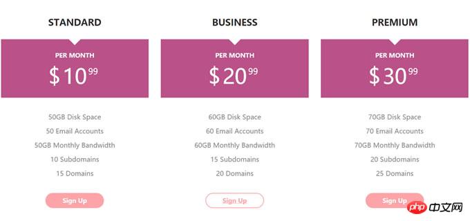
Let’s look at the renderings first
View the demo download source code
First of all The bootstrap.min.css file is introduced into the page. Here I use the official CDN resource. You can also download it for local use.
<link rel="stylesheet" href="http//cdn.bootcss.com/bootstrap/3.3.5/css/bootstrap.min.css">
The HTML structure of the css3 price list is as follows:
<p class="container">
    <p class="row">
        <p class="col-md-4 col-sm-6">
            <p class="pricingTable">
                <h3 class="title">Standard</h3>
                <p class="price-value">
                    <span class="month">per month</span>
                    <span class="amount">
                        <span class="currency">$</span>
                        10
                        <span class="value">99</span>
                    </span>
                </p>
                <ul class="pricing-content">
                    <li>50GB Disk Space</li>
                    <li>50 Email Accounts</li>
                    <li>50GB Monthly Bandwidth</li>
                    <li>10 Subdomains</li>
                    <li>15 Domains</li>
                </ul>
                <a href="#" class="pricingTable-signup">sign up</a>
            </p>
        </p>

        <p class="col-md-4 col-sm-6">
            <p class="pricingTable">
                <h3 class="title">Business</h3>
                <p class="price-value">
                    <span class="month">per month</span>
                    <span class="amount">
                        <span class="currency">$</span>
                        20
                        <span class="value">99</span>
                    </span>
                </p>
                <ul class="pricing-content">
                    <li>60GB Disk Space</li>
                    <li>60 Email Accounts</li>
                    <li>60GB Monthly Bandwidth</li>
                    <li>15 Subdomains</li>
                    <li>20 Domains</li>
                </ul>
                <a href="#" class="pricingTable-signup">sign up</a>
            </p>
        </p>
    </p>
</p>
CSS3
Add the following CSS to the price list Styles for rendering and beautification.
.pricingTable{
    text-align: center;
    background: #fff;
    padding: 30px 0;
}
.pricingTable .title{
    font-size: 22px;
    font-weight: 600;
    color: #2e282a;
    text-transform: uppercase;
    margin: 0 0 30px 0;
}
.pricingTable .price-value{
    padding: 30px 0;
    background: #ba5289;
    margin-bottom: 30px;
    position: relative;
}
.pricingTable .price-value:before{
    content: "";
    border-top: 15px solid #fff;
    border-left: 15px solid transparent;
    border-right: 15px solid transparent;
    position: absolute;
    top: 0;
    left: 46%;
}
.pricingTable .month{
    display: block;
    height: 50px;
    font-size: 15px;
    font-weight: 900;
    color: #fff;
    text-transform: uppercase;
}
.pricingTable .amount{
    display: inline-block;
    font-size: 50px;
    color: #fff;
    position: relative;
}
.pricingTable .currency{
    position: absolute;
    top: -1px;
    left: -35px;
}
.pricingTable .value{
    font-size: 20px;
    position: absolute;
    top: -11px;
    right: -27px;
}
.pricingTable .pricing-content{
    padding: 0;
    margin: 0 0 30px 0;
    list-style: none;
}
.pricingTable .pricing-content li{
    font-size: 16px;
    color: #868686;
    line-height: 35px;
}
.pricingTable .pricingTable-signup{
    display: inline-block;
    padding: 8px 40px;
    background: #fca4a7;
    font-size: 15px;
    font-weight: 600;
    color: #fff;
    text-transform: capitalize;
    border: 2px solid #fca4a7;
    border-radius: 30px;
    transition: all 0.5s ease 0s;
}
.pricingTable .pricingTable-signup:hover{
    background: #fff;
    color: #fca4a7;
}
@media only screen and (max-width: 990px){
    .pricingTable{ margin-bottom: 30px; }
}I believe you have mastered the method after reading the case in this article. For more exciting information, please pay attention to other related articles on the php Chinese website!
Recommended reading:
## There are several ways to implement a three-column layout in CSS
The above is the detailed content of Bootstrap implements price list. For more information, please follow other related articles on the PHP Chinese website!

Hot AI Tools

Undresser.AI Undress
AI-powered app for creating realistic nude photos

AI Clothes Remover
Online AI tool for removing clothes from photos.

Undress AI Tool
Undress images for free

Clothoff.io
AI clothes remover

Video Face Swap
Swap faces in any video effortlessly with our completely free AI face swap tool!

Hot Article
Hot Tools

Notepad++7.3.1
Easy-to-use and free code editor

SublimeText3 Chinese version
Chinese version, very easy to use

Zend Studio 13.0.1
Powerful PHP integrated development environment

Dreamweaver CS6
Visual web development tools

SublimeText3 Mac version
God-level code editing software (SublimeText3)
Hot Topics
 1387
1387
 52
52

 How to get the bootstrap search bar
Apr 07, 2025 pm 03:33 PM
How to get the bootstrap search bar
Apr 07, 2025 pm 03:33 PM
How to use Bootstrap to get the value of the search bar: Determines the ID or name of the search bar. Use JavaScript to get DOM elements. Gets the value of the element. Perform the required actions.
 How to use bootstrap in vue
Apr 07, 2025 pm 11:33 PM
How to use bootstrap in vue
Apr 07, 2025 pm 11:33 PM
Using Bootstrap in Vue.js is divided into five steps: Install Bootstrap. Import Bootstrap in main.js. Use the Bootstrap component directly in the template. Optional: Custom style. Optional: Use plug-ins.
 How to do vertical centering of bootstrap
Apr 07, 2025 pm 03:21 PM
How to do vertical centering of bootstrap
Apr 07, 2025 pm 03:21 PM
Use Bootstrap to implement vertical centering: flexbox method: Use the d-flex, justify-content-center, and align-items-center classes to place elements in the flexbox container. align-items-center class method: For browsers that do not support flexbox, use the align-items-center class, provided that the parent element has a defined height.
 How to write split lines on bootstrap
Apr 07, 2025 pm 03:12 PM
How to write split lines on bootstrap
Apr 07, 2025 pm 03:12 PM
There are two ways to create a Bootstrap split line: using the tag, which creates a horizontal split line. Use the CSS border property to create custom style split lines.
 How to resize bootstrap
Apr 07, 2025 pm 03:18 PM
How to resize bootstrap
Apr 07, 2025 pm 03:18 PM
To adjust the size of elements in Bootstrap, you can use the dimension class, which includes: adjusting width: .col-, .w-, .mw-adjust height: .h-, .min-h-, .max-h-
 How to use bootstrap button
Apr 07, 2025 pm 03:09 PM
How to use bootstrap button
Apr 07, 2025 pm 03:09 PM
How to use the Bootstrap button? Introduce Bootstrap CSS to create button elements and add Bootstrap button class to add button text
 How to set up the framework for bootstrap
Apr 07, 2025 pm 03:27 PM
How to set up the framework for bootstrap
Apr 07, 2025 pm 03:27 PM
To set up the Bootstrap framework, you need to follow these steps: 1. Reference the Bootstrap file via CDN; 2. Download and host the file on your own server; 3. Include the Bootstrap file in HTML; 4. Compile Sass/Less as needed; 5. Import a custom file (optional). Once setup is complete, you can use Bootstrap's grid systems, components, and styles to create responsive websites and applications.
 How to insert pictures on bootstrap
Apr 07, 2025 pm 03:30 PM
How to insert pictures on bootstrap
Apr 07, 2025 pm 03:30 PM
There are several ways to insert images in Bootstrap: insert images directly, using the HTML img tag. With the Bootstrap image component, you can provide responsive images and more styles. Set the image size, use the img-fluid class to make the image adaptable. Set the border, using the img-bordered class. Set the rounded corners and use the img-rounded class. Set the shadow, use the shadow class. Resize and position the image, using CSS style. Using the background image, use the background-image CSS property.
