

Several ways to implement Footer at the bottom in CSS
This time I will bring you several ways to implement Footer at the bottom in CSS. What are the precautions for implementing Footer at the bottom in CSS? The following is a practical case, let’s take a look.
Sticky footer means that the footer part of the web page is always at the bottom of the browser window. When the content of the web page is long enough to exceed the visual height of the browser, the footer will be pushed to the bottom of the web page along with the content; but if the content of the web page is not long enough, the bottom footer will remain in the browser bottom of window.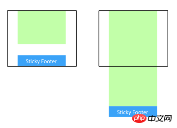
Method 1: Set the margin-bottom of the content part to a negative number
<p class="wrapper">
    <!-- content -->
    <p class="push"></p>
</p>
<p class="footer">footer</p>
html, body {
  margin: 0;
  padding: 0;
  height: 100%;
}
.wrapper {
  min-height: 100%;
  margin-bottom: -50px; /* 等于footer的高度 */
}
.footer, .push {
  height: 50px;
}Method 2: Set the margin-top of the footer to a negative number
Add a parent element outside the content, And make thepadding-bottom of the content part equal to the height of the footer.
<p class="content">
  <p class="content-inside">
    <!-- content -->
  </p>
</p>
<p class="footer">footer</p>
html, body {
  margin: 0;
  padding: 0;
  height: 100%;
}
.content {
  min-height: 100%;
}
.content-inside {
  padding: 20px;
  padding-bottom: 50px;
}
.footer {
  height: 50px;
  margin-top: -50px;
}Method 3: Use calc() to set the content height
<p class="content">
  <!-- content -->
</p>
<p class="footer">footer</p>
.content {
  min-height: calc(100vh - 70px);
}
.footer {
  height: 50px;
}Method 4: Use flexbox layout
The footer height of the above three methods is fixed Yes, if there is too much content in the footer, the layout may be destroyed.<p class="content"> <!-- content --> </p> <p class="footer">footer</p>
html {
height: 100%;
}
body {
min-height: 100%;
display: flex;
flex-direction: column;
}
.content {
flex: 1;
}Method Five: Use Grid Grid Layout
<p class="content">
  <!-- content -->
</p>
<p class="footer">footer</p>
html {
  height: 100%;
}
body {
  min-height: 100%;
  display: grid;
  grid-template-rows: 1fr auto;
}
.footer {
  grid-row-start: 2;
  grid-row-end: 3;
}React and CSS3 implement WeChat red envelope opening animation
Advanced usage of background-attachment in css
The above is the detailed content of Several ways to implement Footer at the bottom in CSS. For more information, please follow other related articles on the PHP Chinese website!

Hot AI Tools

Undresser.AI Undress
AI-powered app for creating realistic nude photos

AI Clothes Remover
Online AI tool for removing clothes from photos.

Undress AI Tool
Undress images for free

Clothoff.io
AI clothes remover

AI Hentai Generator
Generate AI Hentai for free.

Hot Article
Hot Tools

Notepad++7.3.1
Easy-to-use and free code editor

SublimeText3 Chinese version
Chinese version, very easy to use

Zend Studio 13.0.1
Powerful PHP integrated development environment

Dreamweaver CS6
Visual web development tools

SublimeText3 Mac version
God-level code editing software (SublimeText3)
Hot Topics
 1359
1359
 52
52

 How to remove the default style in Bootstrap list?
Apr 07, 2025 am 10:18 AM
How to remove the default style in Bootstrap list?
Apr 07, 2025 am 10:18 AM
The default style of the Bootstrap list can be removed with CSS override. Use more specific CSS rules and selectors, follow the "proximity principle" and "weight principle", overriding the Bootstrap default style. To avoid style conflicts, more targeted selectors can be used. If the override is unsuccessful, adjust the weight of the custom CSS. At the same time, pay attention to performance optimization, avoid overuse of !important, and write concise and efficient CSS code.
 How to layout bootstrap
Apr 07, 2025 pm 02:24 PM
How to layout bootstrap
Apr 07, 2025 pm 02:24 PM
To use Bootstrap to layout a website, you need to use a grid system to divide the page into containers, rows, and columns. First add the container, then add the rows in it, add the columns within the row, and finally add the content in the column. Bootstrap's responsive layout function automatically adjusts the layout according to breakpoints (xs, sm, md, lg, xl). Different layouts under different screen sizes can be achieved by using responsive classes.
 How to build a bootstrap framework
Apr 07, 2025 pm 12:57 PM
How to build a bootstrap framework
Apr 07, 2025 pm 12:57 PM
To create a Bootstrap framework, follow these steps: Install Bootstrap via CDN or install a local copy. Create an HTML document and link Bootstrap CSS to the <head> section. Add Bootstrap JavaScript file to the <body> section. Use the Bootstrap component and customize the stylesheet to suit your needs.
 How to insert pictures on bootstrap
Apr 07, 2025 pm 03:30 PM
How to insert pictures on bootstrap
Apr 07, 2025 pm 03:30 PM
There are several ways to insert images in Bootstrap: insert images directly, using the HTML img tag. With the Bootstrap image component, you can provide responsive images and more styles. Set the image size, use the img-fluid class to make the image adaptable. Set the border, using the img-bordered class. Set the rounded corners and use the img-rounded class. Set the shadow, use the shadow class. Resize and position the image, using CSS style. Using the background image, use the background-image CSS property.
 Does the image centering support image zooming?
Apr 07, 2025 am 07:42 AM
Does the image centering support image zooming?
Apr 07, 2025 am 07:42 AM
How to achieve image centering and scaling in Bootstrap: Use d-flex justify-content-center to center images horizontally. Use align-items-center and fixed parent element height vertically center the image. Use the width and height attributes to control the image size, or use max-width and max-height to limit the maximum size. Use the img-fluid class or responsive design mechanism, such as media queries, to achieve responsive scaling. Optimize image size, control scaling using the object-fit attribute, and follow best practices to ensure performance and maintainability.
 How to upload files on bootstrap
Apr 07, 2025 pm 01:09 PM
How to upload files on bootstrap
Apr 07, 2025 pm 01:09 PM
The file upload function can be implemented through Bootstrap. The steps are as follows: introduce Bootstrap CSS and JavaScript files; create file input fields; create file upload buttons; handle file uploads (using FormData to collect data and then send to the server); custom style (optional).
 How to set the bootstrap navigation bar
Apr 07, 2025 pm 01:51 PM
How to set the bootstrap navigation bar
Apr 07, 2025 pm 01:51 PM
Bootstrap provides a simple guide to setting up navigation bars: Introducing the Bootstrap library to create navigation bar containers Add brand identity Create navigation links Add other elements (optional) Adjust styles (optional)
 How is the compatibility of Bootstrap image centering
Apr 07, 2025 am 07:51 AM
How is the compatibility of Bootstrap image centering
Apr 07, 2025 am 07:51 AM
Bootstrap image centering faces compatibility issues. The solution is as follows: Use mx-auto to center the image horizontally for display: block. Vertical centering Use Flexbox or Grid layouts to ensure that the parent element is vertically centered to align the child elements. For IE browser compatibility, use tools such as Autoprefixer to automatically add browser prefixes. Optimize image size, format and loading order to improve page performance.
