

css3 to achieve animated bicycle effect
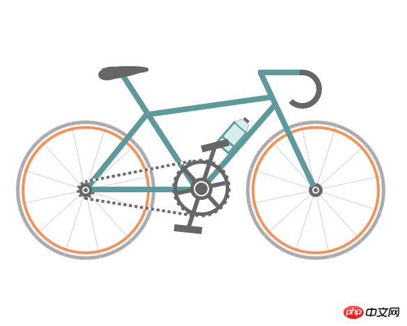
This time I will bring you css3 to realize the animated bicycle effect. What are the precautions to realize the animated bicycle effect with css3? The following is a practical case, let's take a look.
First let’s take a look at the implemented renderings (static):
Instance source code:
<!DOCTYPE html>
<html>
 <head>
  <meta charset="UTF-8">
  <title>自行车</title>
  <style type="text/css">
   * {
    margin: 0;
    padding: 0
   }

   ol,
   ul {
    list-style: none/*去掉圆点或数字*/
   }

   .cycle-outer {
    width: 534px;
    height: 260px;
    position: absolute;
    /*绝对定位*/
    top: 50%;
    /*距离顶部*/
    margin: -160px 0 0 -267px;
    /*距离外边距*/
    left: 50%;
   }

   .cycle-wrapper {
    width: 534px;
    height: 260px;
    margin: 0 auto;
    position: relative;
    /*相对定位*/
   }

   .cycle-wheel-front {
    /*前轮*/
    margin: 100px 0 0 330px;
   }

   .cycle-wheel-back {
    /*后轮*/
    margin: 100px 0 0 0px;
   }

   .cycle-wheel-outer {
    background: transparent;
    border: 5px solid #aaa;
    border-radius: 50%;
    /*画外轮圆圈*/
    width: 190px;
    height: 190px;
    position: absolute;
    margin-top: 5px;
    animation: wheel-rotate 2s linear infinite;
    /*定义动画*/
   }
   /*轮胎开始旋转*/
   @keyframes wheel-rotate {
    from {
     transform: rotate(0deg);
    }
    to {
     transform: rotate(360deg);
    }
   }

   .cycle-wheel-outer:after {
    /*插入内轮胎圆圈*/
    background: transparent;
    border: 4px solid #EF9058;
    border-radius: 50%;
    width: 176px;
    height: 176px;
    position: absolute;
    margin: 3px;
    content: "";
   }

   .spoke {
    /*开始画车轮线条*/
    position: absolute;
    width: 1px;
    height: 200px;
    background: #ccc;
    margin: -5px 0 0 95px;
    z-index: 0;
   }

   .spoke:after {
    /*在后面插入两条*/
    content: "";
    position: absolute;
    width: 1px;
    height: 200px;
    background: #ccc;
    transform: rotate(120deg);
   }

   .spoke:before {
    /*在前面插入两条*/
    content: "";
    position: absolute;
    width: 1px;
    height: 200px;
    background: #ccc;
    transform: rotate(240deg);
   }
   /*轮胎线条完成*/

   .spoke-container li:nth-child(2) {
    /*中心点旋转*/
    transform: rotate(30deg);
   }

   .inner-disc {
    /*画中心轴圆点*/
    background: #666;
    width: 20px;
    height: 20px;
    border-radius: 50%;
    position: absolute;
    left: 50%;
    margin: -10px 0 0 -10px;
    top: 50%;
   }
   /*.cycle-wheel-back .inner-disc:after {
    content: "";
    background: #666;
    width: 20px;
    height: 20px;
    border-radius: 50%;
    position: absolute;
    left: 50%;
    margin: -10px 0 0 -10px;
    top: 50%;
   }*/

   .inner-disc-2 {
    /*画轮胎中心轴的圆圈*/
    background: transparent;
    width: 6px;
    height: 6px;
    border: 2px solid #FFF;
    border-radius: 50%;
    position: absolute;
    left: 50%;
    margin: -5px 0 0 -5px;
    top: 50%;
   }

   .cycle-wheel-back .inner-disc-2:after {
    /*插入后轮轴心齿轮*/
    content: "";
    background: transparent;
    width: 18px;
    height: 18px;
    border-radius: 50%;
    position: absolute;
    left: 50%;
    margin: -13px 0 0 -13px;
    top: 50%;
    border: 4px dotted #666;
   }
   .cycle-body {
    margin-left: 125px;
   }
   .front-wheel-frame {/*前叉*/
    background: #5E999B;
    width: 8px;
    height: 180px;
    position: absolute;
    z-index: 2;
    transform: rotate(-25deg);
    margin: -72px 0 0 260px;
   }
   .top-frame {/*上管*/
    background: #5E999B;
    width: 180px;
    height: 8px;
    position: absolute;
    z-index: 2;
    margin: -20px 0 0 62px;
    transform: rotate(-8deg);
   }
   .front-frame {/*下管*/
    background: #5E999B;
    width: 8px;
    height: 160px;
    position: absolute;
    z-index: 2;
    transform: rotate(41deg);
    margin: -36px 0 0 189px;
   }
   .center-frame { /*坐杆*/
    background: #5E999B;
    width: 8px;
    height: 205px;
    position: absolute;
    z-index: 2;
    transform: rotate(-33deg);
    margin: -84px 0 0 75px;
   }
   .back-frame {/*后管*/
    background: #5E999B;
    width: 8px;
    height: 136px;
    position: absolute;
    z-index: 2;
    transform: rotate(39deg);
    margin: -23px 0 0 19px;
   }
   .bottom-frame {/*后叉or平管*/
    background: #5E999B;
    width: 159px;
    height: 8px;
    position: absolute;
    z-index: 2;
    margin: 100px 0 0 -16px;
   }
   .handlebar-front {/*车把*/
    width: 60px;
    height: 8px;
    background: #5E999B;
    z-index: 2;
    position: absolute;
    margin: -68px 0 0 222px;
    border-top-left-radius: 3px;
    border-bottom-left-radius: 3px;
   }
   .handlebar-curve {/*车把手*/
    width: 40px;
    height: 40px;
    border: 8px solid #666;
    border-top-right-radius: 100%;
    border-bottom-right-radius: 100%;
    border-bottom-left-radius: 100%;
    background: transparent;
    position: absolute;
    margin: -68px 0 0 258px;
    border-left: 8px solid transparent;
    border-top: 8px solid #666;
    border-bottom: 8px solid #666;
   }
   /*座垫*/
   .seat {
    width: 50px;
    height: 10px;
    background: #666;
    border-radius: 44%;
    position: absolute;
    margin: -73px 0 0 15px;
   }

   .seat:after {
    width: 0px;
    height: 0px;
    border-style: solid;
    border-width: 0 40px 16px 40px;
    border-color: transparent transparent #666 transparent;
    content: "";
    position: absolute;
    z-index: 3;
    transform: rotate(-12deg);
    position: absolute;
    border-radius: 100%;
    margin: 0 0 0 -26px;
   }
   .seat:before {
    width: 0px;
    height: 0px;
    border-style: solid;
    border-width: 0 40px 16px 40px;
    border-color: transparent transparent #666 transparent;
    content: "";
    position: absolute;
    z-index: 3;
    transform: rotate(179deg);
    position: absolute;
    border-radius: 100%;
    margin: 0 0 0 -26px;
   }
   .seat span {
    width: 32px;
    height: 19px;
    background: #666;
    border-radius: 100%;
    position: absolute;
    margin: 1px 0 0 -22px;
    transform: rotate(-11deg);
   }
   /*去掉中心轴的*/
   .chain-rotation {
    position: absolute;
    z-index: 16;
   }
   /*中心轴*/
   .chain-disc-inner {
    background: #666;
    width: 18px;
    height: 18px;
    border-radius: 50%;
    position: absolute;
    margin: 2px;
    z-index: 4;
   }
   .chain-disc-outer {
    background: #FFF;
    width: 22px;
    height: 22px;
    border: 5px solid #666;
    border-radius: 50%;
    position: absolute;
    margin: 87px 0 0 250px;
    z-index: 3;
    content: "";
   }
   /*牙盘*/
   .chain-rods {
    height: 70px;
    width: 6px;
    background: #666;
    position: absolute;
    margin: 67px 0 0 263px;
    z-index: 15;
    animation: wheel-rotate 2s linear infinite;
   }
   .chain-rods:before {
    content: "";
    height: 70px;
    width: 6px;
    background: #666;
    position: absolute;
    transform: rotate(120deg);
   }
   .chain-rods:after {
    content: "";
    height: 70px;
    width: 6px;
    background: #666;
    position: absolute;
    transform: rotate(240deg);
    -webkit-transform: rotate(240deg);
    -moz-transform: rotate(240deg);
   }
   .outer-axle {
    height: 70px;
    width: 70px;
    border-radius: 50%;
    background: transparent;
    border: 5px solid #666;
    position: absolute;
    margin: 62px 0 0 226px;
    z-index: 3;
   }

   .outer-axle:after {
    content: "";
    height: 74px;
    width: 74px;
    border-radius: 50%;
    background: transparent;
    border: 5px dotted #666;
    margin: -7px;
    position: absolute;
    z-index: 3;
    animation: wheel-rotate 2s linear infinite;
   }
   /*车链子*/
   .chain-up {
    background-color: transparent;
    background-size: 8px 2px;
    background-position: 0 0, 30px 30px;
    width: 155px;
    height: 4px;
    position: absolute;
    z-index: 9;
    background: #EEE;
    transform: rotate(-11deg);
    margin: 76px 0 0 98px;
   }
   .chain-up:before {
    content: "";
    background-color: transparent;
    background-image: linear-gradient(90deg, #666 25%, transparent 25%, transparent 75%, #666 75%, #666);
    background-size: 8px 2px;
    background-position: 0 0, 30px 30px;
    width: 155px;
    height: 4px;
    animation: chainUp 2s linear infinite;
    position: absolute;
    z-index: 10;
   }
   .chain-bottom {
    background-color: transparent;
    background-size: 8px 2px;
    background-position: 0 0, 30px 30px;
    width: 155px;
    height: 4px;
    position: absolute;
    z-index: 9;
    background: #EEE;
    -webkit-transform: rotate(9deg);
    -moz-transform: rotate(9deg);
    transform: rotate(9deg);
    margin: 127px 0 0 98px;
   }

   .chain-bottom:before {
    content: "";
    background-color: transparent;
    background-image: linear-gradient(90deg, #666 25%, transparent 25%, transparent 75%, #666 75%, #666);
    background-size: 8px 2px;
    background-position: 0 0, 30px 30px;
    width: 155px;
    height: 4px;
    animation: chainDown 2s linear infinite;
    position: absolute;
    z-index: 10;
   }
   /*脚踏*/
   .pedal-rod {
    height: 120px;
    width: 6px;
    background: #666;
    position: absolute;
    margin: -25px 0 0 0px;
   }

   .pedal-rod:before {
    width: 40px;
    height: 10px;
    background: #666;
    position: absolute;
    margin: 10px;
    content: "";
    margin: -7px -17px;
    animation: pedal1 2s linear infinite;
   }

   .pedal-rod:after {
    width: 40px;
    height: 10px;
    background: #666;
    position: absolute;
    margin: 10px;
    content: "";
    margin: 119px -17px;
    animation: pedal2 2s linear infinite;
   }
   /*水壶架*/
   .bottle-holder {
    width: 20px;
    height: 36px;
    background: #daeded;
    border: 3px solid #5E999B;
    position: absolute;
    margin: 54px 0 0 -25px;
   }

   .bottle-holder:after {
    width: 20px;
    height: 3px;
    content: "";
    background: #5E999B;
    position: absolute;
    margin: 24px 0 0 0px;
   }
   /*水壶*/
   .bottle-holder:before {
    background-color: #daeded;
    width: 18px;
    height: 10px;
    border-radius: 30% / 100%;
    border-bottom-left-radius: 0;
    border-bottom-right-radius: 0;
    content: "";
    position: absolute;
    margin-top: -13px;
    border: 1px solid #98baba;
    border-bottom: 0;
   }
   .bottle-holder span {
    position: absolute;
    width: 9px;
    height: 4px;
    background: #666;
    margin: -17px 0 0 5px;
   }
   /*车链子动画*/
   @keyframes chainUp {
    0% {
     background-position: 0 25%;
    }
    100% {
     background-position: 100% 0;
    }
   }
   @keyframes chainDown {
    0% {
     background-position: 100% 0;
    }
    100% {
     background-position: 0 25%;
    }
   }
   /*脚踏动画*/
   @keyframes pedal1 {
    0% {
     transform: rotate(00deg);
    }
    25% {
     transform: rotate(-140deg);
    }
    50% {
     transform: rotate(-180deg);
    }
    75% {
     transform: rotate(-240deg);
    }
    100% {
     transform: rotate(-360deg);
    }
   }
   @keyframes pedal2 {
    0% {
     transform: rotate(00deg);
    }
    25% {
     transform: rotate(-60deg);
    }
    50% {
     transform: rotate(-180deg);
    }
    75% {
     transform: rotate(-340deg);
    }
    100% {
     transform: rotate(-360deg);
    }
   }
  </style>
 </head>
 <body>
  <p class="cycle-outer">
   <p class="cycle-wrapper">
    <!--
                 描述:车架
                -->
    <p class="cycle-body">
     <p class="seat">
      <span></span>
     </p>
     <p class="front-wheel-frame"></p>

     <p class="top-frame"></p>
     <p class="front-frame">
      <p class="bottle-holder">
       <span></span>
      </p>
     </p>
     <p class="center-frame"></p>
     <p class="back-frame"></p>
     <p class="bottom-frame"></p>
     <p class="handlebar-front"></p>
     <p class="handlebar-curve"></p>
    </p>
    <!--
                 描述:后轮
                -->
    <p class="cycle-wheel cycle-wheel-back">
     <p class="cycle-wheel-outer">
      <p class="cycle-wheel-inner">
       <p class="cycle-wheel-inner-padding">
        <ul class="spoke-container">
         <li class="spoke"></li>
         <li class="spoke"></li>
        </ul>
        <p class="inner-disc"></p>
        <p class="inner-disc-2"></p>
       </p>
      </p>
     </p>
    </p>
    <!--
                 描述:前轮
                -->
    <p class="cycle-wheel cycle-wheel-front">
     <p class="cycle-wheel-outer">
      <p class="cycle-wheel-inner">
       <p class="cycle-wheel-inner-padding">
        <ul class="spoke-container">
         <li class="spoke"></li>
         <li class="spoke"></li>
        </ul>
        <p class="inner-disc"></p>
        <p class="inner-disc-2"></p>
       </p>
      </p>
     </p>
    </p>
    <!--
                 描述:中心轴  车链子 牙盘 水壶架  水壶   脚踏
                -->
    <p class="chain-up"></p>
    <p class="chain-bottom"></p>
    <p class="chain-rotation">
     <p class="outer-axle"></p>
     <p class="chain-disc-outer">
      <p class="chain-disc-inner"></p>
     </p>
    </p>
    <p class="chain-rods">
     <p class="pedal-rod"></p>
    </p>
   </p>
  </p>
  <p style="text-align:center;clear:both;">
 </body>
</html>Detailed explanation of the use of css3 multi-class selector
css to create ripple animation
Advanced usage of background-attachment in css
The above is the detailed content of css3 to achieve animated bicycle effect. For more information, please follow other related articles on the PHP Chinese website!

Hot AI Tools

Undresser.AI Undress
AI-powered app for creating realistic nude photos

AI Clothes Remover
Online AI tool for removing clothes from photos.

Undress AI Tool
Undress images for free

Clothoff.io
AI clothes remover

AI Hentai Generator
Generate AI Hentai for free.

Hot Article
Hot Tools

Notepad++7.3.1
Easy-to-use and free code editor

SublimeText3 Chinese version
Chinese version, very easy to use

Zend Studio 13.0.1
Powerful PHP integrated development environment

Dreamweaver CS6
Visual web development tools

SublimeText3 Mac version
God-level code editing software (SublimeText3)
Hot Topics
 1376
1376
 52
52

 How to use bootstrap button
Apr 07, 2025 pm 03:09 PM
How to use bootstrap button
Apr 07, 2025 pm 03:09 PM
How to use the Bootstrap button? Introduce Bootstrap CSS to create button elements and add Bootstrap button class to add button text
 How to resize bootstrap
Apr 07, 2025 pm 03:18 PM
How to resize bootstrap
Apr 07, 2025 pm 03:18 PM
To adjust the size of elements in Bootstrap, you can use the dimension class, which includes: adjusting width: .col-, .w-, .mw-adjust height: .h-, .min-h-, .max-h-
 How to set up the framework for bootstrap
Apr 07, 2025 pm 03:27 PM
How to set up the framework for bootstrap
Apr 07, 2025 pm 03:27 PM
To set up the Bootstrap framework, you need to follow these steps: 1. Reference the Bootstrap file via CDN; 2. Download and host the file on your own server; 3. Include the Bootstrap file in HTML; 4. Compile Sass/Less as needed; 5. Import a custom file (optional). Once setup is complete, you can use Bootstrap's grid systems, components, and styles to create responsive websites and applications.
 How to insert pictures on bootstrap
Apr 07, 2025 pm 03:30 PM
How to insert pictures on bootstrap
Apr 07, 2025 pm 03:30 PM
There are several ways to insert images in Bootstrap: insert images directly, using the HTML img tag. With the Bootstrap image component, you can provide responsive images and more styles. Set the image size, use the img-fluid class to make the image adaptable. Set the border, using the img-bordered class. Set the rounded corners and use the img-rounded class. Set the shadow, use the shadow class. Resize and position the image, using CSS style. Using the background image, use the background-image CSS property.
 How to verify bootstrap date
Apr 07, 2025 pm 03:06 PM
How to verify bootstrap date
Apr 07, 2025 pm 03:06 PM
To verify dates in Bootstrap, follow these steps: Introduce the required scripts and styles; initialize the date selector component; set the data-bv-date attribute to enable verification; configure verification rules (such as date formats, error messages, etc.); integrate the Bootstrap verification framework and automatically verify date input when form is submitted.
 How to view the date of bootstrap
Apr 07, 2025 pm 03:03 PM
How to view the date of bootstrap
Apr 07, 2025 pm 03:03 PM
Answer: You can use the date picker component of Bootstrap to view dates in the page. Steps: Introduce the Bootstrap framework. Create a date selector input box in HTML. Bootstrap will automatically add styles to the selector. Use JavaScript to get the selected date.
 How to write split lines on bootstrap
Apr 07, 2025 pm 03:12 PM
How to write split lines on bootstrap
Apr 07, 2025 pm 03:12 PM
There are two ways to create a Bootstrap split line: using the tag, which creates a horizontal split line. Use the CSS border property to create custom style split lines.
 How to upload files on bootstrap
Apr 07, 2025 pm 01:09 PM
How to upload files on bootstrap
Apr 07, 2025 pm 01:09 PM
The file upload function can be implemented through Bootstrap. The steps are as follows: introduce Bootstrap CSS and JavaScript files; create file input fields; create file upload buttons; handle file uploads (using FormData to collect data and then send to the server); custom style (optional).
