

Detailed explanation of box-sizing, the new property of css3
This time I will bring you a detailed explanation of the new css3 attribute box-sizing. What are the precautions of the css3 attribute box-sizing? Here are practical cases, let’s take a look.
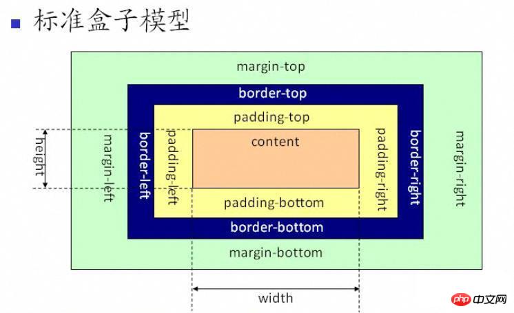
Before understanding box-sizing, let us review the box model. The model is divided into: standard box model+IE box model. So what's the difference? See the picture:
As you can see from the above picture, the scope of the standard w3c box model includes margin, border, padding, and content, and the content part does not include other parts.
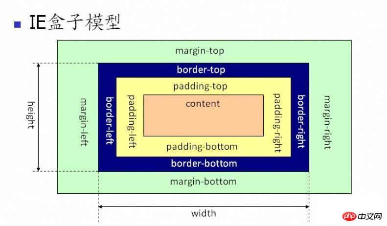
As you can see from the above figure, the scope of the IE box model also includes margin, border, padding, and content. The difference from the standard w3c box model is: the content of the IE box model The part includes border and padding.
Of course, front-end engineers should adopt the standard box model when writing page layout (you need to add a doctype statement to the page html declaration) , telling the browser to render the page according to the standard box model. Otherwise, the page will be parsed according to different browsers. IE will use IE's box model for rendering. Firefox and GOOGLE will render according to the standard mode, which is obviously inconsistent. Common sense.
So in order to make the web pages we write compatible with various browsers, it is best to use the standard w3c box model.
After talking about the box model, let’s get into our understanding of the css attribute box-sizing.
The three property values of box-sizing: content-box draws the element's padding in addition to the width and height and border|border-box Any padding specified for the element and borders will be drawn within the set width and height | inherit specifies that the value of the box-sizing attribute should be inherited from the parent element; the box-sizing attribute allows you to define specific elements that match a certain area in a specific way.
ie8+ browser supports content-box and border-box;
ff supports all three values.
<!doctype html public "-//w3c//dtd xhtml 1.0 transitional//en" "http://www.w3.org/tr/xhtml1/dtd/xhtml1-transitional.dtd">
<html lang="en">
    <head>
        <meta charset="utf-8">
        <title>box-sizing事项</title>
        <style type="text/css">
            *{padding: 0;margin: 0;font-family: "微软雅黑";box-sizing:border-box;-moz-box-sizing:border-box; /* Firefox */
-webkit-box-sizing:border-box; /* Safari */}
            .content{width: 800px;height: 500px;margin: 30px auto;border: 5px solid #e2e2e2;padding: 10px}
        </style>
    </head>
    <body>
        <p class="content">
            这是内容@!
        </p>
    </body>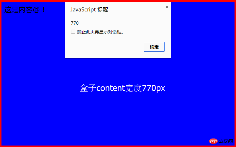
</html>After modifying the box-sizing attribute, the width of the box is: 770px = 800px - 10px -20px;
It means that the inner filling and border are 800 pixels in the content box that has been set Drawing inside causes the width of the content box to be: 770.
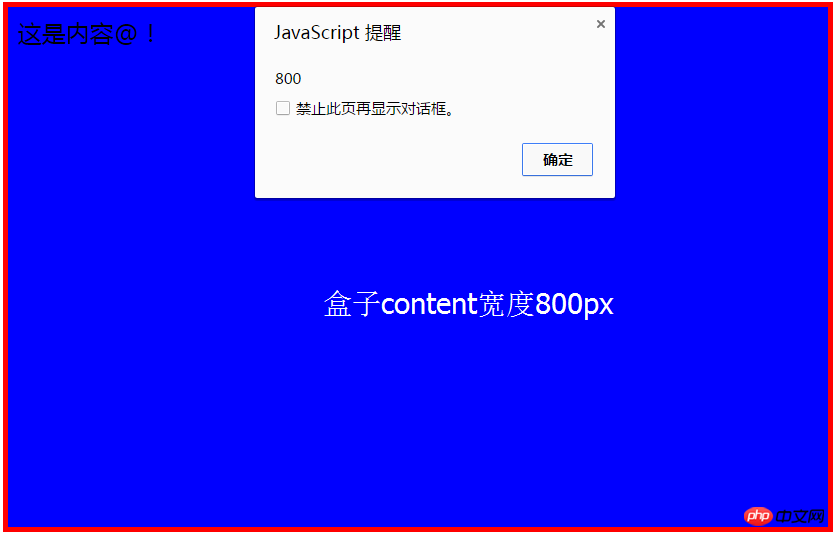
The width of the box after not modifying the box-sizing attribute is: 800px;
Detailed explanation of the use of background-attachment in CSS
CSS3 animation example of clicking to enlarge
Use css to achieve relief effect
The above is the detailed content of Detailed explanation of box-sizing, the new property of css3. For more information, please follow other related articles on the PHP Chinese website!

Hot AI Tools

Undresser.AI Undress
AI-powered app for creating realistic nude photos

AI Clothes Remover
Online AI tool for removing clothes from photos.

Undress AI Tool
Undress images for free

Clothoff.io
AI clothes remover

Video Face Swap
Swap faces in any video effortlessly with our completely free AI face swap tool!

Hot Article
Hot Tools

Notepad++7.3.1
Easy-to-use and free code editor

SublimeText3 Chinese version
Chinese version, very easy to use

Zend Studio 13.0.1
Powerful PHP integrated development environment

Dreamweaver CS6
Visual web development tools

SublimeText3 Mac version
God-level code editing software (SublimeText3)
Hot Topics


 How to achieve wave effect with pure CSS3? (code example)
Jun 28, 2022 pm 01:39 PM
How to achieve wave effect with pure CSS3? (code example)
Jun 28, 2022 pm 01:39 PM
How to achieve wave effect with pure CSS3? This article will introduce to you how to use SVG and CSS animation to create wave effects. I hope it will be helpful to you!
 Use CSS skillfully to realize various strange-shaped buttons (with code)
Jul 19, 2022 am 11:28 AM
Use CSS skillfully to realize various strange-shaped buttons (with code)
Jul 19, 2022 am 11:28 AM
This article will show you how to use CSS to easily realize various weird-shaped buttons that appear frequently. I hope it will be helpful to you!
 How to hide elements in css without taking up space
Jun 01, 2022 pm 07:15 PM
How to hide elements in css without taking up space
Jun 01, 2022 pm 07:15 PM
Two methods: 1. Using the display attribute, just add the "display:none;" style to the element. 2. Use the position and top attributes to set the absolute positioning of the element to hide the element. Just add the "position:absolute;top:-9999px;" style to the element.
 How to implement lace borders in css3
Sep 16, 2022 pm 07:11 PM
How to implement lace borders in css3
Sep 16, 2022 pm 07:11 PM
In CSS, you can use the border-image attribute to achieve a lace border. The border-image attribute can use images to create borders, that is, add a background image to the border. You only need to specify the background image as a lace style; the syntax "border-image: url (image path) offsets the image border width inward. Whether outset is repeated;".
 It turns out that text carousel and image carousel can also be realized using pure CSS!
Jun 10, 2022 pm 01:00 PM
It turns out that text carousel and image carousel can also be realized using pure CSS!
Jun 10, 2022 pm 01:00 PM
How to create text carousel and image carousel? The first thing everyone thinks of is whether to use js. In fact, text carousel and image carousel can also be realized using pure CSS. Let’s take a look at the implementation method. I hope it will be helpful to everyone!
 How to enlarge the image by clicking the mouse in css3
Apr 25, 2022 pm 04:52 PM
How to enlarge the image by clicking the mouse in css3
Apr 25, 2022 pm 04:52 PM
Implementation method: 1. Use the ":active" selector to select the state of the mouse click on the picture; 2. Use the transform attribute and scale() function to achieve the picture magnification effect, the syntax "img:active {transform: scale(x-axis magnification, y Axis magnification);}".
 How to set animation rotation speed in css3
Apr 28, 2022 pm 04:32 PM
How to set animation rotation speed in css3
Apr 28, 2022 pm 04:32 PM
In CSS3, you can use the "animation-timing-function" attribute to set the animation rotation speed. This attribute is used to specify how the animation will complete a cycle and set the speed curve of the animation. The syntax is "element {animation-timing-function: speed attribute value;}".
 Does css3 animation effect have deformation?
Apr 28, 2022 pm 02:20 PM
Does css3 animation effect have deformation?
Apr 28, 2022 pm 02:20 PM
The animation effect in css3 has deformation; you can use "animation: animation attribute @keyframes ..{..{transform: transformation attribute}}" to achieve deformation animation effect. The animation attribute is used to set the animation style, and the transform attribute is used to set the deformation style. .
