 Web Front-end
 CSS Tutorial
 Detailed graphic and text explanation of radio-select and check-select styles beautification
Detailed graphic and text explanation of radio-select and check-select styles beautification
This time I will bring you detailed pictures and texts on beautifying single-selection and multiple-selection styles. Notes on beautifying single-selection and multiple-selection stylesare Which ones, the following are practical cases, let’s take a look.
Preface
I believe everyone knows that in form elements, radio buttons and check buttons Both have selected and unselected states. It is difficult to override the default styles of these two buttons. In CSS3, we can implement custom styles through the status selector ":checked" and other tags. Using CSS3, we can create a very personalized user form. The effect achieved in this article is very good. Friends who are interested can come and learn together.
The rendering is as follows
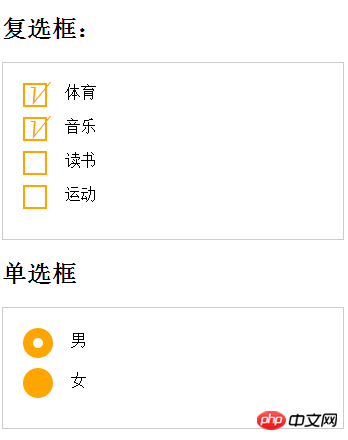
##Example code
<!DOCTYPE html>
<html lang="en">
<head>
    <meta charset="UTF-8">
    <title>复选单选样式</title>
    <link rel="stylesheet" href="style.css">
</head>
<style>
    form {
      border: 1px solid #ccc;
      padding: 20px;
      width: 300px;
    }
    .wrapper {
      margin-bottom: 10px;
    }
    /*复选框*/
    .checkbox-box {
      display: inline-block;
      width: 20px;
      height: 20px;
      margin-right: 10px;
      position: relative;
      border: 2px solid orange;
      vertical-align: middle;
    }
    .checkbox-box input {
      opacity: 0;
      position: absolute;
      top:0;
      left:0;
      z-index:10;
    }
    .checkbox-box span {
      position: absolute;
      top: -10px;
      right: 3px;
      font-size: 30px;
      font-weight: bold;
      font-family: Arial;
      -webkit-transform: rotate(30deg);
      transform: rotate(30deg);
      color: orange;
    }
    .checkbox-box input[type="checkbox"] + span {
      opacity:0;
    }
    .checkbox-box input[type="checkbox"]:checked + span {
      opacity: 1;
    }
    /*单选框*/
    .redio-box {
      display: inline-block;
      width: 30px;
      height: 30px;
      margin-right: 10px;
      position: relative;
      background: orange;
      vertical-align: middle;
      border-radius: 100%;
    }
    .redio-box input {
      opacity: 0;
      position: absolute;
      top:0;
      left:0;
      width: 100%;
      height:100%;
      z-index:100;/*使input按钮在span的上一层,不加点击区域会出现不灵敏*/
    }
    .redio-box span {
      display: block;
      width: 10px;
      height: 10px;
      border-radius: 100%;
      position: absolute;
      background: #fff;
      top: 50%;
      left:50%;
      margin: -5px 0  0 -5px;
      z-index:1;
    }
    .redio-box input[type="radio"] + span {
      opacity: 0;
    }
    .redio-box input[type="radio"]:checked + span {
      opacity: 1;
    }
</style>
<body>
<h2>复选框:</h2>
<form action="#">
  <p class="wrapper">
    <p class="checkbox-box">
      <input name="1" type="checkbox" checked id="usename" />
      <span>√</span>
    </p>
    <label for="usename">体育</label>
  </p>

  <p class="wrapper">
    <p class="checkbox-box">
      <input name="1" type="checkbox"  id="usepwd" />
      <span>√</span>
    </p>
    <label for="usepwd">音乐</label>
  </p>
  <p class="wrapper">
    <p class="checkbox-box">
      <input name="1" type="checkbox"  id="checkbox3" />
      <span>√</span>
    </p>
    <label for="checkbox3">读书</label>
  </p>

  <p class="wrapper">
    <p class="checkbox-box">
      <input name="1" type="checkbox"   id="checkbox4" />
      <span>√</span>
    </p>
    <label for="checkbox4">运动</label>
  </p>
</form>
<h2>单选框</h2>
<form action="#">
  <p class="wrapper">
    <p class="redio-box">
      <input type="radio" checked="checked"  id="boy" name="1" /><span></span>
    </p>
    <label for="boy">男</label>
  </p>

  <p class="wrapper">
    <p class="redio-box">
      <input type="radio"  id="girl" name="1" /><span></span>
    </p>
    <label for="girl">女</label>
  </p>
</form>
</body>
</html>Note:
+ is the adjacent selector of css. There are only four relationship selectors, which are spaces > + ~ (including selectors, sub-selectors, adjacent selectors, and sibling selectors)I believe you have mastered the method after reading the case in this article. For more exciting information, please pay attention to other related articles on the php Chinese website! Recommended reading:
CSS implementation of first-level navigation bar
Detailed explanation of the use of linear-gradient
Common misunderstandings in the use of CSS and HTML
The above is the detailed content of Detailed graphic and text explanation of radio-select and check-select styles beautification. For more information, please follow other related articles on the PHP Chinese website!

Hot AI Tools

Undresser.AI Undress
AI-powered app for creating realistic nude photos

AI Clothes Remover
Online AI tool for removing clothes from photos.

Undress AI Tool
Undress images for free

Clothoff.io
AI clothes remover

Video Face Swap
Swap faces in any video effortlessly with our completely free AI face swap tool!

Hot Article

Hot Tools

Notepad++7.3.1
Easy-to-use and free code editor

SublimeText3 Chinese version
Chinese version, very easy to use

Zend Studio 13.0.1
Powerful PHP integrated development environment

Dreamweaver CS6
Visual web development tools

SublimeText3 Mac version
God-level code editing software (SublimeText3)

Hot Topics
 1386
1386
 52
52
 macOS: How to change the color of desktop widgets
Oct 07, 2023 am 08:17 AM
In macOS Sonoma, widgets don't have to be hidden off-screen or forgotten in the Notification Center panel like they did in previous versions of Apple's macOS. Instead, they can be placed directly on your Mac’s desktop – they’re also interactive. When not in use, macOS desktop widgets fade into the background in a monochrome style, reducing distractions and allowing you to focus on the task at hand in the active application or window. However, when you click on the desktop, they return to full color. If you prefer a drab look and want to retain that aspect of uniformity on your desktop, there's a way to make it permanent. The following steps demonstrate how it is done. Open the System Settings app
 Guide to solving misalignment of WordPress web pages
Mar 05, 2024 pm 01:12 PM
Guide to solving misaligned WordPress web pages In WordPress website development, sometimes we encounter web page elements that are misaligned. This may be due to screen sizes on different devices, browser compatibility, or improper CSS style settings. To solve this misalignment, we need to carefully analyze the problem, find possible causes, and debug and repair it step by step. This article will share some common WordPress web page misalignment problems and corresponding solutions, and provide specific code examples to help develop
 Use ThinkPHP6 to implement a beautiful 404 page
Jun 20, 2023 am 11:06 AM
As the Internet develops, many websites or applications have gradually become more complex. When users use it, they often encounter error pages, the most common of which is the 404 page. The 404 page means that the page being accessed does not exist and is a common error page. For websites or applications, a beautiful 404 page can greatly improve the user experience. In this article, we will introduce how to use ThinkPHP6 to quickly implement a beautiful 404 page. Create a route First, we need to create an err in the route folder
 CSS web background image design: create various background image styles and effects
Nov 18, 2023 am 08:38 AM
CSS web page background image design: Create various background image styles and effects, specific code examples are required Summary: In web design, background images are an important visual element, which can effectively enhance the attractiveness and readability of the page. This article will introduce some common CSS background image design styles and effects, and provide corresponding code examples. Readers can select and apply these background image styles and effects according to their own needs and preferences to achieve better visual effects and user experience. Keywords: CSS, background image, design style, effect, code representation
 How to beautify word
Mar 19, 2024 pm 08:31 PM
When we edit word documents, we always hope to make the documents more beautiful and beautiful. However, when it comes to word beautification, many people think of making the fonts and colors more personalized, and adjusting the margins and line spacing. Wait, in fact, we can make word more beautiful through more operations. For example, we can make word documents more beautiful by inserting pictures, modifying borders, etc. Next we will try to use border patterns to make word documents more beautiful, let’s learn together! First, open a new Word document, and then find the [Paragraph] tool under the [Home] tab. Next, click the [Border] option, as indicated by the red arrow in the image. 2. After we click, the system will automatically pop up a drop-down selection
 Beautify your user interface with new JavaFX CSS stylesheets in Java 13
Jul 30, 2023 pm 02:49 PM
Use the new JavaFXCSS style sheet in Java13 to beautify the user interface Introduction: In software development, the beauty and ease of use of the user interface are crucial to improving the user experience. JavaFX is a modern, expressive interface technology on the Java platform that provides rich UI components and functions. In order to make the user interface more beautiful, JavaFX provides CSS style sheets to beautify and customize the interface. In Java13, JavaFX introduced new CSS style sheets,
 Use the :nth-last-child(2) pseudo-class selector to select the style of the second-to-last child element
Nov 20, 2023 am 11:22 AM
Use the :nth-last-child(2) pseudo-class selector to select the style of the penultimate child element. Specific code examples are required. In CSS, the pseudo-class selector is a very powerful tool that can be used to select the document tree. specific elements. One of them is the :nth-last-child(2) pseudo-class selector, which selects the second-to-last child element and applies styles to it. First, let's create a sample HTML document so that we can use this pseudo-class selector in it. by
 Use the :root pseudo-class selector to select the style of the root element of the document
Nov 20, 2023 pm 02:18 PM
Using the :root pseudo-class selector to select the style of the root element of the document requires specific code examples. In CSS, we can use the :root pseudo-class selector to select the root element of the document and specify a specific style for it. The :root pseudo-class selector is equivalent to selecting html elements in most cases, but when a namespace exists in the document, the :root pseudo-class selector will select the root element of the default namespace. Here is a concrete code example that shows how to use the :root pseudo-class selector to select the root element of the document.


