Home Web Front-end CSS Tutorial CSS3 makes responsive, configurable lottery wheel

CSS3 makes responsive, configurable lottery wheel

Mar 22, 2018 pm 01:30 PM
css css3

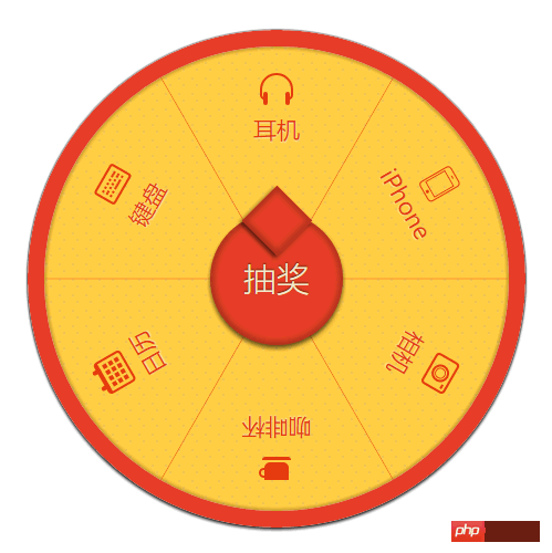
This time I will bring you CSS3 to make a responsive and configurable lottery carousel. What are the things to note about using CSS3 to make a responsive and configurable lottery carousel. The following is a practical case. Get up and take a look.

Due to the initial popular beta period of the WeChat mini program some time ago, the big carousel lottery that was previously implemented using Canvas was transplanted into the WeChat mini program. Unfortunately, the mini program did not have enough support for Canvas at that time. Perfect, I had to reduce it to CSS3. Although it is not as gorgeous as Canvas drawing, I finally completed a lottery demo. For details, see: http://xiazai.jb51.net/201701/yuanma/wechat-canvas_jb51.rar

Thinking about it afterwards, CSS3 implementation is not without its benefits. For example, it is simple, fast, easy to debug, and rendering is more efficient than Canvas. More importantly, it supports

media query, and the large carousel can also be made responsive. of. So I took the time to sort it out, use pure CSS3 to implement a large carousel lottery demo and record it.

If you have similar needs and don’t want to bother with the details, you can go here - Canvas’ complete big carousel lottery project (can be used directly) http://xiazai.jb51.net/201701/yuanma/ canvas_jb51.rar

The code will be pasted directly below.

Code

HTML

1

2

3

4

5

6

7

<section class="gb-wheel-container" id="gbWheel">

    <p class="gb-wheel-content gb-wheel-run">

        <ul class="gb-wheel-line"></ul>

        <p class="gb-wheel-list"></p>

    </p>

    <a href="javascript:;" class="gb-wheel-btn" id="gbLottery">抽奖</a>     

</section>

Copy after login
JS

1

2

3

4

5

6

7

8

9

10

11

12

13

14

15

16

17

18

19

20

21

22

23

24

25

26

27

28

29

30

31

32

33

34

35

36

37

38

39

40

41

42

43

44

45

46

47

48

49

50

51

52

53

54

55

56

57

58

59

60

61

62

63

64

65

66

67

68

69

70

71

72

73

(function() {

    // 奖品配置

    var awards = [

            {'index': 0, 'text''耳机' 'name''icono-headphone'},

            {'index': 1, 'text''iPhone' 'name''icono-iphone'},

            {'index': 2, 'text''相机' 'name''icono-camera'},

            {'index': 3, 'text''咖啡杯' 'name''icono-cup'},

            {'index': 4, 'text''日历''name''icono-calendar'},

            {'index': 5, 'text''键盘''name''icono-keyboard'}

        ],

        len = awards.length,

        turnNum = 1 / len;  // 文字旋转 turn 值

    var gbWheel = $('gbWheel'),

        lineList = gbWheel.querySelector('ul.gb-wheel-line'),

        itemList = gbWheel.querySelector('.gb-wheel-list'),

        lineListHtml = [],

        itemListHtml = [];

    var transform = preTransform();

    awards.forEach(function(v, i, a) {

        // 分隔线

        lineListHtml.push('<li class="gb-wheel-litem" style="&#39; + transform + &#39;: rotate(&#39;+ (i * turnNum + turnNum / 2) +&#39;turn)"></li>');

        // 奖项

        itemListHtml.push('<p class="gb-wheel-item">');

        itemListHtml.push('<p class="gb-wheel-icontent" style="&#39; + transform + &#39;: rotate(&#39;+ (i * turnNum) +&#39;turn)">');

        itemListHtml.push('<p class="gb-wheel-iicon">');

        itemListHtml.push('<i class="&#39;+v.name+&#39;"></i>');

        itemListHtml.push('</p>');

        itemListHtml.push('<p class="gb-wheel-itext">');

        itemListHtml.push(v.text);

        itemListHtml.push('</p>');

        itemListHtml.push('</p>');

        itemListHtml.push('</p>');

    });           

    lineList.innerHTML = lineListHtml.join('');

    itemList.innerHTML = itemListHtml.join('');

    function $(id) {

        return document.getElementById(id);

    };

    // 旋转

    var i = 0;

    $('gbLottery').onclick = function() {

        i++;

        gbWheel.querySelector('.gb-wheel-content').style = transform + ': rotate('+ i * 3600 +'deg)';  

    }

    // transform兼容

    function preTransform() {

        var cssPrefix,

        vendors = {

          '''',

          Webkit: 'webkit',

          Moz: '',

          O: 'o',

          ms: 'ms'

        },

        testEle = document.createElement('p'),

        cssSupport = {};

         // 嗅探特性

        Object.keys(vendors).some(function(vendor) {

            if (testEle.style[vendor + (vendor ? 'T' 't') + 'ransform'] !== undefined) {

              cssPrefix = vendor ? '-' + vendor.toLowerCase() + '-' '';

              return true;

            }

        });

      function normalizeCss(name) {

        name = name.toLowerCase();

        return cssPrefix ? cssPrefix + name : name;

      }

      cssSupport = {

        transform: normalizeCss('Transform'),

      }

      return cssSupport.transform;

    }

}());

Copy after login
CSS

1

2

3

4

5

6

7

8

9

10

11

12

13

14

15

16

17

18

19

20

21

22

23

24

25

26

27

28

29

30

31

32

33

34

35

36

37

38

39

40

41

42

43

44

45

46

47

48

49

50

51

52

53

54

55

56

57

58

59

60

61

62

63

64

65

66

67

68

69

70

71

72

73

74

75

76

77

78

79

80

81

82

83

84

85

86

87

88

89

90

91

92

93

94

95

96

97

98

99

100

101

102

103

104

105

106

107

108

109

110

111

112

113

114

115

116

117

118

119

120

121

122

123

124

125

126

127

128

129

130

131

132

133

134

135

136

137

138

139

140

141

142

143

144

145

146

147

148

149

150

151

152

153

154

155

156

157

158

159

160

161

162

163

164

165

166

167

168

html {

    font-size: 10px

}

.gb-wheel-container ul,

.gb-wheel-container li,

.gb-wheel-container p {

    margin: 0;

    padding: 0

}

.gb-wheel-container ul,

.gb-wheel-container li {

    list-style: none

}

.gb-wheel-container {

    margin: 0 auto;

    position: relative;

    width: 30rem;

    height: 30rem;

    border-radius: 50%;

    box-shadow: 0 2px 3px #333, 0 0 2px #000;

    overflow: hidden

}

.gb-wheel-content {

    position: absolute;

    left: 1rem;

    top: 1rem;

    z-index: 2;

    width: 28rem;

    height: 28rem;

    box-sizing: border-box;

    border-radius: inherit;

    background-clip: padding-box;

    background: -webkit-radial-gradient(rgba(100, 100, 100, 0.1) 15%, transparent 16%) 0 0,  

                -webkit-radial-gradient(rgba(100, 100, 100, 0.1) 15%, transparent 16%) 8px 8px,  

  -webkit-radial-gradient(rgba(255, 255, 255, 0.1) 15%, transparent 20%) 0 1px,

  -webkit-radial-gradient(rgba(255, 255, 255, 0.1) 15%, transparent 20%) 8px 9px;

    background: radial-gradient(rgba(100, 100, 100, 0.1) 15%, transparent 16%) 0 0,

                radial-gradient(rgba(100, 100, 100, 0.1) 15%, transparent 16%) 8px 8px, 

  radial-gradient(rgba(255, 255, 255, 0.1) 15%, transparent 20%) 0 1px, 

  radial-gradient(rgba(255, 255, 255, 0.1) 15%, transparent 20%) 8px 9px;

    background-color: #ffcb3f;

    background-size: 12px 14px

}

.gb-wheel-content:before {

    content: ' ';

    position: absolute;

    left: -1rem;

    top: -1rem;

    z-index: -1;

    width: 28rem;

    height: 28rem;

    border-radius: inherit;

    border: 1rem solid #E44025;

    box-shadow: 0 0 2px 2px rgba(0, 0, 0, 0.2) inset

}

.gb-wheel-list {

    position: absolute;

    left: 0;

    top: 0;

    width: inherit;

    height: inherit;

    z-index: 9999

}

.gb-wheel-item {

    position: absolute;

    left: 0;

    top: 0;

    width: 100%;

    height: 100%;

    color: #e4370e;

    font-weight: bold;

    text-shadow: 0 1px 1px rgba(255, 255, 255, 0.6)

}

.gb-wheel-icontent {

    position: relative;

    display: block;

    padding-top: 1.5rem;

    margin: 0 auto;

    text-align: center;

    -webkit-transform-origin: 50% 14rem;

    -ms-transform-origin: 50% 14rem;

    transform-origin: 50% 14rem

}

.gb-wheel-itext {

    font-size: 1.4rem;

    font-weight: lighter

}

.gb-wheel-iicon [class*=icono-] {

    color: #e4370e

}

.gb-wheel-line {

    position: absolute;

    left: 0;

    top: 0;

    width: inherit;

    height: inherit;

    z-index: 99

}

.gb-wheel-litem {

    position: absolute;

    left: 14rem;

    top: 0;

    width: 1px;

    height: 14rem;

    background-color: rgba(228, 55, 14, 0.6);

    overflow: hidden;

    -webkit-transform-origin: 50% 14rem;

    -ms-transform-origin: 50% 14rem;

    transform-origin: 50% 14rem

}

.gb-wheel-btn {

    position: absolute;

    left: 11rem;

    top: 11rem;

    z-index: 400;

    width: 8rem;

    height: 8rem;

    border-radius: 50%;

    color: #F4E9CC;

    background-color: #E44025;

    line-height: 8rem;

    text-align: center;

    font-size: 2rem;

    text-shadow: 0 -1px 1px rgba(0, 0, 0, 0.6);

    box-shadow: 0 3px 5px rgba(0, 0, 0, 0.6), 0 0 5px 4px rgba(0, 0, 0, 0.2) inset;

    text-decoration: none

}

a.gb-wheel-btn {

    border-bottom: none

}

.gb-wheel-btn::after {

    position: absolute;

    content: '';

    left: 2.5rem;

    top: -1rem;

    width: 3rem;

    height: 3rem;

    background-color: #E44025;

    -webkit-transform: rotate(45deg);

    -ms-transform: rotate(45deg);

    transform: rotate(45deg);

    box-shadow: 0 3px 5px rgba(0, 0, 0, 0.6), 0 0 5px 4px rgba(0, 0, 0, 0.2) inset

}

.gb-wheel-btn.disabled,

.gb-wheel-btn.disabled::after {

    pointer-events: none;

    background: #B07A7B;

    color: #ccc

}

.gb-wheel-run {

    -webkit-transition: transform 6s ease;

    transition: transform 6s ease

}

@media only screen and (min-width: 320px) {

    html {

        font-size: 10px

    }

}

@media only screen and (min-width: 375px) {

    html {

        font-size: 11.71875px

    }

}

@media only screen and (min-width: 480px) {

    html {

        font-size: 15px

    }

}

Copy after login

I believe you have read the case in this article After mastering the method, please pay attention to other related articles on the php Chinese website for more exciting content!

Recommended reading:

Detailed explanation of the use of linear-gradient

Several methods of clearing floats

The above is the detailed content of CSS3 makes responsive, configurable lottery wheel. For more information, please follow other related articles on the PHP Chinese website!

Statement of this Website
The content of this article is voluntarily contributed by netizens, and the copyright belongs to the original author. This site does not assume corresponding legal responsibility. If you find any content suspected of plagiarism or infringement, please contact admin@php.cn

Hot AI Tools

Undresser.AI Undress

Undresser.AI Undress

AI-powered app for creating realistic nude photos

AI Clothes Remover

AI Clothes Remover

Online AI tool for removing clothes from photos.

Undress AI Tool

Undress AI Tool

Undress images for free

Clothoff.io

Clothoff.io

AI clothes remover

AI Hentai Generator

AI Hentai Generator

Generate AI Hentai for free.

Hot Article

R.E.P.O. Energy Crystals Explained and What They Do (Yellow Crystal)
3 weeks ago By 尊渡假赌尊渡假赌尊渡假赌
R.E.P.O. Best Graphic Settings
3 weeks ago By 尊渡假赌尊渡假赌尊渡假赌
R.E.P.O. How to Fix Audio if You Can't Hear Anyone
3 weeks ago By 尊渡假赌尊渡假赌尊渡假赌

Hot Tools

Notepad++7.3.1

Notepad++7.3.1

Easy-to-use and free code editor

SublimeText3 Chinese version

SublimeText3 Chinese version

Chinese version, very easy to use

Zend Studio 13.0.1

Zend Studio 13.0.1

Powerful PHP integrated development environment

Dreamweaver CS6

Dreamweaver CS6

Visual web development tools

SublimeText3 Mac version

SublimeText3 Mac version

God-level code editing software (SublimeText3)

How to remove the default style in Bootstrap list? How to remove the default style in Bootstrap list? Apr 07, 2025 am 10:18 AM

The default style of the Bootstrap list can be removed with CSS override. Use more specific CSS rules and selectors, follow the "proximity principle" and "weight principle", overriding the Bootstrap default style. To avoid style conflicts, more targeted selectors can be used. If the override is unsuccessful, adjust the weight of the custom CSS. At the same time, pay attention to performance optimization, avoid overuse of !important, and write concise and efficient CSS code.

How to resize bootstrap How to resize bootstrap Apr 07, 2025 pm 03:18 PM

To adjust the size of elements in Bootstrap, you can use the dimension class, which includes: adjusting width: .col-, .w-, .mw-adjust height: .h-, .min-h-, .max-h-

How to use bootstrap button How to use bootstrap button Apr 07, 2025 pm 03:09 PM

How to use the Bootstrap button? Introduce Bootstrap CSS to create button elements and add Bootstrap button class to add button text

How to upload files on bootstrap How to upload files on bootstrap Apr 07, 2025 pm 01:09 PM

The file upload function can be implemented through Bootstrap. The steps are as follows: introduce Bootstrap CSS and JavaScript files; create file input fields; create file upload buttons; handle file uploads (using FormData to collect data and then send to the server); custom style (optional).

How to layout bootstrap How to layout bootstrap Apr 07, 2025 pm 02:24 PM

To use Bootstrap to layout a website, you need to use a grid system to divide the page into containers, rows, and columns. First add the container, then add the rows in it, add the columns within the row, and finally add the content in the column. Bootstrap's responsive layout function automatically adjusts the layout according to breakpoints (xs, sm, md, lg, xl). Different layouts under different screen sizes can be achieved by using responsive classes.

How to build a bootstrap framework How to build a bootstrap framework Apr 07, 2025 pm 12:57 PM

To create a Bootstrap framework, follow these steps: Install Bootstrap via CDN or install a local copy. Create an HTML document and link Bootstrap CSS to the &lt;head&gt; section. Add Bootstrap JavaScript file to the &lt;body&gt; section. Use the Bootstrap component and customize the stylesheet to suit your needs.

How to insert pictures on bootstrap How to insert pictures on bootstrap Apr 07, 2025 pm 03:30 PM

There are several ways to insert images in Bootstrap: insert images directly, using the HTML img tag. With the Bootstrap image component, you can provide responsive images and more styles. Set the image size, use the img-fluid class to make the image adaptable. Set the border, using the img-bordered class. Set the rounded corners and use the img-rounded class. Set the shadow, use the shadow class. Resize and position the image, using CSS style. Using the background image, use the background-image CSS property.

How to change the size of a Bootstrap list? How to change the size of a Bootstrap list? Apr 07, 2025 am 10:45 AM

The size of a Bootstrap list depends on the size of the container that contains the list, not the list itself. Using Bootstrap's grid system or Flexbox can control the size of the container, thereby indirectly resizing the list items.

See all articles