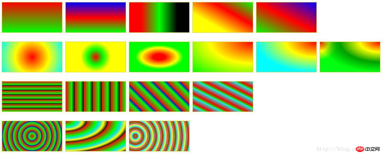
Summary of commonly used color gradient methods
This time I will bring you a summary of commonly used color gradient methods, and what are the precautions for color gradient methods? The following is a practical case, let’s take a look.
1. Linear gradient: linear-gradient
## Grammar: gradient> = linear-gradient([ [
to left: Set the gradient from right to left. Equivalent to: 270deg
to right: Set the gradient from left to right. Equivalent to: 90deg
to top: Set the gradient from bottom to top. Equivalent to: 0deg
to bottom: Set the gradient from top to bottom. Equivalent to: 180deg. This is the default value, which is equivalent to leaving it blank.
# & lt; length & gt ;: Specify the startup position with length value. The negative value is not allowed
# & lt; percentage & gt;: Specify the start and end color position with a percentage.
Example:##
p {
    width: 200px;
    height: 100px;
    margin: 10px 5px;
    border: 1px solid #ddd000;
}
#LinearStartToEnd {
  float:left;
  background: linear-gradient(#ff0000, #00ff00);
}
#LinearPercentage {
  float:left;
  background: linear-gradient(#0000ff, #ff0000 52%, #00ff00);
}
#LinearAnglePercentage {
  float:left;
  background: linear-gradient(90deg, #ff0000 20%, #00ff00 50%, #000000 80%);
}
#LinearAngle {
  float:left;
  background: linear-gradient(30deg, #ffff00 30%, #ff0000, #00ff00);
}
#LinearTopRight {
  float:left;
  background: linear-gradient(to right top, #00ff00, #ff0000 50%, #0000ff);
}
Grammar:
<position
> = [ ;
;
Use the length value Specify the abscissa value of the center of the radial gradient circle. Can be negative.
# & lt; Percentage & GT; ①: Specify the horizontal coordinate value of the radial gradient center with percentage. Can be negative.
# & lt; length & gt; ②: Specify the vertical coordinate value of the radial gradient and round heart with a length value. Can be negative.
# & lt; Percentage & gt; ②: Specify the vertical margin value of the radial gradient center with percentage. Can be negative.
center①:设置中间为径向渐变圆心的横坐标值。
center②:设置中间为径向渐变圆心的纵坐标值。
left:设置左边为径向渐变圆心的横坐标值。
right:设置右边为径向渐变圆心的横坐标值。
top:设置顶部为径向渐变圆心的纵坐标值。
bottom:设置底部为径向渐变圆心的纵坐标值。
circle:指定圆形的径向渐变
ellipse:指定椭圆形的径向渐变。
closest-side:指定径向渐变的半径长度为从圆心到离圆心最近的边。
closest-corner:指定径向渐变的半径长度为从圆心到离圆心最近的角。
farthest-side:指定径向渐变的半径长度为从圆心到离圆心最远的边。
farthest-corner:指定径向渐变的半径长度为从圆心到离圆心最远的角。
示例:

#RadialCenterCircle {
  float:left;
    background: radial-gradient(circle at center, #ff0000, #ffff00, #00ffff);
}
#RadialClosestSide {
  float:left;
    background: radial-gradient(circle closest-side, #ff0000, #00ff00, #ffff00);
}
#RadialFarthestSide {
  float:left;
    background: radial-gradient(farthest-side, #ff0000 20%, #ffff00 60%, #00ff00 80%);
}
#RadialRightTop {
  float:left;
    background: radial-gradient(at right top, #ff0000, #ffff00, #00ff00);
}
#RadialRadiusCenter {
  float:left;
    background: radial-gradient(farthest-side at top right, #ff0000, #ffff00, #01fefe);
}
#RadialGroup {
  float:left;
    background:
        radial-gradient(farthest-side at top right, #ff0000, #ffff00, #009f00, transparent),
        radial-gradient(60px at top left, #ff0000, #ffff00, #00ff0e);
}三、重复的线性渐变:repeating-linear-gradient
语法和参数类似线性渐变,这里不在赘述。详情请参考CSS手册。
示例:
#RepeatingLinearPercentage{
  float:left;
    background: repeating-linear-gradient(#ff0000, #00ff00 10%, #000000 15%);
}
#RepeatingLinearRight {
  float:left;
    background: repeating-linear-gradient(to right, #ff0000, #00ff00 10%, #000000 15%);
}
#RepeatingLinearAngle {
  float:left;
    background: repeating-linear-gradient(45deg, #ff0000, #00ff00 10%, #0000ff 15%);
}
#RepeatingLinearBottomLeft {
  float:left;
    background: repeating-linear-gradient(to bottom left, #00ffff, #ff0000 10%, #00ff00 15%);
}四、重复的径向渐变:repeating-radial-gradient
语法和参数类似径向渐变,这里不在赘述。详情请参考CSS手册。
示例:

#RepeatingRadialCircle {
  float:left;
    background: repeating-radial-gradient(circle, #ff0000 0, #00ff00 10%, #0000ff 15%);
}
#RepeatingRadialTopLeft {
  float:left;
    background: repeating-radial-gradient(at top left, #ff0000, #00ff00 10%, #0de0f0 15%, #ffff00 20%, #000000 25%);
}
#RepeatingRadialClosestCorner {
  float:left;
    background: repeating-radial-gradient(circle closest-corner at 20px 50px, #00ff00, #ff0000 10%, #00ffff 20%, #ffff00 30%, #ff00ff 40%);
}完整的例子:

<!DOCTYPE html>
<html>
<head>
<meta charset="utf-8" />
<title>ImageCSS3</title>
<style>
p {
    width: 200px;
    height: 100px;
    margin: 10px 5px;
    border: 1px solid #ddd000;
}
#LinearStartToEnd {
  float:left;
  background: linear-gradient(#ff0000, #00ff00);
}
#LinearPercentage {
  float:left;
  background: linear-gradient(#0000ff, #ff0000 52%, #00ff00);
}
#LinearAnglePercentage {
  float:left;
  background: linear-gradient(90deg, #ff0000 20%, #00ff00 50%, #000000 80%);
}
#LinearAngle {
  float:left;
  background: linear-gradient(30deg, #ffff00 30%, #ff0000, #00ff00);
}
#LinearTopRight {
  float:left;
  background: linear-gradient(to right top, #00ff00, #ff0000 50%, #0000ff);
}

#RadialCenterCircle {
  float:left;
    background: radial-gradient(circle at center, #ff0000, #ffff00, #00ffff);
}
#RadialClosestSide {
  float:left;
    background: radial-gradient(circle closest-side, #ff0000, #00ff00, #ffff00);
}
#RadialFarthestSide {
  float:left;
    background: radial-gradient(farthest-side, #ff0000 20%, #ffff00 60%, #00ff00 80%);
}
#RadialRightTop {
  float:left;
    background: radial-gradient(at right top, #ff0000, #ffff00, #00ff00);
}
#RadialRadiusCenter {
  float:left;
    background: radial-gradient(farthest-side at top right, #ff0000, #ffff00, #01fefe);
}
#RadialGroup {
  float:left;
    background:
                radial-gradient(farthest-side at top right, #ff0000, #ffff00, #009f00, transparent),
                radial-gradient(60px at top left, #ff0000, #ffff00, #00ff0e);
}

#RepeatingLinearPercentage{
  float:left;
    background: repeating-linear-gradient(#ff0000, #00ff00 10%, #000000 15%);
}
#RepeatingLinearRight {
  float:left;
    background: repeating-linear-gradient(to right, #ff0000, #00ff00 10%, #000000 15%);
}
#RepeatingLinearAngle {
  float:left;
    background: repeating-linear-gradient(45deg, #ff0000, #00ff00 10%, #0000ff 15%);
}
#RepeatingLinearBottomLeft {
  float:left;
    background: repeating-linear-gradient(to bottom left, #00ffff, #ff0000 10%, #00ff00 15%);
}

#RepeatingRadialCircle {
  float:left;
    background: repeating-radial-gradient(circle, #ff0000 0, #00ff00 10%, #0000ff 15%);
}
#RepeatingRadialTopLeft {
  float:left;
    background: repeating-radial-gradient(at top left, #ff0000, #00ff00 10%, #0de0f0 15%, #ffff00 20%, #000000 25%);
}
#RepeatingRadialClosestCorner {
  float:left;
    background: repeating-radial-gradient(circle closest-corner at 20px 50px, #00ff00, #ff0000 10%, #00ffff 20%, #ffff00 30%, #ff00ff 40%);
}

</style>
</head>
<body>
<!-- 指定线性渐变起止色 -->
<p id="LinearStartToEnd"></p>
<!-- 指定线性渐变起止色位置 -->
<p id="LinearPercentage"></p>
<!-- 指定线性渐变颜色渐变方向和起止色位置 -->
<p id="LinearAnglePercentage"></p>
<!-- 指定线性渐变颜色渐变方向 -->
<p id="LinearAngle"></p>
<!-- 设置渐变从右上到左下 -->
<p id="LinearTopRight"></p>

<!-- 浮动p换行,此处指定p宽高和边界,是为了覆盖前面定义的p统一CSS样式,
 可以尝试去掉指定的p宽高和边界,看看效果 -->
<p style="width:0; height:0; border:none; clear:both"></p>
<!-- 以中心点为圆心的圆形径向渐变 -->
<p id="RadialCenterCircle"></p>
<!-- 径向渐变半径长度:圆心到离圆心最近边的长度 -->
<p id="RadialClosestSide"></p>
<!-- 径向渐变半径长度:圆心到离圆心最远边的长度 -->
<p id="RadialFarthestSide"></p>
<!-- 左边为径向渐变圆心的横坐标值,顶边为径向渐变圆心的纵坐标值 -->
<p id="RadialRightTop"></p>
<!-- 同时指定径向渐变的圆心和半径 -->
<p id="RadialRadiusCenter"></p>
<!-- 径向渐变组合 -->
<p id="RadialGroup"></p>

<p style="width:0; height:0; border:none; clear:both"></p>
<!-- 指定颜色起止色位置的重复线性渐变 -->
<p id="RepeatingLinearPercentage"></p>
<!-- 从左到右渐变的重复线性渐变 -->
<p id="RepeatingLinearRight"></p>
<!-- 渐变角度为45度的重复线性渐变 -->
<p id="RepeatingLinearAngle"></p>
<!-- 从左下到右上的重复线性渐变 -->
<p id="RepeatingLinearBottomLeft"></p>

<p style="width:0; height:0; border:none; clear:both"></p>
<!-- 圆形重复径向渐变 -->
<p id="RepeatingRadialCircle"></p>
<!-- 渐变方向为左上到右下的重复径向渐变 -->
<p id="RepeatingRadialTopLeft"></p>
<!-- 重复径向渐变:渐变半径长度为从圆心到离圆心最近的角的距离 -->
<p id="RepeatingRadialClosestCorner"></p>

</body>
</html>
相信看了本文案例你已经掌握了方法,更多精彩请关注php中文网其它相关文章!
推荐阅读:
Solution to compatibility issues under IE6
The above is the detailed content of Summary of commonly used color gradient methods. For more information, please follow other related articles on the PHP Chinese website!

Hot AI Tools

Undresser.AI Undress
AI-powered app for creating realistic nude photos

AI Clothes Remover
Online AI tool for removing clothes from photos.

Undress AI Tool
Undress images for free

Clothoff.io
AI clothes remover

AI Hentai Generator
Generate AI Hentai for free.

Hot Article

Hot Tools

Notepad++7.3.1
Easy-to-use and free code editor

SublimeText3 Chinese version
Chinese version, very easy to use

Zend Studio 13.0.1
Powerful PHP integrated development environment

Dreamweaver CS6
Visual web development tools

SublimeText3 Mac version
God-level code editing software (SublimeText3)

Hot Topics
 1371
1371
 52
52
 How to delete WeChat friends? How to delete WeChat friends
Mar 04, 2024 am 11:10 AM
WeChat is one of the mainstream chat tools. We can meet new friends, contact old friends and maintain the friendship between friends through WeChat. Just as there is no such thing as a banquet that never ends, disagreements will inevitably occur when people get along with each other. When a person extremely affects your mood, or you find that your views are inconsistent when you get along, and you can no longer communicate, then we may need to delete WeChat friends. How to delete WeChat friends? The first step to delete WeChat friends: tap [Address Book] on the main WeChat interface; the second step: click on the friend you want to delete and enter [Details]; the third step: click [...] in the upper right corner; Step 4: Click [Delete] below; Step 5: After understanding the page prompts, click [Delete Contact]; Warm
 How to write a novel in the Tomato Free Novel app. Share the tutorial on how to write a novel in Tomato Novel.
Mar 28, 2024 pm 12:50 PM
Tomato Novel is a very popular novel reading software. We often have new novels and comics to read in Tomato Novel. Every novel and comic is very interesting. Many friends also want to write novels. Earn pocket money and edit the content of the novel you want to write into text. So how do we write the novel in it? My friends don’t know, so let’s go to this site together. Let’s take some time to look at an introduction to how to write a novel. Share the Tomato novel tutorial on how to write a novel. 1. First open the Tomato free novel app on your mobile phone and click on Personal Center - Writer Center. 2. Jump to the Tomato Writer Assistant page - click on Create a new book at the end of the novel.
 How to enter bios on Colorful motherboard? Teach you two methods
Mar 13, 2024 pm 06:01 PM
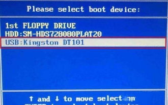
Colorful motherboards enjoy high popularity and market share in the Chinese domestic market, but some users of Colorful motherboards still don’t know how to enter the bios for settings? In response to this situation, the editor has specially brought you two methods to enter the colorful motherboard bios. Come and try it! Method 1: Use the U disk startup shortcut key to directly enter the U disk installation system. The shortcut key for the Colorful motherboard to start the U disk with one click is ESC or F11. First, use Black Shark Installation Master to create a Black Shark U disk boot disk, and then turn on the computer. When you see the startup screen, continuously press the ESC or F11 key on the keyboard to enter a window for sequential selection of startup items. Move the cursor to the place where "USB" is displayed, and then
 How to recover deleted contacts on WeChat (simple tutorial tells you how to recover deleted contacts)
May 01, 2024 pm 12:01 PM
Unfortunately, people often delete certain contacts accidentally for some reasons. WeChat is a widely used social software. To help users solve this problem, this article will introduce how to retrieve deleted contacts in a simple way. 1. Understand the WeChat contact deletion mechanism. This provides us with the possibility to retrieve deleted contacts. The contact deletion mechanism in WeChat removes them from the address book, but does not delete them completely. 2. Use WeChat’s built-in “Contact Book Recovery” function. WeChat provides “Contact Book Recovery” to save time and energy. Users can quickly retrieve previously deleted contacts through this function. 3. Enter the WeChat settings page and click the lower right corner, open the WeChat application "Me" and click the settings icon in the upper right corner to enter the settings page.
 Summary of methods to obtain administrator rights in Win11
Mar 09, 2024 am 08:45 AM
A summary of how to obtain Win11 administrator rights. In the Windows 11 operating system, administrator rights are one of the very important permissions that allow users to perform various operations on the system. Sometimes, we may need to obtain administrator rights to complete some operations, such as installing software, modifying system settings, etc. The following summarizes some methods for obtaining Win11 administrator rights, I hope it can help you. 1. Use shortcut keys. In Windows 11 system, you can quickly open the command prompt through shortcut keys.
 The secret of hatching mobile dragon eggs is revealed (step by step to teach you how to successfully hatch mobile dragon eggs)
May 04, 2024 pm 06:01 PM
Mobile games have become an integral part of people's lives with the development of technology. It has attracted the attention of many players with its cute dragon egg image and interesting hatching process, and one of the games that has attracted much attention is the mobile version of Dragon Egg. To help players better cultivate and grow their own dragons in the game, this article will introduce to you how to hatch dragon eggs in the mobile version. 1. Choose the appropriate type of dragon egg. Players need to carefully choose the type of dragon egg that they like and suit themselves, based on the different types of dragon egg attributes and abilities provided in the game. 2. Upgrade the level of the incubation machine. Players need to improve the level of the incubation machine by completing tasks and collecting props. The level of the incubation machine determines the hatching speed and hatching success rate. 3. Collect the resources required for hatching. Players need to be in the game
 Quickly master: How to open two WeChat accounts on Huawei mobile phones revealed!
Mar 23, 2024 am 10:42 AM
In today's society, mobile phones have become an indispensable part of our lives. As an important tool for our daily communication, work, and life, WeChat is often used. However, it may be necessary to separate two WeChat accounts when handling different transactions, which requires the mobile phone to support logging in to two WeChat accounts at the same time. As a well-known domestic brand, Huawei mobile phones are used by many people. So what is the method to open two WeChat accounts on Huawei mobile phones? Let’s reveal the secret of this method. First of all, you need to use two WeChat accounts at the same time on your Huawei mobile phone. The easiest way is to
 How to set font size on mobile phone (easily adjust font size on mobile phone)
May 07, 2024 pm 03:34 PM
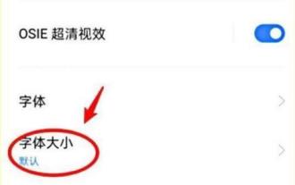
Setting font size has become an important personalization requirement as mobile phones become an important tool in people's daily lives. In order to meet the needs of different users, this article will introduce how to improve the mobile phone use experience and adjust the font size of the mobile phone through simple operations. Why do you need to adjust the font size of your mobile phone - Adjusting the font size can make the text clearer and easier to read - Suitable for the reading needs of users of different ages - Convenient for users with poor vision to use the font size setting function of the mobile phone system - How to enter the system settings interface - In Find and enter the "Display" option in the settings interface - find the "Font Size" option and adjust it. Adjust the font size with a third-party application - download and install an application that supports font size adjustment - open the application and enter the relevant settings interface - according to the individual


