Detailed explanation of margin attribute in css

php中世界最好的语言
Release: 2018-03-22 16:55:51
Original
2498 people have browsed it

This time I will bring you a detailed explanation of the margin attribute in css. What are the precautions for using margin in css? The following is a practical case, let’s take a look.

Before I always thought that the margin attribute was a very simple attribute, but recently I encountered some problems while working on a project, and I discovered that there are still some "pitfalls" in the margin attribute. Below I will introduce the basic knowledge of margin and Those "pits". This blog post is mainly divided into the following parts:

  • margin--Basic knowledge

  • margin--In elements at the same level (non-parent-child Relationships)

  • margin--Apply between parent elements and child elements (emphasis)

  • margin--The unit of margin value Several situations when it is %

##Part 1: margin--basic knowledge

To introduce the basic knowledge of margin, we cannot avoid it Talking about the

css box model (Box Model), generally speaking, the css box model is used for design and layout. It is essentially a box, including: margin, border, padding and the middle content. The picture below is the box model (here we only talk about the standard box model of the W3C specification, not the non-standard box model used in IE5 and IE6 in weird mode):

The margin we are going to introduce is on the outermost layer. Because margin (margin) must be transparent, it can be used to leave a certain gap between different boxes to achieve beautiful layout and other effects. From the box model above, we can see that margins exist all around. We can use margin-top,

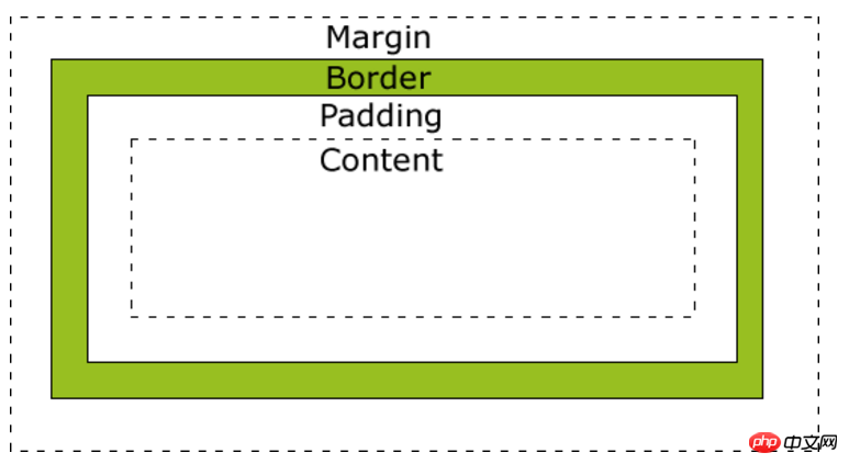
margin-right, margin-bottom, and margin-left to set these respectively. Margin values ​​in four directions. (Note: Since this part of the knowledge is relatively basic, I will not introduce more in this part)

Part 2: margin--between elements of the same level (non-parent-child relationship) Application

This part mainly introduces the problem of merging horizontal and vertical margins.

(1) Horizontal margins merge

When two horizontal boxes meet, the final distance between them is the right margin of the left box Sum the margins of the box on the right.

Example 1:

The code is as follows:

<!DOCTYPE html>
<html lang="en">
<head>
    <meta charset="UTF-8">
    <title>水平方向的两个盒子</title>
    <style>
        *{
            margin:0;
            padding:0;
            border:0;
        }
        body{
            font-size: 0;
        }
        .left{
            width: 100px;
            height: 100px;
            background: red;
            display: inline-block;
            margin-right: 50px;
            font-size: 20px;
        }
        .right{
            width: 100px;
            height: 100px;
            background: yellow;
            display: inline-block;
            margin-left: 50px;
            font-size: 20px;
        }
    </style>
</head>
<body>
    <p class="left">宽为100px,右边距为50px</p>
    <p class="right">宽为100px,左边距为50px</p>
</body>
</html>
Copy after login
The effect is as follows:

At this time, the difference between the two The distance is exactly 100px.

Additional explanation: As you can see, in order to make the two p (block elements) out of the normal document flow, I used display:inline-block; Attribute, in addition, I also set the font-size of the body to 0, which can solve the problem of inline-block itself, otherwise the two p examples will be larger than 100px. Of course, using float can also make two p appear on the same line.

(2) Vertical margin merging

When two vertical boxes meet, their vertical distance is equal to the lower outer edge of the upper box The larger of the margin and the top margin of the box below.

Example 2:

<!DOCTYPE html>
<html lang="en">
<head>
    <meta charset="UTF-8">
    <title>水平方向的两个盒子</title>
    <style>
        *{
            margin:0;
            padding:0;
            border:0;
        }
        .top{
            width: 100px;
            height: 100px;
            margin-bottom: 100px;
            background: red;
        }
        .bottom{
            width: 100px;
            height: 100px;
            margin-top: 50px;
            background: green;
        }
    </style>
</head>
<body>
    <p class="top">高为100px,下边距为100px</p>
    <p class="bottom">高为100px,上边距为50px</p>
</body>
</html>
Copy after login
The effect is as follows:

At this time, we can observe it with the naked eye. Examples of both vertical directions It is about 100px (actually 100px) instead of 100+50=150px; this is precisely because when two vertical boxes meet, the vertical distance is equal to the lower margin of the upper box and the upper margin of the lower box The larger one.

Another interesting example is: Suppose there is an element with margin-top and margin-bottom set at the same time, but the content is empty, then the two margin values ​​​​will also be superimposed, and the value will be the largest of the two. , which is similar to the superposition of margin values ​​​​of two boxes in the vertical direction. The code is as follows:

<!DOCTYPE html>
<html lang="en">
<head>
    <meta charset="UTF-8">
    <title>水平方向的两个盒子</title>
    <style>
        *{
            margin:0;
            padding:0;
        }
 
        .top{
            width: 500px;
            height: 100px;
            background: red;
        }
        .middle{
            margin-top: 100px;
            margin-bottom:50px;
        }
        .footer{
            width: 500px;
            height: 100px;
            background: green;
        }
 
    </style>
</head>
<body>
    <p class="top">上面的p,高100px</p>
    <p class="middle"></p>
    <p class="footer">下面的p,高100px</p>
</body>
</html>
Copy after login
The final effect is as follows:

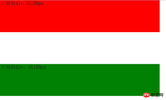
我们发现这时在上面的p和在下面的p之间的举例并不是100+50=150px,而是两者中的最大者,即100px。

那么W3C为什么会设定这样的标准而不设定和水平方向一样的标准呢?即margin值的叠加,实际上这也是有一定的道理的。比如我们需要设计一个由若干个段落构成的一个页面。我们需要设置margin-top和margin-bottom使得第一段和页面的最上方有一段距离,使得最后一段和最下方有一段距离。下面是不叠加和叠加的效果图:

我们可以看到左边的页面没有重叠,那么两个段落之间的举例就是最上方的两倍间距了,而右边的页面发生了重叠,则所有的间距都是相等的。或许这就是这样设定标准的目的吧,谁知道呢?

第三部分:margin--在父元素和子元素之间应用(重点)

第二部分介绍了同级元素之间使用margin,而这一部分将要介绍最有意思的父元素和子元素之间margin的应用。这一部分,我们同样从两个方面来讨论。一方面是子元素设置水平方向上的margin值,另一方面是子元素设置竖直方向的margin值。

(1)在子元素中设置水平方向的margin值

我们可以设置margin-left来控制子元素的左边框和父元素的左边框之间的举例。

例3:

<!DOCTYPE html>
<html lang="en">
<head>
    <meta charset="UTF-8">
    <title>margin</title>
    <style>
        *{padding:0; margin:0; border:0;}
        .father{
            width: 500px;
            height: 500px;
            background: red;
        }
        .son{
            width: 100px;
            height: 100px;
            background: green;
            margin-left: 100px;
        }
    </style>
</head>
<body>
    <p class="father">
        <p class="son">宽度为100px,margin-left为100px。</p>
    </p>
</body>
</html>
Copy after login

我将子元素的margin-left设置为了100px;效果如下:

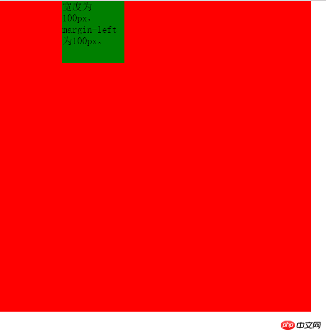
即子元素的左边框和父元素的左边框之间的距离为100px。与在同级元素之间设置margin不同,因为同级元素之间的margin不会考虑到padding,但是在父元素和子元素就不同了,那么如果父元素中如果有padding,效果会是什么样的呢?请看下面一个例子:

例4:

下面我们在上面例子的基础上给父元素添加padding值。

<!DOCTYPE html>
<html lang="en">
<head>
    <meta charset="UTF-8">
    <title>margin</title>
    <style>
        *{padding:0; margin:0; border:0;}
        .father{
            width: 500px;
            height: 500px;
            padding:100px;
            background: red;
        }
        .son{
            width: 100px;
            height: 100px;
            background: green;
            margin-left: 100px;
        }
    </style>
</head>
<body>
    <p class="father">
        <p class="son">宽度为100px,margin-left为100px。</p>
    </p>
</body>
</html>
Copy after login

上面的代码给父元素添加了100px的padding值,效果如下:

我们可以看到子元素举例上方的距离为100px,因为子元素一定是在父元素的content的部分的,这点毫无疑问。

但是经过测量可以发现子元素的左边框距离父元素的左边框之间的距离为200px,因为其中还有100px的左padding值,前面的例子因为我没有设置padding值,所以没有观察出来,因此这就说明了在子元素中设置margin-left,其值实际上是子元素的左边框距离父元素左padding内侧的距离。

例5:margin-right的使用和margin-left的使用是相似的,我在这里只举一个例子。

这个例子在子元素中设置了margin-right值,如下所示:

<!DOCTYPE html>
<html lang="en">
<head>
    <meta charset="UTF-8">
    <title>margin</title>
    <style>
        *{padding:0; margin:0; border:0;}
        .father{
            width: 500px;
            height: 500px;
            padding:100px;
            background: red;
        }
        .son{
            float: right;
            width: 100px;
            height: 100px;
            background: green;
            margin-right: 100px;
        }
    </style>
</head>
<body>
    <p class="father">
        <p class="son">宽度为100px,margin-right为100px。</p>
    </p>
</body>
</html>
Copy after login

这个例子与例4的区别仅在与子元素的位置不同。效果如下:

通过这个例子可以说明margin-right的值是子元素的右边框和父元素的右padding内侧的距离。只是前面的几个例子我没有使用padding,所以无法观察出来。

(2)在子元素中设置竖直方向的margin值

按照前面的经验,理论上来说,我们同样可以通过设置margin-top的值使得子元素的上边框和父元素的上padding的内侧留有一定的距离。那么我们就试试吧!

例6:

<!DOCTYPE html>
<html lang="en">
<head>
    <meta charset="UTF-8">
    <title>margin</title>
    <style>
        *{padding:0; margin:0; border:0;}
        .father{
            width: 500px;
            height: 500px;
            background: red;
        }
        .son{
            width: 100px;
            height: 100px;
            background: green;
            margin-top: 100px;
        }
    </style>
</head>
<body>
    <p class="father">
        <p class="son">高度为100px,margin-top为100px。</p>
    </p>
</body>
</html>
Copy after login

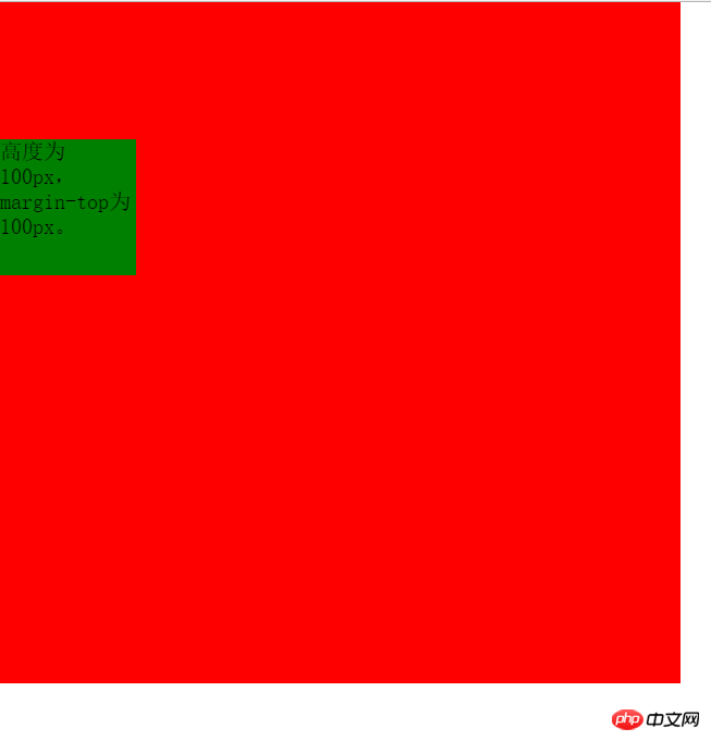
这个例子我设置了margin-top为100px,效果如下:

这并不是我们想要的效果啊,我们希望子元素的上部距离父元素的上部为100px,可是我们看到的却是父元素的上部距离浏览器页面的上部有100px的距离,这是为什么呢?哪里出现问题了呢?

实际上这是因为当父元素没有设置padding值以及border值时,出现了一个bug--父元素的上方与子元素的上方完全重合在了一起,无法分开。所以才会导致上述这种父元素和子元素同时向下的情况。

对于这种问题解决方法有下面几种:

  • 方法一:给父元素添加padding-top值

  • 方法二:给父元素添加border值

  • 方法三:给父元素添加属性overflow:hidden;

  • 方法四:给父元素或者子元素声明浮动float

  • 方法五:使父元素或子元素声明为绝对定位:position:absolute;

  • 方法六:给父元素添加属性 overflow:auto; positon:relative;(注:此方法为后续添加,感谢博友@小精灵Pawn提供此方法)

方法一:基于例6,在父元素的css代码中添加padding-top:1px;效果如下:

 方法的唯一缺点就是增加了1px的误差。

方法二:基于例6,在父元素的css代码中添加border-top:1px solid transparent;效果如下:

同样达到了效果, 缺点同方法一。

方法三:基于例6,在父元素的css代码中添加overflow:hidden;效果如下:

同样达到了效果,并且没有任何误差的存在。堪称perfect!!!!

方法四:给父元素或者子元素声明float;基于例6,在子元素css代码添加float:left;或者在父元素css代码添加float:left;均达到效果,这里不再展示相同的图片。

优点:没有像素的误差。   缺点:float有时是不必要的。

方法五:给父元素或者子元素添加position:absolute;属性。 同样达到效果。

优点:同方法四。  且只要我们不使用top和left也不会有任何影响,所以这也是一种不错的方法。

方法六:给父元素添加overflow:auto;和position:relative;同样达到效果。

第四部分:margin值的单位为%时的几种情况

之前我举例子时使用margin,它的值都是以px为单位的,这个理解起来没有问题。但是如果margin值是以%为单位呢?实际上这时候百分比(%)是相对于该元素的父元素(容器),对于同级元素和父子元素都是如此。(再次感谢 博友@小精灵Pawn 提供的建议!!基于此建议补充这部分内容) 但是在同级元素中使用竖直方向的margin时会出现意想不到的结果,下面举例说明。

(1)同级元素在水平方向使用值为%的margin

例7:

<head>
    <meta charset="UTF-8">
    <title>margin</title>
    <style>
        *{
            margin:0;
            padding:0;
        }
        .first{
            float: left;
            width: 200px;
            height: 200px;
            background: green;
        }
        .second{
            float: left;
            width: 200px;
            height: 200px;
            background: red;
            margin-left: 20%;
        }
    </style>
</head>
<body>
    <p class="first">宽为200,无margin</p>
    <p class="second">宽为200,margin-left为20%;</p>
</body>
</html>
Copy after login

这个例子中,设置两个元素向左浮动,以便于观察两者水平方向的margin。其中左边p无margin,右边p的margin-left为20%,效果如下:

从效果图可以看出两个p之间的间距始终为父元素(这里右边p的父元素即为body,其宽度为浏览器宽度)的20%。

(2)同级元素在竖直方向使用值为%的margin

根据例7的启发,我们可以猜想,如果在竖直方向上使用margin,且值的单位为%,那么最终两者之间的距离将是父元素(上例中为body)的百分数。那么究竟是不是这样呢?看下面的例子。

例8

<head>
    <meta charset="UTF-8">
    <title>margin</title>
    <style>
        *{
            margin:0;
            padding:0;
        }
        .first{
            width: 200px;
            height: 200px;
            background: green;
        }
        .second{
            width: 200px;
            height: 200px;
            background: red;
            margin-top: 10%;
        }
    </style>
</head>
<body>
    <p class="first">高为200,无margin</p>
    <p class="second">高为200,margin-top为20%;</p>
</body>
</html>
Copy after login

这里设置上面的p无margin,下面的p的margin-top为10。效果如下:

我们发现,当我在缩小浏览器的高度时,竖直方向上的间距并没有缩小!!! 而当我缩小浏览器的宽度时,竖直方向上的距离缩小了!!!

这就说明:统计元素之间在竖直方向上使用margin,当值的单位为%时,它是相对于父元素的宽度。

那么这里为什么不是如我们所希望的那样相对于浏览器的高度呢?知乎上有大神是这样解释的:

(3)父子元素使用值为%的margin

对于父子元素,如果在子元素中使用单位为%margin,那么这个margin值是相对于父元素的宽度和高度(注意:这时的确是相对于父元素的高度!)的。

例9 

代码如下:

<!DOCTYPE html>
<html lang="en">
<head>
    <meta charset="UTF-8">
    <title>Document</title>
    <style>
        *{
            margin:0;
            padding:0;
        }
        .father{
            width: 500px;
            height: 300px;
            background: red;
            overflow: hidden;
        }
        .son{
            width: 100px;
            height: 100px;
            background: green;
            margin-top: 20%;
            margin-left: 20%;
        }
    </style>
</head>
<body>
    <p class="father">
        <p class="son"></p>
    </p>
</body>
</html>
Copy after login

在这个例子中,我设置了margin-left的值为20%,margin-top的值为20%,父元素的width为500px,父元素的height为300px。下面看看效果吧。

从上图可以看出子元素的margin-top值最终同样是相对与父元素的宽度而非高度。

总结:

这篇博文只介绍了margin的其中一部分知识点,但如果大家读后能有些许收获是再好不过的了。由于本人总结仓促,知识不足,错误在所难免,希望大家如果发现不妥之初能提出意见,我将非常感激。

相信看了本文案例你已经掌握了方法,更多精彩请关注php中文网其它相关文章!

推荐阅读:

CSS3的box-sizing属性图文教程

在CSS边界线消失如何处理

三种绝对定位元素的水平垂直居中的办法

The above is the detailed content of Detailed explanation of margin attribute in css. For more information, please follow other related articles on the PHP Chinese website!

Related labels:
source:php.cn
Statement of this Website
The content of this article is voluntarily contributed by netizens, and the copyright belongs to the original author. This site does not assume corresponding legal responsibility. If you find any content suspected of plagiarism or infringement, please contact admin@php.cn
Popular Tutorials
More>
Latest Downloads
More>
Web Effects
Website Source Code
Website Materials
Front End Template
About us Disclaimer Sitemap
php.cn:Public welfare online PHP training,Help PHP learners grow quickly!