css suspension effect shadow implementation code
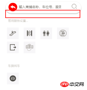
This article mainly introduces to you the relevant information and examples of CSS methods to achieve the shadow of suspension effect. I hope it can help you. Let’s take a look at the renderings first.
Rendering to be achieved:

Code to be implemented:
-webkit-box-shadow:0px 3px 3px #c8c8c8 ;
-moz-box-shadow:0px 3px 3px #c8c8c8 ;
box-shadow:0px 3px 3px #c8c8c8 ;
of the entire page Code:
<!DOCTYPE html >
<html>
<head>
        <meta http-equiv="Content-Type" content="text/html; charset=utf-8" />
        <meta name="viewport" content="width=device-width, initial-scale=0.0, user-scalable=no, minimum-scale=1.0, maximum-scale=1.0" />

        <style>
            .search {
                height: 46px;
                border: 1px solid #F0F1F1;
                border-radius: 25px;
                margin: 0 20px;

-webkit-box-shadow:0px 3px 3px #c8c8c8 ;
-moz-box-shadow:0px 3px 3px #c8c8c8 ;
box-shadow:0px 3px 3px #c8c8c8 ;
            }

            .search_left {
                float: left;
                margin: 5px 7px 5px 11px;
                width: 35px;
                height: 34px;
                border-radius: 50px;
                background: red;
                text-align: center;
                line-height: 42px;
            }

            .search_left img {
                width: 60%;
                height: 60%;
            }

            .search_input {
                float: left;
            }

            .search_input input {
                border: none;
                height: 30px;
                margin-top: 5px;
            }

            .search_right {
                float: right;
                width: 20px;
                height: 20px;
                margin: 9px 17px 5px 10px;
            }

            .search_right img {
                width: 100%;
                height: 100%;
            }

            .words {
                color: #D1D1D1;
                font-size: 12px;
                margin-top: 21px;
                margin-left: 30px;
            }

            .servers {
                overflow: auto;
            }

            .servers ul {
                overflow: auto;
                padding-left: 16px;
            }

            .servers ul li {
                list-style: none;
                background: #f6f6f9;
                float: left;
                width: 47px;
                height: 47px;
                text-align: center;
                margin: 5px 10px;
            }

            .servers ul li img {
                width: 60%;
                height: 60%;
                margin-top: 9px;
            }
        </style>
        <title>高校地图</title>
    </head>

    <body>
        <p class="container">
            <p class="search">
                <p class="search_left"><img src="img/back.png" /></p>
                <p class="search_input"><input type="text" placeholder="输入商铺名称,车位号,服务设施"></p>
                <p class="search_right"><img src="img/scale_search.png" alt="放大" /></p>
            </p>
        </p>

        <p class="words">常用服务设置...</p>

        <p class="servers">
            <ul>
                <li><img src="img/stairs.png" alt="手扶电梯" /></li>
                <li><img src="img/stairs2.png" alt="手扶电梯" /></li>
                <li><img src="img/sex.png" alt="手扶电梯" /></li>
                <li><img src="img/entris.png" alt="手扶电梯" /></li>
                <li><img src="img/exiy.png" alt="手扶电梯" /></li>
                <li><img src="img/moner.png" alt="手扶电梯" /></li>
            </ul>
        </p>

        <p class="words">车牌找车</p>
        <p class="servers">
            <ul>
                <li><img src="img/car.png" alt="车牌找车" /></li>

            </ul>
        </p>
    </body>

</html>Related recommendations:
JS implementation example sharing of image centering and floating effect
The above is the detailed content of css suspension effect shadow implementation code. For more information, please follow other related articles on the PHP Chinese website!

Hot AI Tools

Undresser.AI Undress
AI-powered app for creating realistic nude photos

AI Clothes Remover
Online AI tool for removing clothes from photos.

Undress AI Tool
Undress images for free

Clothoff.io
AI clothes remover

AI Hentai Generator
Generate AI Hentai for free.

Hot Article

Hot Tools

Notepad++7.3.1
Easy-to-use and free code editor

SublimeText3 Chinese version
Chinese version, very easy to use

Zend Studio 13.0.1
Powerful PHP integrated development environment

Dreamweaver CS6
Visual web development tools

SublimeText3 Mac version
God-level code editing software (SublimeText3)

Hot Topics
 1376
1376
 52
52
 How to use bootstrap button
Apr 07, 2025 pm 03:09 PM
How to use the Bootstrap button? Introduce Bootstrap CSS to create button elements and add Bootstrap button class to add button text
 How to resize bootstrap
Apr 07, 2025 pm 03:18 PM
To adjust the size of elements in Bootstrap, you can use the dimension class, which includes: adjusting width: .col-, .w-, .mw-adjust height: .h-, .min-h-, .max-h-
 How to view the date of bootstrap
Apr 07, 2025 pm 03:03 PM
Answer: You can use the date picker component of Bootstrap to view dates in the page. Steps: Introduce the Bootstrap framework. Create a date selector input box in HTML. Bootstrap will automatically add styles to the selector. Use JavaScript to get the selected date.
 How to set up the framework for bootstrap
Apr 07, 2025 pm 03:27 PM
To set up the Bootstrap framework, you need to follow these steps: 1. Reference the Bootstrap file via CDN; 2. Download and host the file on your own server; 3. Include the Bootstrap file in HTML; 4. Compile Sass/Less as needed; 5. Import a custom file (optional). Once setup is complete, you can use Bootstrap's grid systems, components, and styles to create responsive websites and applications.
 How to insert pictures on bootstrap
Apr 07, 2025 pm 03:30 PM
There are several ways to insert images in Bootstrap: insert images directly, using the HTML img tag. With the Bootstrap image component, you can provide responsive images and more styles. Set the image size, use the img-fluid class to make the image adaptable. Set the border, using the img-bordered class. Set the rounded corners and use the img-rounded class. Set the shadow, use the shadow class. Resize and position the image, using CSS style. Using the background image, use the background-image CSS property.
 How to verify bootstrap date
Apr 07, 2025 pm 03:06 PM
To verify dates in Bootstrap, follow these steps: Introduce the required scripts and styles; initialize the date selector component; set the data-bv-date attribute to enable verification; configure verification rules (such as date formats, error messages, etc.); integrate the Bootstrap verification framework and automatically verify date input when form is submitted.
 How to write split lines on bootstrap
Apr 07, 2025 pm 03:12 PM
There are two ways to create a Bootstrap split line: using the tag, which creates a horizontal split line. Use the CSS border property to create custom style split lines.
 How to upload files on bootstrap
Apr 07, 2025 pm 01:09 PM
The file upload function can be implemented through Bootstrap. The steps are as follows: introduce Bootstrap CSS and JavaScript files; create file input fields; create file upload buttons; handle file uploads (using FormData to collect data and then send to the server); custom style (optional).


