

How to display product information with 3D effect in H5+C3
This time I will show you how H5+C3 displays product information with 3D effect. What are the precautions for H5+C3 to display product information with 3D effect. Here is a practical case, let’s take a look.
Strengthen the usage of perspective and transform:translateZ. Traditional product display may not attract users' attention very well, but if you add appropriate 3D elements to the display, ~ maybe the effect will be good ~
Rendering:

Explanation: This idea is not my idea, ha~ I imitate others, the idea should be from w3cplus. Of course, the point is to teach you how to do it, just like a high imitation~
First of all, let’s teach you how to use CSS3 to make a cube:
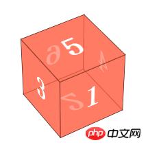
Zaimu Before CSS, such a cube should be difficult to make~ Well, I think it is difficult~
html:
<body>


<p class="wapper">
    <p class="cube">
        <p class="side  front">1</p>
        <p class="side   back">6</p>
        <p class="side  right">4</p>
        <p class="side   left">3</p>
        <p class="side    top">5</p>
        <p class="side bottom">2</p>
    </p>
</p>

</body>
wapper is the stage for this effect, that is, setting the perspective element. If Multiple elements share a stage, so the effect of observing all the elements from one line of sight is different. It is equivalent to standing in front of a row of doors tilted at 45 degrees under normal circumstances. Each door has a different view from our line of sight. The angles are different; p#cube represents a cube, and then the 6 p's represent each face.
p#cube sets transform-style:preserve-3d, and then sets rotate and translateZ for each element
Now all the faces overlap on the same plane, we let:
Move the font forward by half the side length (translateZ(50px)) in the Z-axis direction, which is 50px;
Back first rotate 180 degrees around the Y-axis so that the font is facing the outside, and then translateZ (50px), because it has been rotated 180 degrees at this time, so tanslateZ is downward.
Similarly, other surfaces are rotated 90 degrees around the X-axis or Y-axis, and then translateZ(50px)
CSS:
.wapper
       {
           margin: 100px auto 0;
           width: 100px;
           height: 100px;
           -webkit-perspective: 1200px;
           font-size: 50px;
           font-weight: bold;
           color: #fff;
       }

       .cube
       {

           position: relative;
           width: 100px;
           -webkit-transform: rotateX(-40deg) rotateY(32deg);
           -webkit-transform-style: preserve-3d;
       }

       .side
       {
           text-align: center;
           line-height: 100px;
           width: 100px;
           height: 100px;
           background: rgba(255, 99, 71, 0.6);
           border: 1px solid rgba(0, 0, 0, 0.5);
           position: absolute;
       }

       .front
       {
           -webkit-transform: translateZ(50px);
       }

       .top
       {
           -webkit-transform: rotateX(90deg) translateZ(50px);
       }

       .right
       {
           -webkit-transform: rotateY(90deg) translateZ(50px);
       }

       .left
       {
           -webkit-transform: rotateY(-90deg) translateZ(50px);
       }

       .bottom
       {
           -webkit-transform: rotateX(-90deg) translateZ(50px);
       }

       .back
       {
           -webkit-transform: rotateY(-180deg) translateZ(50px);
}For the display effect, you can adjust the perspective distance~
Okay, if the cube is understood, then this product display will not be difficult; the two p's represent two There are two sides, one is a picture, and the other is an introduction. Initially, the introduction is rotated 90deg around the X-axis, and then when the mouse moves, the entire box is rotated 90deg around the X-axis.
HTML:
<!DOCTYPE html>
<html>
<head>
    <title></title>
    <meta charset="utf-8">
    <link href="css/reset.css" rel="stylesheet" type="text/css">


</head>
<body>


<ul id="content">

    <li>
        <p class="wrapper">
            <img src="images/a.png">
            <span class="information">
              <strong>Contact Form</strong> The easiest way to add a contact form to your shop.
            </span>
        </p>
    </li>

    <li>
        <p class="wrapper">
            <img src="images/b.jpeg">
            <span class="information">
              <strong>Contact Form</strong> The easiest way to add a contact form to your shop.
            </span>
        </p>

    </li>

    <li>
        <p class="wrapper">
            <img src="images/c.png">
            <span class="information">
              <strong>Contact Form</strong> The easiest way to add a contact form to your shop.
            </span>
        </p>

    </li>

</ul>


</body>
</html>
CSS:
<style type="text/css">
        body
        {
            font-family: Tahoma, Arial;
        }

        #content
        {
            margin: 100px auto 0;
        }

        #content li, #content .wrapper, #content li img, #content li span
        {
            width: 310px;
            height: 100px;
        }

        #content li
        {
            cursor: pointer;
            -webkit-perspective: 4000px;
            width: 310px;
            height: 100px;
            float: left;
            margin-left: 60px;
            /*box-shadow: 2px 2px 5px #888888;*/

        }

        #content .wrapper
        {
            position: relative;
            -webkit-transform-style: preserve-3d;
            -webkit-transition: -webkit-transform .6s;
        }

        #content li img
        {
            top: 0;
            border-radius: 3px;
            box-shadow: 0px 3px 8px rgba(0, 0, 0, 0.3);
            position: absolute;
            -webkit-transform: translateZ(50px);
            -webkit-transition: all .6s;
        }

        #content  li span
        {
            background: -webkit-gradient(linear, left top, left bottom, color-stop(0%, rgba(236, 241, 244, 1)), color-stop(100%, rgba(190, 202, 217, 1)));
            text-shadow: 1px 1px 1px rgba(255, 255, 255, 0.5);
            position: absolute;
            -webkit-transform: rotateX(-90deg) translateZ(50px);
            -webkit-transition: all .6s;
            display: block;
            top: 0;
            text-align: left;
            border-radius: 15px;
            font-size: 12px;
            padding: 10px;
            width: 290px;
            height: 80px;
            text-shadow: 1px 1px 1px rgba(255, 255, 255, 0.5);
            box-shadow: none;
        }

        #content li span strong
        {
            display: block;
            margin: .2em 0 .5em 0;
            font-size: 20px;
            font-family: "Oleo Script";
        }

        #content li:hover .wrapper
        {
            -webkit-transform: rotateX(95deg);
        }

        #content li:hover img
        {
            box-shadow: none;
            border-radius: 15px;
        }

        #content li:hover span
        {
            box-shadow: 0px 3px 8px rgba(0, 0, 0, 0.3);
            border-radius: 3px;
        }


</style>CSS has basically been analyzed above. Here is a point. We have made a p.wapper for each product. It looks like It is redundant, but it is not, because we want each product to be a normal 90deg flip, so we cannot let all products share a stage, so we added a p.wapper to let him set transform-style: preverse-3d, and then Each li sets the stage effect perspective separately. The final flip effect is on p.wapper.
I believe you have mastered the method after reading the case in this article. For more exciting information, please pay attention to other related articles on the php Chinese website!
Recommended reading:
How to use the constraint verification API in H5
##postMessage to achieve cross-domain and cross-window messaging
The above is the detailed content of How to display product information with 3D effect in H5+C3. For more information, please follow other related articles on the PHP Chinese website!

Hot AI Tools

Undresser.AI Undress
AI-powered app for creating realistic nude photos

AI Clothes Remover
Online AI tool for removing clothes from photos.

Undress AI Tool
Undress images for free

Clothoff.io
AI clothes remover

AI Hentai Generator
Generate AI Hentai for free.

Hot Article
Hot Tools

Notepad++7.3.1
Easy-to-use and free code editor

SublimeText3 Chinese version
Chinese version, very easy to use

Zend Studio 13.0.1
Powerful PHP integrated development environment

Dreamweaver CS6
Visual web development tools

SublimeText3 Mac version
God-level code editing software (SublimeText3)
Hot Topics


 Table Border in HTML
Sep 04, 2024 pm 04:49 PM
Table Border in HTML
Sep 04, 2024 pm 04:49 PM
Guide to Table Border in HTML. Here we discuss multiple ways for defining table-border with examples of the Table Border in HTML.
 Nested Table in HTML
Sep 04, 2024 pm 04:49 PM
Nested Table in HTML
Sep 04, 2024 pm 04:49 PM
This is a guide to Nested Table in HTML. Here we discuss how to create a table within the table along with the respective examples.
 HTML margin-left
Sep 04, 2024 pm 04:48 PM
HTML margin-left
Sep 04, 2024 pm 04:48 PM
Guide to HTML margin-left. Here we discuss a brief overview on HTML margin-left and its Examples along with its Code Implementation.
 HTML Table Layout
Sep 04, 2024 pm 04:54 PM
HTML Table Layout
Sep 04, 2024 pm 04:54 PM
Guide to HTML Table Layout. Here we discuss the Values of HTML Table Layout along with the examples and outputs n detail.
 Moving Text in HTML
Sep 04, 2024 pm 04:45 PM
Moving Text in HTML
Sep 04, 2024 pm 04:45 PM
Guide to Moving Text in HTML. Here we discuss an introduction, how marquee tag work with syntax and examples to implement.
 HTML Ordered List
Sep 04, 2024 pm 04:43 PM
HTML Ordered List
Sep 04, 2024 pm 04:43 PM
Guide to the HTML Ordered List. Here we also discuss introduction of HTML Ordered list and types along with their example respectively
 HTML onclick Button
Sep 04, 2024 pm 04:49 PM
HTML onclick Button
Sep 04, 2024 pm 04:49 PM
Guide to HTML onclick Button. Here we discuss their introduction, working, examples and onclick Event in various events respectively.
 HTML Input Placeholder
Sep 04, 2024 pm 04:54 PM
HTML Input Placeholder
Sep 04, 2024 pm 04:54 PM
Guide to HTML Input Placeholder. Here we discuss the Examples of HTML Input Placeholder along with the codes and outputs.
