

This article mainly introduces you to the relevant information on making various web icons (triangle, pause button, download arrow, plus sign, etc.) using pure CSS. The editor thinks it is quite good, so I will share it with you now and give it to everyone. Here is a reference for everyone, I hope it can help everyone.
Triangle

##
<p class="box"></p>
<style>
.box{
            width: 0;
            height: 0;
            border-top: 50px solid transparent;
            border-bottom: 50px solid transparent;
            border-left: 50px solid transparent;
            border-right: 50px solid red;
}
</style>Parallelogram icon

<p class="box"></p>
<style>
 .box{
            width: 50px;
            height: 50px;
            margin: 100px auto;
            background-color: red;
            transform: skew(-25deg);
        }
</style>Pause button
# #
<p class="box"></p>
    <style>
        .box{
            width: 50px;
            height: 50px;
            margin: 100px auto;
            color: #000;
            border: 1px solid;
            border-radius: 50%;
            outline: 10px solid;
            outline-offset: -26px;
        }
</style>In fact, if you set the value of outline-offset a little smaller, it will appear after one addition
Plus sign
<p class="box"></p>
<style>
    .box{
        width: 50px;
        height: 50px;
        margin: 100px auto;
        color: #000;
        border: 1px solid;
        border-radius: 50%;
        outline: 10px solid;
        outline-offset: -35px;
    }
</style>If you rotate it again, it becomes a close button
Close button
 ##
##
<p class="box"></p>
<style>
    .box{
        width: 50px;
        height: 50px;
        margin: 100px auto;
        color: #000;
        border: 1px solid;
        border-radius: 50%;
        outline: 10px solid;
        outline-offset: -35px;
        transform: rotate(45deg);
}Burger Button
##
<p class="box"></p>
<style>
    .box{
        width: 50px;
        height: 0px;
        margin: 100px auto;
        box-shadow: 36px 10px 0 3px red,
        36px 0 0 3px red,
        36px 20px 0 3px red;
    }
</style> Burger Button 2:
 <p class="box"></p>
<style>
.box{
width: 30px;
height: 3px;
margin: 100px auto;
padding: 2px 0;
border-top: 3px solid red;
border-bottom: 3px solid red;
background-clip: content-box;
background-color: red;
}
</style>Radio Button
Because box-shadow will scale proportionally, just set the first value to white, and then set the second value to be larger than the first value
<p class="box"></p>
<style>
    .box{
        width: 30px;
        height: 30px;
        margin: 100px auto;
        background-color: #000;
        border-radius: 50%;
        box-shadow: 0 0 0 5px #fff,0 0 0 10px #000;
    }
</style>Circle with a cross
##
<p class="box"></p>
<style>
    .box {
        width: 30px;
        height: 30px;
        margin: 100px auto;
        background-color: #000;
        border-radius: 50%;
        box-shadow: 0 0 0 5px #fff, 0 0 0 10px #000;
        outline: 36px solid #fff;
        outline-offset: -50px;
    }
</style>Field icon
<p class="box"></p>
<style>
    .box {
        width: 0;
        margin: 100px auto;
        border: 3px solid red;
        outline: 6px dotted red;
        outline-offset: 6px;
    }
</style>Download arrow
Made using border Triangle, use box-shadow to make a square, mainly using offset
<p class="box"></p>
<style>
    .box {
        width: 0;
        margin: 100px auto;
        color: red;
        border: 8px solid transparent;
        border-top: 8px solid red;
        box-shadow: 0 -12px 0 -4px;
    }
</style>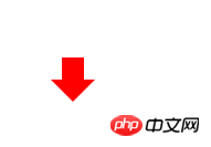 Bookmark
The principle of achieving this effect is to set the triangle as the background color, so that the hollow triangle appears
<p class="box"></p>
<style>
    .box {
        width: 0;
        height: 8px;
        background-color:orange;
        border: 8px solid transparent;
        border-bottom: 8px solid #fff;
    }
</style> Two semicircle icons
This is relatively simple, it is implemented through the gradient function, and then a rounded border
<p class="box"></p>
<style>
    .box {
       width: 50px;
        height: 50px;
        border-radius: 50%;
        background-image: linear-gradient(to right,#ccc 50%,#000 50%);
    }
</style>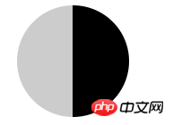 Disable the icon
Use a rounded border for the outer circle, use a gradient for the vertical line inside, and then use the rotation attribute
<p class="box"></p>
<style>
    .box {
       width: 50px;
        height: 50px;
        border-radius: 50%;
        border:2px solid #000;
        background: linear-gradient(to right,#fff  45%,#000 45%,#000 45%,#fff 55%);
        transform: rotate(40deg);
    }
</style>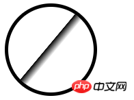 Left and right arrow icons
Since you can make one triangle, you can make two triangles.
<p class="box"></p>
<style>
    .box {
        width: 0;
        height: 0;
        margin: 100px auto;
        border: 10px solid transparent;
        border-left: 10px solid red;
        -webkit-box-reflect: left 5px;
        box-reflect:left 5px;
    }
</style> Needs to be opened in Chrome browser, because other browsers may not support Eagle beak icon
<p class="box"></p>
<style>
    .box {
       width: 32px;
        margin: 100px auto;
        border-top: 50px solid transparent;
        border-right: 22px solid #096;
        border-bottom-right-radius: 100%;;
    }
</style>
The above is the detailed content of Examples of methods for creating various web icons using CSS. For more information, please follow other related articles on the PHP Chinese website!


![[Web front-end] Node.js quick start](https://img.php.cn/upload/course/000/000/067/662b5d34ba7c0227.png)


