

Detailed explanation of background-clip property in css

This article mainly introduces the function of the background-clip attribute in CSS. The popular function of the background-clip attribute is to specify the area where the background of the element is located. Friends who are interested in the relevant knowledge of the background-clip attribute in CSS should take a look. Well, I hope it helps everyone.
The popular function of the background-clip attribute is to specify the area where the background of the element is located. There are four values
1, border-box
border -box is the default value, which means that the background of the element retains the background starting from within the border area (including the border).
The simple code is as follows:
<!doctype html>
<html>
    <head>
        <style>
        *{margin:0;padding:0;}
            .box{width:380px;height:280px;margin:100px auto;background:url("1.jpg") no-repeat -5px;padding:5px;border:5px dotted #000;<br>       background-clip:border-box;}
        </style>
   </head>
   <body>
       <p class="box"></p>
   </body>
</html>The effect is as follows:
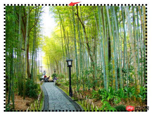
From the picture above We can see that the element background exists in the border and the area by default, but I don’t know why adding a background image cannot cover it all; but the background color does not have this problem.
2. padding-box
padding-box means that the background of the element is retained from within the padding area (including padding).
The simple code is as follows:
<!doctype html>
<html>
    <head>
        <style>
        *{margin:0;padding:0;}
            .box{width:380px;height:280px;margin:100px auto;background:url("1.jpg") no-repeat -5px;padding:5px;border:5px dotted #000;<br>            background-clip:padding-box;}
        </style>
   </head>
   <body>
       <p class="box"></p>
   </body>
</html>The effect is as follows:
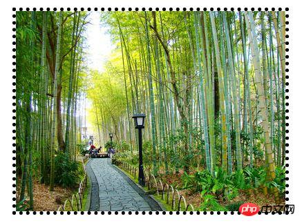
From the picture above We can see that the background image exists in the padding and within the area.
3. content-box
content-box indicates that the background of the element is retained from within the content area.
The simple code is as follows:
<!doctype html>
<html>
    <head>
        <style>
        *{margin:0;padding:0;}
            .box{width:380px;height:280px;margin:100px auto;background:url("1.jpg") no-repeat -5px;padding:5px;border:5px dotted #000;<br>            background-clip:content-box;}
        </style>
   </head>
   <body>
       <p class="box"></p>
   </body>
</html>The effect is as follows:
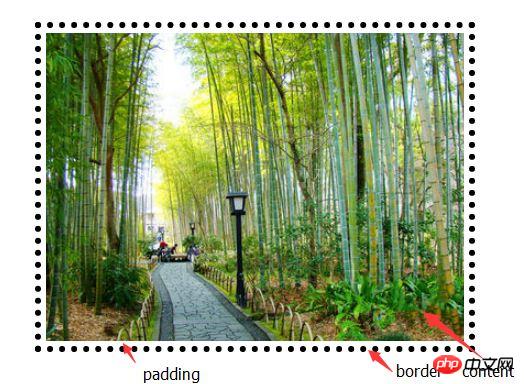
We can see from the picture above The background image exists within the content area.
4. text
content-box means that the background of the element remains in the foreground content (text), which is the same as its shape and size. Currently it only supports Chrome browser
The simple code is as follows:
<!doctype html>
<html>
    <head>
        <style>
        *{margin:0;padding:0;}
            .box{width:380px;height:280px;margin:100px auto;background:red;padding:5px;border:5px dotted #000;<br>             font-size:100px;font-weight;bold;-webkit-background-clip:text;-webkit-text-fill-color:transparent;}
        </style>
   </head>
   <body>
       <p class="box">你 好 你 好</p>
   </body>
</html>The effect is as follows:
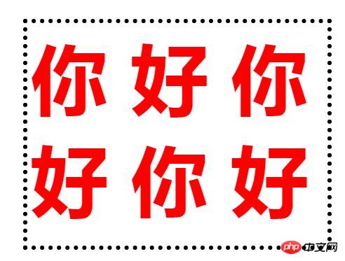
Description: When the current value is text , the compatibility is extremely poor, just know it.
Related recommendations:
CSS3 tutorial: background-clip and background-origin
##
The above is the detailed content of Detailed explanation of background-clip property in css. For more information, please follow other related articles on the PHP Chinese website!

Hot AI Tools

Undresser.AI Undress
AI-powered app for creating realistic nude photos

AI Clothes Remover
Online AI tool for removing clothes from photos.

Undress AI Tool
Undress images for free

Clothoff.io
AI clothes remover

Video Face Swap
Swap faces in any video effortlessly with our completely free AI face swap tool!

Hot Article
Hot Tools

Notepad++7.3.1
Easy-to-use and free code editor

SublimeText3 Chinese version
Chinese version, very easy to use

Zend Studio 13.0.1
Powerful PHP integrated development environment

Dreamweaver CS6
Visual web development tools

SublimeText3 Mac version
God-level code editing software (SublimeText3)
Hot Topics
 1393
1393
 52
37
110
52
37
110

 How to use bootstrap in vue
Apr 07, 2025 pm 11:33 PM
How to use bootstrap in vue
Apr 07, 2025 pm 11:33 PM
Using Bootstrap in Vue.js is divided into five steps: Install Bootstrap. Import Bootstrap in main.js. Use the Bootstrap component directly in the template. Optional: Custom style. Optional: Use plug-ins.
 The Roles of HTML, CSS, and JavaScript: Core Responsibilities
Apr 08, 2025 pm 07:05 PM
The Roles of HTML, CSS, and JavaScript: Core Responsibilities
Apr 08, 2025 pm 07:05 PM
HTML defines the web structure, CSS is responsible for style and layout, and JavaScript gives dynamic interaction. The three perform their duties in web development and jointly build a colorful website.
 How to write split lines on bootstrap
Apr 07, 2025 pm 03:12 PM
How to write split lines on bootstrap
Apr 07, 2025 pm 03:12 PM
There are two ways to create a Bootstrap split line: using the tag, which creates a horizontal split line. Use the CSS border property to create custom style split lines.
 Understanding HTML, CSS, and JavaScript: A Beginner's Guide
Apr 12, 2025 am 12:02 AM
Understanding HTML, CSS, and JavaScript: A Beginner's Guide
Apr 12, 2025 am 12:02 AM
WebdevelopmentreliesonHTML,CSS,andJavaScript:1)HTMLstructurescontent,2)CSSstylesit,and3)JavaScriptaddsinteractivity,formingthebasisofmodernwebexperiences.
 How to use bootstrap button
Apr 07, 2025 pm 03:09 PM
How to use bootstrap button
Apr 07, 2025 pm 03:09 PM
How to use the Bootstrap button? Introduce Bootstrap CSS to create button elements and add Bootstrap button class to add button text
 How to set up the framework for bootstrap
Apr 07, 2025 pm 03:27 PM
How to set up the framework for bootstrap
Apr 07, 2025 pm 03:27 PM
To set up the Bootstrap framework, you need to follow these steps: 1. Reference the Bootstrap file via CDN; 2. Download and host the file on your own server; 3. Include the Bootstrap file in HTML; 4. Compile Sass/Less as needed; 5. Import a custom file (optional). Once setup is complete, you can use Bootstrap's grid systems, components, and styles to create responsive websites and applications.
 How to insert pictures on bootstrap
Apr 07, 2025 pm 03:30 PM
How to insert pictures on bootstrap
Apr 07, 2025 pm 03:30 PM
There are several ways to insert images in Bootstrap: insert images directly, using the HTML img tag. With the Bootstrap image component, you can provide responsive images and more styles. Set the image size, use the img-fluid class to make the image adaptable. Set the border, using the img-bordered class. Set the rounded corners and use the img-rounded class. Set the shadow, use the shadow class. Resize and position the image, using CSS style. Using the background image, use the background-image CSS property.
 How to resize bootstrap
Apr 07, 2025 pm 03:18 PM
How to resize bootstrap
Apr 07, 2025 pm 03:18 PM
To adjust the size of elements in Bootstrap, you can use the dimension class, which includes: adjusting width: .col-, .w-, .mw-adjust height: .h-, .min-h-, .max-h-
