jQuery implements animated carousel ads
This time I will bring you jQuery to implement animated carousel ads. What are the precautions for jQuery to implement animated carousel ads? The following is a practical case, let’s take a look.

1. Requirements analysis
#1. Provide many pictures of equal sizes and display them in a row. 2. There are two switch buttons on the left and right, used to control whether to display the previous or next picture. 3. There is an indicator "small circle" on the lower right to prompt which picture to display; you can also click it to switch pictures. 4. Every fixed time, the picture will automatically scroll. 5. When the mouse is placed on the picture, automatic scrolling will stop; when the mouse leaves, it will automatically play again after a fixed interval.2. Code analysis
1. Use html code to build the framework
<body>
 <p id="container">
  <ul id="content">
   <li><a href="#"><img src="images/0.jpg"/></a></li>
   <li><a href="#"><img src="images/1.jpg"/></a></li>
   <li><a href="#"><img src="images/2.jpg"/></a></li>
   <li><a href="#"><img src="images/3.jpg"/></a></li>
   <li><a href="#"><img src="images/4.jpg"/></a></li>
  </ul>
  <p id="btn">
   <p id="leftBtn"></p>
   <p id="rightBtn"></p>
  </p>
  <ul id="indicator">
   <li class="current"></li>
   <li></li>
   <li></li>
   <li></li>
   <li></li>
  </ul>
 </p>
</body>
2> The ul whose id is content, the content stored in it is the scrolling picture displayed on the interface.
2. CSS code to change the display style
1> The following two lines of code clear the browser's default gap.*{margin: 0; padding: 0;}#container
{
width:560px;
height: 300px;
margin: 100px auto;
position: relative;
overflow: hidden;
}
absolutely positioned, their positions should be Set to absolute. This is the so-called principle of "the son must be like the father". This is used in absolute positioning.
3> Set the style of content#container #content
{
list-style: none;
width: 10000px;
position: absolute;
left:0;
top:0;
}
#container #content li
{
float:left;
}
#container #content li img
{
border: 0;
}4> Set the style of the left and right switch buttons
#container #leftBtn
{
 position: absolute;
 width:45px;
 height: 45px;
 top:108px;
 left: 20px;
 background: url(images/icons.png) no-repeat 0 0;
 cursor: pointer;
}

#container #rightBtn
{
 position: absolute;
 width:45px;
 height: 45px;
 top:108px;
 right: 20px;
 background: url(images/icons.png) no-repeat 0 -45px;
 cursor: pointer;
}
#container #indicator
{
 position: absolute;
 right: 50px;
 list-style: none;
 bottom: 12px;
}

#container #indicator li
{
 float: left;
 cursor: pointer;
 margin-left: 20px;
 width:14px;
 height: 14px;
 background: url(images/icons.png) no-repeat -23px -127px;
}

#container #indicator li.current
{
 background-position: -9px -125px;
}
3. Use JQuery to add interactive effects
1> 切换下一张(点击右边按钮)
$(function(){

 // 总的图片个数(用代码获取个数,扩展性比较强)
 var totalCount = $("#container #content li").length;
 // 当前处于第几个图片
 var nowImage = 0;
 $("#container #btn #rightBtn").click(rightBtnClick);
<span style="white-space:pre"> </span>function rightBtnClick(){
  if(!$("#container #content").is(":animated")){
   if(nowImage == totalCount - 1){
   <span style="white-space:pre"> </span>nowImage = 0;
<span style="white-space:pre">    </span>$("#container #indicator li").eq(nowImage).addClass("current").siblings().removeClass("current");
<span style="white-space:pre">    </span>$("#container #content").animate({"left": -560 * (totalCount -1 )}, 1000, function(){
    $("#container #content").css("left",0);
   });
  } else {
   nowImage++;
   changeImage();
  }
 }
}
});changeImage 函数
function changeImage(){
 if(!$("#container #content").is(":animated")){
 <span style="white-space:pre"> </span>$("#container #content").animate({"left": -560 * nowImage}, 1000);
  $("#container #indicator li").eq(nowImage).addClass("current").siblings().removeClass("current");
 }
}代码中,当DOM元素加载完毕,就执行了$('#container #btn #rightBtn').click(rightClick), 也就是立刻执行了切换图片操作。在rightBtnClick函数中,先进行了content是否正在进行动画的判断,这样做的目的:防止动画在执行的过程,用户又进行强制的执行其他动画,会产生干扰,最终导致动画效果混乱。
如果有的话,则将标志变量nowImage指向下一个图片,并且执行changeImage函数中的代码:1. 将content中的所有图片左移一个图片大小的宽度;2.将指示器的图片也移动到对应的位置。
如果没有的话,并且图片现在是显示到了最后一个,则先执行动画,执行完毕后,立刻将content中所有的图片内容拉回到第一个,但是这里任然会穿帮,因为当前图片显示为最后一个后,你继续执行动画,是没有任何效果的,所以在这个动画执行期间是没有任何反应的,当动画时间执行完毕后,会突然在界面上出现第一个图片。
设计思想:为了解决这个问题,解决方案就是在这些图片之后追加一个与第一张相同的图片;这就是传统轮播的主要设计思想。所以当图片滚动到倒数第二章的时候;首先执行滚动动画,也就是滚动到预先准备的与第一张一模一样的图片,看起来似乎是滚动到了第一张,其实不然。在动画执行完毕后,立刻将content中所有的图片拉回到第一张。流程图如下:
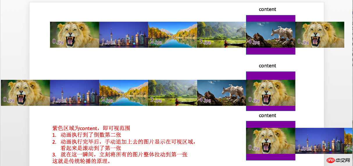
所以此刻修改一点代码,在代码的开头追加第一张图片
/*克隆轮播的第一个li追加到最后*/
$("#container #content li").first().clone().appendTo($("#container #content"));在rightBtnClick代码中,将nowImage == totalCount - 1 修改为 nowImage == totalCount - 2。
2> 切换上一张(点击左边按钮)
代码与点击右边按钮类似
$("#container #btn #leftBtn").click(function(){
 if(!$("#container #content").is(":animated")){
  if(nowImage == 0){
   nowImage = totalCount - 2;
   $("#container #content").css("left",-560 * (totalCount - 1));

   $("#container #indicator li").eq(nowImage).addClass("current").siblings().removeClass("current");

   $("#container #content").animate({"left": -560 * nowImage}, 1000);
  } else {
   nowImage--;
   changeImage();
  }
 }
});3> 点击指示器按钮进行图片切换
它的设计思路,就是获取图片的索引,然后调用changeImage函数就可以了。
$("#container #indicator li").click(function(){
 nowImage = $(this).index();
 changeImage();
});4> 添加定时执行动画的功能
也就是定时的调用点击右边按钮的代码;添加如下代码:
var timer = setInterval(rightBtnClick, 2000);
5> 鼠标悬停在图片上,停止滚动;鼠标离开图片后,继续滚动
也就是对定时器进行开启和关闭;添加如下代码:
$("#container").mouseenter(function(){
 clearInterval(timer);
}).mouseleave(function(){
 timer = setInterval(rightBtnClick, 2000);
});精彩专题分享:jQuery图片轮播 JavaScript图片轮播 Bootstrap图片轮播
相信看了本文案例你已经掌握了方法,更多精彩请关注php中文网其它相关文章!
推荐阅读:
The above is the detailed content of jQuery implements animated carousel ads. For more information, please follow other related articles on the PHP Chinese website!

Hot AI Tools

Undresser.AI Undress
AI-powered app for creating realistic nude photos

AI Clothes Remover
Online AI tool for removing clothes from photos.

Undress AI Tool
Undress images for free

Clothoff.io
AI clothes remover

AI Hentai Generator
Generate AI Hentai for free.

Hot Article

Hot Tools

Notepad++7.3.1
Easy-to-use and free code editor

SublimeText3 Chinese version
Chinese version, very easy to use

Zend Studio 13.0.1
Powerful PHP integrated development environment

Dreamweaver CS6
Visual web development tools

SublimeText3 Mac version
God-level code editing software (SublimeText3)

Hot Topics
 1378
1378
 52
52
 Users encounter rare glitches: Samsung Watch smartwatches suddenly experience white screen issues
Apr 03, 2024 am 08:13 AM
You may have encountered the problem of green lines appearing on the screen of your smartphone. Even if you have never seen it, you must have seen related pictures on the Internet. So, have you ever encountered a situation where the smart watch screen turns white? On April 2, CNMO learned from foreign media that a Reddit user shared a picture on the social platform, showing the screen of the Samsung Watch series smart watches turning white. The user wrote: "I was charging when I left, and when I came back, it was like this. I tried to restart, but the screen was still like this during the restart process." Samsung Watch smart watch screen turned white. The Reddit user did not specify the smart watch. Specific model. However, judging from the picture, it should be Samsung Watch5. Previously, another Reddit user also reported
 How to turn off the ads recommended by 360 Browser? How to turn off ads recommended by 360 Browser on PC?
Mar 14, 2024 am 09:16 AM
How to turn off the ads recommended by 360 Browser? I believe that many users are using 360 Browser, but this browser sometimes pops up advertisements, which makes many users very distressed. Let this site carefully introduce to users how to Turn off the ads recommended by 360 Browser on your computer. How to turn off the ads recommended by 360 Browser on your computer? Method 1: 1. Open 360 Safe Browser. 2. Find the "three horizontal bars" logo in the upper right corner and click [Settings]. 3. Find [Lab] in the taskbar on the left side of the pop-up interface, and check [Enable "360 Hotspot Information" function]. Method 2: 1. First double-click
 Kyushu Fengshen Assassin 4S Radiator Review Air-cooled 'Assassin Master' Style
Mar 28, 2024 am 11:11 AM
Speaking of ASSASSIN, I believe players will definitely think of the master assassins in "Assassin's Creed". They are not only skilled, but also have the creed of "devoting themselves to the darkness and serving the light". The ASSASSIN series of flagship air-cooled radiators from the appliance brand DeepCool coincide with each other. Recently, the latest product of this series, ASSASSIN4S, has been launched. "Assassin in Suit, Advanced" brings a new air-cooling experience to advanced players. The appearance is full of details. The Assassin 4S radiator adopts a double tower structure + a single fan built-in design. The outside is covered with a cube-shaped fairing, which has a strong overall sense. It is available in white and black colors to meet different colors. Tie
 How to completely turn off ads in Moments
Mar 03, 2024 pm 12:31 PM
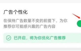
Users will encounter a lot of advertisements when browsing Moments, so how can they completely turn off the advertisements? Users need to click Settings in My, then find Personal Information and Permissions, then click Personalized Ads Management, and just turn off ad personalization. This article will tell you how to completely turn off ads in Moments, so take a look! WeChat usage tutorial: How to completely turn off ads in Moments? Answer: It cannot be turned off completely. You can only turn off personalized recommendations. Specific methods: 1. First, click on me, and then find the settings inside. 2. Find the personal information and permissions options. 3. Click on the personalized advertising management function inside. 4. Click the switch on the right side of ad personalization and turn it off. How to turn off ads: 1. Find the ads in Moments. 2. Click right
 Exquisite light and shadow art in spring, Haqu H2 is the cost-effective choice
Apr 17, 2024 pm 05:07 PM
With the arrival of spring, everything revives and everything is full of vitality and vitality. In this beautiful season, how to add a touch of color to your home life? Haqu H2 projector, with its exquisite design and super cost-effectiveness, has become an indispensable beauty in this spring. This H2 projector is compact yet stylish. Whether placed on the TV cabinet in the living room or next to the bedside table in the bedroom, it can become a beautiful landscape. Its body is made of milky white matte texture. This design not only makes the projector look more advanced, but also increases the comfort of the touch. The beige leather-like material adds a touch of warmth and elegance to the overall appearance. This combination of colors and materials not only conforms to the aesthetic trend of modern homes, but also can be integrated into
 How to turn off ads in the new version of Edge? How to block Edge personalized ads
Mar 14, 2024 am 11:37 AM
After updating the Edge browser, many users found that there were a lot of advertisements on the interface. For example, at the bottom of the new tab page, there were links to multiple websites and the word advertisements were marked, which looked very annoying. Is there any way to turn off personalized ads in Edge browser? The editor has searched many methods on the Internet, and I will share with you a little trick to turn off ads. How to turn off ads in the new version of Edge? 1. Open the Edge browser. 2. Click [•••] in the upper right corner. 3. Click [Settings]. 4. Click [Privacy, Search and Services]. 5. Turn off the switch on the right side of "Personalize your web experience" to turn off the personalization pushed by Microsoft.
 Huntkey MX750P full module power supply review: 750W of concentrated platinum strength
Mar 28, 2024 pm 03:20 PM
With its compact size, the ITX platform has attracted many players who pursue the ultimate and unique beauty. With the improvement of manufacturing processes and technological advancements, both Intel's 14th generation Core and RTX40 series graphics cards can exert their strength on the ITX platform, and gamers also There are higher requirements for SFX power supply. Game enthusiast Huntkey has launched a new MX series power supply. In the ITX platform that meets high-performance requirements, the MX750P full-module power supply has a rated power of up to 750W and has passed 80PLUS platinum level certification. Below we bring the evaluation of this power supply. Huntkey MX750P full-module power supply adopts a simple and fashionable design concept. There are two black and white models for players to choose from. Both use matte surface treatment and have a good texture with silver gray and red fonts.
 Easily understand 4K HD images! This large multi-modal model automatically analyzes the content of web posters, making it very convenient for workers.
Apr 23, 2024 am 08:04 AM
A large model that can automatically analyze the content of PDFs, web pages, posters, and Excel charts is not too convenient for workers. The InternLM-XComposer2-4KHD (abbreviated as IXC2-4KHD) model proposed by Shanghai AILab, the Chinese University of Hong Kong and other research institutions makes this a reality. Compared with other multi-modal large models that have a resolution limit of no more than 1500x1500, this work increases the maximum input image of multi-modal large models to more than 4K (3840x1600) resolution, and supports any aspect ratio and 336 pixels to 4K Dynamic resolution changes. Three days after its release, the model topped the HuggingFace visual question answering model popularity list. Easy to handle


