jQuery animation effect picture carousel implementation (with code)
This time I will bring you the implementation of jQuery animation effect picture carousel (with code). What are the precautions for the implementation of jQuery animation effect picture carousel. The following is a practical case, let's take a look. 1. Requirements Analysis
1. Provide many pictures of equal sizes and display them in a row.
2. There are two switch buttons on the left and right, used to control whether to display the previous or next picture.
3. There is an indicator "small circle" on the lower right to prompt which picture to display; you can also click it to switch pictures.
4. Every fixed time, the picture will automatically scroll.
5. When the mouse is placed on the picture, automatic scrolling will stop; when the mouse leaves, it will automatically play again after a fixed interval.
2. Code analysis
1. Use html code to build the framework
<body>
 <p id="container">
  <ul id="content">
   <li><a href="#"><img src="images/0.jpg"/></a></li>
   <li><a href="#"><img src="images/1.jpg"/></a></li>
   <li><a href="#"><img src="images/2.jpg"/></a></li>
   <li><a href="#"><img src="images/3.jpg"/></a></li>
   <li><a href="#"><img src="images/4.jpg"/></a></li>
  </ul>
  <p id="btn">
   <p id="leftBtn"></p>
   <p id="rightBtn"></p>
  </p>
  <ul id="indicator">
   <li class="current"></li>
   <li></li>
   <li></li>
   <li></li>
   <li></li>
  </ul>
 </p>
</body>
1> p with the id of container is the container for the entire carousel effect.
2> The ul whose id is content, the content stored in it is the scrolling picture displayed on the interface.
3> p with id btn, the two sub-elements inside are buttons used to switch between the previous and next pictures.
4> The ul whose id is indicator is used to display the indicator.
2. CSS code to change the display style
1> The following two lines of code clear the browser's default gap.
*{margin: 0; padding: 0;}2> Set the style of the parent container.
#container
{
 width:560px;
 height: 300px;
 margin: 100px auto;
 position: relative;
 overflow: hidden;
}Since the size of the displayed image is 560 If the child elements exceed the scope of the container, they will be hidden (Note: Since the displayed pictures are displayed in a row, if the overflow: hidden attribute is not added, the secret will be exposed. If this attribute is removed, the effect is as follows:).

#In other words, if the overflow: hidden attribute is not added, all the pictures will be displayed in a row.
The last one is the positioning attribute position: relative; Since container is the parent container, it should be set to relative, and if all its child elements are to be absolutely positioned, their positions should be Set to absolute. This is the so-called principle of "the son must be like the father". This is used in absolute positioning.
3> Set the style of content
#container #content
{
 list-style: none;
 width: 10000px;
 position: absolute;
 left:0;
 top:0;
}

#container #content li
{
 float:left;
}

#container #content li img
{
 border: 0;
} Notice that the width attribute of content is set to 10000px, this is to ensure that it can store enough pictures. By default, all li in content are block-level elements, that is, they are arranged up and down; so a float:left is added to arrange them left and right. The parent element container is set with overflow: hidden, so only the first one of these pictures arranged left and right can be seen.
4> Set the style of the left and right switch buttons
#container #leftBtn
{
 position: absolute;
 width:45px;
 height: 45px;
 top:108px;
 left: 20px;
 background: url(images/icons.png) no-repeat 0 0;
 cursor: pointer;
}

#container #rightBtn
{
 position: absolute;
 width:45px;
 height: 45px;
 top:108px;
 right: 20px;
 background: url(images/icons.png) no-repeat 0 -45px;
 cursor: pointer;
}Notice that when obtaining the left and right buttons, they are taken from the same picture icons.png. It's just that the positions of the picture interceptions are inconsistent. This is the so-called "elf". In order to reduce the size of the picture, many small icons are placed on a picture, and then the desired part is obtained by positioning and intercepting. (Note: How to position the icon? 1. Write code and adjust slowly; 2. Use sprite cutting and positioning software, such as CSS Sprites, etc.). The picture design is roughly as follows:

This picture not only contains the left and right switching buttons, but also the indicator buttons, so when writing the indicator button When writing css code, you can also use this image.
4> Set the style of the indicator
#container #indicator
{
 position: absolute;
 right: 50px;
 list-style: none;
 bottom: 12px;
}

#container #indicator li
{
 float: left;
 cursor: pointer;
 margin-left: 20px;
 width:14px;
 height: 14px;
 background: url(images/icons.png) no-repeat -23px -127px;
}

#container #indicator li.current
{
 background-position: -9px -125px;
}The background picture set by #indicator li in the code is the small hollow circle in the picture above, and the background picture set by #indicator li.current It’s the big solid circle in the picture above. So when you first start, the first one is selected by default.
3. Use JQuery to add interactive effects
1> Switch to the next image (click the button on the right)
$(function(){

 // 总的图片个数(用代码获取个数,扩展性比较强)
 var totalCount = $("#container #content li").length;
 // 当前处于第几个图片
 var nowImage = 0;
 $("#container #btn #rightBtn").click(rightBtnClick);
<span style="white-space:pre"> </span>function rightBtnClick(){
  if(!$("#container #content").is(":animated")){
   if(nowImage == totalCount - 1){
   <span style="white-space:pre"> </span>nowImage = 0;
<span style="white-space:pre">    </span>$("#container #indicator li").eq(nowImage).addClass("current").siblings().removeClass("current");
<span style="white-space:pre">    </span>$("#container #content").animate({"left": -560 * (totalCount -1 )}, 1000, function(){
    $("#container #content").css("left",0);
   });
  } else {
   nowImage++;
   changeImage();
  }
 }
}
});changeImage function
function changeImage(){
 if(!$("#container #content").is(":animated")){
 <span style="white-space:pre"> </span>$("#container #content").animate({"left": -560 * nowImage}, 1000);
  $("#container #indicator li").eq(nowImage).addClass("current").siblings().removeClass("current");
 }
}代码中,当DOM元素加载完毕,就执行了$('#container #btn #rightBtn').click(rightClick), 也就是立刻执行了切换图片操作。在rightBtnClick函数中,先进行了content是否正在进行动画的判断,这样做的目的:防止动画在执行的过程,用户又进行强制的执行其他动画,会产生干扰,最终导致动画效果混乱。
如果有的话,则将标志变量nowImage指向下一个图片,并且执行changeImage函数中的代码:1. 将content中的所有图片左移一个图片大小的宽度;2.将指示器的图片也移动到对应的位置。
如果没有的话,并且图片现在是显示到了最后一个,则先执行动画,执行完毕后,立刻将content中所有的图片内容拉回到第一个,但是这里任然会穿帮,因为当前图片显示为最后一个后,你继续执行动画,是没有任何效果的,所以在这个动画执行期间是没有任何反应的,当动画时间执行完毕后,会突然在界面上出现第一个图片。
设计思想:为了解决这个问题,解决方案就是在这些图片之后追加一个与第一张相同的图片;这就是传统轮播的主要设计思想。所以当图片滚动到倒数第二章的时候;首先执行滚动动画,也就是滚动到预先准备的与第一张一模一样的图片,看起来似乎是滚动到了第一张,其实不然。在动画执行完毕后,立刻将content中所有的图片拉回到第一张。流程图如下:
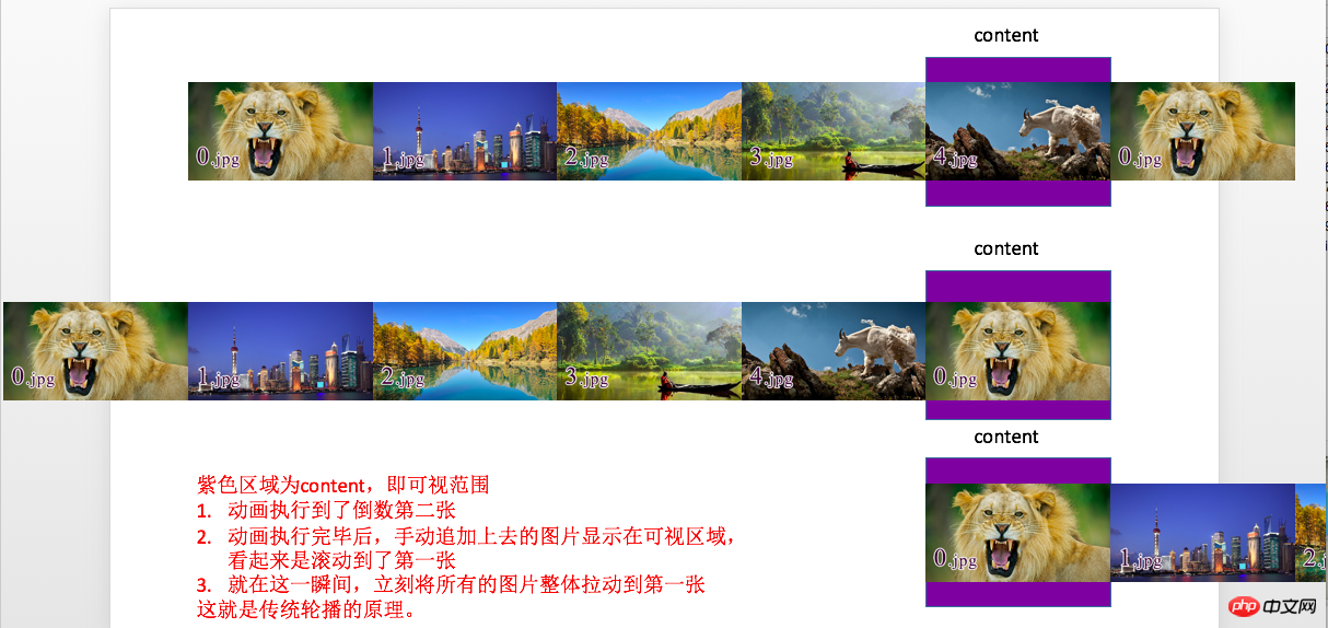
所以此刻修改一点代码,在代码的开头追加第一张图片
/*克隆轮播的第一个li追加到最后*/
$("#container #content li").first().clone().appendTo($("#container #content"));在rightBtnClick代码中,将nowImage == totalCount - 1 修改为 nowImage == totalCount - 2。
2> 切换上一张(点击左边按钮)
代码与点击右边按钮类似
$("#container #btn #leftBtn").click(function(){
 if(!$("#container #content").is(":animated")){
  if(nowImage == 0){
   nowImage = totalCount - 2;
   $("#container #content").css("left",-560 * (totalCount - 1));

   $("#container #indicator li").eq(nowImage).addClass("current").siblings().removeClass("current");

   $("#container #content").animate({"left": -560 * nowImage}, 1000);
  } else {
   nowImage--;
   changeImage();
  }
 }
});3> 点击指示器按钮进行图片切换
它的设计思路,就是获取图片的索引,然后调用changeImage函数就可以了。
$("#container #indicator li").click(function(){
 nowImage = $(this).index();
 changeImage();
});4> 添加定时执行动画的功能
也就是定时的调用点击右边按钮的代码;添加如下代码:
var timer = setInterval(rightBtnClick, 2000);
5> 鼠标悬停在图片上,停止滚动;鼠标离开图片后,继续滚动
也就是对定时器进行开启和关闭;添加如下代码:
$("#container").mouseenter(function(){
 clearInterval(timer);
}).mouseleave(function(){
 timer = setInterval(rightBtnClick, 2000);
});相信看了本文案例你已经掌握了方法,更多精彩请关注php中文网其它相关文章!
推荐阅读:
The above is the detailed content of jQuery animation effect picture carousel implementation (with code). For more information, please follow other related articles on the PHP Chinese website!

Hot AI Tools

Undresser.AI Undress
AI-powered app for creating realistic nude photos

AI Clothes Remover
Online AI tool for removing clothes from photos.

Undress AI Tool
Undress images for free

Clothoff.io
AI clothes remover

AI Hentai Generator
Generate AI Hentai for free.

Hot Article

Hot Tools

Notepad++7.3.1
Easy-to-use and free code editor

SublimeText3 Chinese version
Chinese version, very easy to use

Zend Studio 13.0.1
Powerful PHP integrated development environment

Dreamweaver CS6
Visual web development tools

SublimeText3 Mac version
God-level code editing software (SublimeText3)

Hot Topics
 How to solve the problem of automatically saving pictures when publishing on Xiaohongshu? Where is the automatically saved image when posting?
Mar 22, 2024 am 08:06 AM
With the continuous development of social media, Xiaohongshu has become a platform for more and more young people to share their lives and discover beautiful things. Many users are troubled by auto-save issues when posting images. So, how to solve this problem? 1. How to solve the problem of automatically saving pictures when publishing on Xiaohongshu? 1. Clear the cache First, we can try to clear the cache data of Xiaohongshu. The steps are as follows: (1) Open Xiaohongshu and click the "My" button in the lower right corner; (2) On the personal center page, find "Settings" and click it; (3) Scroll down and find the "Clear Cache" option. Click OK. After clearing the cache, re-enter Xiaohongshu and try to post pictures to see if the automatic saving problem is solved. 2. Update the Xiaohongshu version to ensure that your Xiaohongshu
 How to post pictures in TikTok comments? Where is the entrance to the pictures in the comment area?
Mar 21, 2024 pm 09:12 PM
With the popularity of Douyin short videos, user interactions in the comment area have become more colorful. Some users wish to share images in comments to better express their opinions or emotions. So, how to post pictures in TikTok comments? This article will answer this question in detail and provide you with some related tips and precautions. 1. How to post pictures in Douyin comments? 1. Open Douyin: First, you need to open Douyin APP and log in to your account. 2. Find the comment area: When browsing or posting a short video, find the place where you want to comment and click the "Comment" button. 3. Enter your comment content: Enter your comment content in the comment area. 4. Choose to send a picture: In the interface for entering comment content, you will see a "picture" button or a "+" button, click
 6 Ways to Make Pictures Sharper on iPhone
Mar 04, 2024 pm 06:25 PM
Apple's recent iPhones capture memories with crisp detail, saturation and brightness. But sometimes, you may encounter some issues that may cause the image to look less clear. While autofocus on iPhone cameras has come a long way, allowing you to take photos quickly, the camera can mistakenly focus on the wrong subject in certain situations, making the photo blurry in unwanted areas. If your photos on your iPhone look out of focus or lack sharpness overall, the following post should help you make them sharper. How to Make Pictures Clearer on iPhone [6 Methods] You can try using the native Photos app to clean up your photos. If you want more features and options
 How to make ppt pictures appear one by one
Mar 25, 2024 pm 04:00 PM
In PowerPoint, it is a common technique to display pictures one by one, which can be achieved by setting animation effects. This guide details the steps to implement this technique, including basic setup, image insertion, adding animation, and adjusting animation order and timing. Additionally, advanced settings and adjustments are provided, such as using triggers, adjusting animation speed and order, and previewing animation effects. By following these steps and tips, users can easily set up pictures to appear one after another in PowerPoint, thereby enhancing the visual impact of the presentation and grabbing the attention of the audience.
 How to convert pdf documents into jpg images with Foxit PDF Reader - How to convert pdf documents into jpg images with Foxit PDF Reader
Mar 04, 2024 pm 05:49 PM
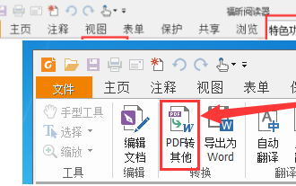
Are you also using Foxit PDF Reader software? So do you know how Foxit PDF Reader converts pdf documents into jpg images? The following article brings you how Foxit PDF Reader converts pdf documents into jpg images. For those who are interested in the method of converting jpg images, please come and take a look below. First start Foxit PDF Reader, then find "Features" on the top toolbar, and then select the "PDF to Others" function. Next, open a web page called "Foxit PDF Online Conversion". Click the "Login" button on the upper right side of the page to log in, and then turn on the "PDF to Image" function. Then click the upload button and add the pdf file you want to convert into an image. After adding it, click "Start Conversion"
 How to implement dual WeChat login on Huawei mobile phones?
Mar 24, 2024 am 11:27 AM
How to implement dual WeChat login on Huawei mobile phones? With the rise of social media, WeChat has become one of the indispensable communication tools in people's daily lives. However, many people may encounter a problem: logging into multiple WeChat accounts at the same time on the same mobile phone. For Huawei mobile phone users, it is not difficult to achieve dual WeChat login. This article will introduce how to achieve dual WeChat login on Huawei mobile phones. First of all, the EMUI system that comes with Huawei mobile phones provides a very convenient function - dual application opening. Through the application dual opening function, users can simultaneously
 How to arrange two pictures side by side in wps document
Mar 20, 2024 pm 04:00 PM
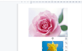
When using WPS office software, we found that not only one form is used, tables and pictures can be added to the text, pictures can also be added to the table, etc. These are all used together to make the content of the entire document look richer. , if you need to insert two pictures into the document and they need to be arranged side by side. Our next course can solve this problem: how to place two pictures side by side in a wps document. 1. First, you need to open the WPS software and find the picture you want to adjust. Left-click the picture and a menu bar will pop up, select "Page Layout". 2. Select "Tight wrapping" in text wrapping. 3. After all the pictures you need are confirmed to be set to "Tight text wrapping", you can drag the pictures to the appropriate position and click on the first picture.
 What should I do if the images on the webpage cannot be loaded? 6 solutions
Mar 15, 2024 am 10:30 AM
Some netizens found that when they opened the browser web page, the pictures on the web page could not be loaded for a long time. What happened? I checked that the network is normal, so where is the problem? The editor below will introduce to you six solutions to the problem that web page images cannot be loaded. Web page images cannot be loaded: 1. Internet speed problem The web page cannot display images. It may be because the computer's Internet speed is relatively slow and there are more softwares opened on the computer. And the images we access are relatively large, which may be due to loading timeout. As a result, the picture cannot be displayed. You can turn off the software that consumes more network speed. You can go to the task manager to check. 2. Too many visitors. If the webpage cannot display pictures, it may be because the webpages we visited were visited at the same time.


